Oribe Shampoo and Conditioner
Topics
Details
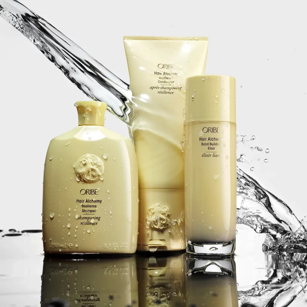
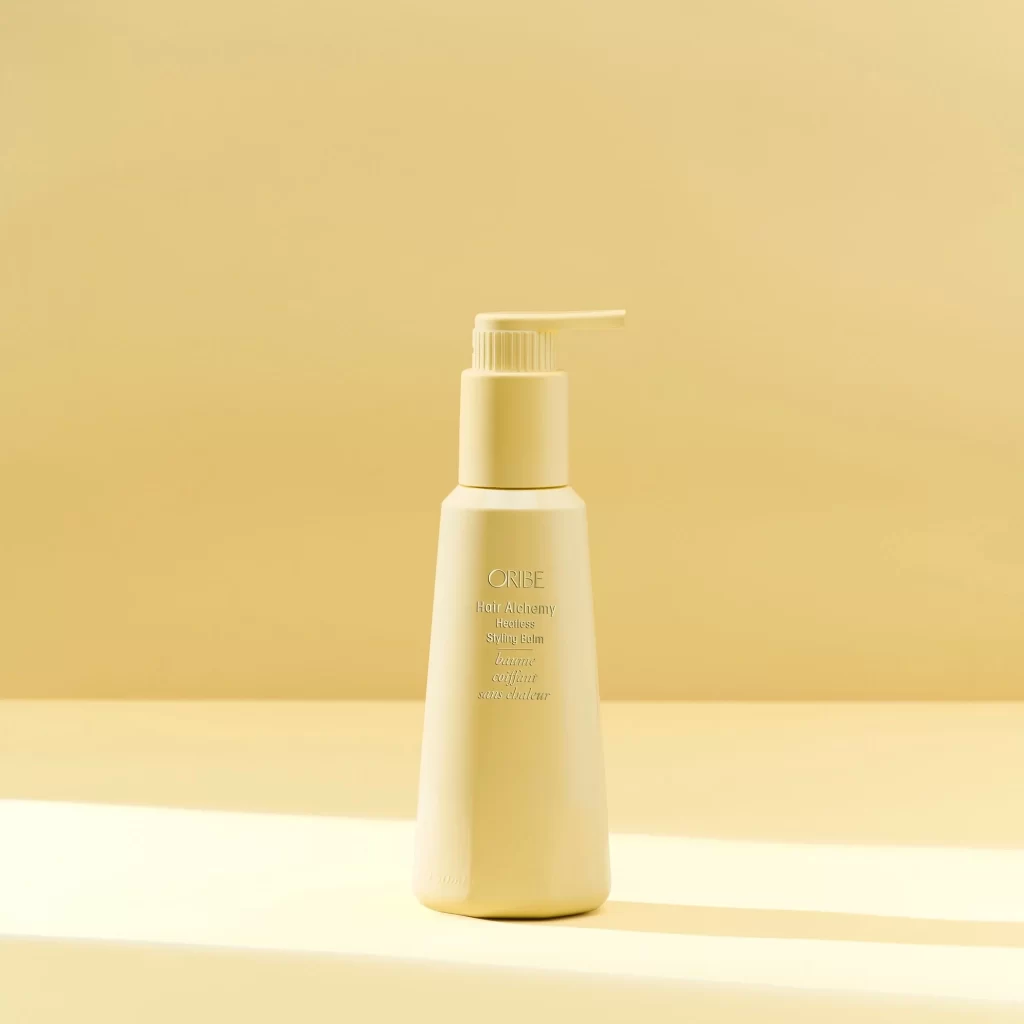
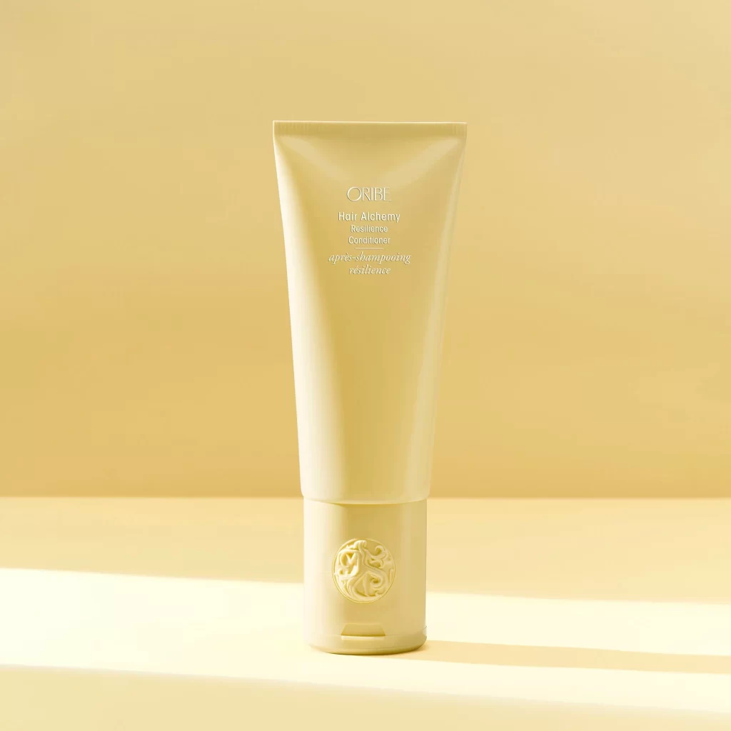
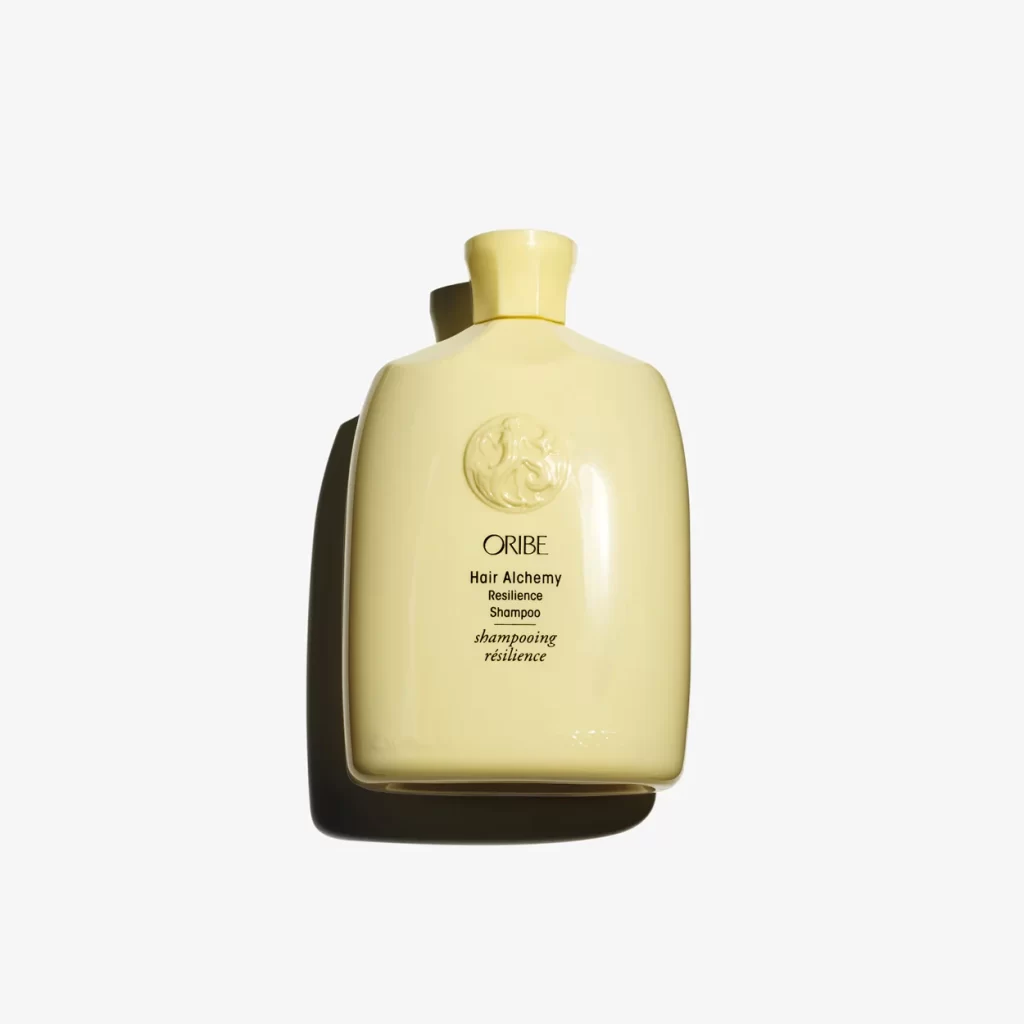
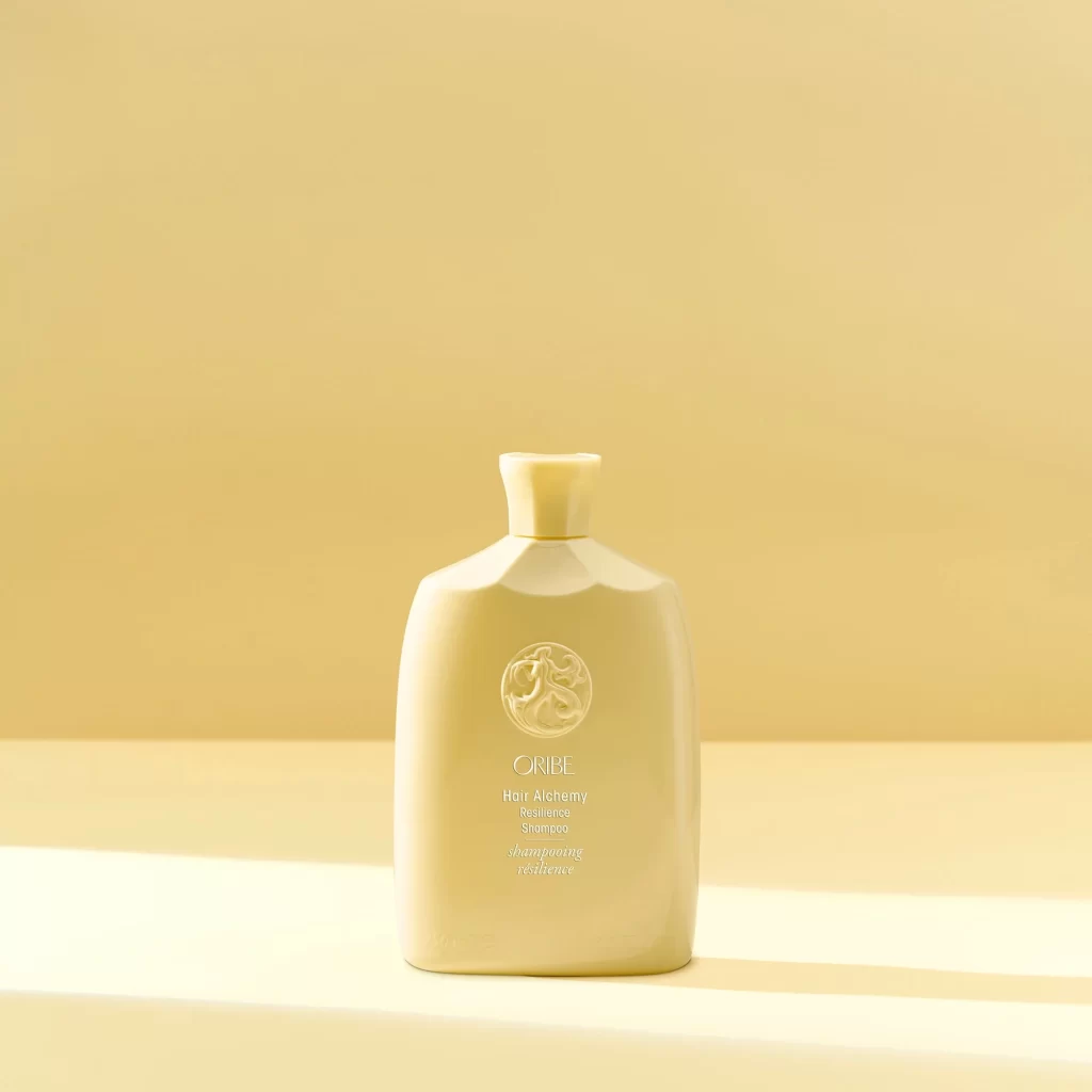
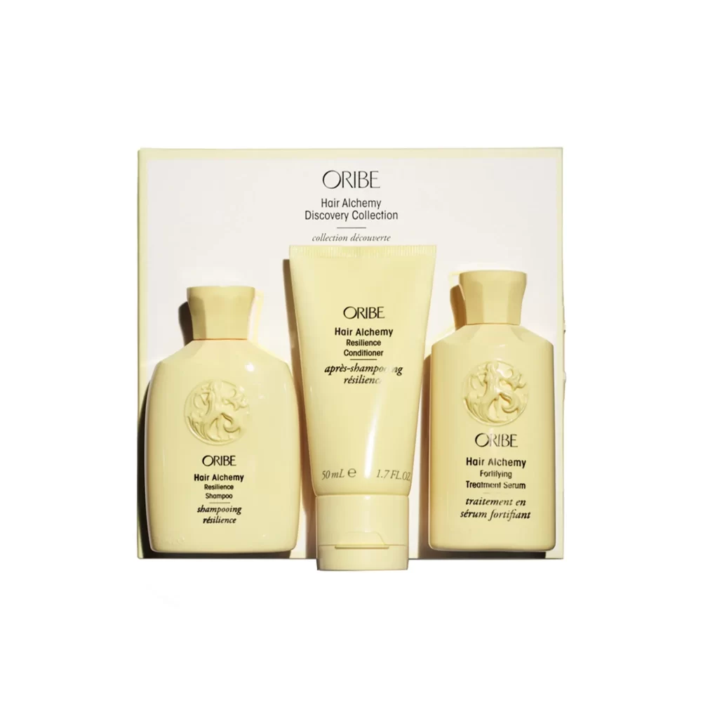
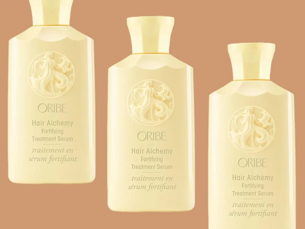
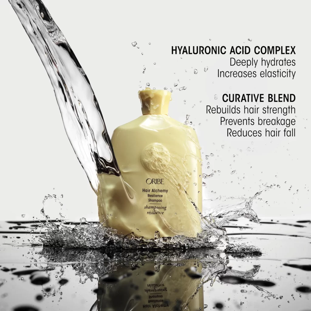
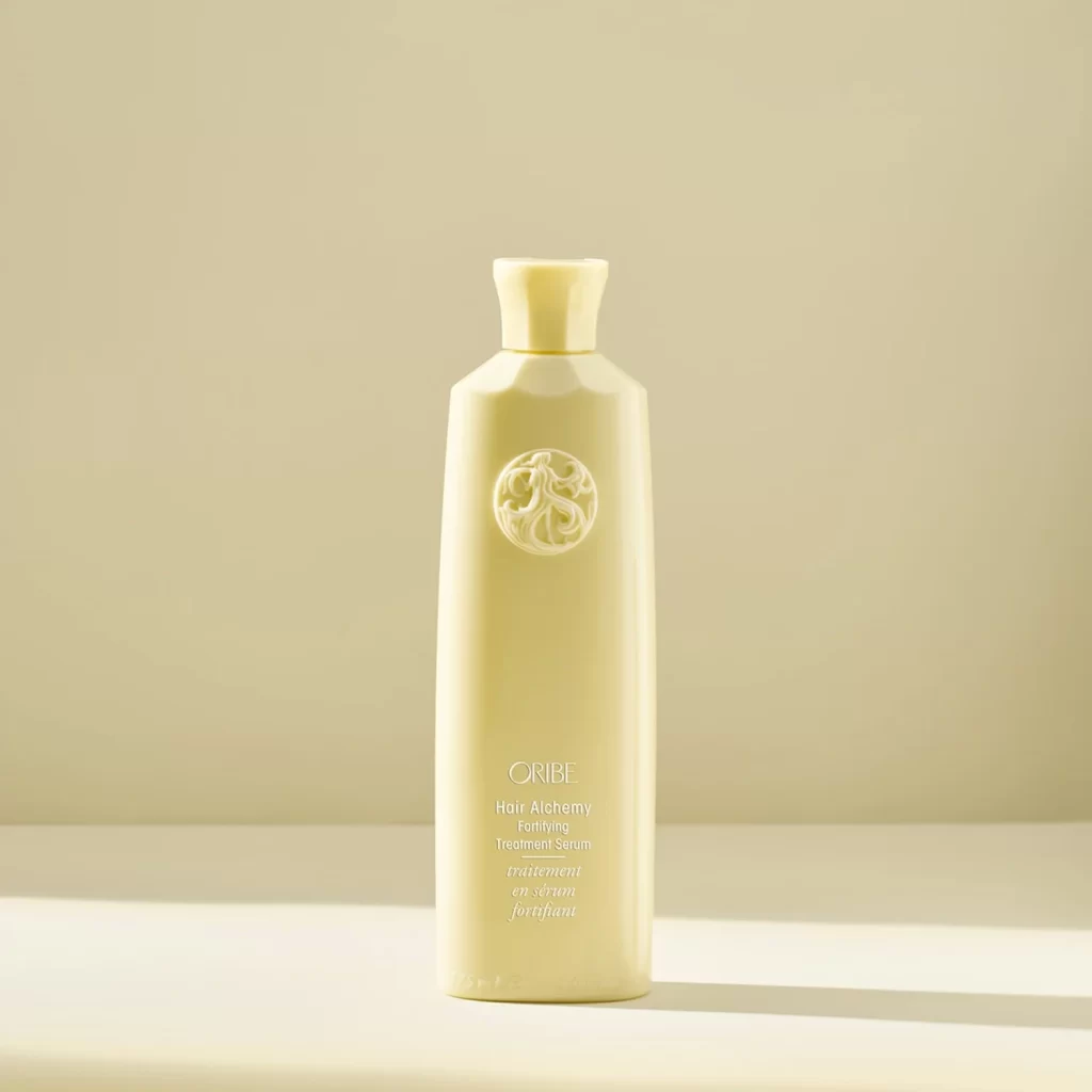
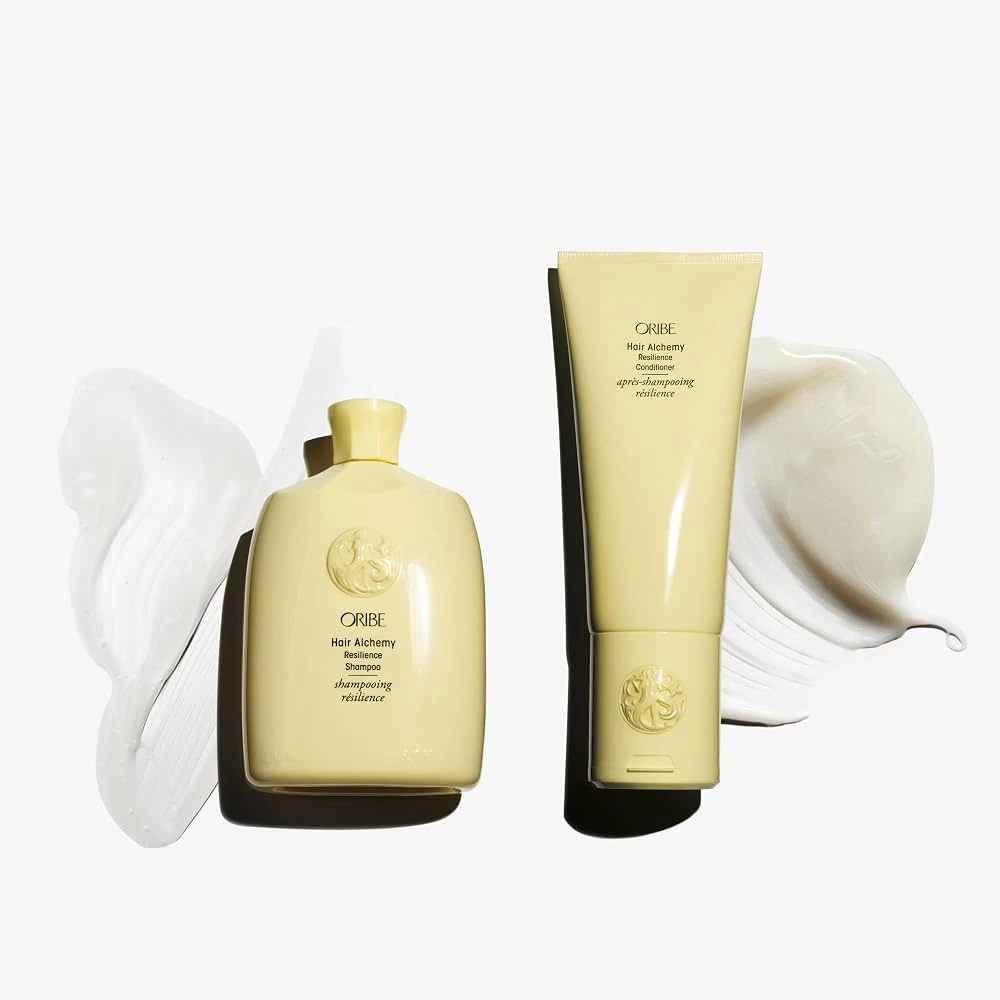
Pale yellow vessels of varying proportions sit against a seamless white ground, each casting a soft, directional shadow to the right. The left object presents as a squat bottle with a cylindrical neck and cap, while the right stands as an elongated tube with a flat seal at the base. Both surfaces bear the embossed Oribe crest and printed text identifying the Hair Alchemy Resilience collection, flanked by viscous white product smears that suggest texture and viscosity.
Monochromatic packaging in this muted butter tone creates a cohesive visual system that feels both pharmaceutical and luxurious. The interplay between the rigid geometric forms and the organic, fluid smears introduces a dynamic contrast between container and content. Subtle embossing on the lower portion of each vessel adds tactile depth without disrupting the minimalist aesthetic.
Art directors studying premium beauty branding might analyze this composition for its balance of negative space and product placement. Photographers specializing in cosmetics could reference the lighting setup used to highlight the matte finish of the plastic. Packaging designers may examine how typography hierarchy functions across different form factors within a single product line.