Nissin Instant Ramen
Topics
Details
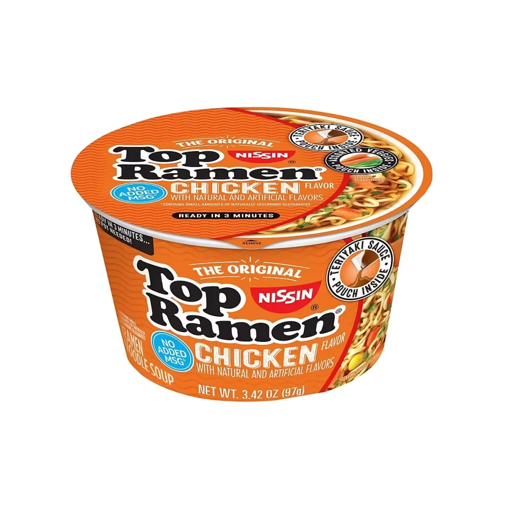
An orange cylindrical cup of Nissin Top Ramen Chicken flavor sits centered against a pure white void, photographed from a slight three-quarter angle that reveals both the lid and the front label. The packaging features bold black serif typography for the brand name, a red Nissin logo, and blue circular badges announcing "No Added MSG." Visible text includes "The Original," "Teriyaki Sauce Pouch Inside," "Dried Veggies," and a net weight of 3.42 oz (97g), while the lid displays an appetizing photograph of prepared noodles with vegetables.
Visual hierarchy relies on high-contrast color blocking, where the saturated orange background makes black text pop while red and blue accents draw attention to key claims. The circular composition of the container creates natural framing for the product photography on the lid, while repeated branding elements across both surfaces ensure recognition from multiple angles. Typography varies between heavy display fonts for the product name and smaller sans-serif details, establishing clear information priority through scale and weight differences.
Food packaging designers might study this example to understand how established brands balance legacy identity with contemporary health-conscious messaging. Illustrators working on commercial food art could reference the lighting techniques used to make the noodle photograph appear appetizing without artificial enhancement. Marketing teams analyzing competitive positioning would find value in how premium features like the teriyaki sauce pouch are integrated into the overall visual narrative rather than treated as secondary information.