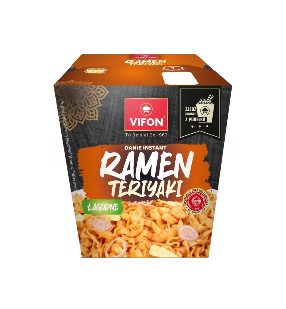
Vifon Instant Ramen Teriyaki Box
Topics
Details
Centered within a sterile white void, the Vifon Instant Ramen Teriyaki container presents a study in contrasting textures and bold color blocking. The upper portion features a matte orange lid, while the main body transitions into a dark, wood-grain textured surface that anchors the composition. Dominating the front is a vibrant orange brushstroke containing 'RAMEN TERIYAKI' in aggressive white typography, positioned beneath the red Vifon logo and its accompanying 1963 heritage tagline.
Visual hierarchy is established through the strategic layering of graphic elements against the photographic base of noodles and onion slices. A black ribbon badge on the right side introduces a functional icon set with Polish text regarding ease of consumption, creating an asymmetrical balance that draws the eye across the packaging. The inclusion of a green 'ŁAGODNE' (mild) label and a circular quality seal adds necessary regulatory and flavor information without cluttering the primary brand identity.
Packaging analysts might utilize this specific layout to examine how international brands adapt their visual language for Eastern European markets through localized text integration. Commercial illustrators could reference the interplay between the ornate gold mandala pattern on the left edge and the modern sans-serif typefaces to understand traditional-contemporary fusion. Furthermore, food stylists may study the lighting on the noodle photography to replicate similar appetizing textures in their own product mockups.