Japanese Ramen Noodle Packaging
DownloadTopics
Details
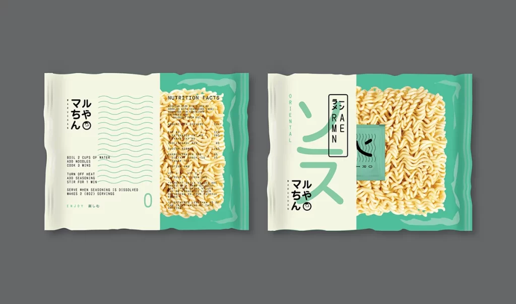
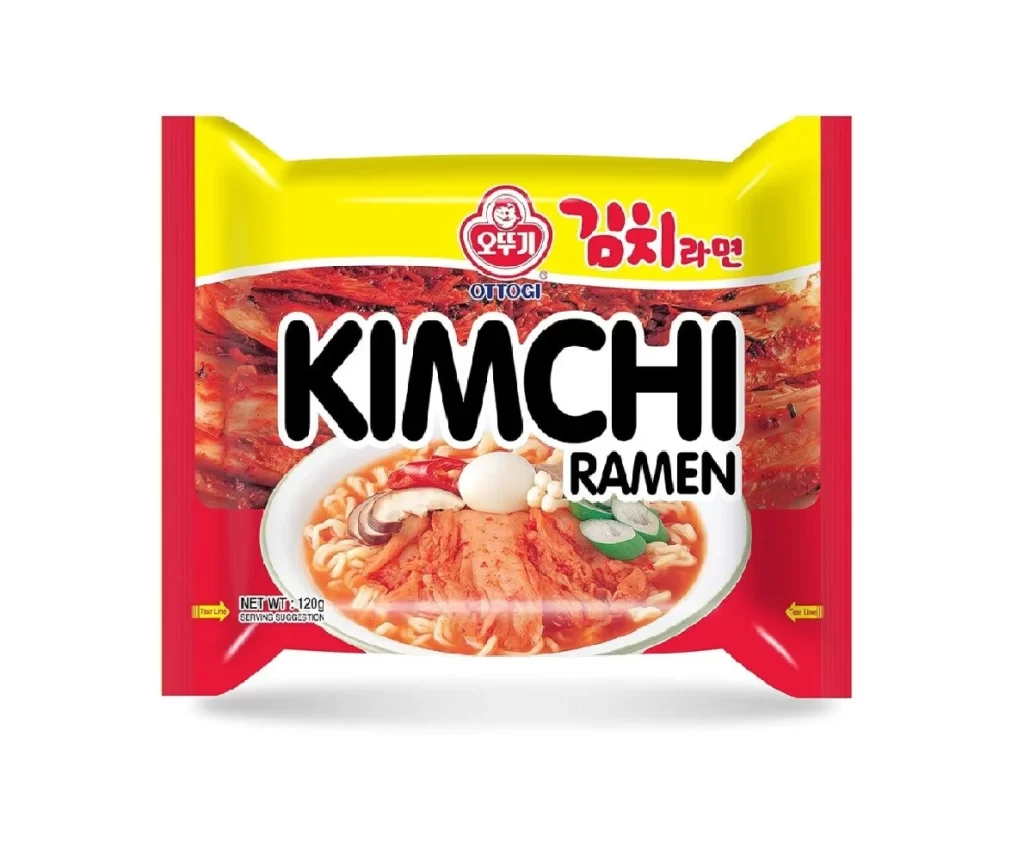
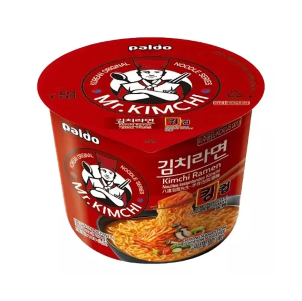
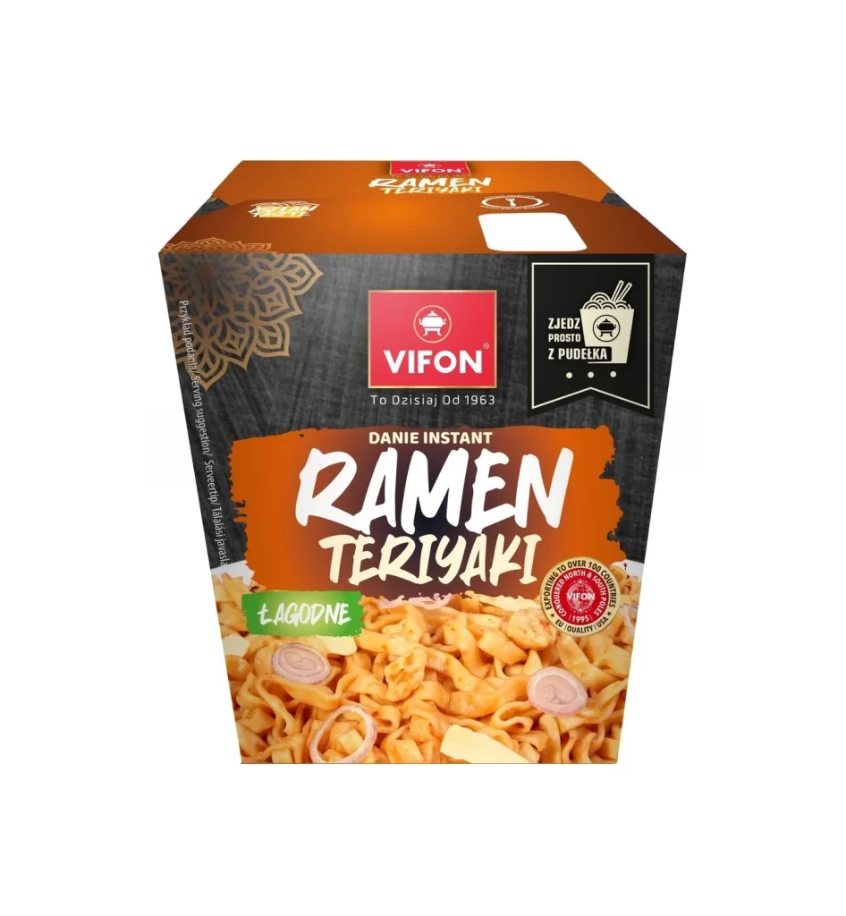
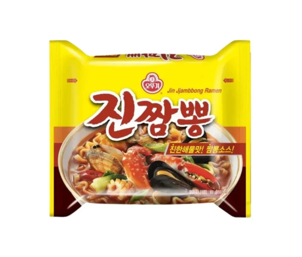
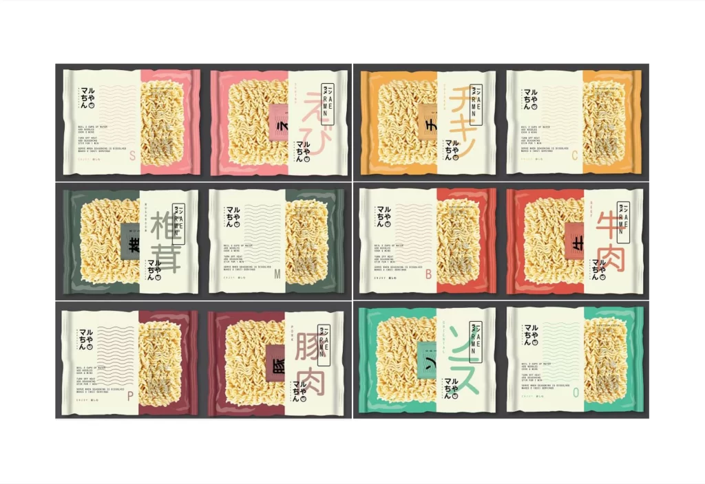
Twelve rectangular noodle packets arrange themselves in a neat three-by-four grid, each featuring a crinkled plastic texture that catches the light across its surface. The designs split each package into two distinct zones: a solid color block on one side—ranging from coral pink and mustard yellow to forest green and burgundy—and an off-white panel on the opposite side displaying the actual dried noodles through a transparent window. Bold Japanese kanji characters like ラーメン (ramen), トマト (tomato), 柚子 (yuzu), and 牛肉 (beef) dominate the typography, accompanied by smaller hiragana text reading マルちゃん (Maruchan) and the English word RAMEN stacked vertically in clean sans-serif lettering.
What makes this collection particularly compelling is how it balances traditional Japanese food packaging aesthetics with modern minimalist graphic design principles. The color palette feels intentionally curated to differentiate flavors at a glance while maintaining visual cohesion across the entire product line, with each hue suggesting the taste profile inside—warm oranges for savory broths, cool greens for citrus notes, deep reds for rich meats. Designers will appreciate how the transparent window integrates with the layout rather than feeling like an afterthought, creating a honest showcase of the product that builds consumer trust.
Food packaging designers studying Asian market trends could mine this grid for typographic hierarchy ideas, particularly how vertical English text complements horizontal Japanese characters without creating visual clutter. Brand identity specialists working on snack or instant-food lines might reference these color-flavor associations when developing their own product differentiation strategies. Anyone needing detailed texture references for crinkled foil or plastic substrates can grab the full-resolution file without cost to examine those material specifics up close.