Top Ramen Instant Noodle
Topics
Details
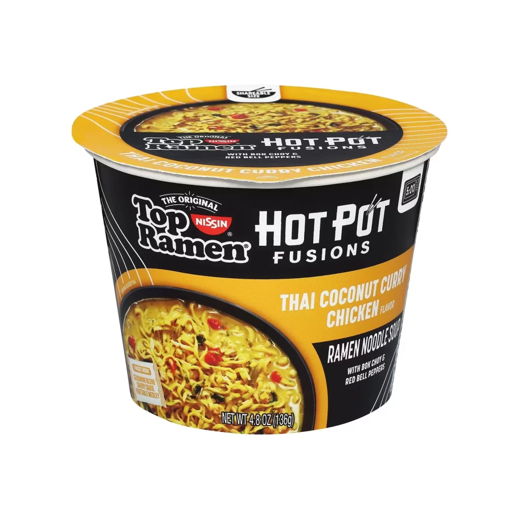
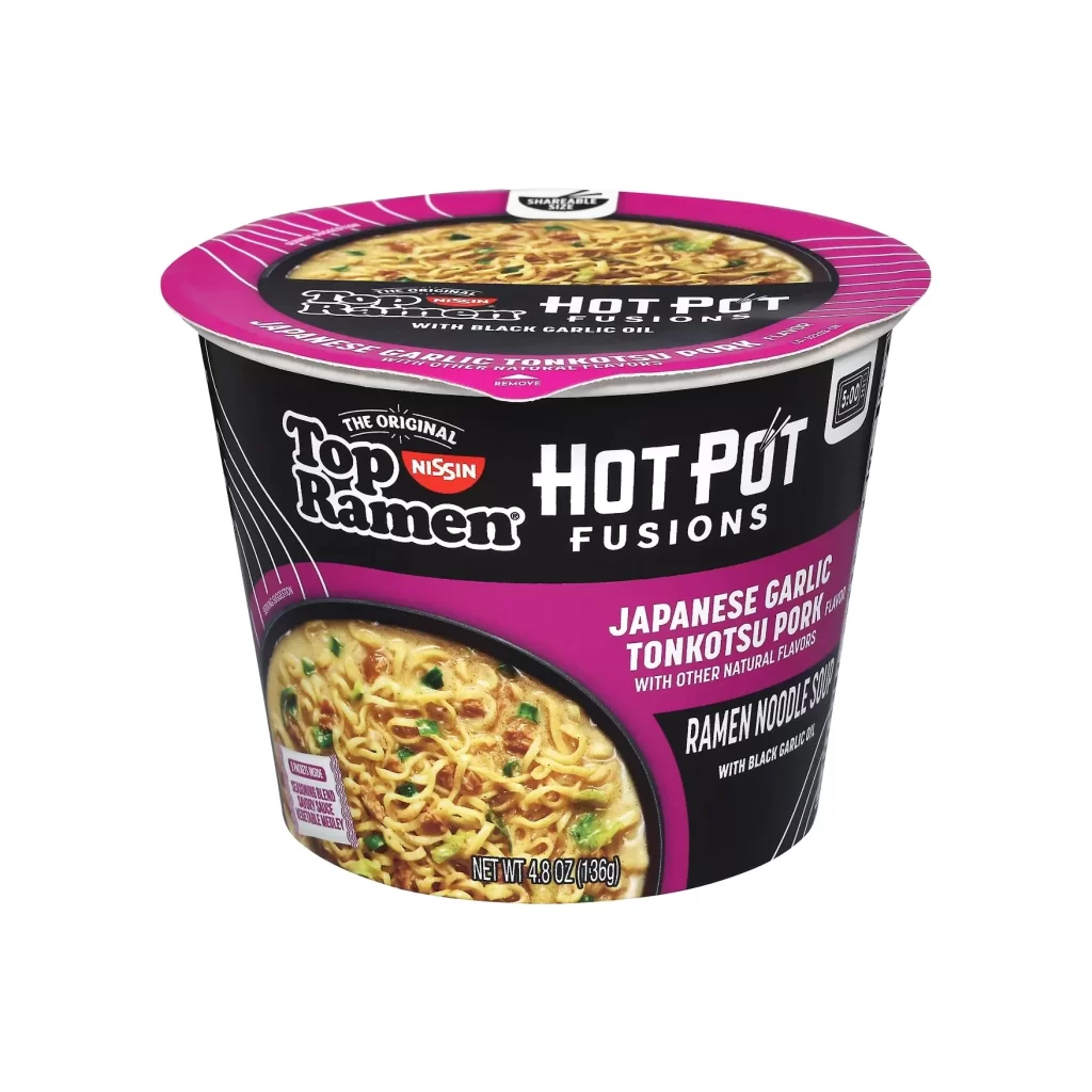
Top Ramen Hot Pot Fusions cup features a bold black body with vibrant magenta accents, displaying 'Japanese Garlic Tonkotsu Pork' in white text alongside a circular window showing the prepared noodles with green onions. The white plastic rim and lid contrast sharply against the dark container, while the Nissin logo sits prominently above the product name in a clean, studio-lit composition.
Visual distinction emerges from the aggressive magenta-to-black color blocking that departs from traditional ramen packaging palettes, signaling a premium fusion variant rather than a standard offering. The typographic hierarchy balances the heritage ‘Top Ramen’ script against modern sans-serif elements for ‘Hot Pot Fusions,’ while the photographic food styling within the oval frame provides textural authenticity. Such deliberate chromatic intensity and layered graphic systems create immediate shelf presence through high-contrast value relationships.
Brand strategists analyzing competitive CPG packaging would examine this object to understand how legacy products signal innovation through color theory and nomenclature shifts. Industrial designers developing disposable food containers might reference the structural relationship between the flared rim and tapered body for ergonomic handling studies. Culinary photographers could deconstruct the lighting setup used to make the broth appear rich and the noodle strands distinct without glare.