Nissin Ramen Pouch
Topics
Details
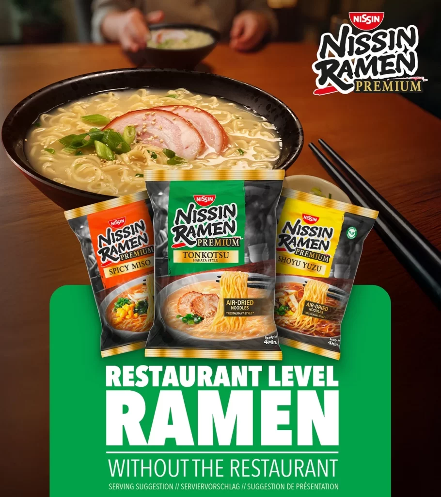
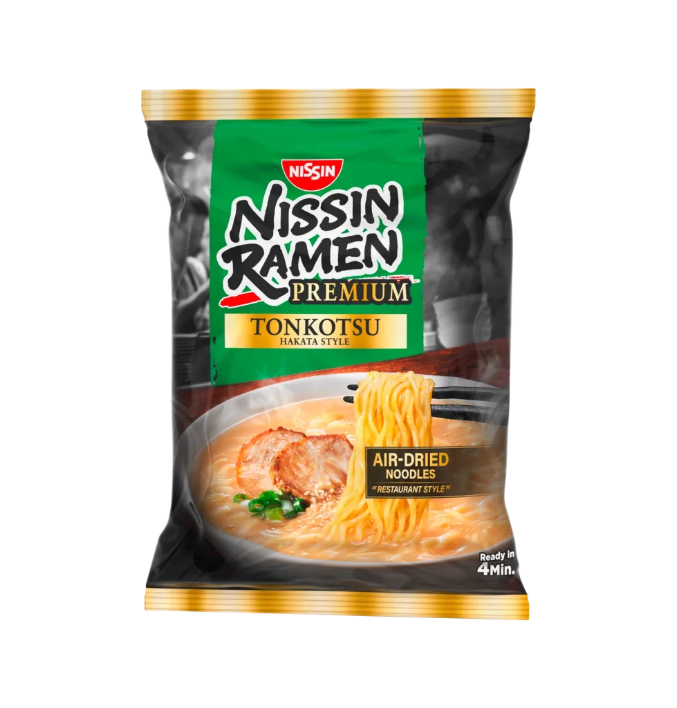
A vibrant green panel anchors the upper half of the packaging, featuring the Nissin logo in a red oval above bold, black serif lettering for the brand name. Below this, the word 'Premium' appears in gold, followed by 'Tonkotsu Hakata Style' set within a rectangular golden badge. The lower portion displays a photographic rendering of ramen in a bowl, showcasing air-dried noodles lifted by chopsticks, slices of pork, and green onions floating in a creamy broth, all framed by black side panels with subtle grayscale imagery and finished with metallic gold trim at the top and bottom edges.
Visual hierarchy plays a crucial role here, as the saturated emerald background creates immediate contrast against the dark typography and the warm tones of the food photography. The inclusion of specific descriptors like 'Air-Dried Noodles' and 'Restaurant Style' in distinct typographic treatments signals a premium market positioning that distinguishes it from standard instant varieties. Furthermore, the strategic placement of the preparation time in the bottom corner balances aesthetic appeal with practical consumer information without cluttering the central appetizing imagery.
Brand strategists might examine this composition to understand how color blocking can effectively separate product heritage from flavor-specific details on limited shelf space. Packaging engineers could study the integration of realistic food photography with graphic elements to gauge how texture representations influence perceived quality. Additionally, culinary marketing teams may reference the specific terminology used to communicate authenticity and cooking method advantages to discerning grocery shoppers.