Top Ramen Instant Noodle View
Topics
Details
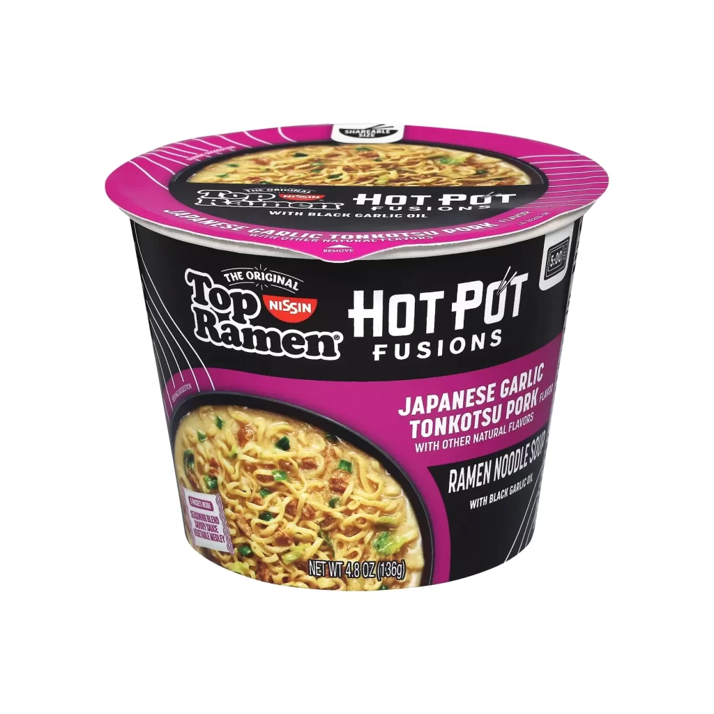
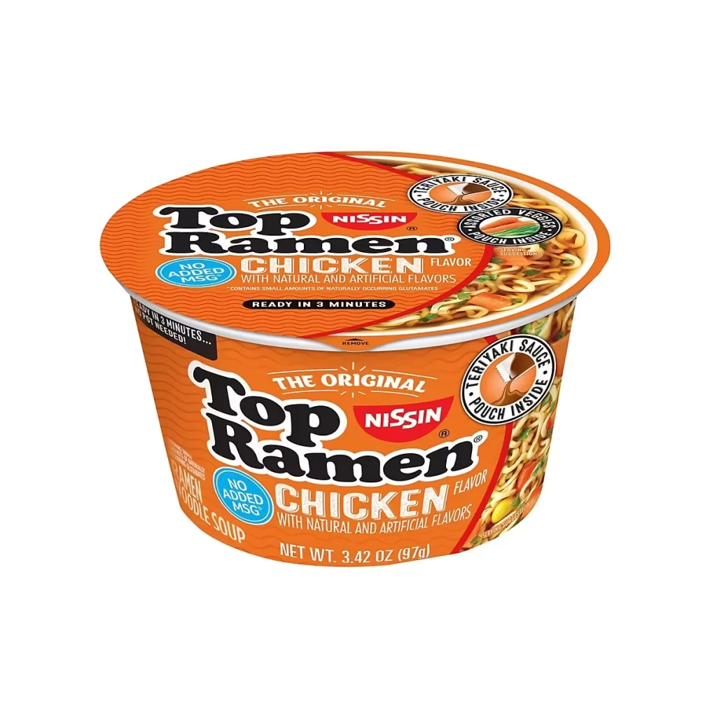
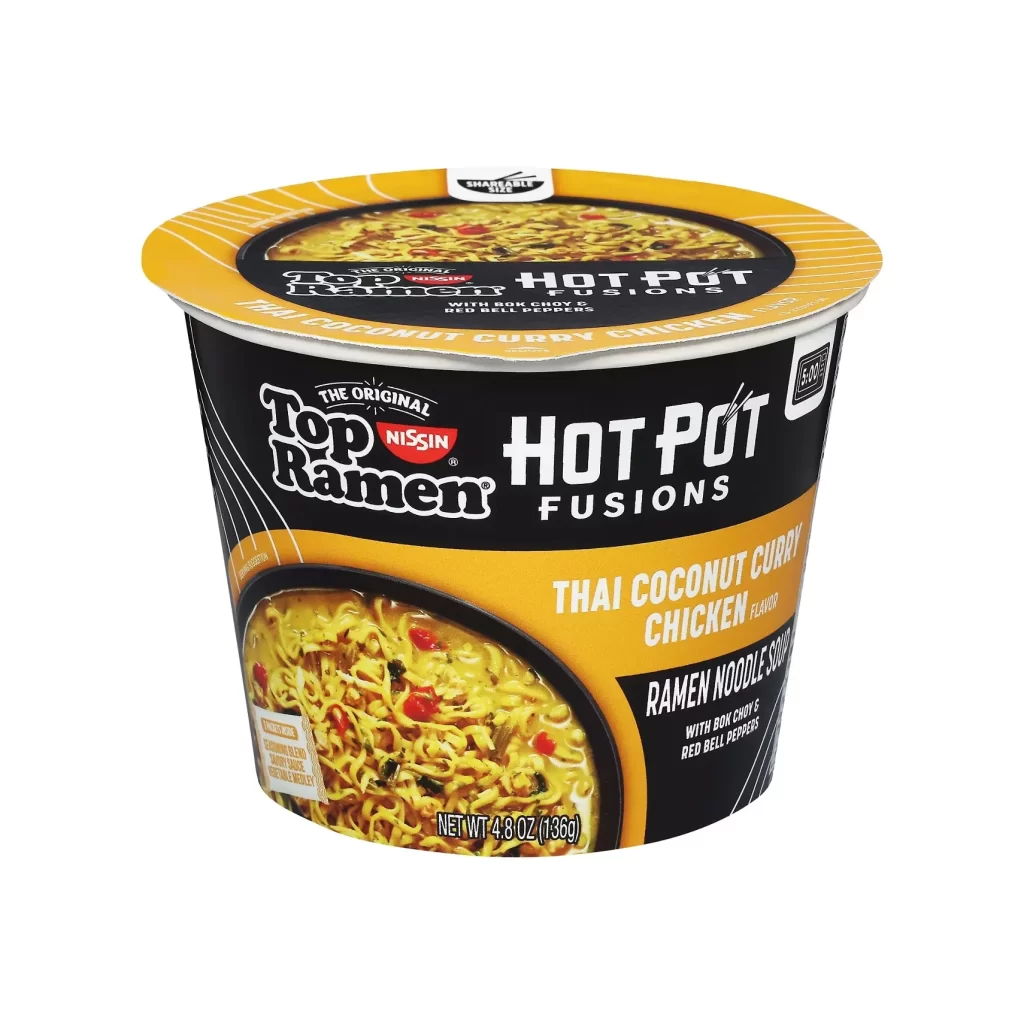
Vibrant orange and deep black define the visual identity of this Nissin Top Ramen Hot Pot Fusions cup, which stands centered in a clean, studio-lit composition. The cylindrical container features a bold yellow lid with diagonal striping, while the main body displays the iconic 'Top Ramen' logo in white script alongside the 'Hot Pot Fusions' branding in a modern, sans-serif typeface. A large circular window on the lower half reveals a steaming bowl of Thai Coconut Curry Chicken noodles, showcasing golden broth, tender chicken pieces, and scattered red bell peppers against the dark packaging background.
What distinguishes this particular SKU is its sophisticated fusion of traditional instant noodle aesthetics with premium hot pot positioning, evident in the elevated color palette and typography choices. The design cleverly uses the photographic food window as both an appetite driver and a compositional anchor, breaking up the otherwise graphic-heavy black field with organic texture and warm tones. Subtle details like the 'SmartLid' tab indicator and the specific ingredient callouts for bok choy and red bell peppers suggest a more culinary-forward approach than standard ramen packaging typically employs.
Packaging designers studying convenience-food branding would find this reference valuable for analyzing how established brands introduce premium sub-lines without abandoning core visual equity. Food photographers might examine the lighting setup used to make the broth appear rich and the vegetables vibrant within the curved plastic window. Marketing teams could also utilize this example when developing position strategies for fusion-flavor extensions that need to signal authenticity while maintaining mass-market accessibility.