Vifon Noodle Pouch View
Topics
Details
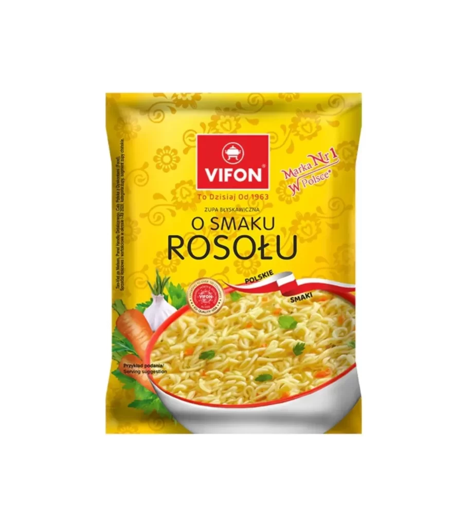
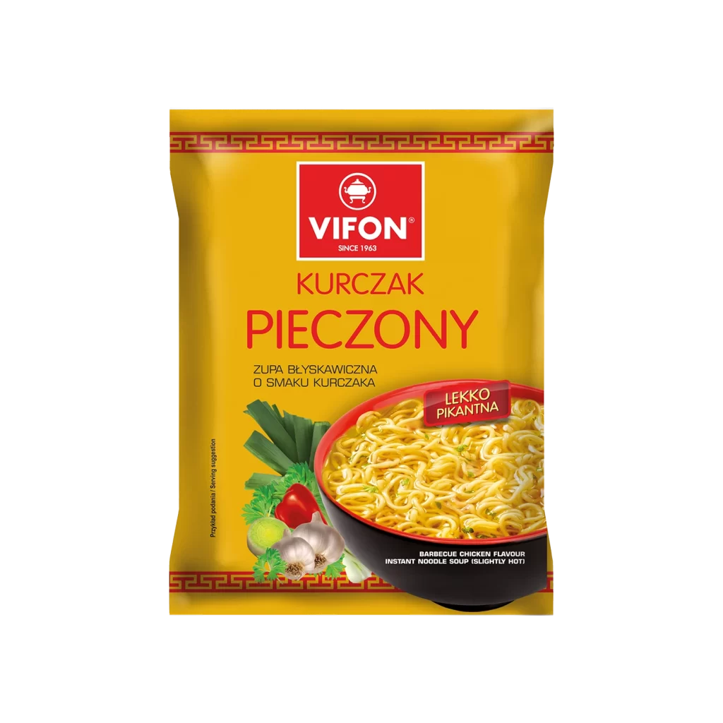
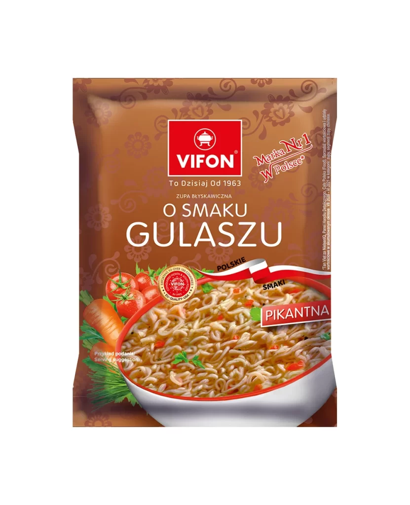
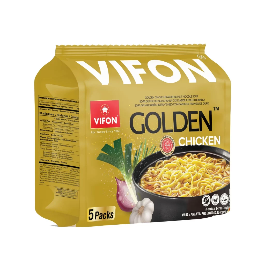
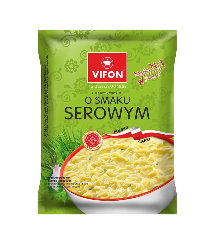
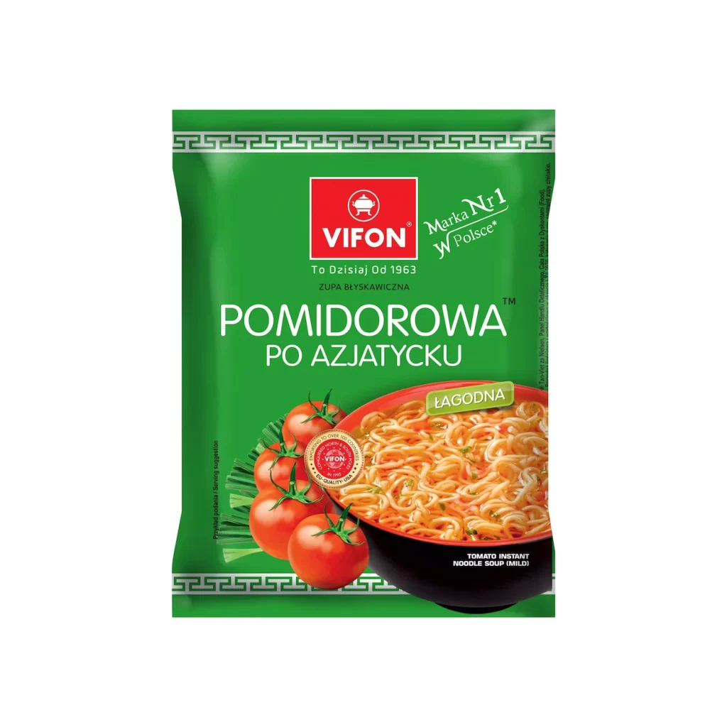
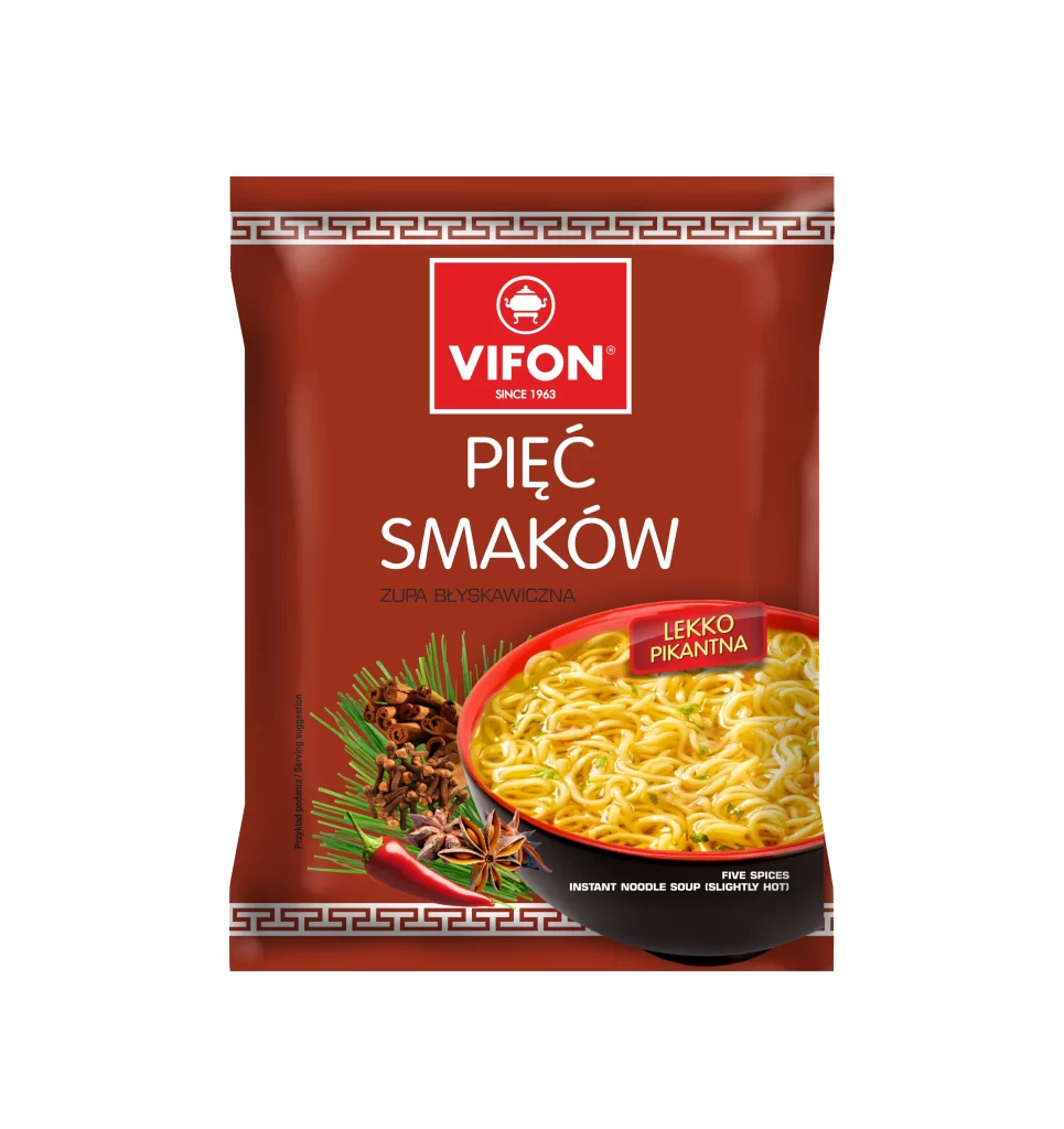
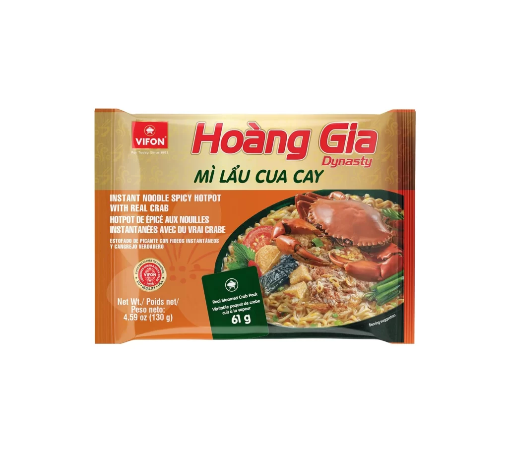
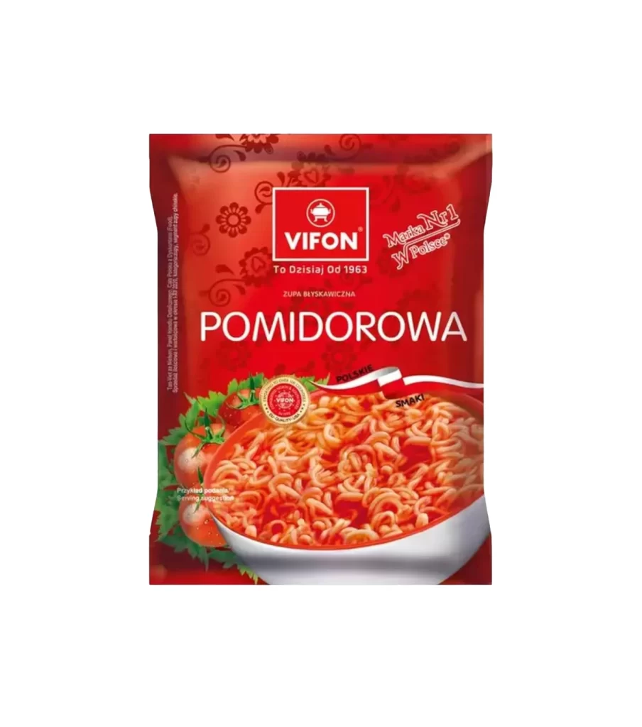
A vibrant crimson field dominates the frame, serving as the backdrop for a Vifon instant noodle pouch that sits centered against a stark white void. The packaging features the brand's logo within a white rectangular border at the top, accompanied by the Polish text 'To Oziśniał Od 1963' and a 'Marka Nr1 W Polsce' badge. Below this, the word 'POMIDOROWA' appears in bold, clean white typography, while the lower portion showcases an appetizing photograph of curly noodles swimming in a rich red broth, flanked by fresh tomatoes and green foliage.
What distinguishes this particular design is its aggressive monochromatic color strategy, which leverages deep reds to immediately signal the tomato flavor profile to consumers. Subtle floral patterns are embossed into the background, adding textural depth without competing with the primary product photography. A small circular quality seal and ribbon graphics reading 'Polskie Smaki' further anchor the product's local market identity, creating a cohesive visual language that balances heritage branding with modern convenience.
Packaging analysts and food industry researchers might examine this artifact to understand how color psychology drives flavor perception in Eastern European markets. Brand strategists could deconstruct the typographic hierarchy to see how legacy claims like the 1963 founding date are integrated with contemporary sales rankings. Culinary historians may also find value in documenting how instant ramen products adapt their visual identity to align with regional taste preferences and national pride.