Nissin Cup Noodle Label
Topics
Details
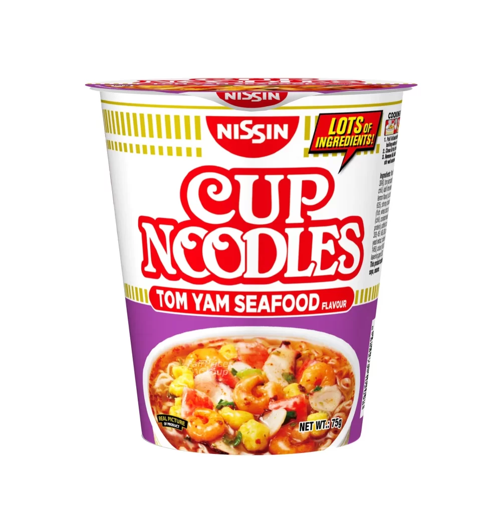
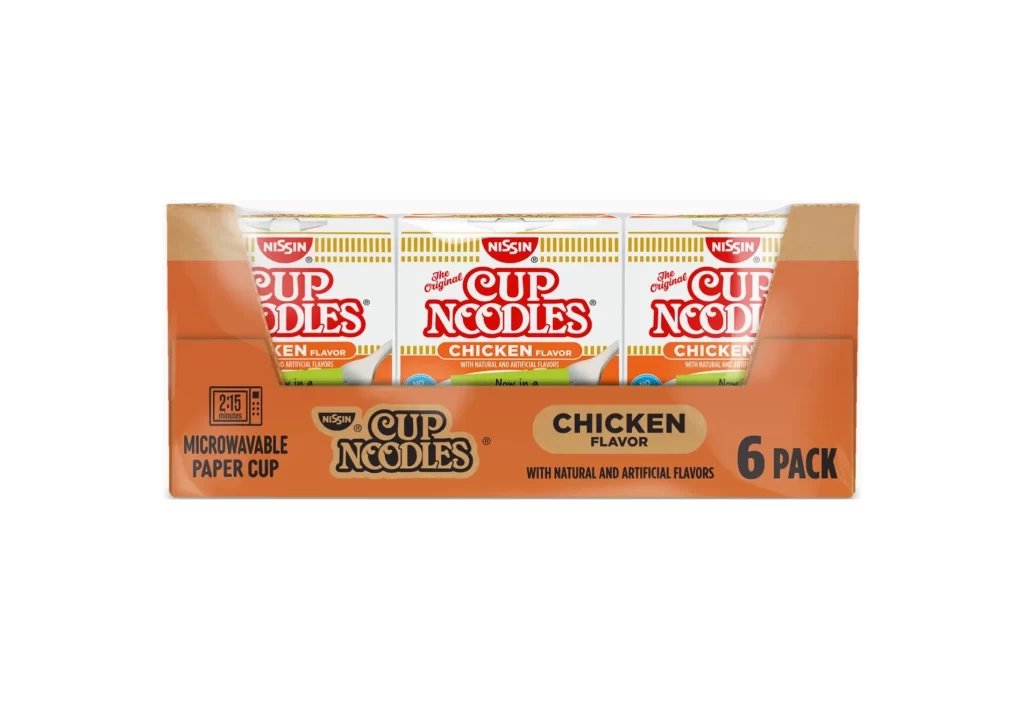
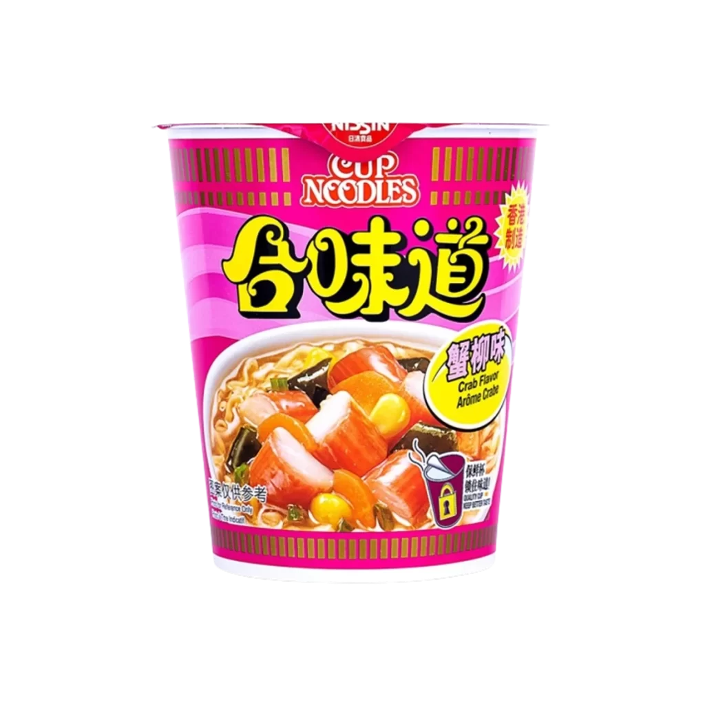
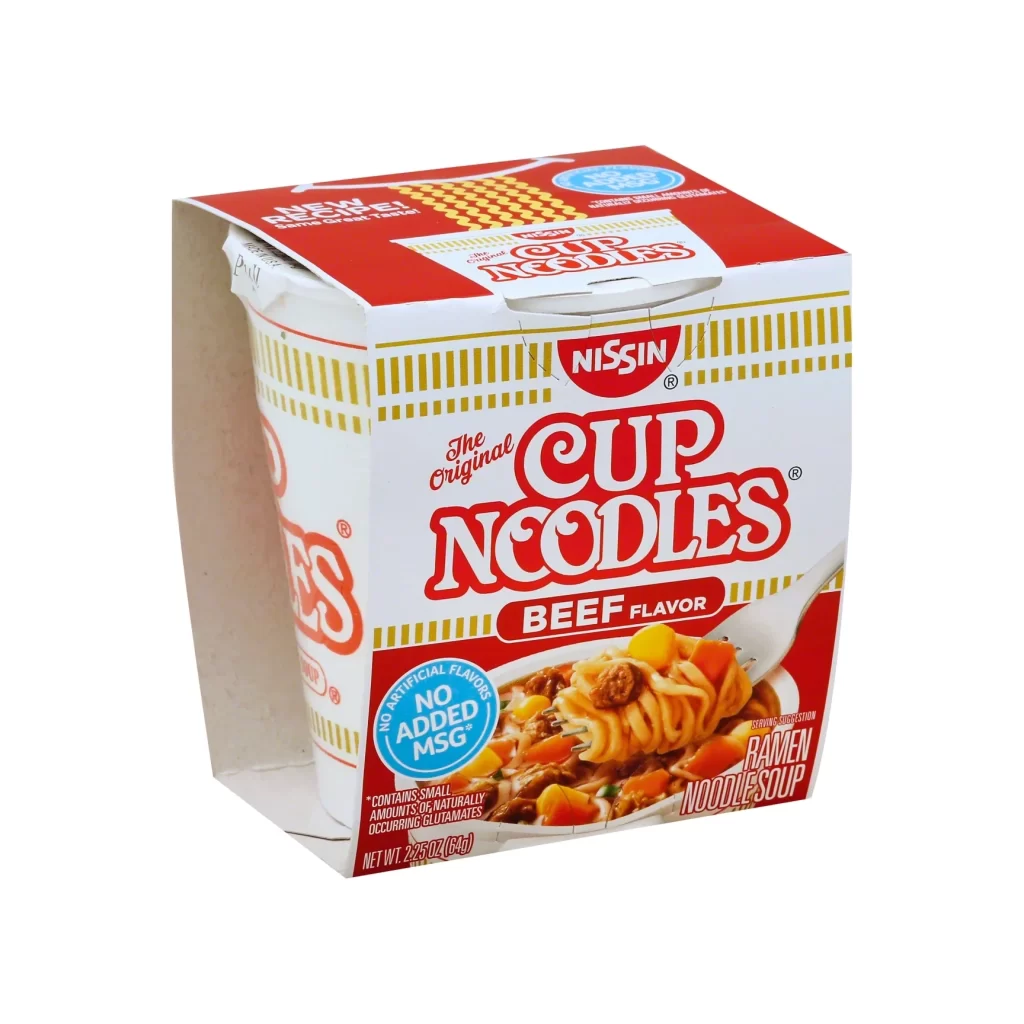
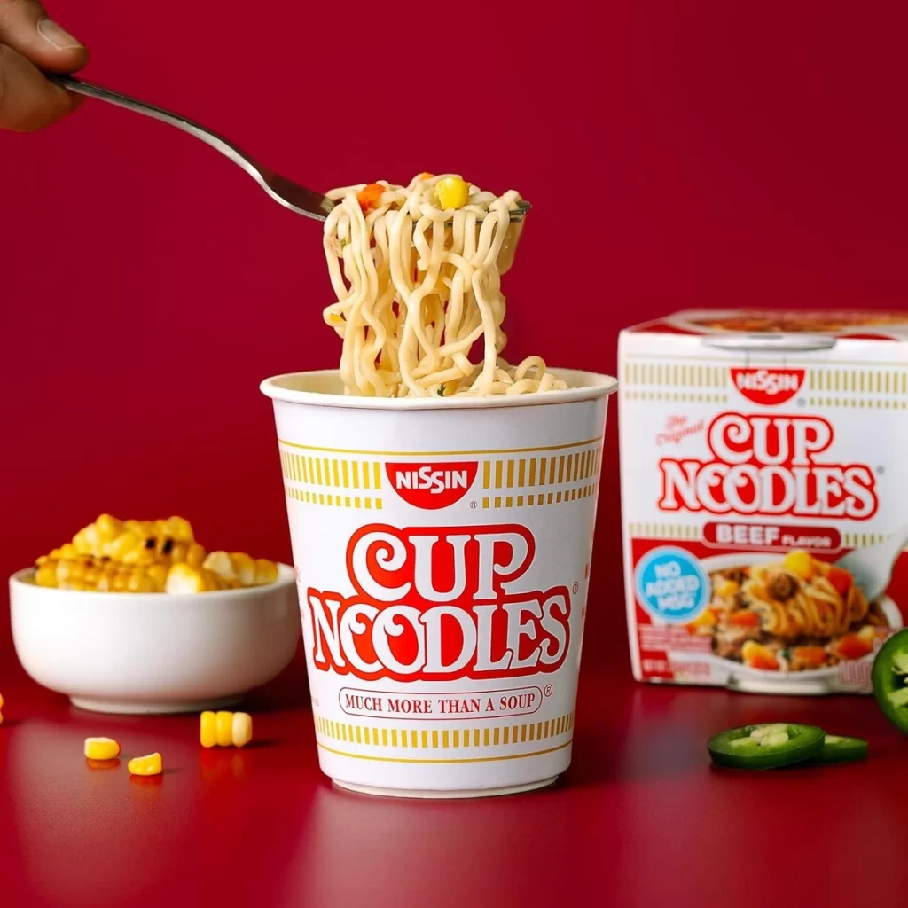
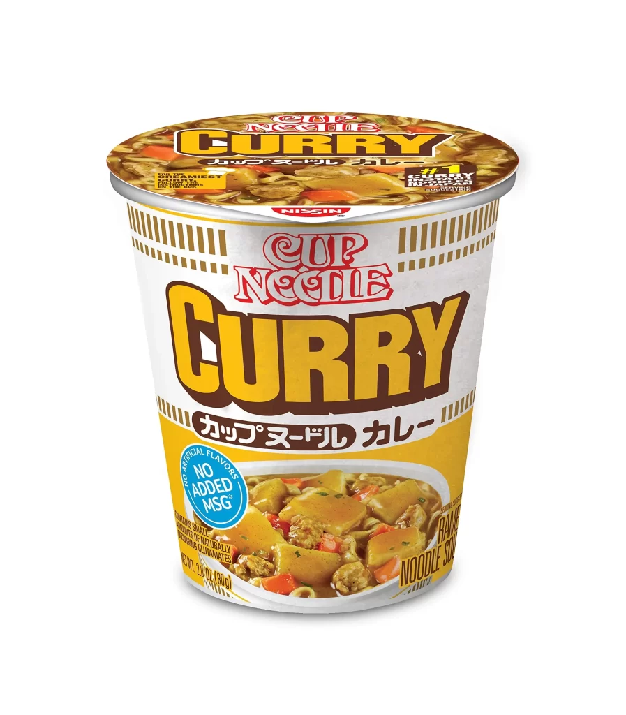
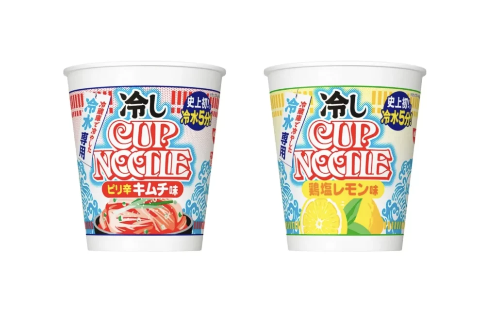
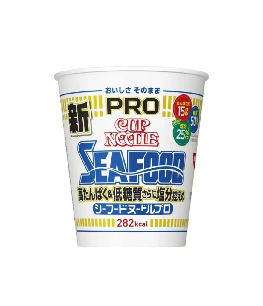
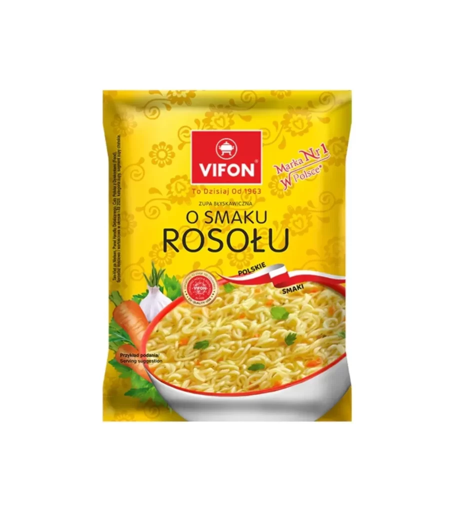
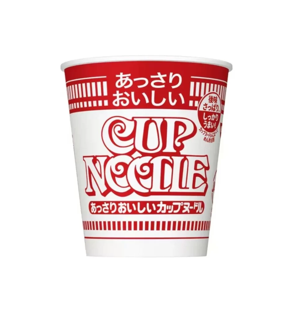
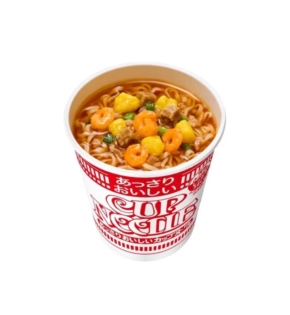
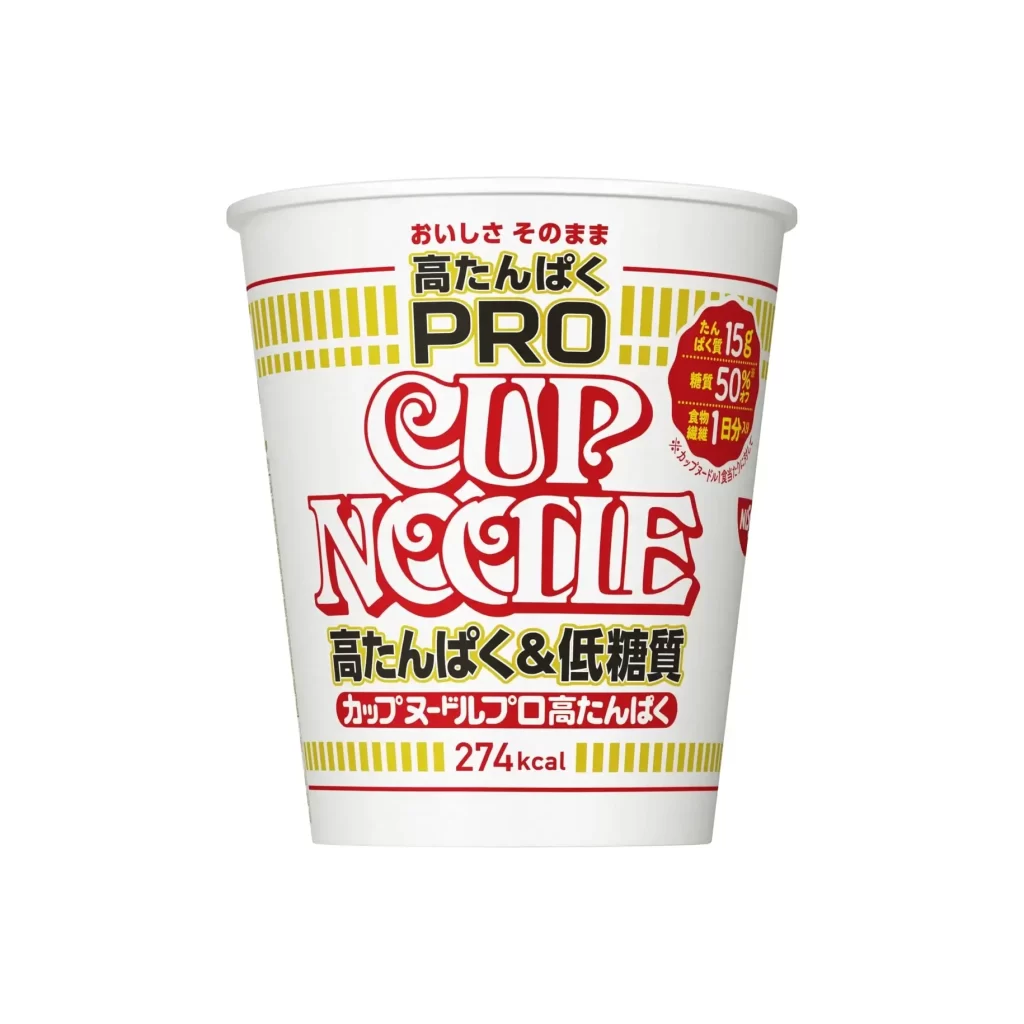
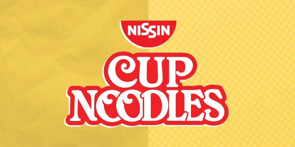
Bold red and white typography dominates the frame, with the Nissin brand name nested inside a semicircular red bowl shape positioned above the larger, rounded 'CUP NOODLES' lettering. The background splits vertically between a crumpled paper texture on the left and a uniform yellow halftone dot pattern on the right, creating a playful contrast in material and surface. Soft, even illumination eliminates harsh shadows, presenting the graphic elements from a direct, frontal perspective that emphasizes the clean lines and saturated color palette.
Visual distinction emerges from the deliberate juxtaposition of organic and mechanical textures within the background, creating a dynamic tension that contrasts with the solid, authoritative weight of the central logotype. The specific curvature of the ‘C’ in ‘CUP’ and the exaggerated serifs on the ‘N’ in ‘NOODLES’ demonstrate mid-century modern advertising aesthetics that prioritize legibility and immediate brand recognition. Such intentional layering of patterns behind flat vector-style elements offers a masterclass in balancing visual noise with focal-point stability.
Brand historians analyzing the evolution of instant-food packaging will find this iteration particularly useful for documenting typographic shifts in Japanese export marketing during the late twentieth century. Graphic educators might employ this as a case study for teaching students about color theory applications, specifically how complementary reds and yellows generate visual appetite and energy. Additionally, packaging designers developing retro-inspired product lines could reference the specific weight ratios between the bowl icon and the product name to maintain authentic period accuracy.