Cup Noodle Instant Noodle Design
Topics
Details
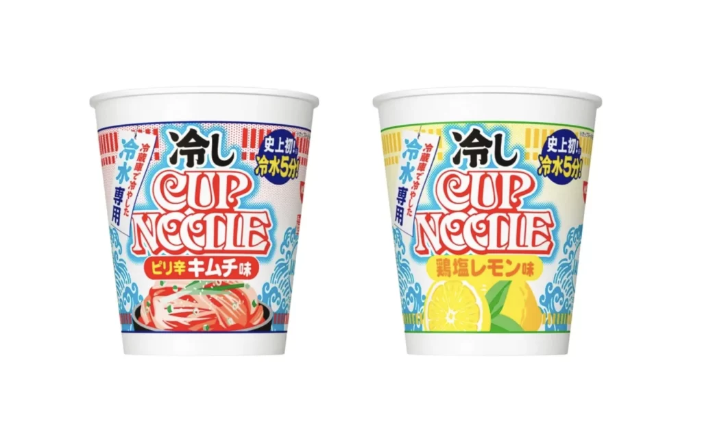
Two white styrofoam cups stand side-by-side against a seamless white background, captured from a direct frontal perspective with even, shadowless studio lighting. The left container features a dominant red and blue color palette with vertical Japanese text reading '冷し' (Hiyashi) in bold black characters above the stylized red 'CUP NOODLE' logotype, while the right cup mirrors this layout but substitutes yellow and green accents. Both designs incorporate circular blue badges proclaiming '史上初!冷水5分' (World's First! 5 Minutes with Cold Water) and vertical banners stating '冷水専用' (For Cold Water Only), with photographic food illustrations anchoring the lower portions—sliced pork for the left variety and lemon slices for the right.
Visual distinction emerges through the strategic deployment of temperature-signaling chromatics, where cool blues and whites establish the chilled preparation method while warm reds and yellows differentiate the specific flavor profiles of spicy kimchi versus salted lemon. The typographic hierarchy balances massive English branding against intricate Japanese instructional text, creating a dense yet legible information architecture that communicates both novelty and convenience. Wave-like graphic patterns in contrasting hues frame each composition, subtly reinforcing the cold-water theme without overwhelming the primary product identity.
Packaging designers analyzing seasonal product variations would examine these containers to understand how established brand equity adapts to niche preparation methods while maintaining visual recognition. Marketing teams developing summer promotional materials could reference the color-coded flavor differentiation system to inform their own limited-edition packaging strategies. Food photographers might study the lighting setup and compositional symmetry to replicate similar product showcase aesthetics for e-commerce catalogues or advertising campaigns.