Nissin Instant Noodle View
DownloadTopics
Details
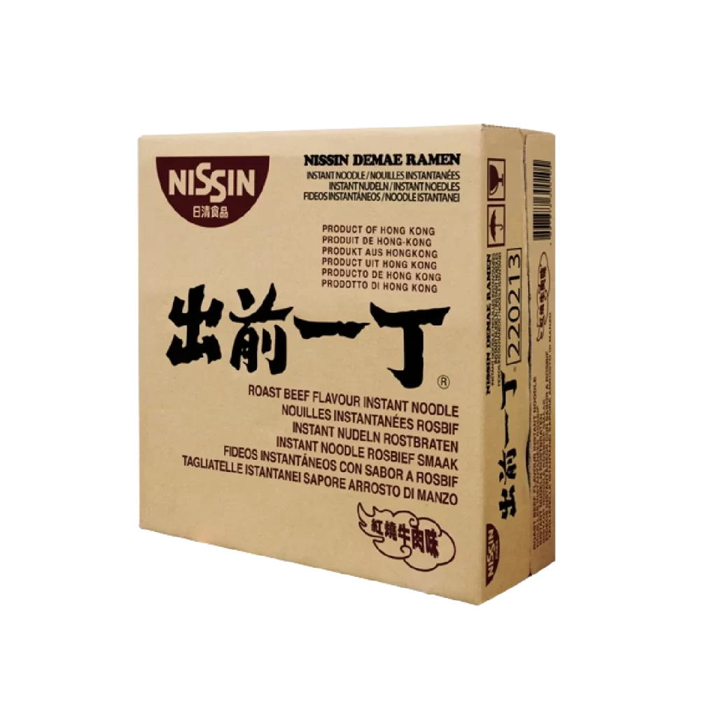
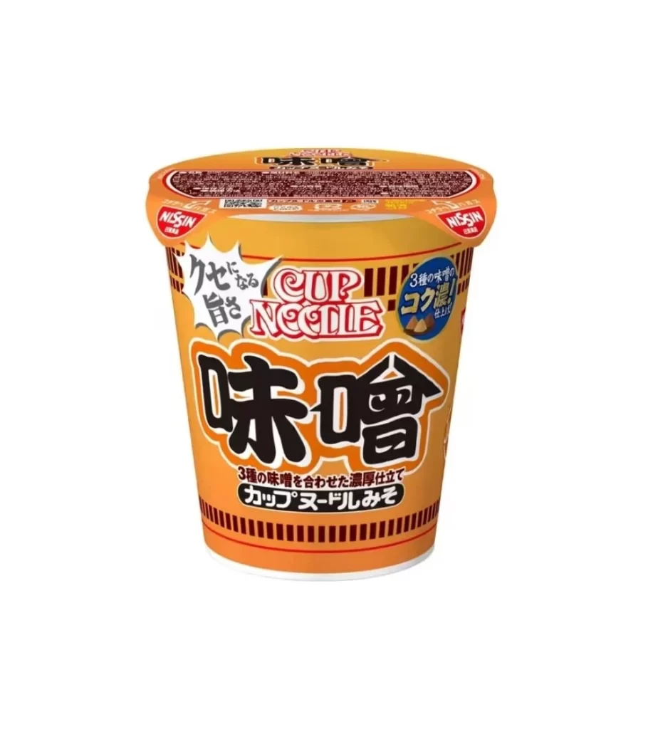
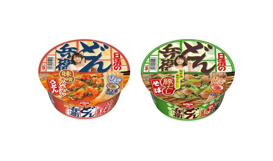
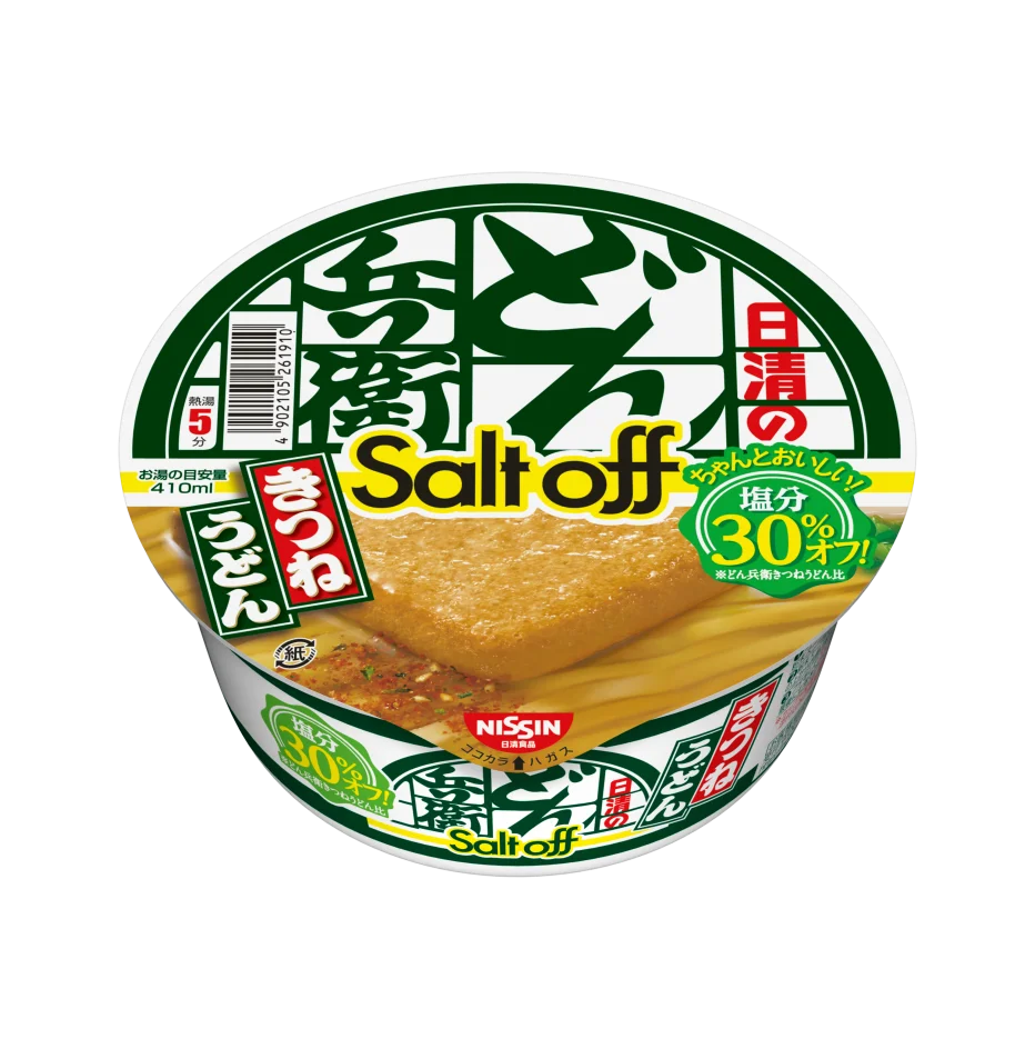
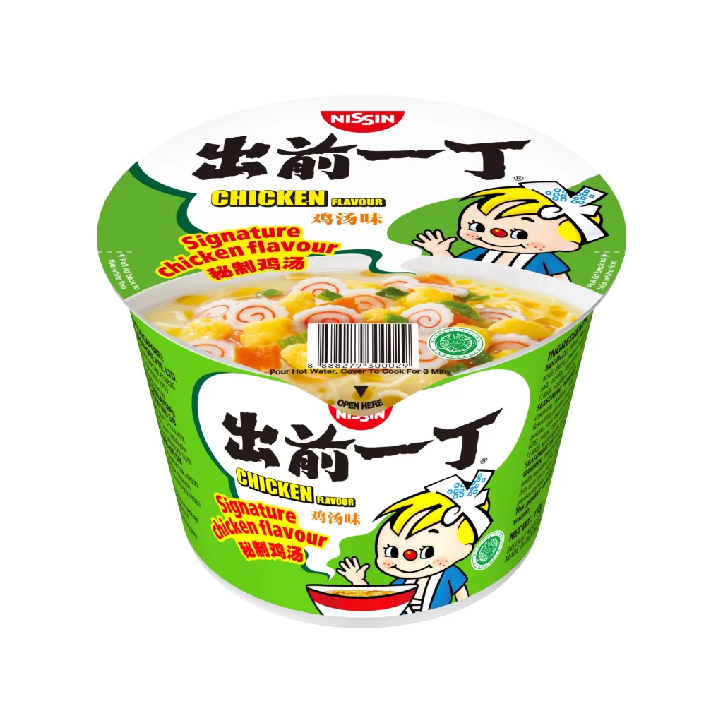
Centered within a seamless white void, the cylindrical cup presents a dual-plane composition that reveals both the lid and the body simultaneously. A dominant emerald green wraps around the lower container, contrasting sharply with the stark white of the upper lid, while bold black calligraphy for '出前一丁' anchors the visual hierarchy. The surface texture suggests a matte plastic finish, illuminated by diffuse studio lighting that eliminates harsh shadows and emphasizes the printed graphics, including the red Nissin logo and the cheerful blonde mascot waving from the right side.
Visual interest derives from the specific typographic layering where English descriptors like 'Signature chicken flavour' intersect with traditional Chinese characters and Japanese kanji. The inclusion of a transparent window on the lid offers a rare glimpse into the actual product contents—swirled fish cakes and corn kernels suspended in broth—which breaks the typical solid-color packaging convention. Designers can access the full-resolution file to study how the barcode is seamlessly integrated into the photographic food display without disrupting the overall aesthetic flow.
Packaging engineers and brand identity specialists would utilize this asset to analyze color balance in international product localization, specifically noting how the green palette signals poultry flavor across different Asian markets. 3D modelers requiring accurate cylindrical mapping coordinates for consumer goods simulations will find the orthogonal perspective particularly valuable for texture projection. Food stylists might also reference the specific arrangement of toppings to understand standard presentation guidelines for instant noodle photography.