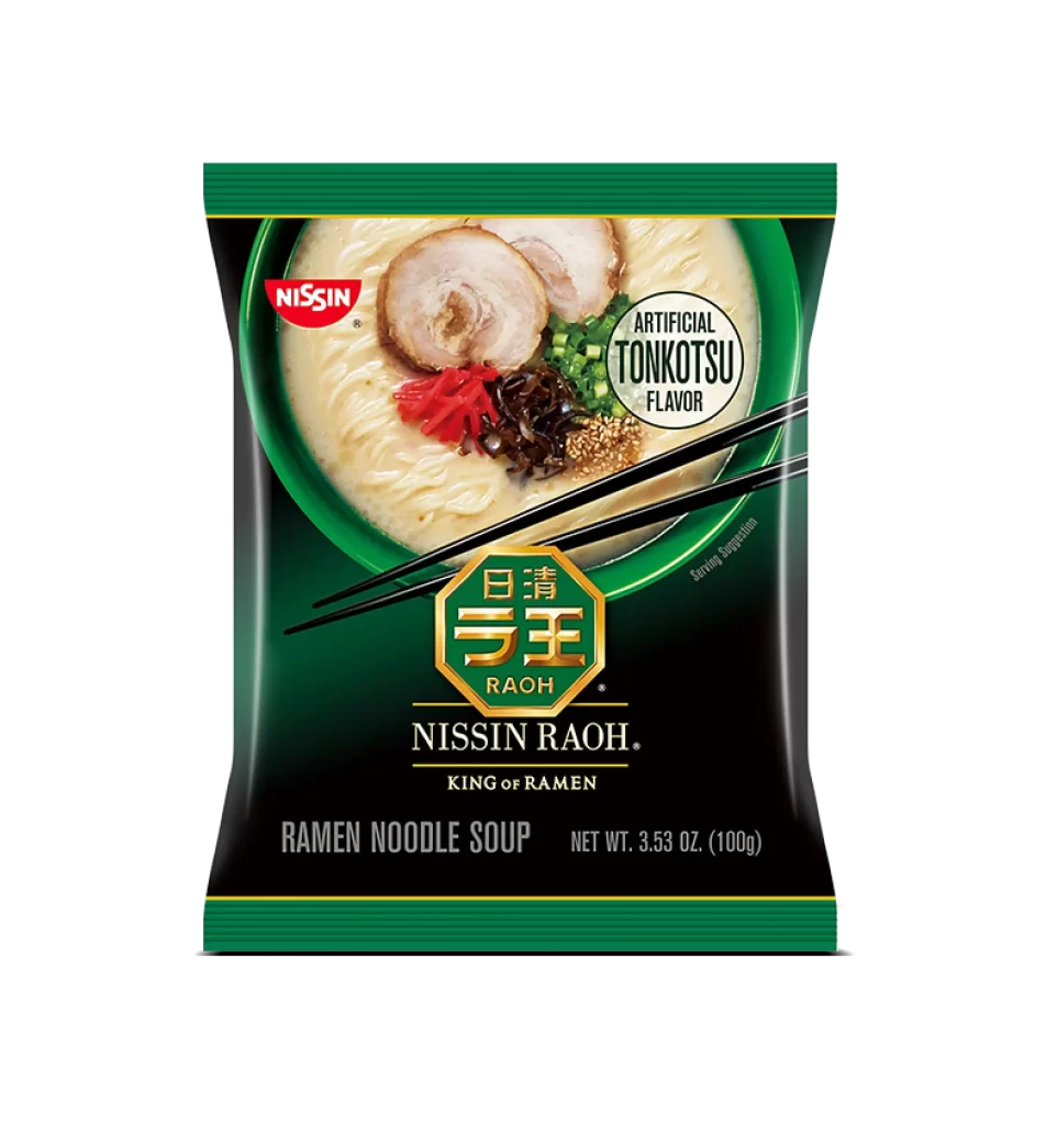
Nissin RAMEN NOODLE SOUP Pouch Design
Topics
Details
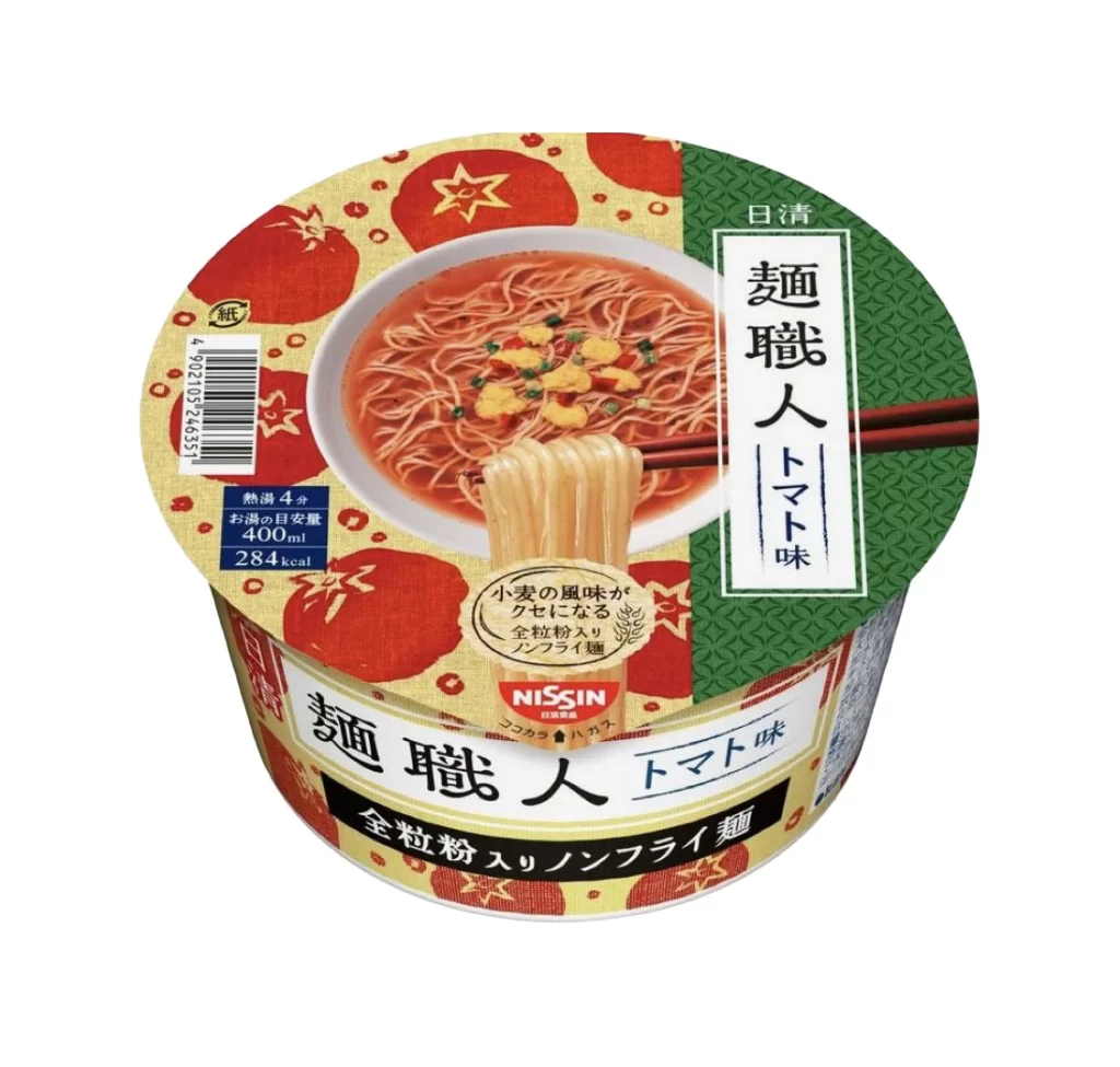
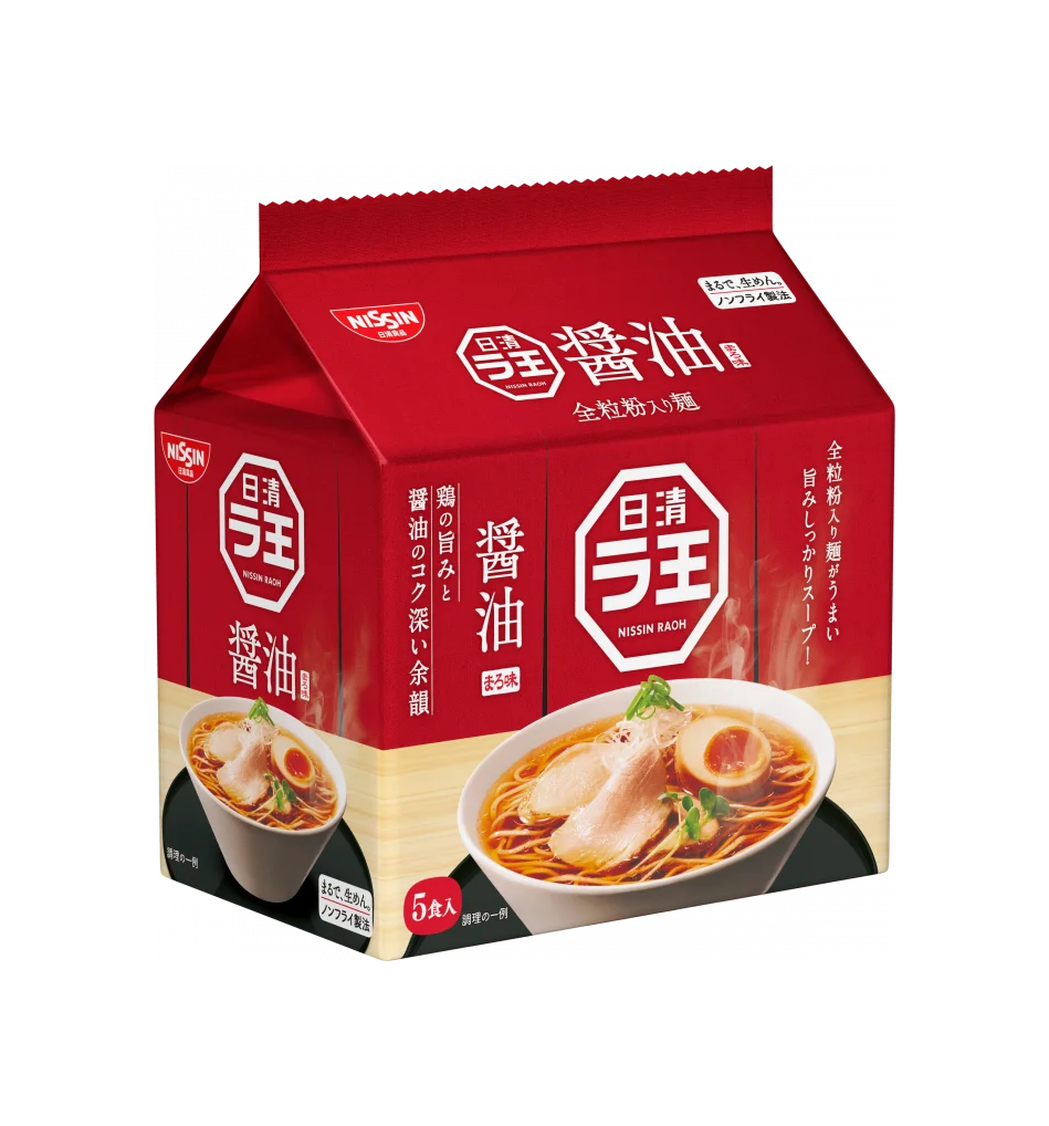
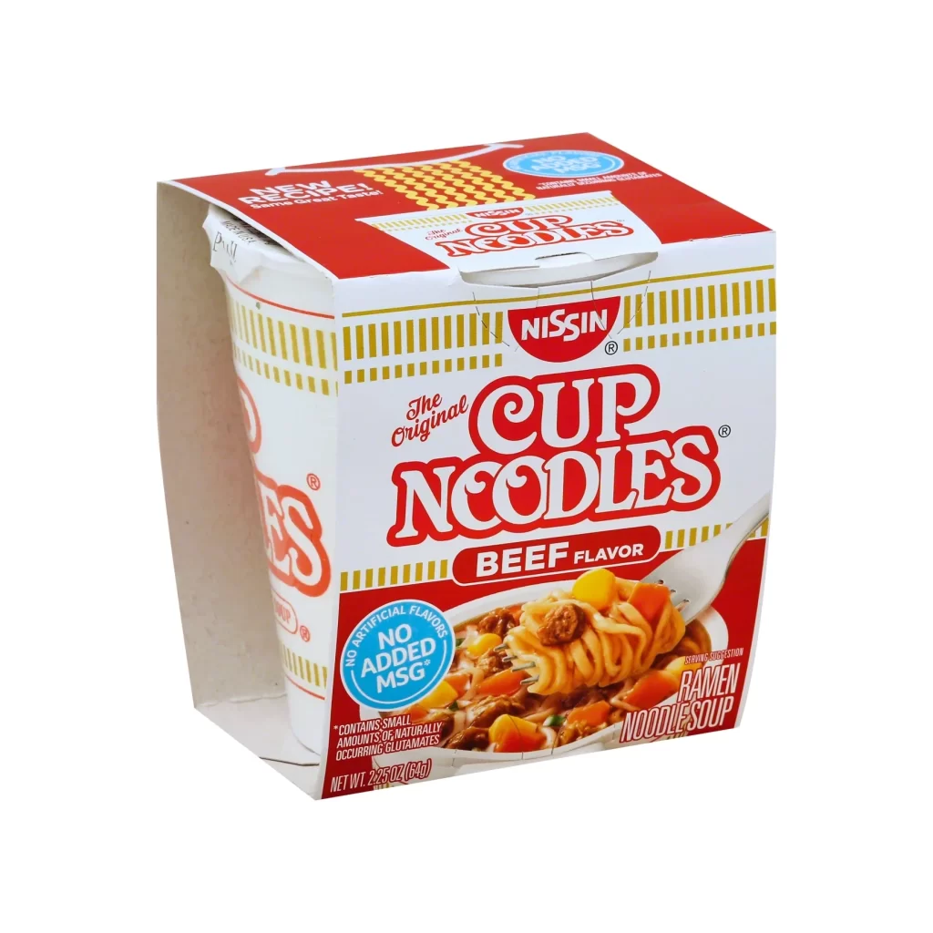
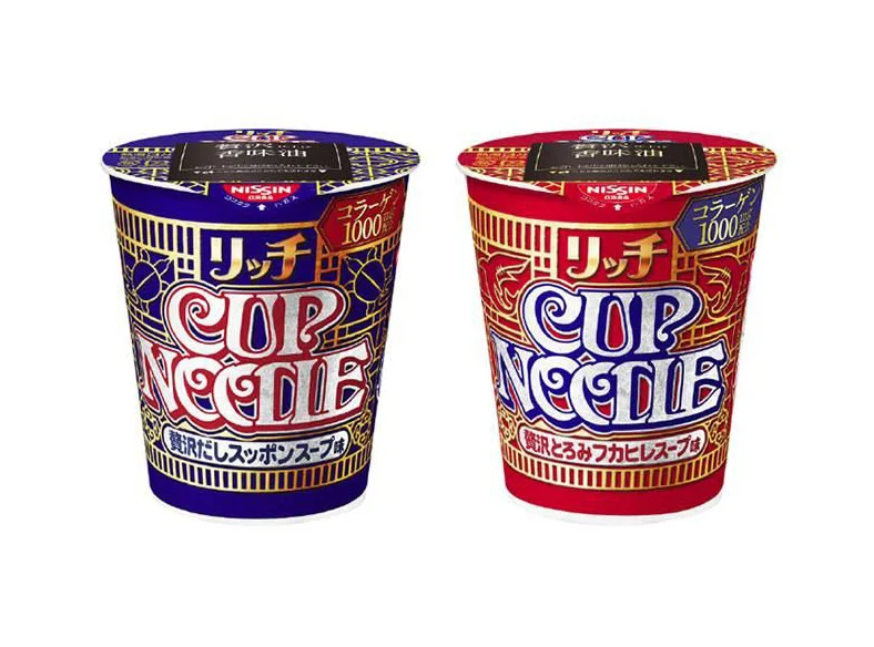
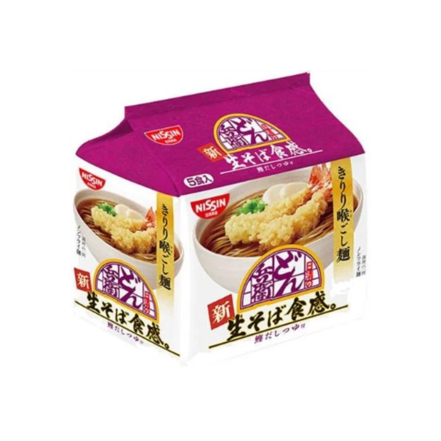
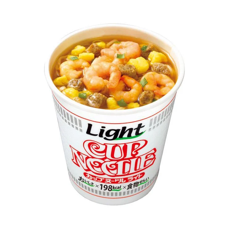
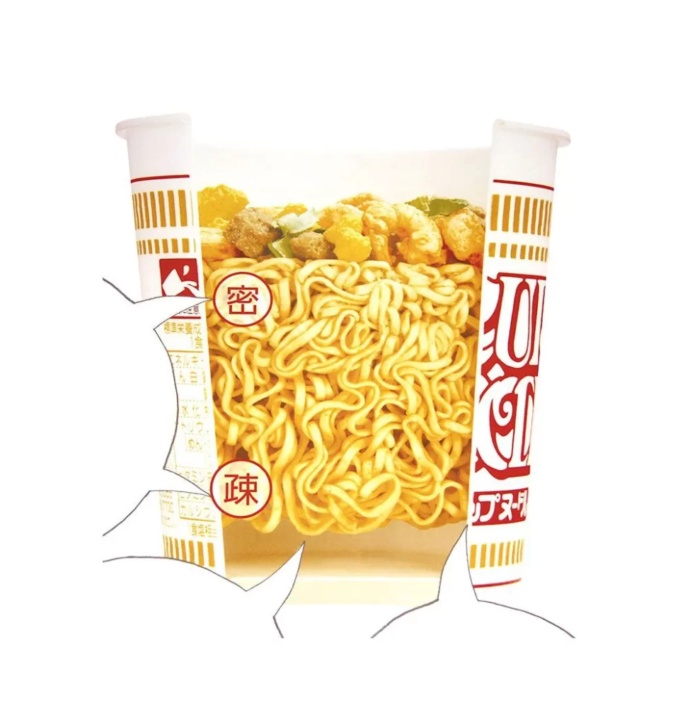
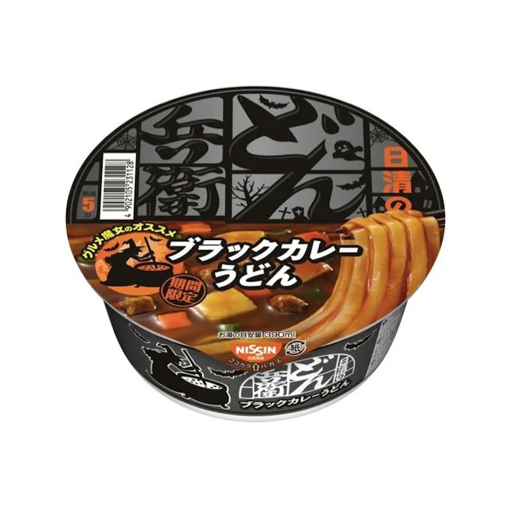
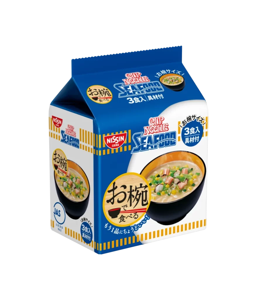
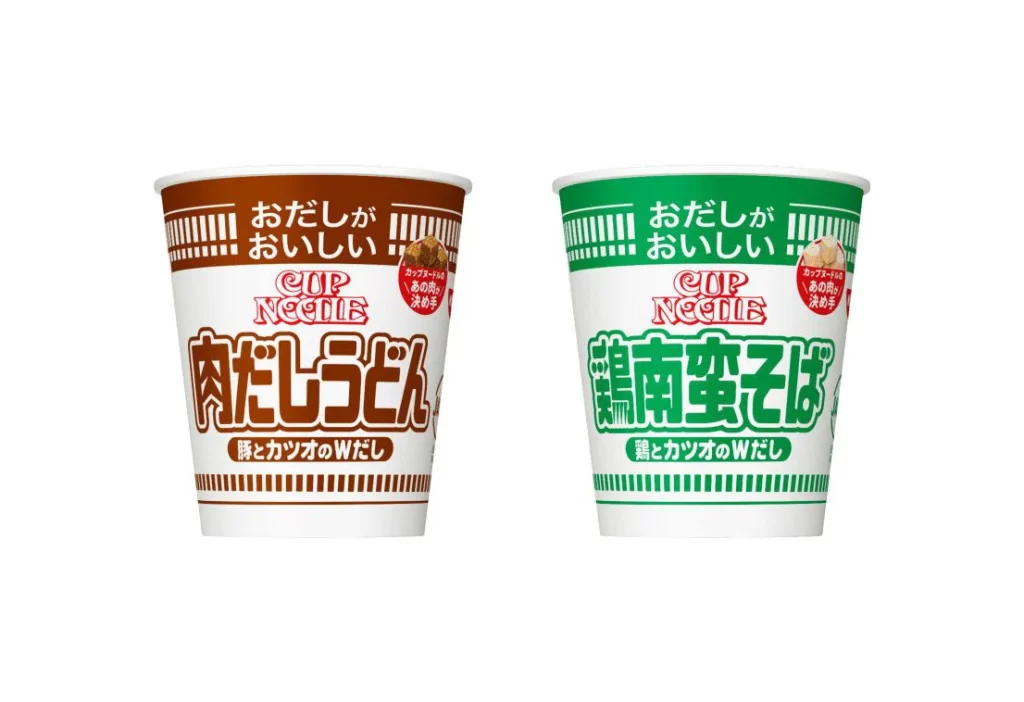
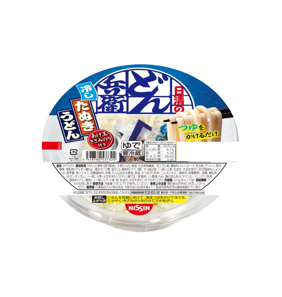
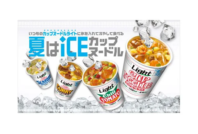
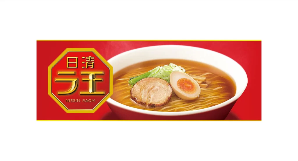
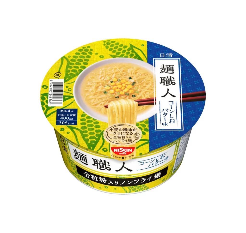
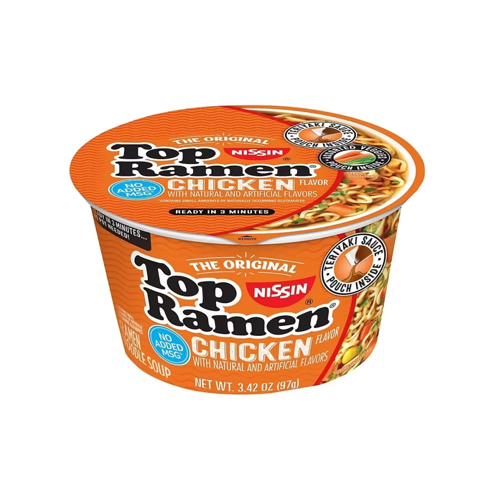
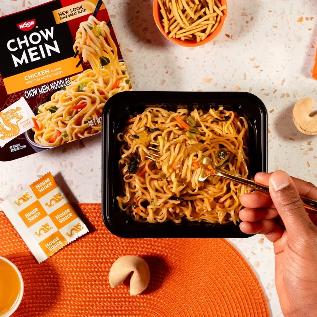
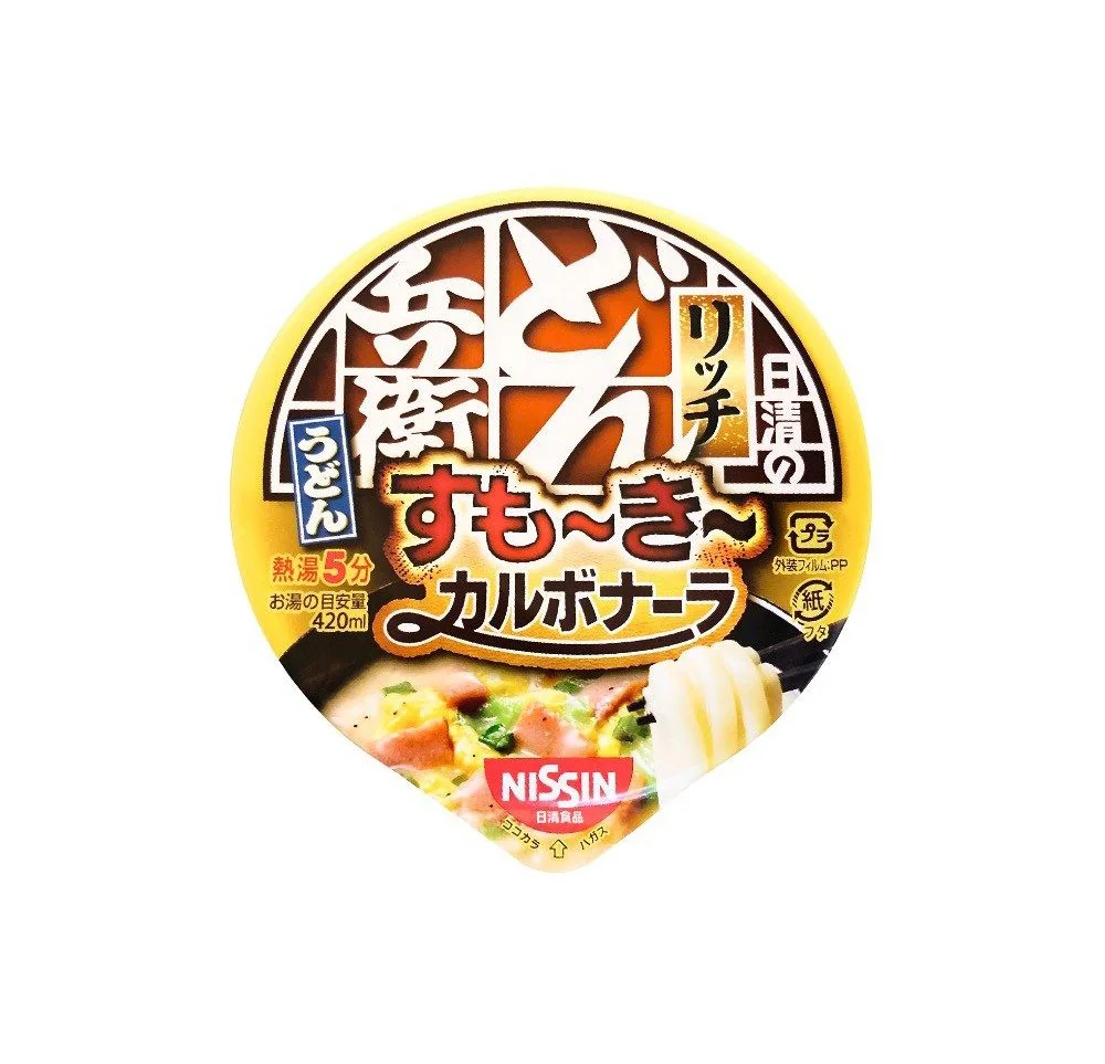
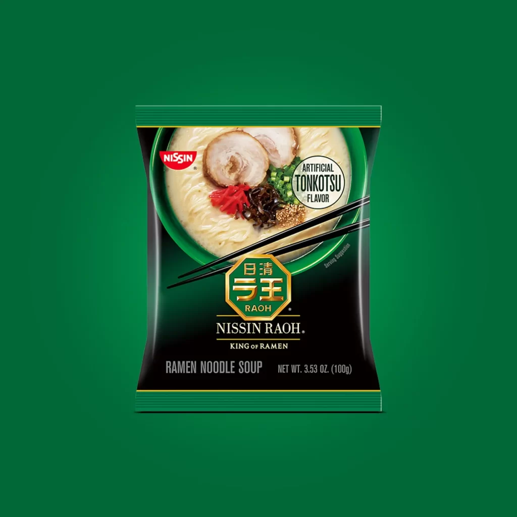
Centered within a pristine white void, the Nissin Raoh package presents a striking vertical composition dominated by deep forest green and matte black. A vivid photographic window occupies the upper half, showcasing a ceramic bowl filled with creamy broth, thick noodles, and meticulously arranged toppings like chashu pork and red pickles. Bold typography anchors the lower section, featuring a golden octagonal emblem with Japanese characters above the 'NISSIN RAOH' brand name in clean white serif lettering.
Visual hierarchy plays a crucial role here, as the contrast between the organic food photography and the rigid geometric logo creates immediate focal tension. The color palette deliberately evokes premium quality through its restrained use of metallic gold accents against dark backgrounds, distinguishing it from typical convenience store aesthetics. Subtle details like the diagonal chopstick placement and the circular 'Artificial Tonkotsu Flavor' badge add layers of authenticity and product-specific information without cluttering the overall layout.
Packaging designers studying Asian market trends would find this case study particularly valuable for understanding how traditional culinary imagery translates to modern retail formats. Brand strategists might analyze the balance between heritage elements—such as the kanji script—and contemporary English labeling to gauge global market appeal. Food photographers could also examine the lighting techniques used to make the broth appear rich and appetizing while maintaining legibility of all printed text elements.