Pasta Nissin Green Red White
DownloadTopics
Details
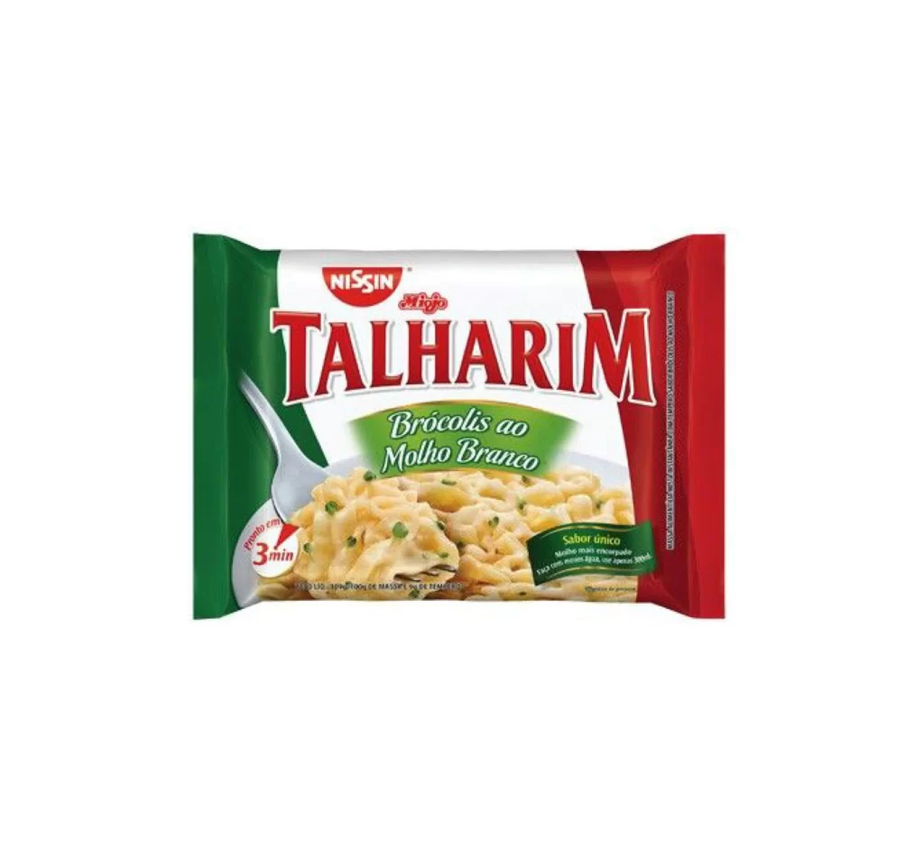
A rectangular Nissin Talharim package dominates the frame with its bold tricolor scheme of forest green, bright white, and deep crimson red. The brand name appears in a red oval at the top, while 'TALHARIM' stretches across the center in large, serifed crimson lettering with a subtle drop shadow. Below this, an olive-green banner contains the flavor text 'Brócolis ao Molho Branco' in elegant cursive, positioned above a photographic inset of creamy pasta flecked with green broccoli bits and a silver spoon resting on the left edge.
The composition leverages strong vertical color blocking to create immediate visual impact, dividing the package into distinct thirds that guide the eye from the corporate logo down to the product photography. Typography plays a crucial role here, contrasting the authoritative weight of the main product name against the softer, organic curves of the flavor descriptor. Designers studying this layout will appreciate how the metallic spoon introduces a reflective element that breaks up the matte printed surfaces. Anyone needing the complete high-resolution asset can access it without cost from our repository.
Packaging analysts and food-industry marketers would find this reference particularly useful when researching Brazilian instant-noodle market aesthetics or color-coding strategies for vegetable-flavored variants. The specific combination of serif and script fonts offers a case study in balancing traditional branding with approachable culinary appeal. Students of commercial photography might also examine the lighting techniques used to make the sauce-coated pasta appear appetizing without creating harsh glare on the plastic wrapper surface.