Nissin Chow Mein Noodle Box
Topics
Details
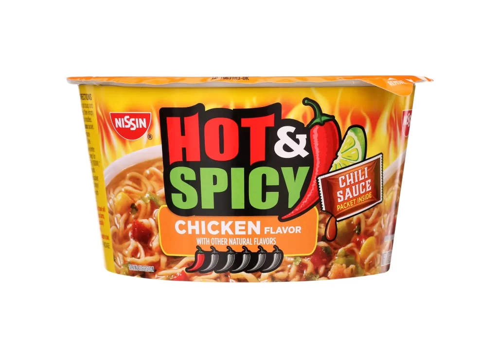
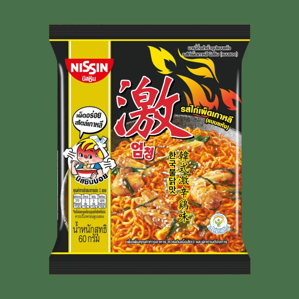
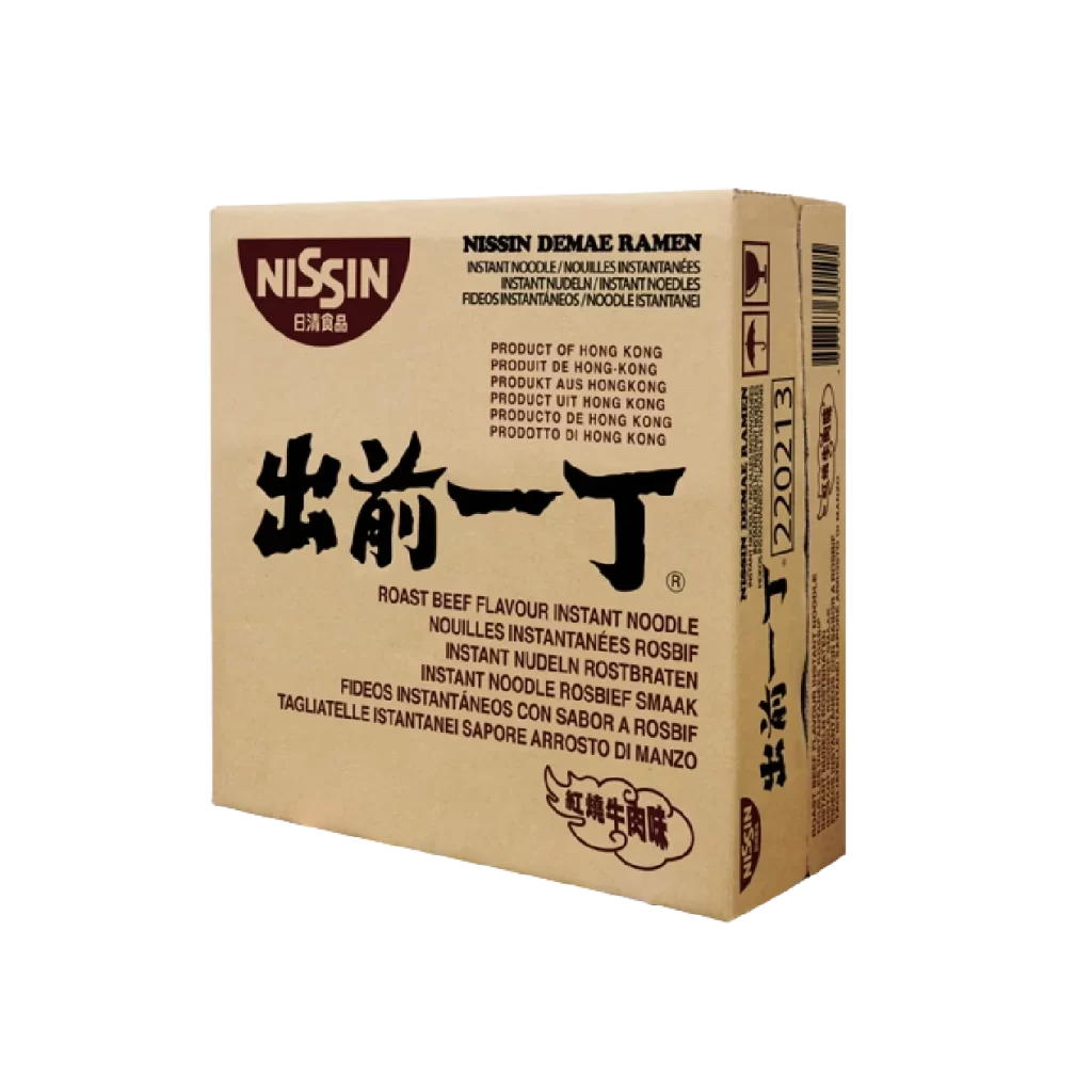
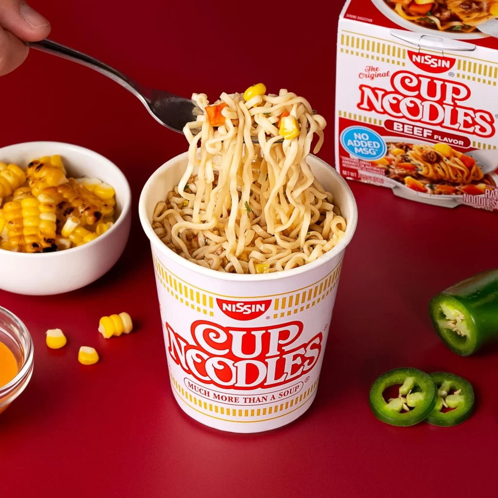
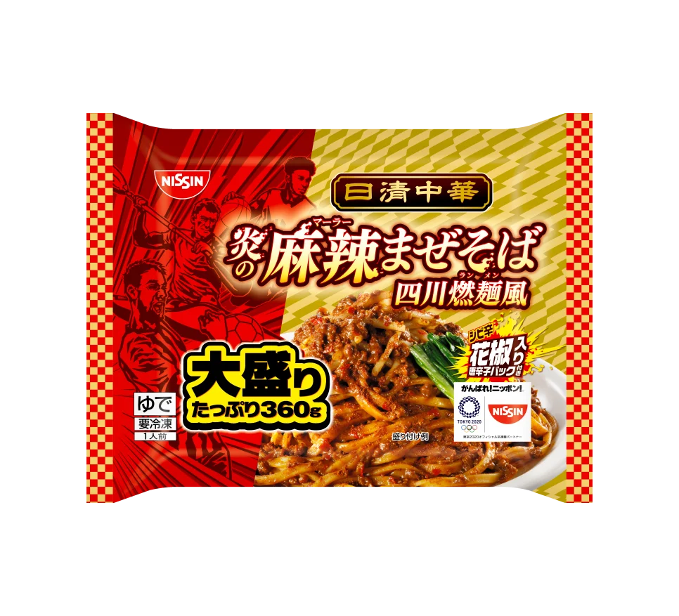
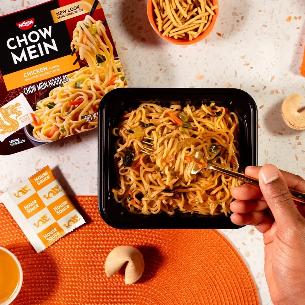
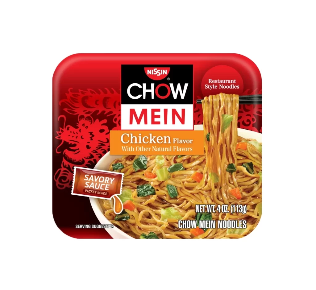
A vibrant red rectangular package with rounded corners dominates the frame, featuring a bold black and white Nissin logo at its center. The product name 'CHOW MEIN' appears in large block letters, with 'Chicken Flavor' highlighted in an orange banner beneath it. To the right, a photographic image of glistening noodles held by chopsticks reveals mixed vegetables, while a stylized red dragon motif decorates the left side against a dark background.
Visual hierarchy is established through the strategic use of contrasting colors, where the deep red field makes the white and black typography pop immediately. The inclusion of an appetizing food photograph alongside traditional iconography like the dragon creates a bridge between modern convenience and cultural heritage. A small brown badge indicating 'SAVORY SAUCE PACKET INSIDE' adds a functional detail that breaks up the primary color scheme effectively.
Packaging designers studying fast-moving consumer goods will find this composition useful for analyzing how appetite appeal integrates with brand identity. Marketing teams developing Asian-inspired food products can examine the balance between English text and cultural motifs. Illustrators requiring reference for commercial food photography might note the lighting techniques used to emphasize the glossy texture of the noodles and sauce.