Nissin Cup Noodle Box View
Topics
Details
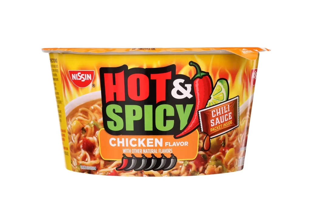
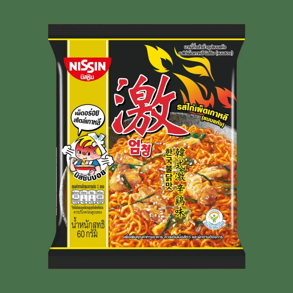
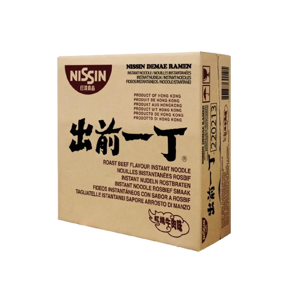
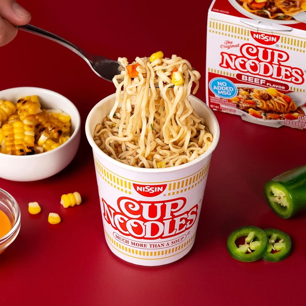
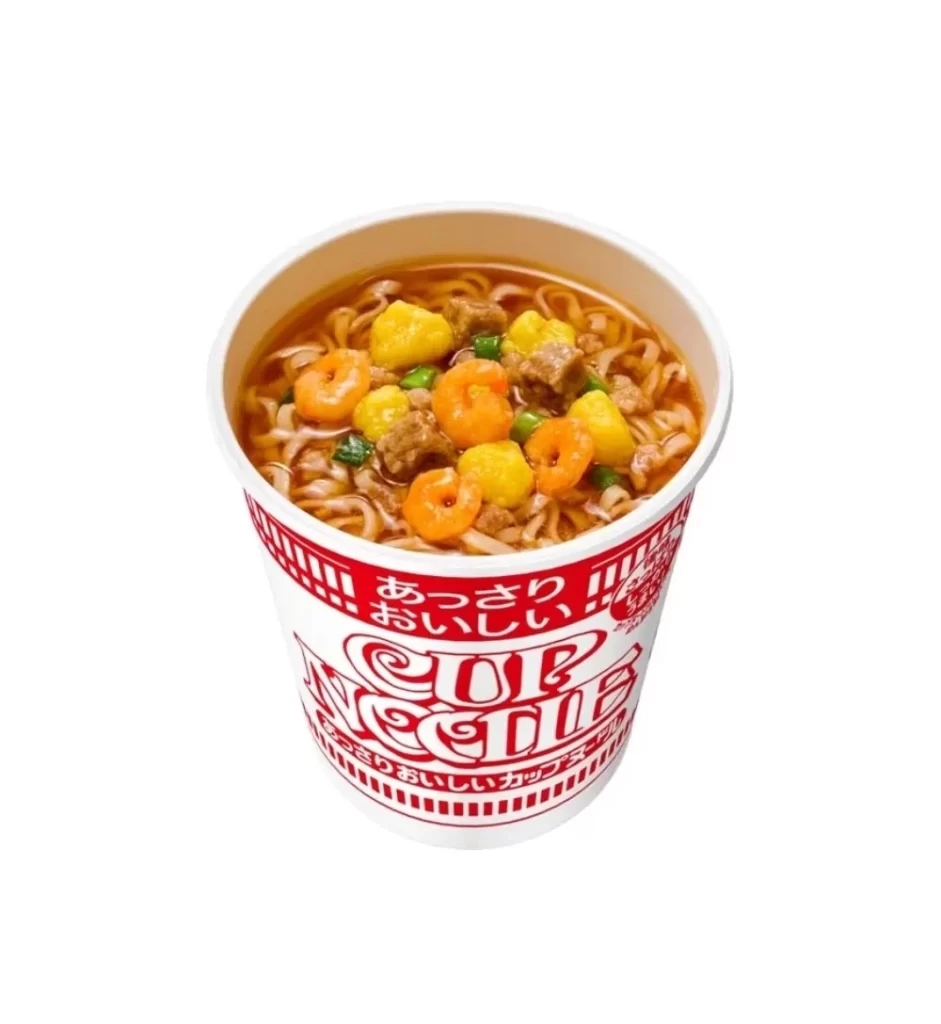
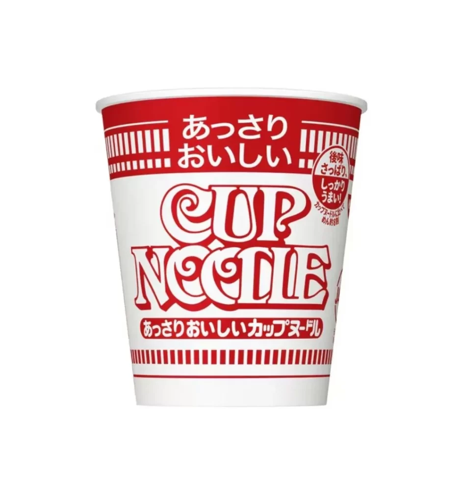
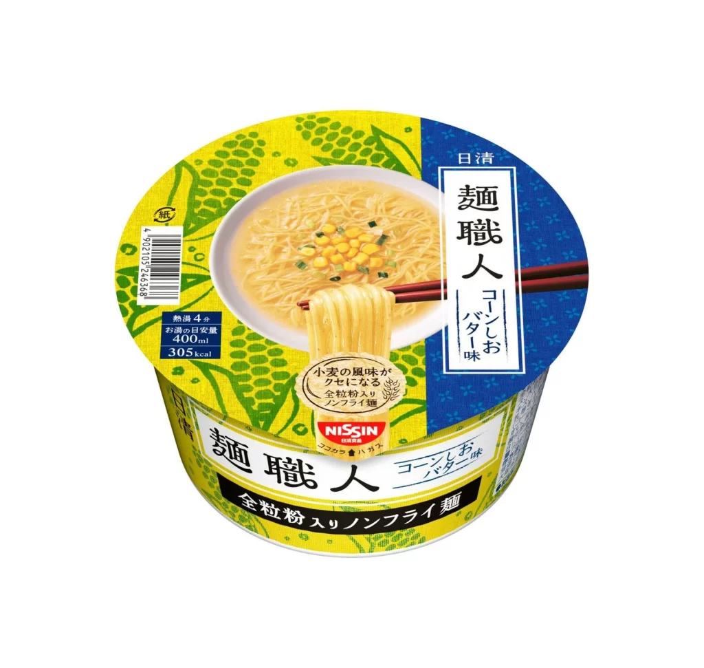
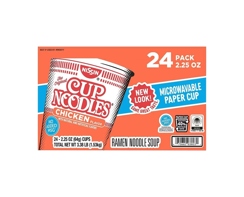
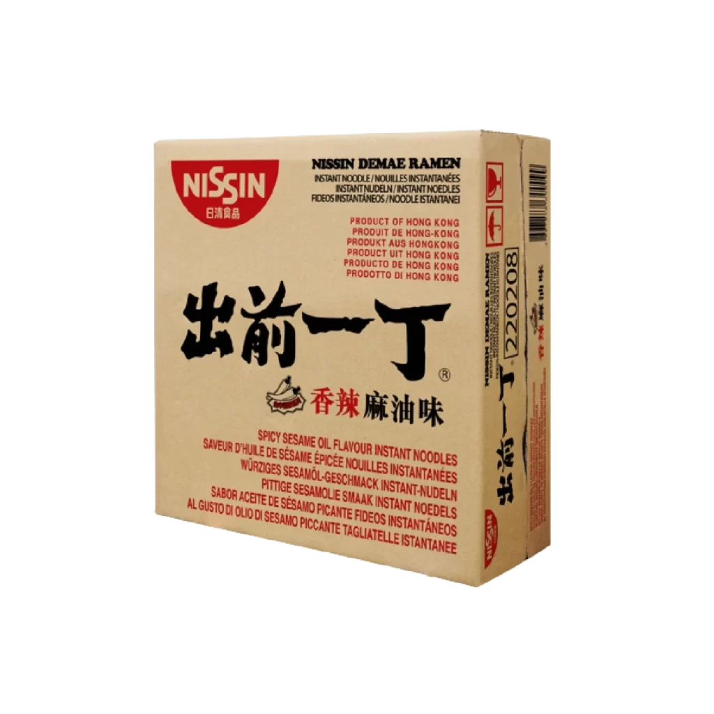
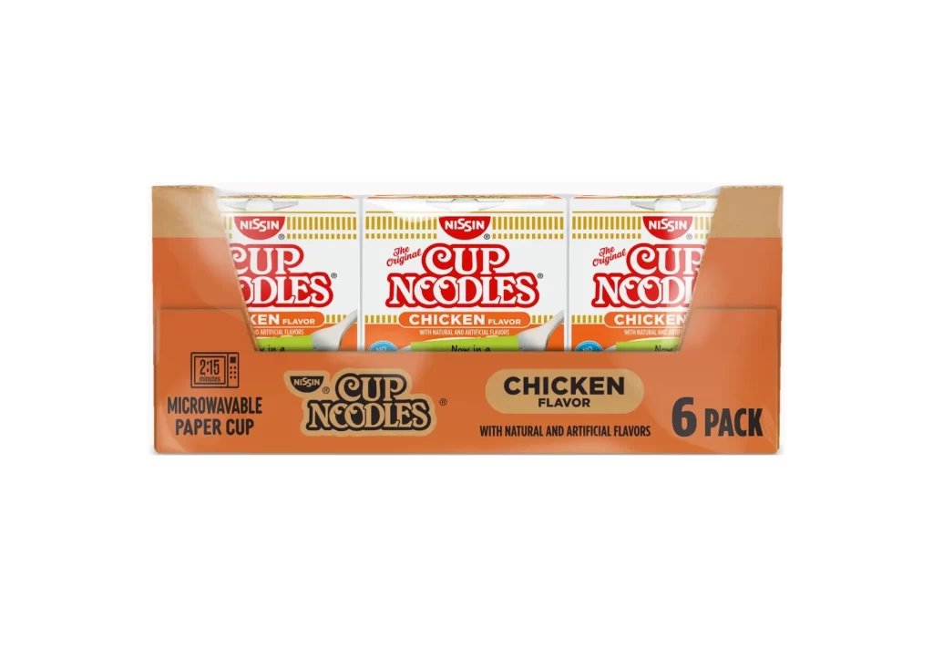
Centered within a seamless white void, a six-pack of Nissin Cup Noodles in Chicken Flavor sits at a direct, level camera angle. The outer cardboard carrier displays a vibrant orange hue with brown side panels, featuring bold black typography that identifies the contents as microwavable paper cups requiring two minutes and fifteen seconds of heating. Three individual white cups peek through the front opening, each adorned with the iconic red 'Cup Noodles' logo, yellow vertical striping, and an orange band denoting the specific chicken variety.
Visual hierarchy plays a crucial role here, as the packaging relies on high-contrast color blocking to separate brand identity from flavor information. The repetition of the red Nissin logo against the white cup background creates a rhythmic pattern that draws the eye across the multi-pack arrangement. Furthermore, the inclusion of functional icons, such as the microwave timer graphic, demonstrates how utilitarian information is integrated into the overall aesthetic without cluttering the primary marketing message.
Packaging engineers might study this composition to understand standard retail shelf presence for instant food products. Brand managers could utilize this view to audit current label layouts or plan updates to the classic orange-and-white color scheme. Additionally, 3D artists modeling consumer goods for commercial renders would find the specific proportions of the carrier versus the individual cups essential for accurate scale representation.