Nissin Cup Noodle
Topics
Details
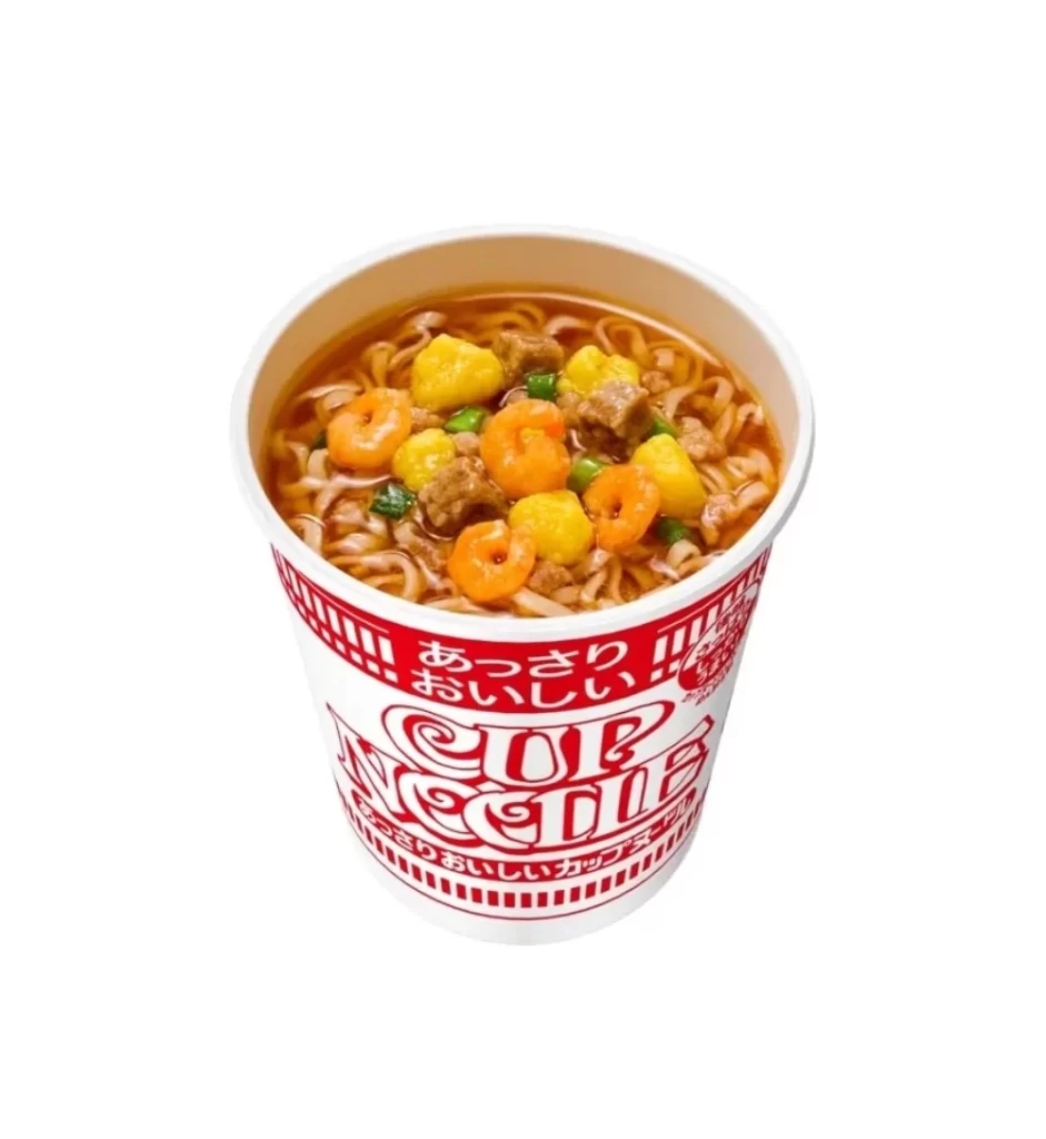
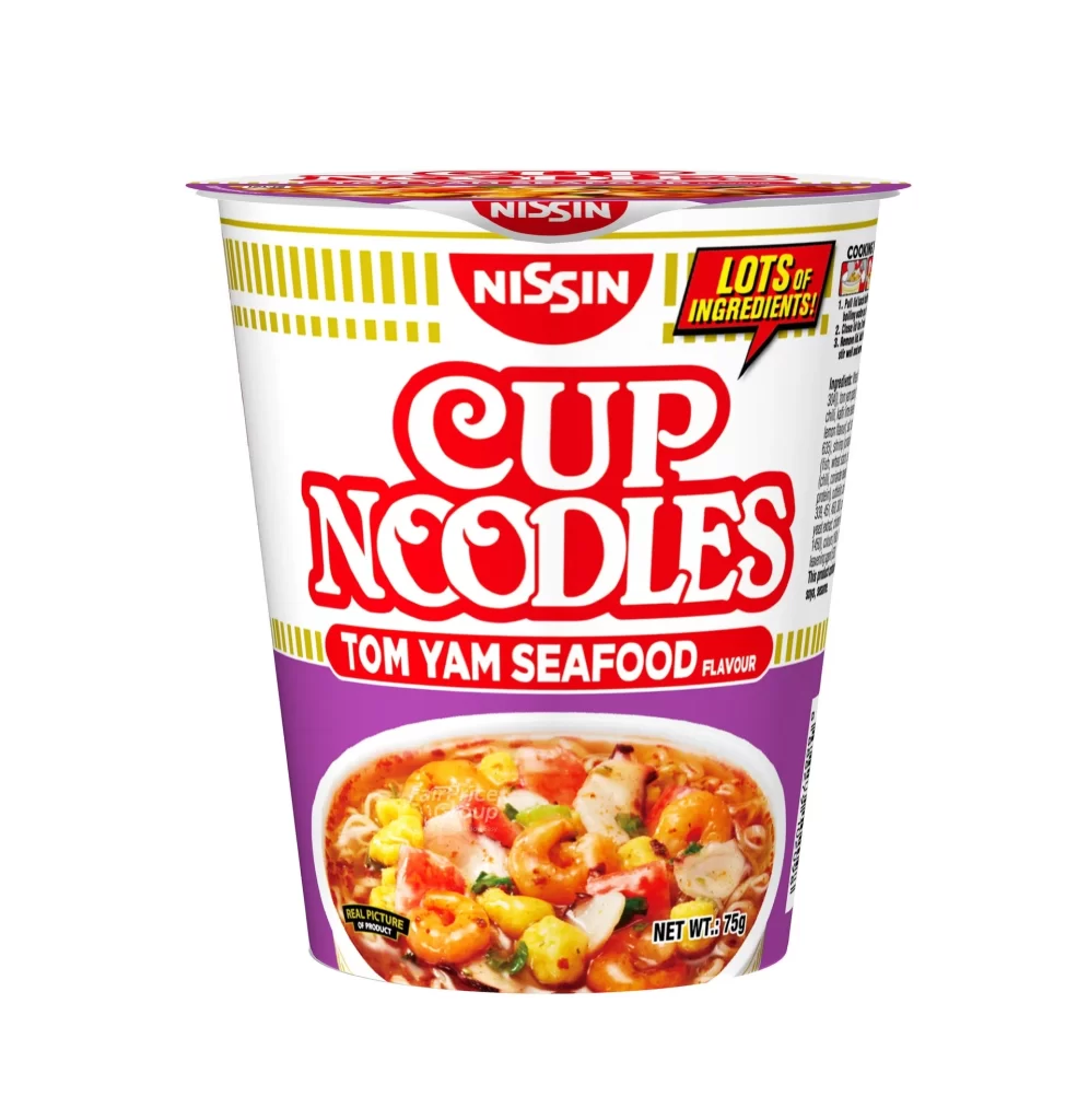
Centered within a seamless white void, the cylindrical container presents a striking color-blocked composition. A white upper band features vertical yellow pinstripes, while a deep purple lower section anchors the visual weight. Bold red typography spells out 'CUP NOODLES' in a playful, rounded serif font, positioned above 'TOM YAM SEAFOOD FLAVOUR' in smaller capital letters. The Nissin logo appears twice—once on the lid and again prominently above the product name. An appetizing photograph of shrimp, corn, and vegetables in a reddish broth occupies the lower curve, accompanied by a yellow burst graphic proclaiming 'LOTS OF INGREDIENTS!' and a net weight of 75g noted in black text.
Visual hierarchy emerges through the strategic use of contrasting hues and typographic scale. The purple base immediately distinguishes this seafood variant from other flavors in the line, creating instant shelf recognition. Yellow accents punctuate the design at both the pinstripe border and the ingredient callout, drawing the eye to key selling points. Photographic realism in the bowl image provides tactile appeal, while the retro-inspired lettering of the main brand name balances nostalgia with modern packaging conventions.
Brand historians might analyze this artifact to trace the evolution of instant-food marketing aesthetics across decades. Packaging designers could study the color psychology behind the purple-to-white gradient transition and its effect on consumer perception. Food stylists may reference the compositional arrangement of the seafood elements when planning similar product photography shoots. Cultural researchers examining global snack food distribution patterns would find the bilingual text placement particularly noteworthy for cross-market adaptation strategies.