Nissin Instant Noodle Pouch
Topics
Details
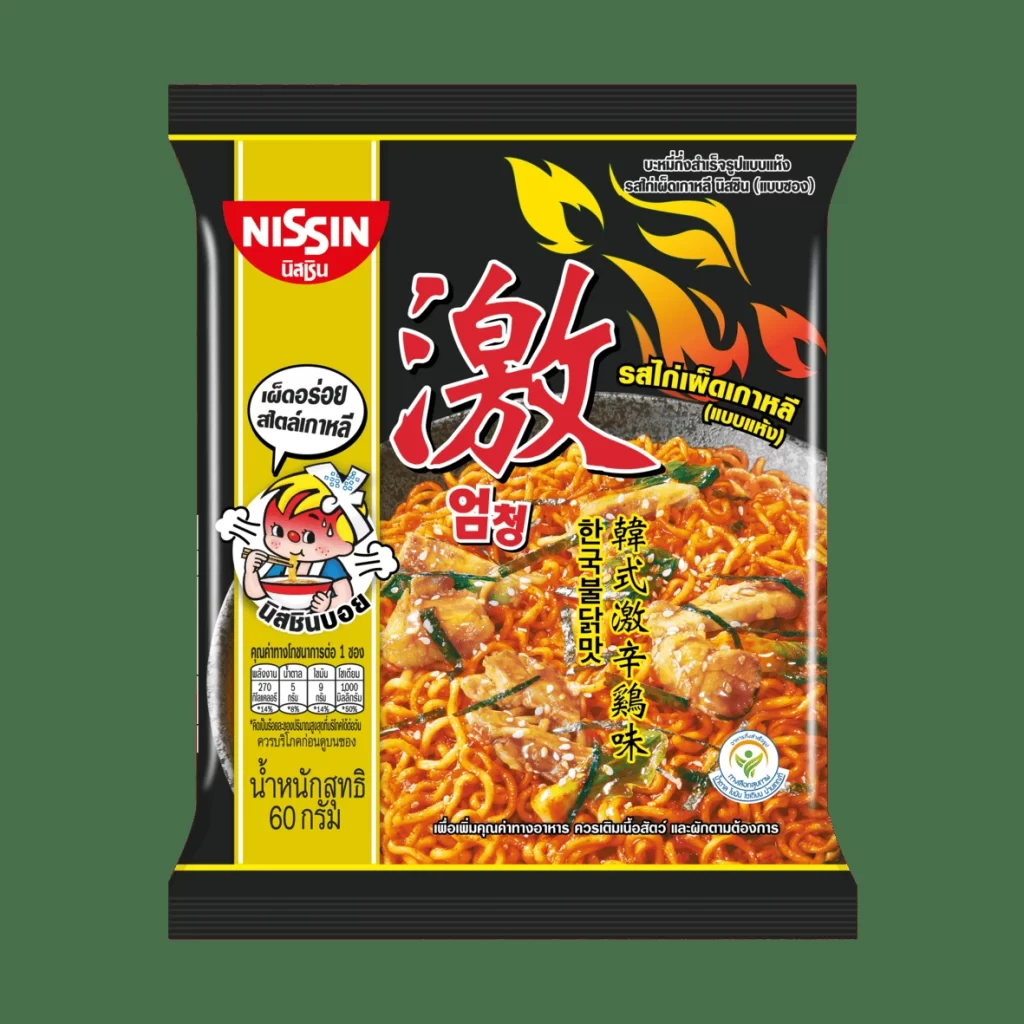
Centered within a solid dark green frame, the Nissin pouch displays a bold black background accented by a vibrant yellow vertical stripe along the left edge. The packaging features the red and white Nissin logo at the top, positioned above a cartoon character holding chopsticks, while the main visual area showcases a large, appetizing photograph of spicy noodles garnished with chicken. Dominating the upper right quadrant is a large red Chinese character for 'spicy' accompanied by yellow flame graphics, with Thai script detailing the Korean-style spicy chicken flavor scattered across the surface.
Visual interest is generated through the high-contrast color palette of black, yellow, and red, which immediately signals heat and intensity to the consumer. The inclusion of multiple languages—Thai, Chinese, and Korean—alongside the specific nutritional table and pricing information suggests this is a localized product variant designed for the Thai market. The composition balances playful branding elements like the mascot with realistic food photography, creating a cohesive look that bridges international culinary trends with local accessibility.
Packaging designers analyzing Asian snack markets would find this reference useful for studying how multinational brands adapt their visual identity for regional consumers. Marketing teams could utilize this example to understand effective color psychology in spicy food categories or to examine the layout strategies used for multilingual text placement. Additionally, illustrators studying commercial food art might reference the way the flame motifs are integrated with typography to enhance the flavor messaging without cluttering the essential product information.