Nissin Cup Noodle Can
Topics
Details
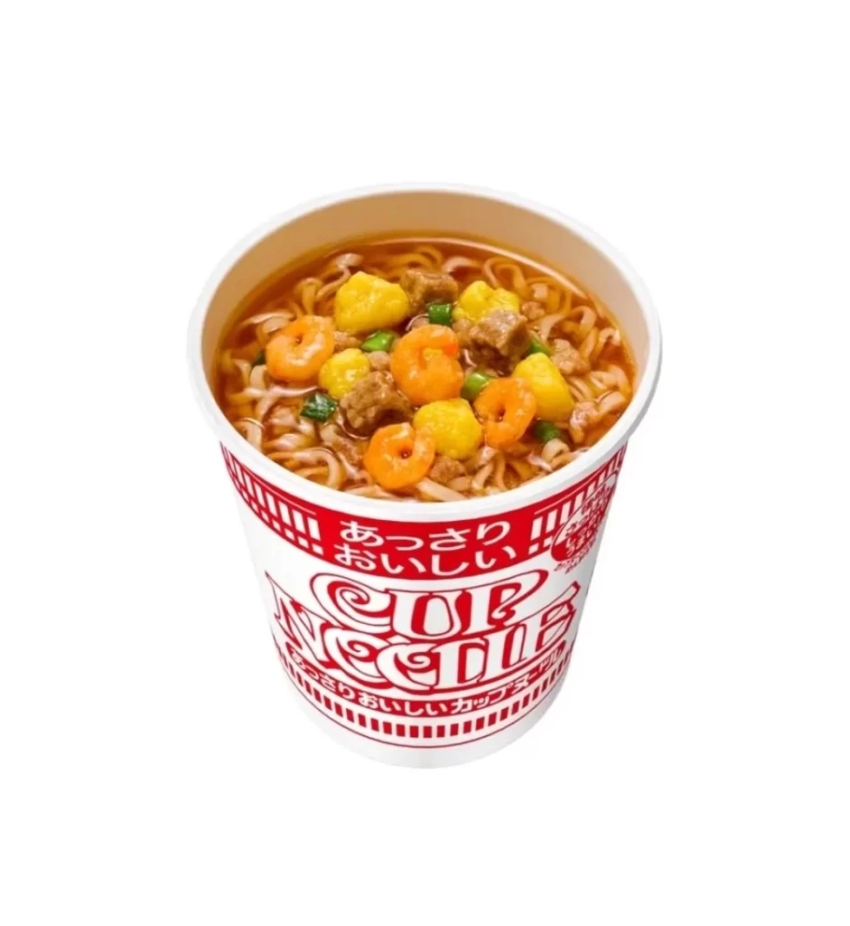
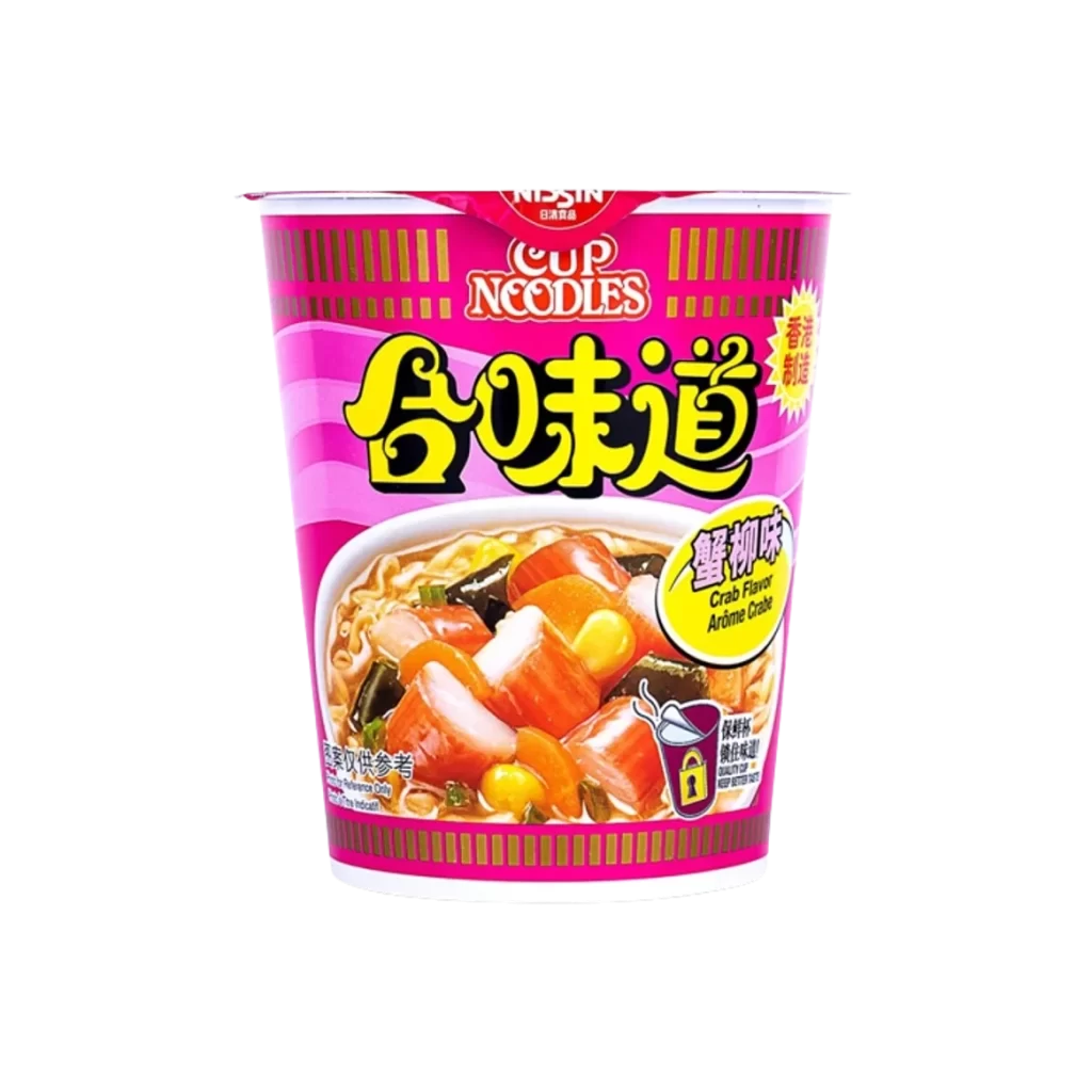
Centered within a seamless white void, the cylindrical container displays a striking magenta and fuchsia color palette accented by vertical gold pinstripes. Bold yellow characters for '合味道' dominate the upper half, positioned above a photographic inset of noodles, crab sticks, corn, and seaweed in broth. The Nissin logo appears in red at the top rim, while a yellow oval badge on the right identifies the 'Crab Flavor' variety alongside smaller English and Chinese text.
Visual hierarchy relies on high-contrast typography where saturated yellows pop against deep pink backgrounds, creating immediate legibility from a distance. The food photography employs warm lighting to emphasize texture and appetite appeal, while geometric striping adds structural rhythm to the curved surface. Regional specificity is established through bilingual labeling and the Hong Kong manufacturing seal, distinguishing this as a localized market variant rather than a generic international release.
Packaging analysts might examine color psychology applications in Asian convenience goods, noting how magenta signals seafood varieties across regional product lines. Industrial designers could study typographic scaling on cylindrical substrates, observing how bold characters maintain readability when wrapped around three-dimensional forms. Culinary historians may reference this artifact when documenting cross-cultural flavor adaptations in global instant-food manufacturing during the late twentieth century.