Cup Noodle Seafood Noodle
Topics
Details
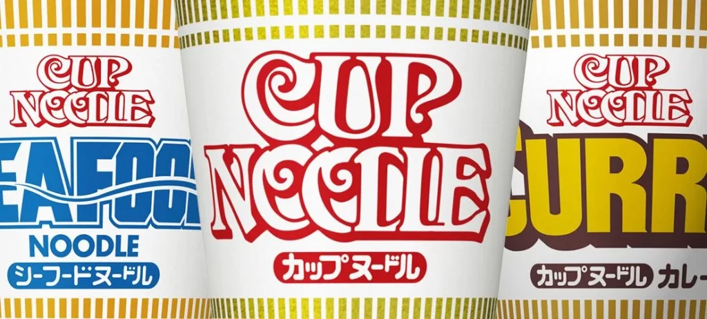
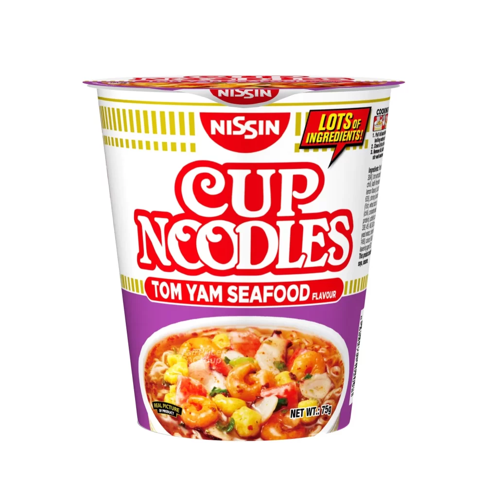
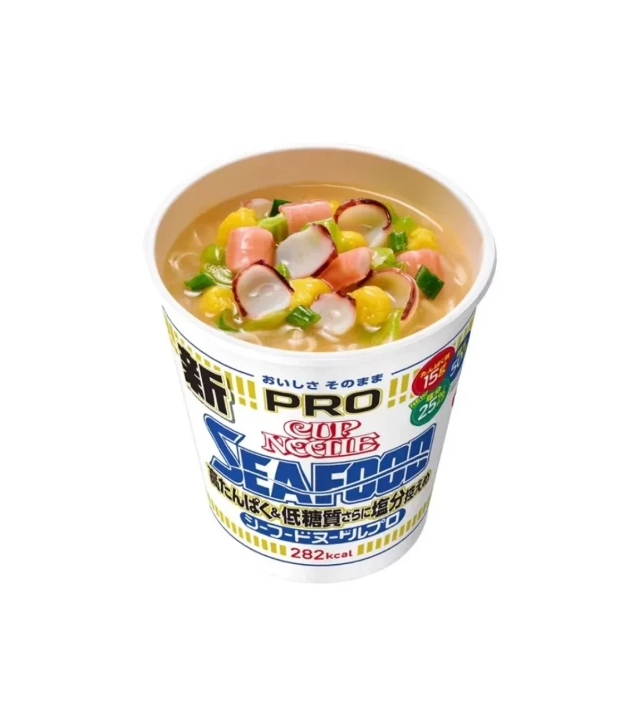
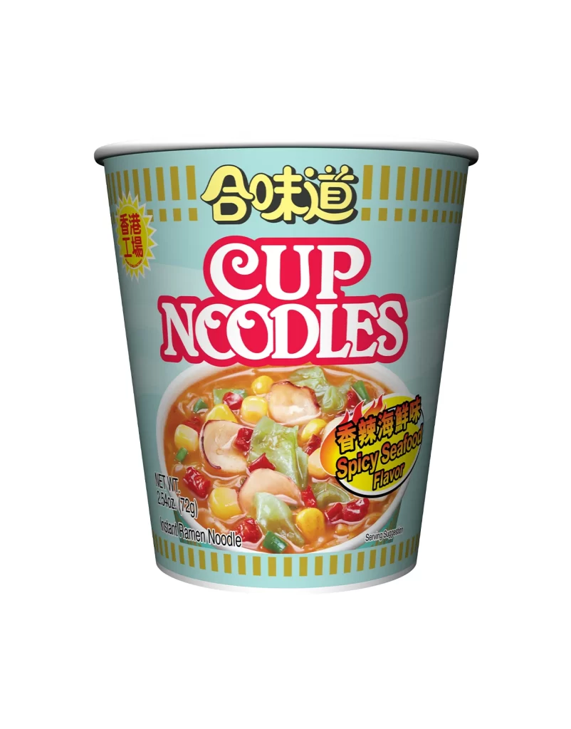
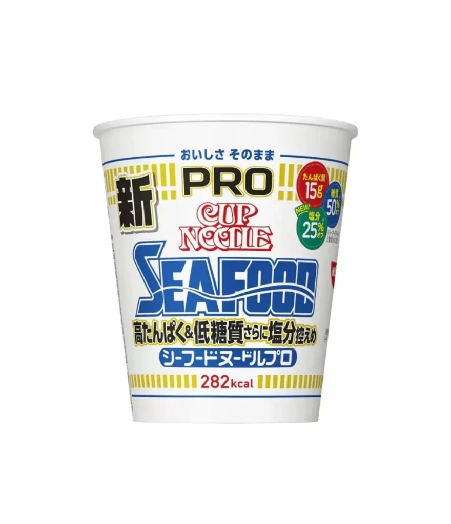
Centered within a clean, seamless white void, a white paper cup stands in direct frontal view, revealing its cylindrical form and rolled rim. The packaging design is dominated by bold typography, featuring the word 'PRO' in heavy black letters above 'CUP NOODLE' rendered in red with white outlining. Below this, 'SEAFOOD' appears in massive blue block characters, while Japanese text and nutritional callouts—including red and green circles highlighting 15g of protein and 25% reduced salt—fill the remaining space alongside yellow vertical striping at the top and bottom edges.
Visual hierarchy plays a crucial role here, as the oversized blue seafood designation immediately draws the eye downward from the brand identifiers. The color palette strategically employs high-contrast black, red, and blue against the white substrate to differentiate product lines while maintaining brand consistency. Notable is the integration of health-conscious messaging through circular badges and specific caloric data (282kcal), which balances commercial branding with functional information without cluttering the composition.
Packaging designers analyzing instant-food market trends would find value in studying how nutritional claims are positioned relative to flavor identification. Marketing teams could reference this layout when developing premium or health-oriented sub-brands that require clear visual separation from standard products. Additionally, typographers examining condensed sans-serif applications in confined circular spaces might use this as a case study for legibility at various scales.