Nissin Instant Noodle Can
Topics
Details
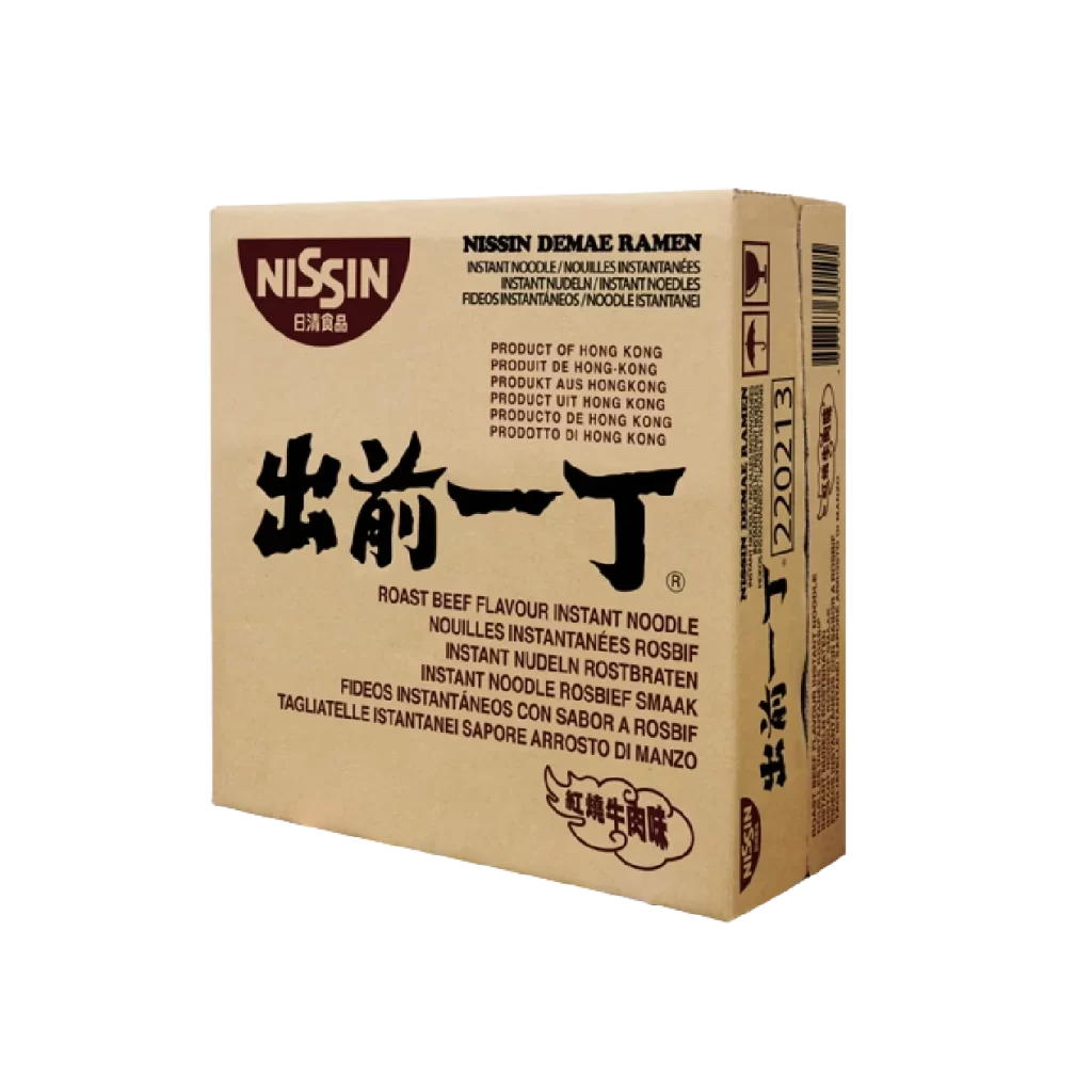
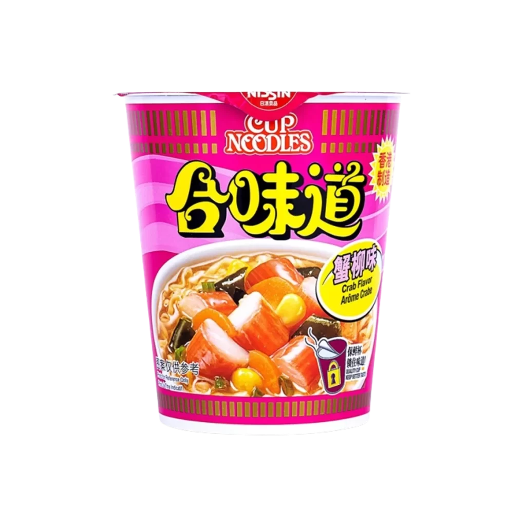
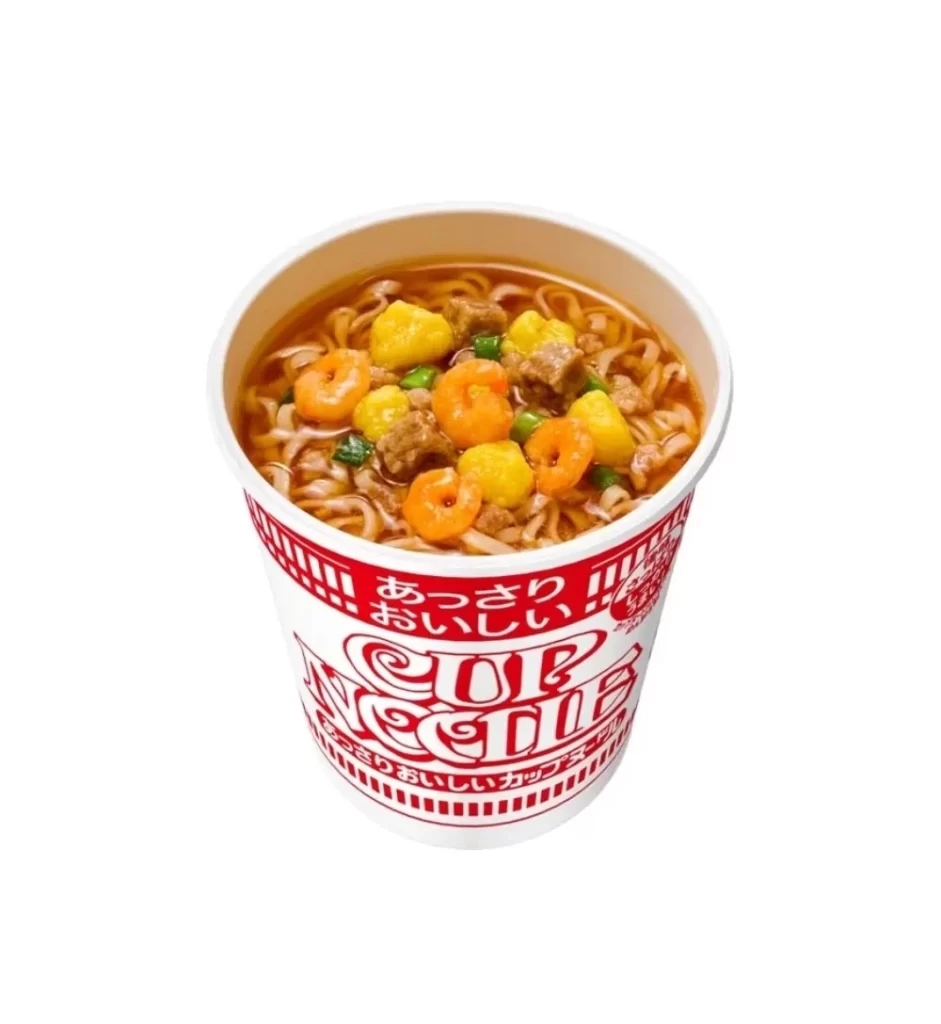
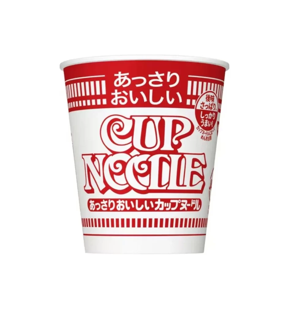
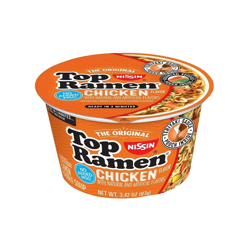
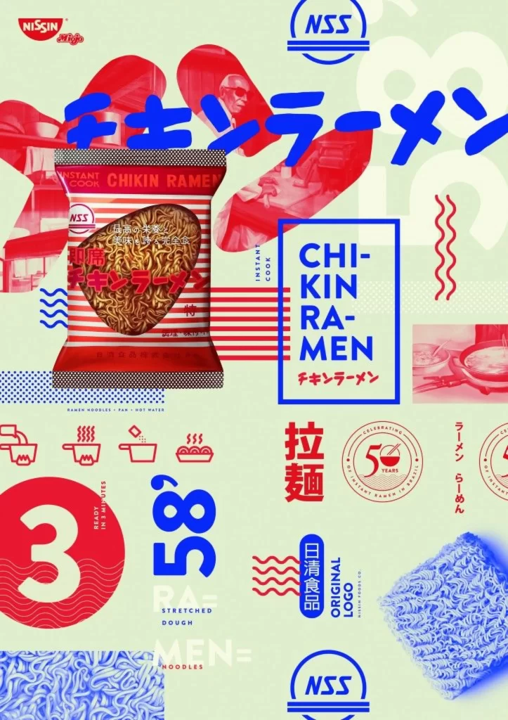
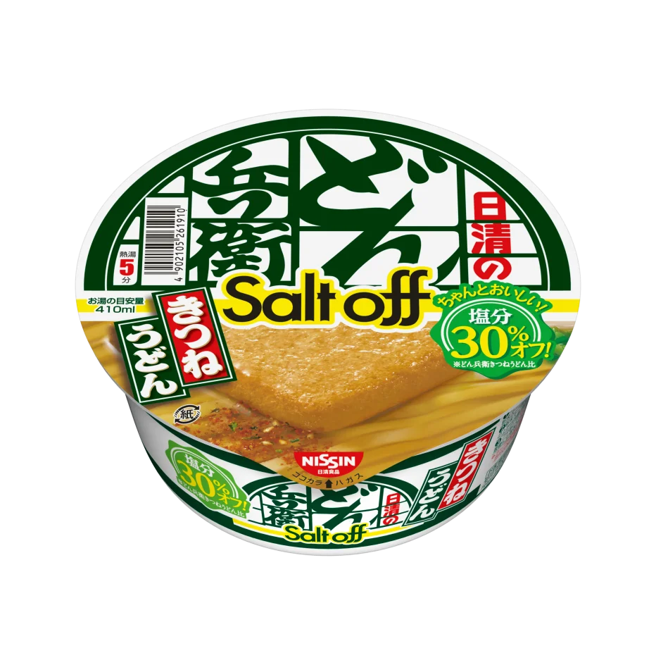
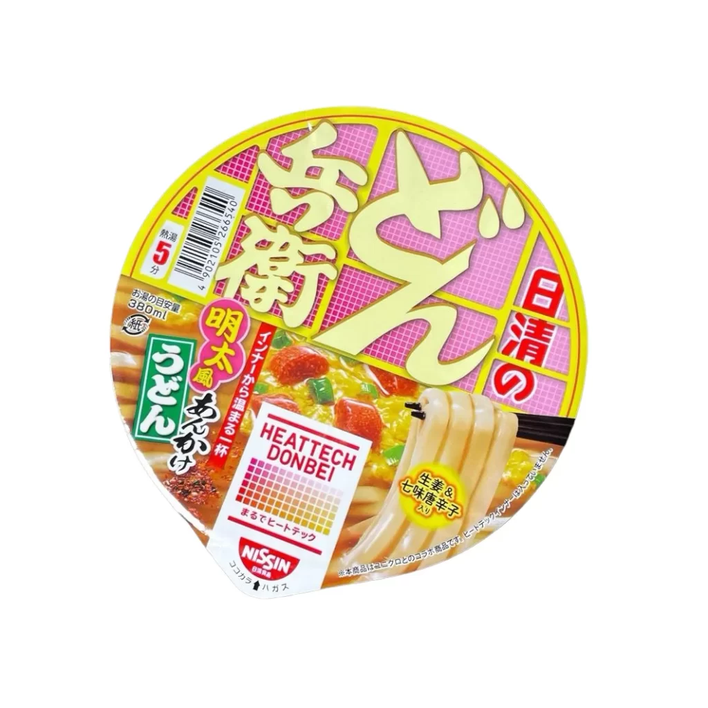
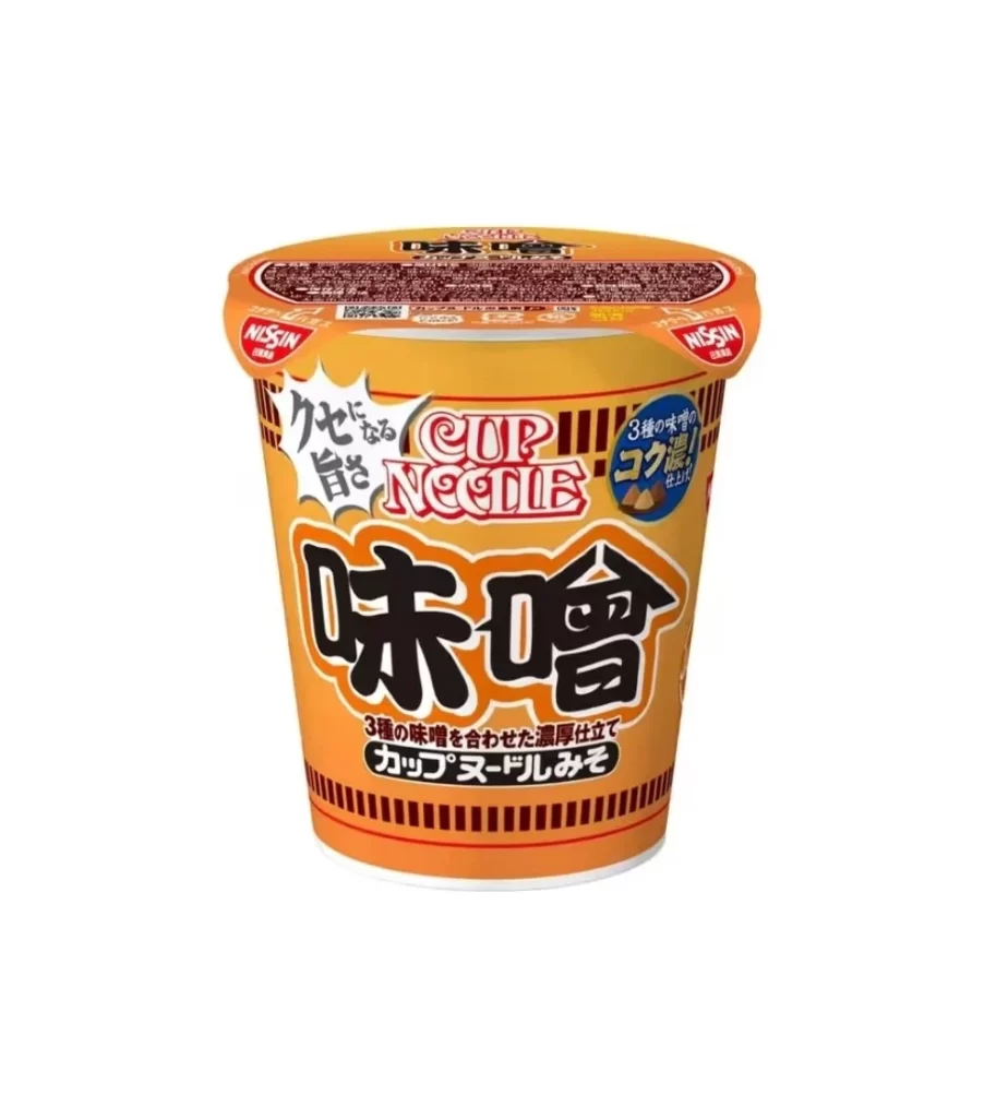
Centered within a seamless white void, a cylindrical Nissin Cup Noodle container dominates the frame with its warm orange and yellow gradient. The packaging features bold, black Japanese kanji for 'Miso' as the primary focal point, flanked by the red and white 'Cup Noodle' logo and a white starburst graphic containing the phrase 'Kete nai aji' (Unforgettable Taste). A blue circular badge on the right side highlights the rich coconut milk content, while the lid displays dense nutritional information and two red Nissin logos positioned symmetrically at the edges.
Visual hierarchy plays a crucial role in this packaging design, utilizing scale and contrast to guide the viewer's eye from the large flavor identifier down to the specific product variant text. The color palette creates an immediate association with savory, warm flavors through its sunset-inspired tones, while the mix of typography styles—ranging from traditional brush-stroke kanji to modern sans-serif elements—bridges cultural authenticity with contemporary convenience. Subtle details like the vertical ribbing pattern near the base add tactile visual interest that suggests the physical texture of the cup itself.
Product photographers and e-commerce specialists might utilize this composition to study optimal lighting techniques for reflective cylindrical packaging without harsh glare. Packaging designers could analyze the typographic balance between English and Japanese text elements when creating localized products for international markets. Food stylists and culinary content creators may reference the color saturation levels and shadow placement to achieve similar appetizing presentations in their own instant food photography work.