Vifon Instant Noodle Pouch
Topics
Details
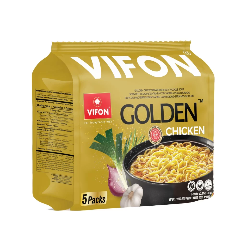
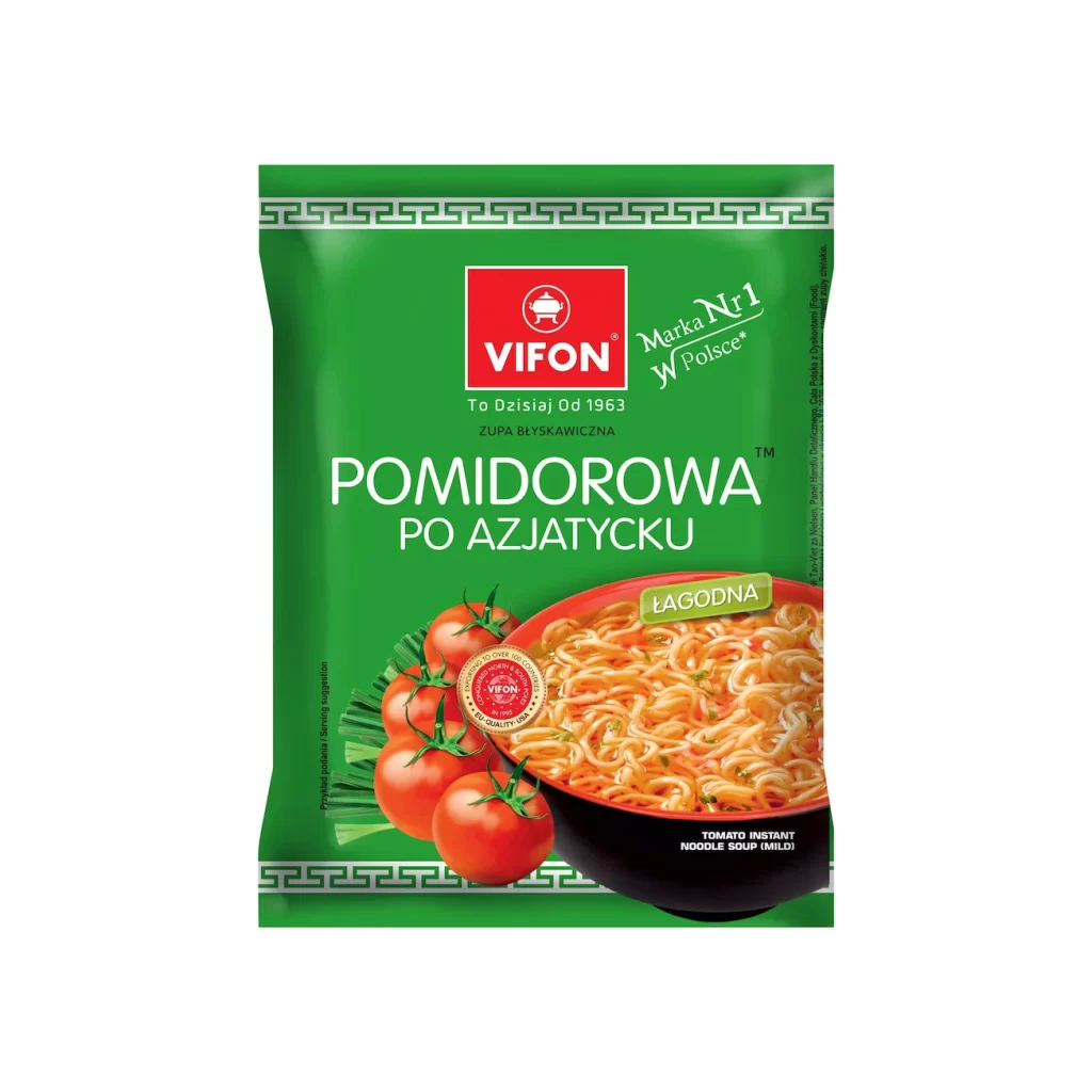
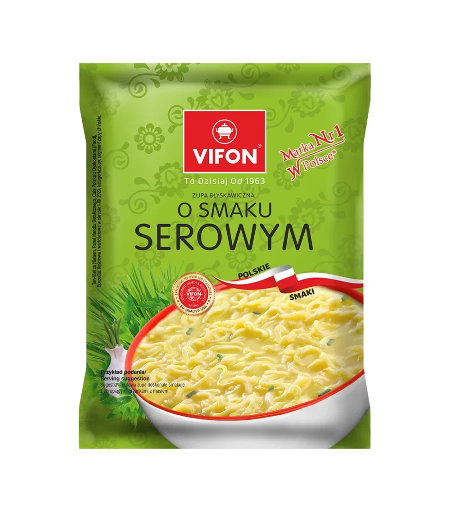
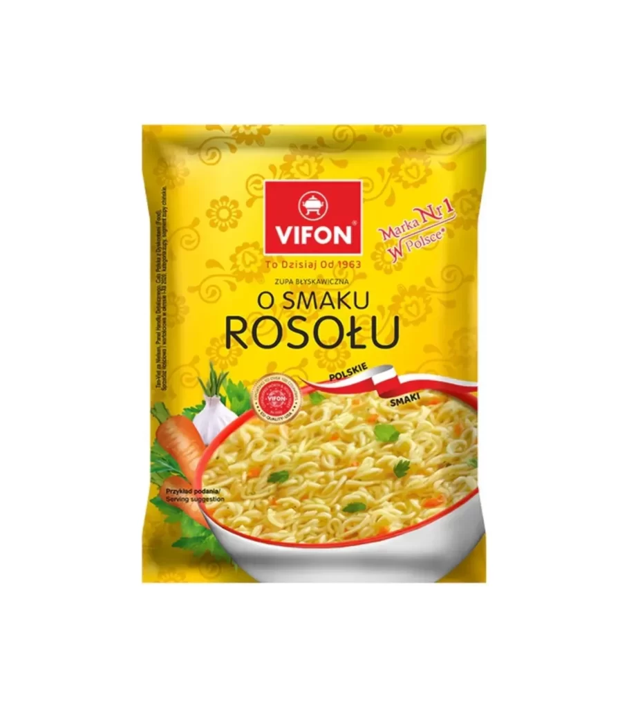
A bright yellow package dominates the frame, featuring a subtle floral pattern that adds texture to the background. Centered near the top sits a bold red square logo with the brand name 'VIFON' in white, positioned above large black text reading 'O SMAKU ROSOŁU'. Below the typography, a realistic bowl of noodles fills the lower half of the pouch, garnished with fresh vegetables like carrots and garlic on the left side.
The visual hierarchy here is quite effective, using the contrast between the warm yellow field and the sharp red branding to catch the eye immediately. A curved ribbon element in the Polish national colors separates the text from the food photography, cleverly reinforcing the product's regional identity without cluttering the layout. The mix of clean sans-serif fonts for the main copy and a more casual script for the 'Marka Nr 1' slogan creates a balanced, approachable aesthetic typical of mass-market grocery items.
Packaging designers studying Eastern European market trends would find this a useful case study in color psychology and localized branding strategies. Illustrators looking to practice rendering crinkled plastic textures or realistic food photography compositions could use this as a solid starting point for their own projects. Even marketing teams analyzing how heritage brands communicate longevity—note the 'Od 1963' tagline—might pull this into their mood boards when planning similar product refreshes.