Vifon Soup Pouch
Topics
Details
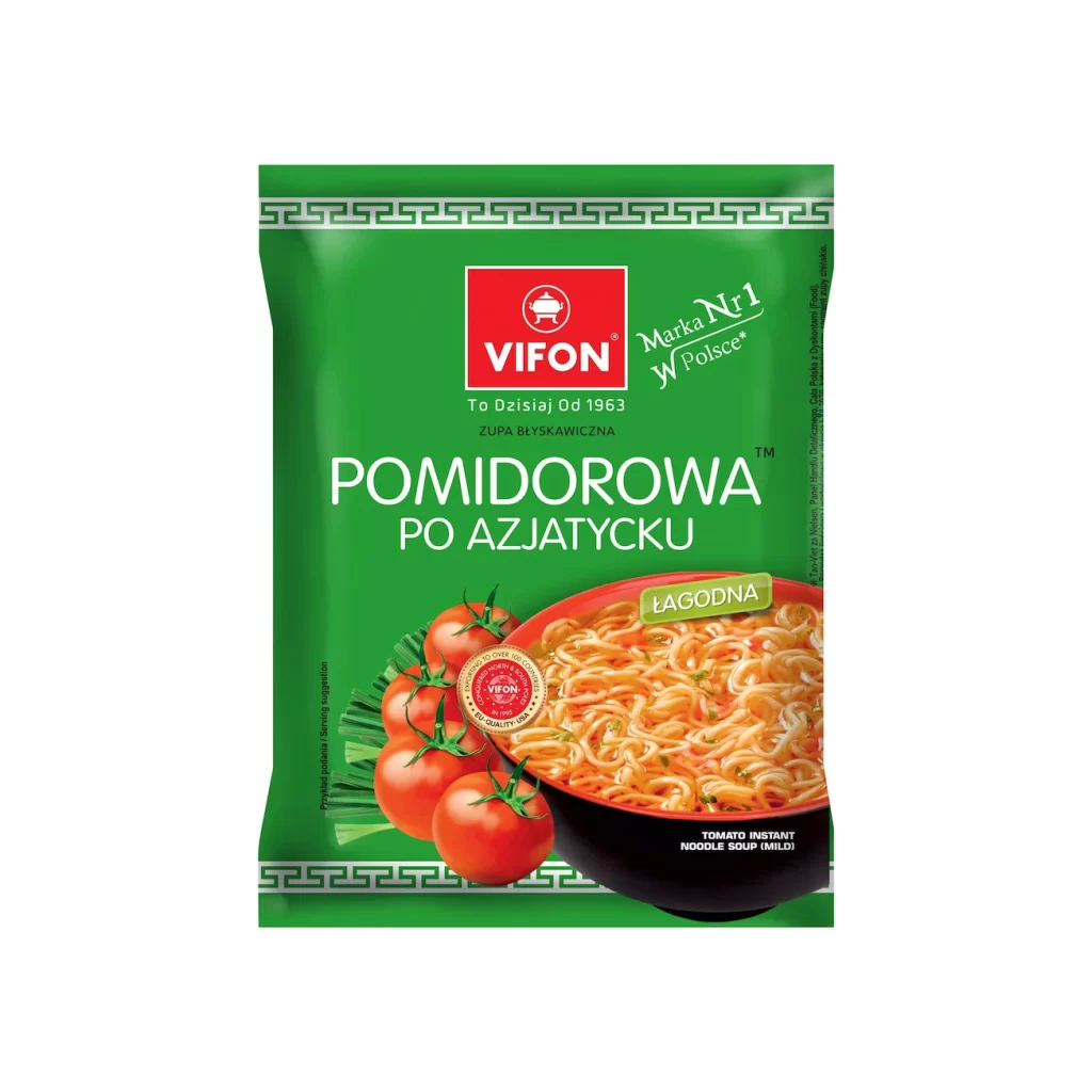
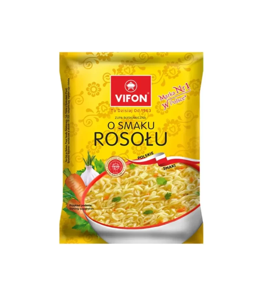
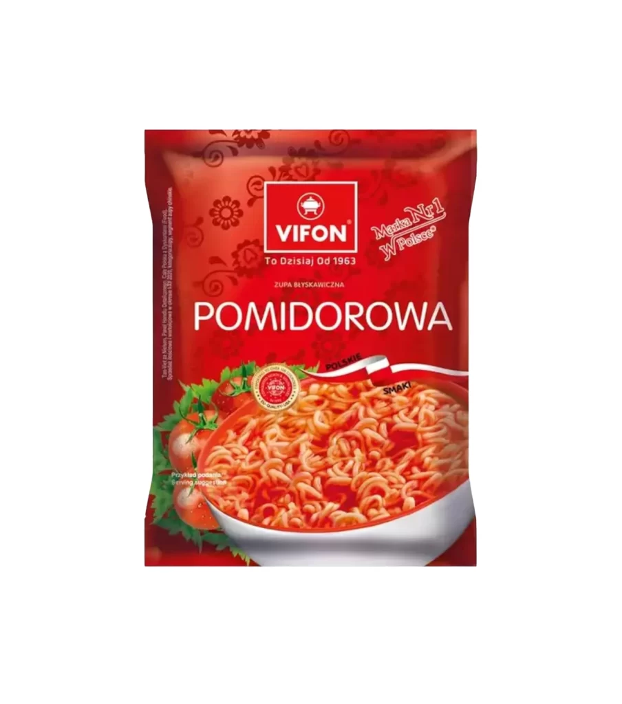
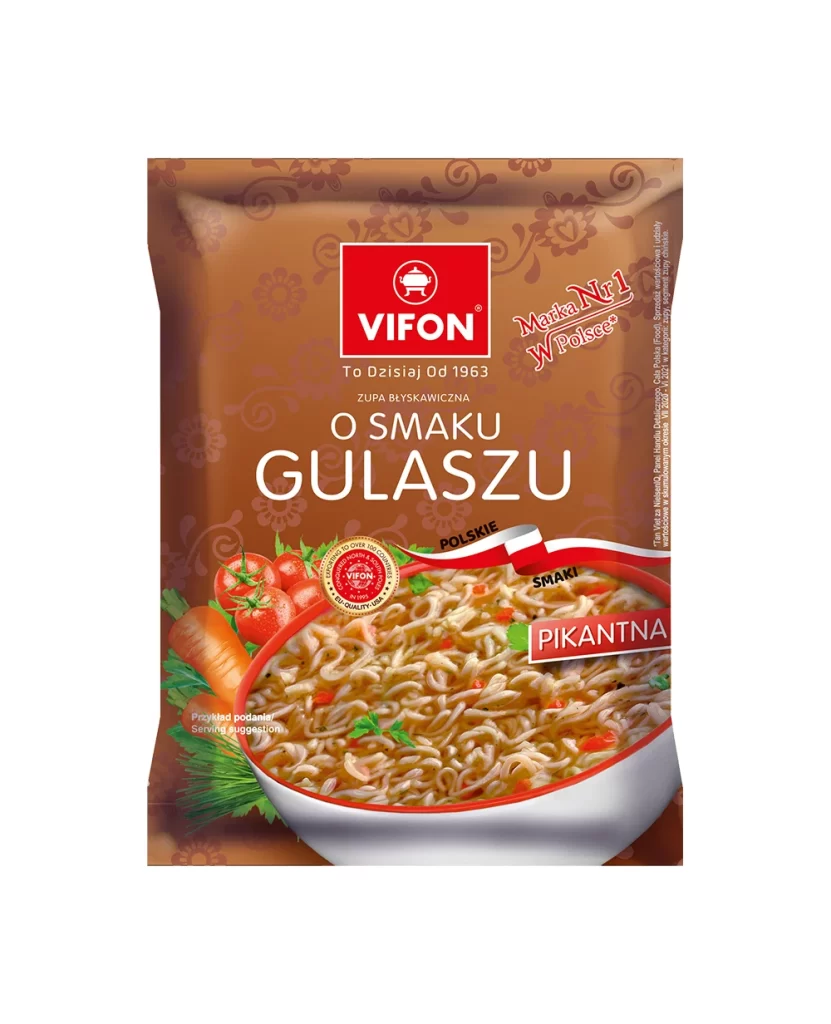
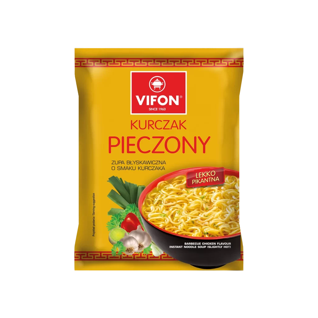
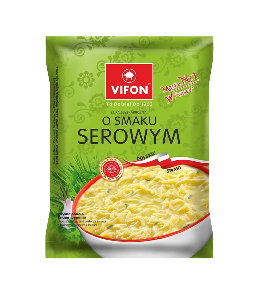
A vibrant lime-green plastic pouch dominates the frame, featuring a subtle floral pattern in a slightly darker shade that serves as the background texture. Centered near the top, the Vifon brand name appears in bold white sans-serif letters inside a bright red square logo, positioned directly above the large black text 'O SMAKU SEROWYM'. The lower half of the packaging showcases an appetizing photograph of creamy cheese-flavored instant noodles in a white bowl with a red rim, accented by fresh green onion illustrations on the left side and a red-and-white ribbon banner reading 'POLSKIE SMAKI' across the upper portion of the food image.
Visual hierarchy is established through strategic color blocking, where the red logo and ribbon create strong focal points against the monochromatic green field. The combination of typographic elements—ranging from the heritage claim 'To Dzisiaj Od 1963' to the stylized 'Marka Nr1 W Polsce' badge—communicates market positioning while maintaining legibility. Photographic realism in the noodle bowl provides tactile contrast to the flat graphic patterns, effectively bridging appetite appeal with brand identity through careful compositional balance.
Packaging designers studying Eastern European FMCG aesthetics would find this composition useful for analyzing how traditional motifs integrate with modern instant-food branding. Marketing teams could reference the layout when developing localized product variants for Polish-speaking markets, particularly noting how flavor indicators combine with national pride messaging. Illustrators requiring examples of food photography within constrained retail packaging dimensions might examine the interplay between the circular bowl image and surrounding graphical elements.