Vifon Noodle Pouch
Topics
Details
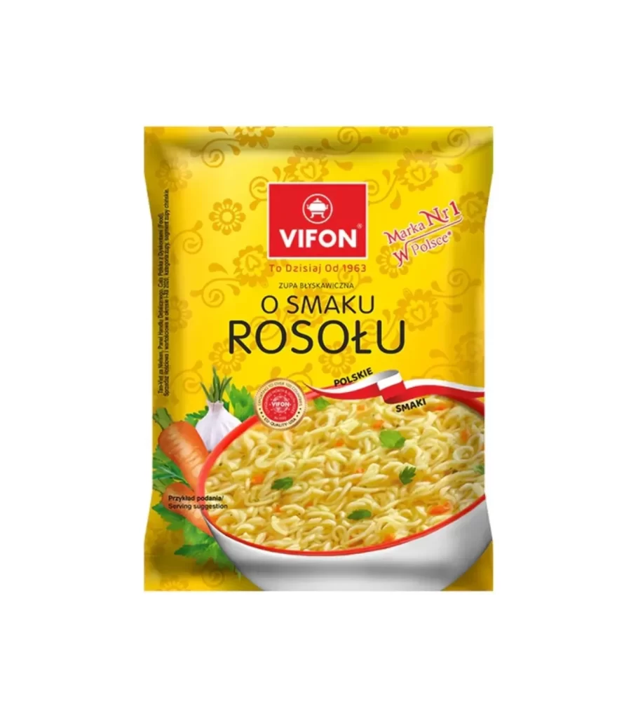
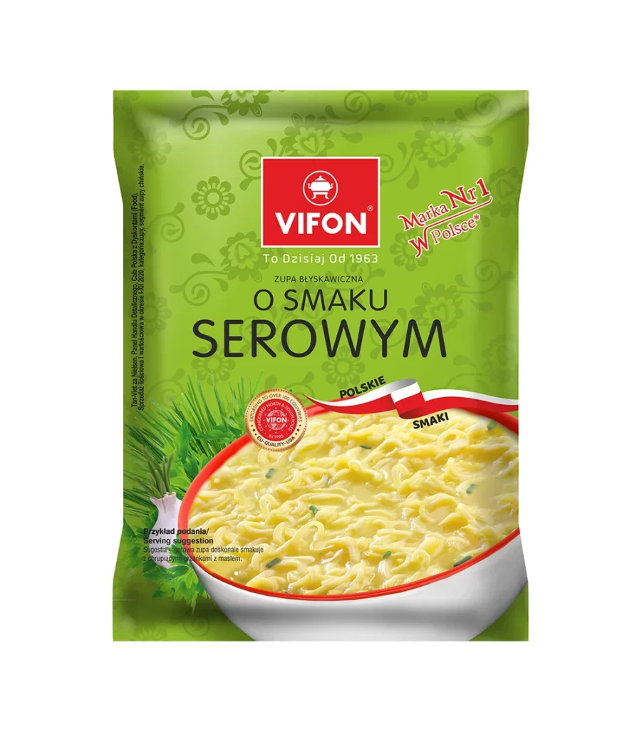
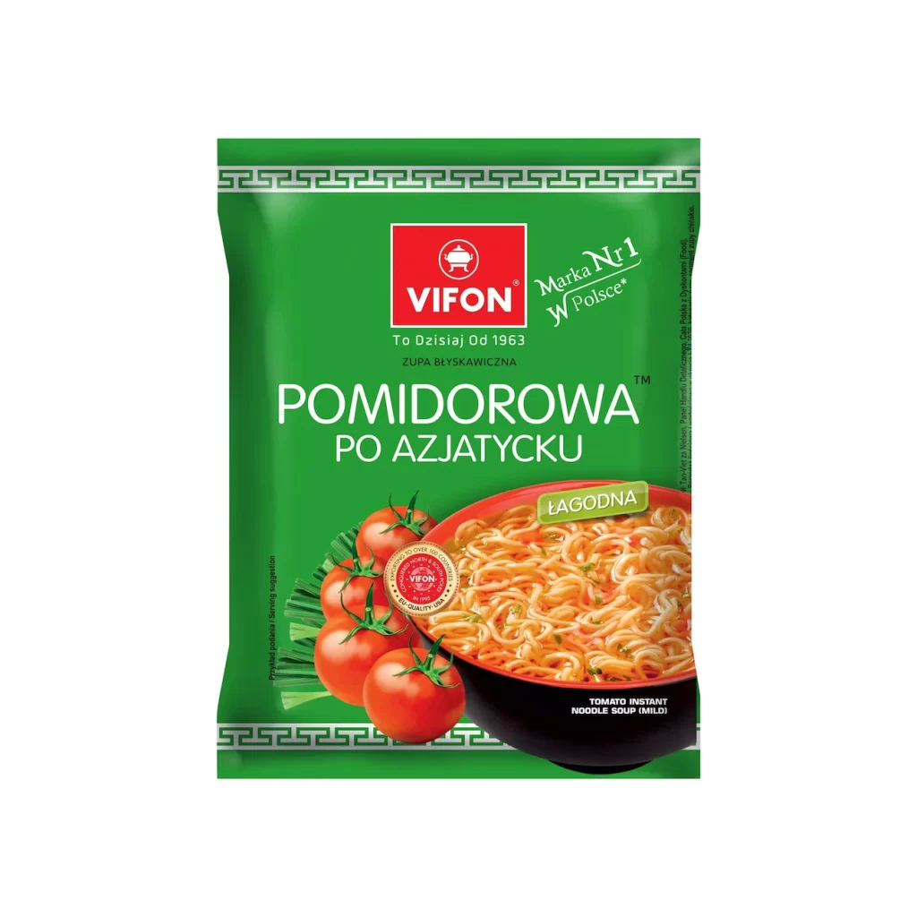
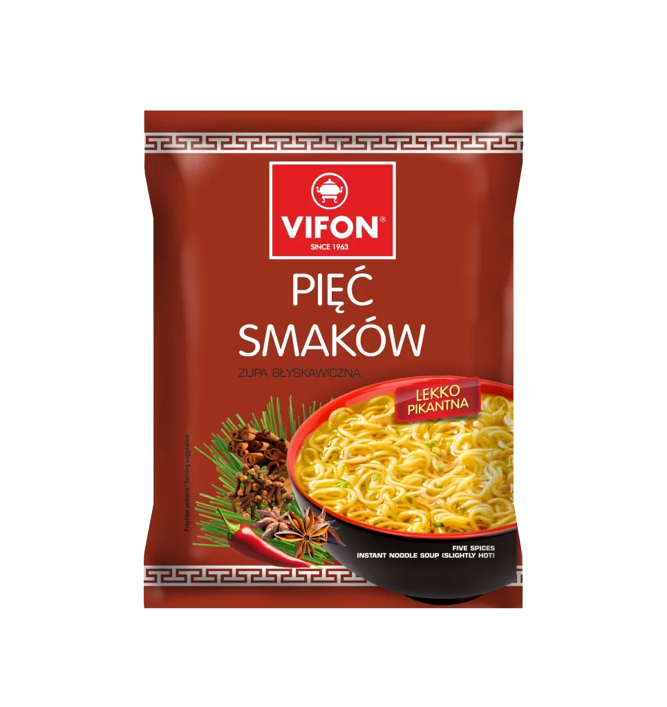
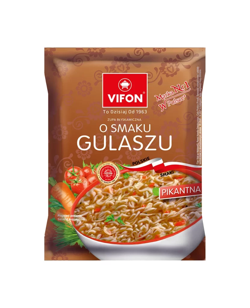
A rich, earthy brown background with subtle floral patterns frames the central composition of this Vifon noodle pouch. The packaging features a prominent red square logo at the top containing the white 'VIFON' brand name and a small pot icon, positioned above the Polish text 'O SMAKU GULASZU' in large, clean white typography. Below the text, a photographic image of a white bowl filled with noodles in a brown broth dominates the lower half, flanked by fresh vegetables including red tomatoes and an orange carrot on the left side.
Visual hierarchy is established through the strategic use of contrasting colors, where the vibrant red brand mark draws immediate attention against the warm terracotta backdrop. The inclusion of national identity elements—specifically the 'Marka Nr 1 w Polsce' badge and a stylized Polish flag ribbon—creates localized market appeal that distinguishes this from generic international packaging. A secondary green label reading 'PIKANTNA' (spicy) adds functional color coding while breaking the monochromatic scheme with an unexpected accent.
Packaging designers studying Eastern European market conventions would find value in analyzing how regional language integration affects consumer trust signals. Food photographers could examine the lighting techniques used to make the broth appear appetizing while maintaining legibility of submerged ingredients. Brand strategists might reference this when developing tiered product lines that require clear flavor differentiation through color-coded labeling systems.