Nissin Mug Cup Noodle Pouch
Topics
Details
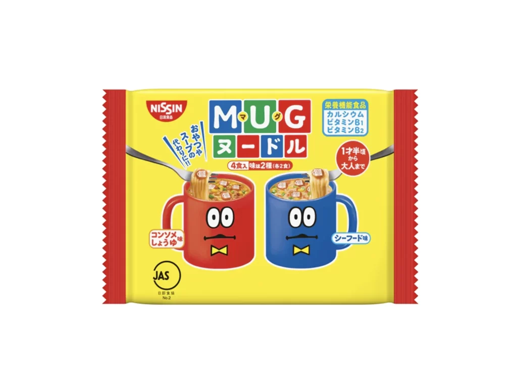
A vibrant, high-key product shot centers on a rectangular yellow package with serrated red side borders. The composition features two anthropomorphic mugs—one red and one blue—each with cartoon eyes and a bowtie, holding noodles and positioned symmetrically in the lower half. Bold, blocky typography spells out 'MUG' in English and 'マグ' (Mug) in Japanese above the katakana for noodle (ヌードル), while the Nissin logo anchors the upper left corner against a clean white studio background.
Visual interest is generated through the playful personification of the serving vessels, which transforms a standard grocery item into a character-driven narrative. The color palette relies on primary contrasts—red, blue, and yellow—to create immediate shelf presence, while the inclusion of nutritional callouts and flavor indicators like 'Shoyu' adds functional density to the graphic layout. Such packaging successfully balances informational requirements with an inviting, almost toy-like aesthetic that broadens its appeal beyond mere sustenance.
Brand strategists might analyze this artifact to understand how mascot integration influences consumer perception of convenience foods. Packaging engineers could study the spatial arrangement of text and iconography to optimize information hierarchy for rapid retail scanning. Furthermore, illustrators seeking to master the art of commercial character design would find the facial expressions and accessory placement on the mugs a useful case study in adding personality to inanimate objects.