Cup Noodle Instant Noodles Cup
Topics
Details
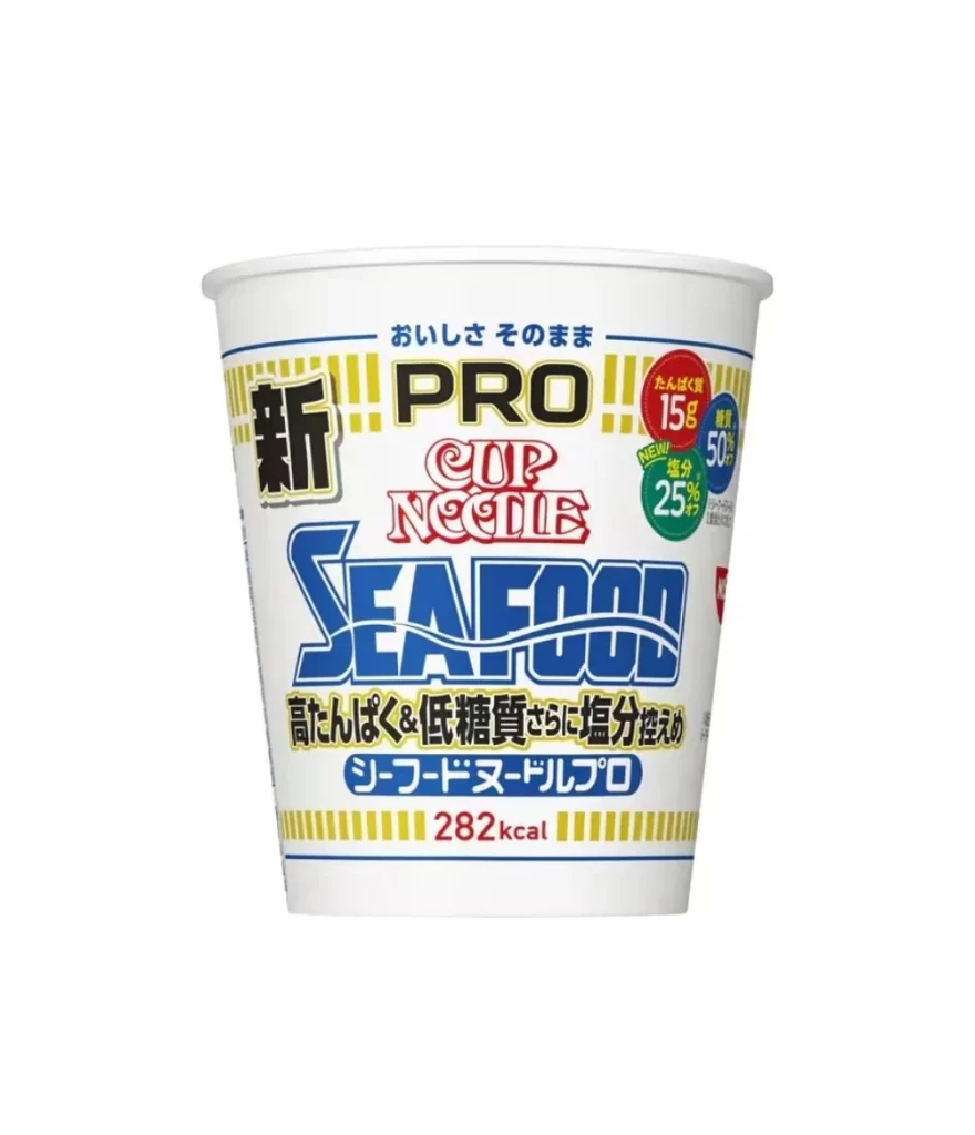
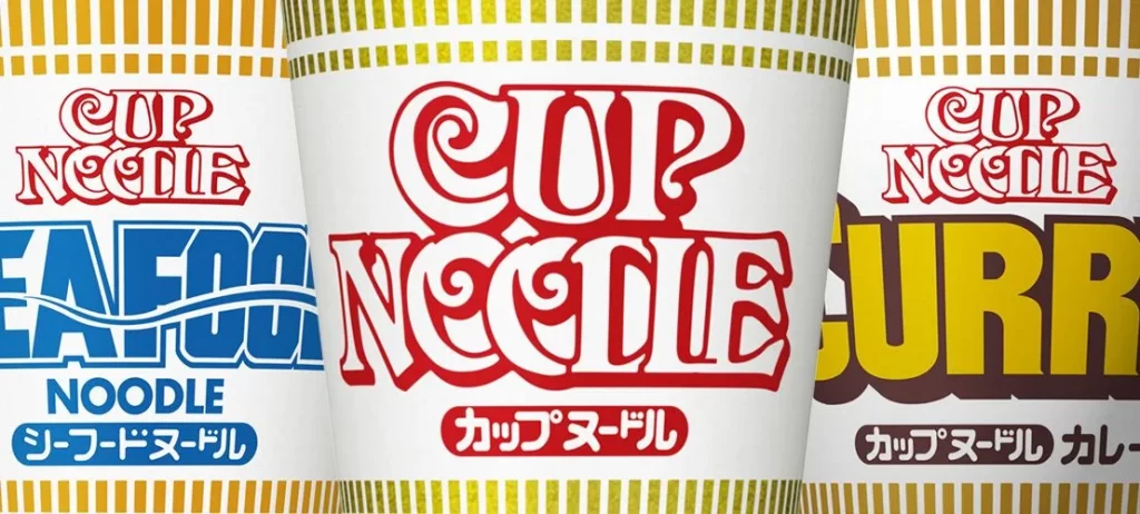
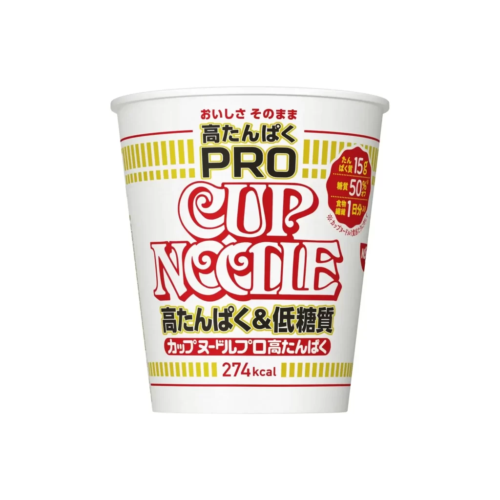
Cup Noodle PRO displays its bold red and black typography on a white paper vessel, framed by yellow vertical stripes at the top and bottom rims. The composition centers the iconic 'CUP NOODLE' logo above Japanese text detailing high protein and low sugar benefits, with a red badge highlighting 15g of protein content. Even studio lighting illuminates the clean, cylindrical surface, emphasizing the 274kcal nutritional information printed near the base.
Visually, this specific iteration deviates from the standard mass-market aesthetic by adopting a more clinical, almost pharmaceutical graphic language. The inclusion of ‘PRO’ alongside health-conscious metrics like ‘Low Sugar’ suggests a targeted demographic shift toward fitness or dietary management. Furthermore, the dense packing of informational text—ranging from protein content to fiber percentages—transforms the packaging into a data-heavy interface rather than a purely appetizing food product.
Brand strategists might analyze this layout to understand how established snack icons adapt their visual identity for the wellness sector. Packaging engineers could utilize the spatial arrangement of the nutritional callouts to study effective information density on curved surfaces. Additionally, typographers may find value in examining how the serif and sans-serif fonts interact within the constrained circular geometry of the cup.