Nissin Ramen Pouch View
Topics
Details
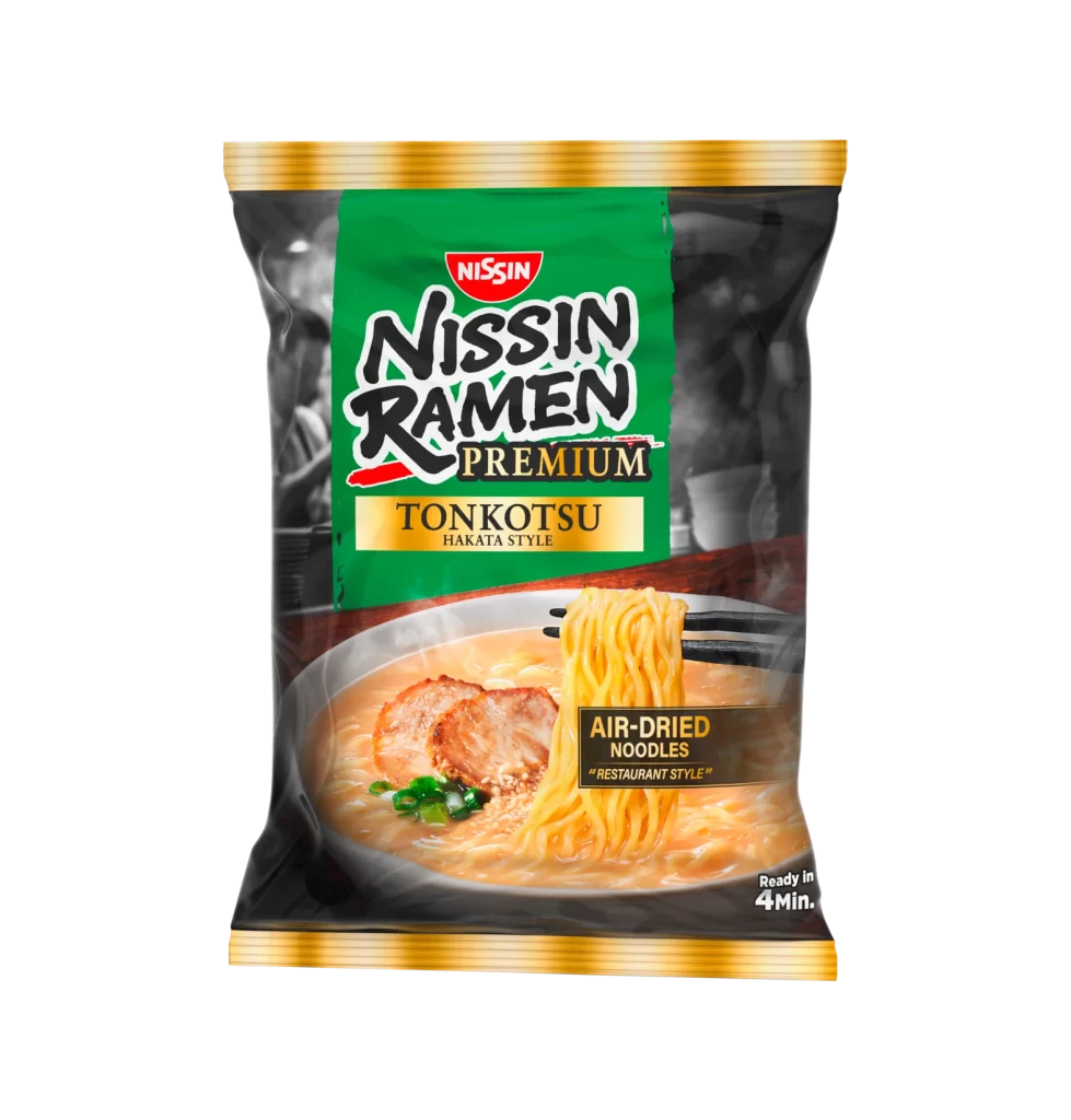
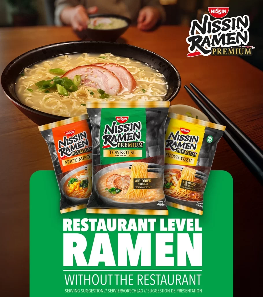
Against a warm wooden tabletop, a steaming bowl of tonkotsu ramen anchors the upper composition, its milky broth cradling pale noodles, pink chashu slices, and emerald scallions. Below the ceramic vessel, three distinct Nissin Ramen Premium pouches fan outward in a triangular arrangement: an orange Spicy Miso variant on the left, a central green Tonkotsu Hakata Style package, and a yellow Shoyu Yuzu option on the right. Bold white typography declaring 'RESTAURANT LEVEL RAMEN' dominates the lower third against a vivid green rectangular field, while black chopsticks rest casually to the right and blurred hands hover over a background bowl.
Visual hierarchy emerges through deliberate color coding that distinguishes each flavor profile at a glance, with metallic gold accents along the pouch edges suggesting premium quality. The photographic styling balances appetizing realism in the prepared dish against clean product photography of the packaging, creating a dual-purpose aesthetic that communicates both taste and convenience. Subtle textural contrasts between the matte paper pouches, glossy broth surface, and grain of the timber table add dimensional depth to the overall presentation.
Marketing teams developing instant food campaigns might study this layout to understand how lifestyle imagery reinforces product claims without overwhelming the merchandise itself. Packaging designers could analyze the typographic weight distribution and color psychology employed to differentiate SKU variants within a unified brand family. Food stylists and art directors preparing commercial shoots for Asian cuisine brands would find valuable guidance here regarding garnish placement, steam simulation, and the integration of human elements to suggest communal dining experiences.