Top Ramen Instant Noodle Box
Topics
Details
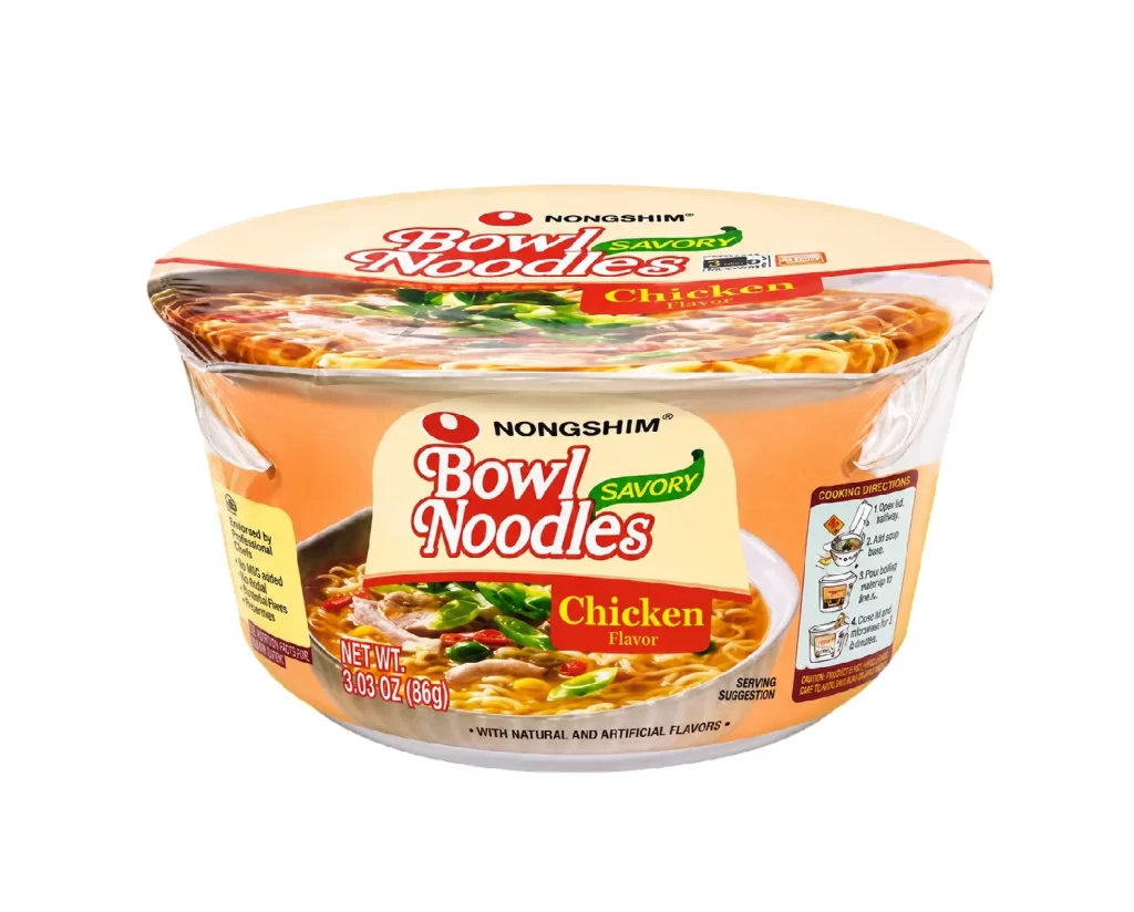
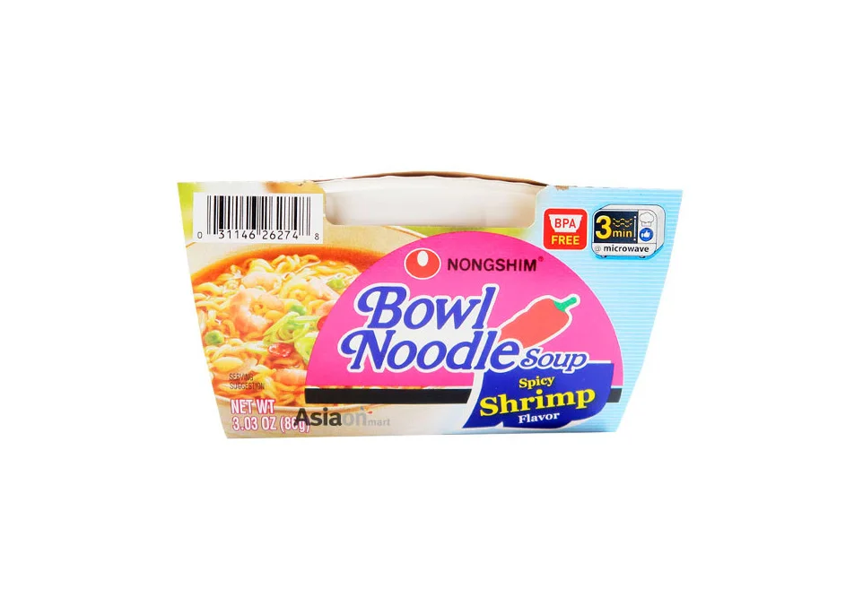
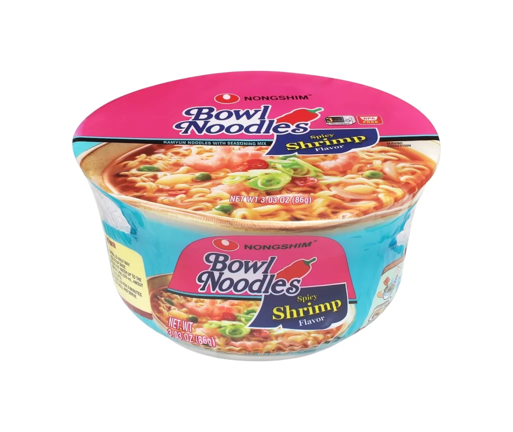
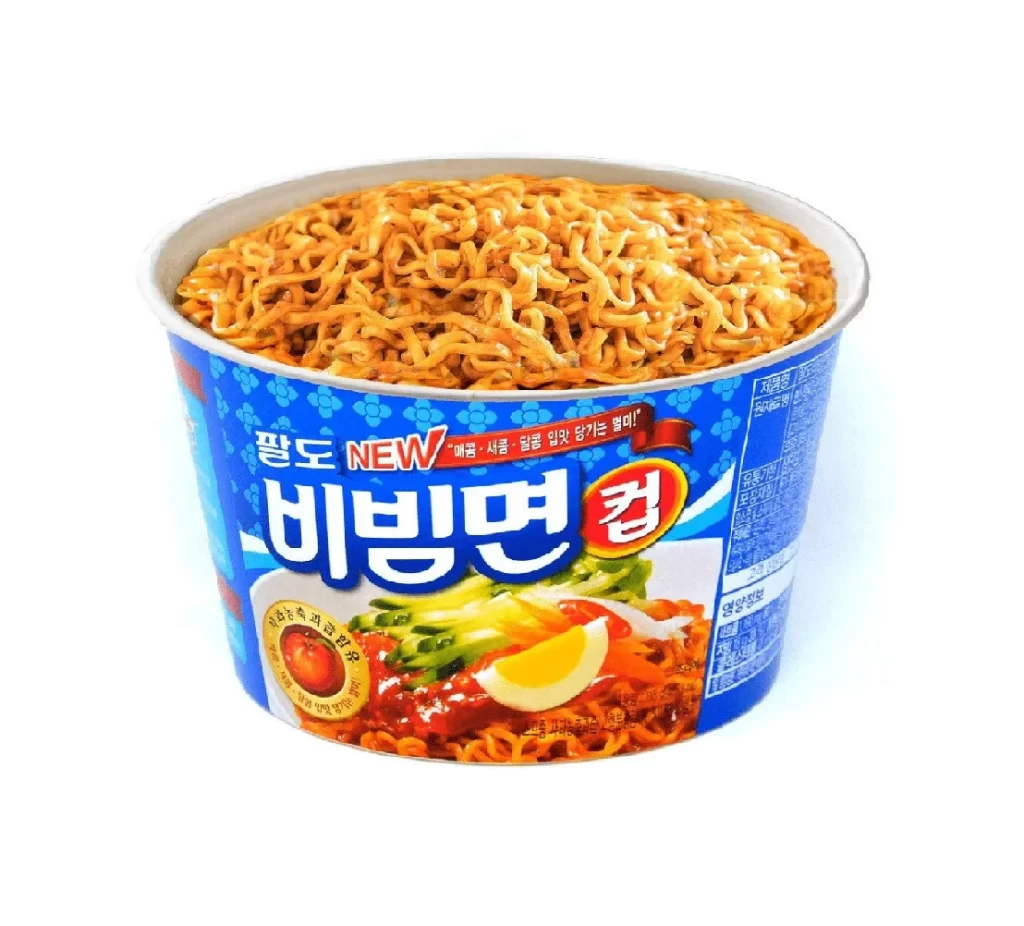
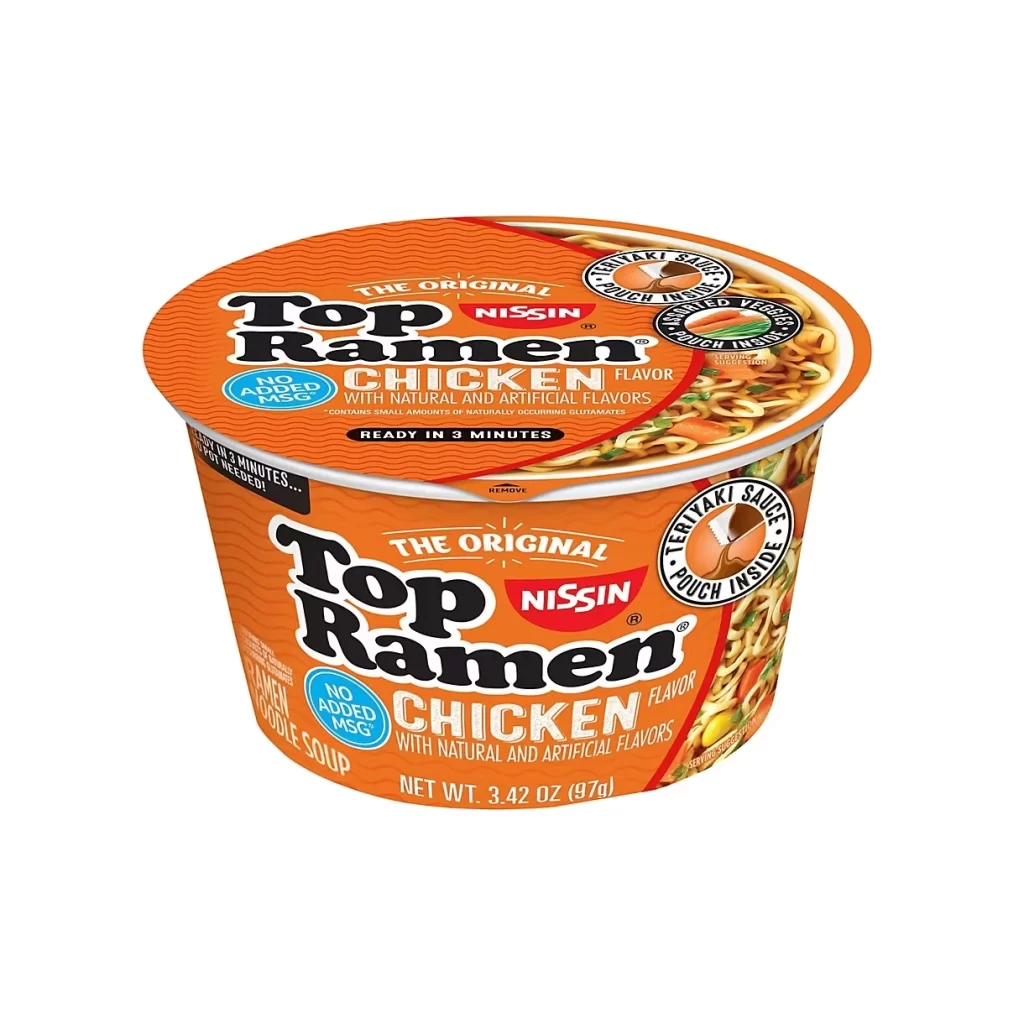
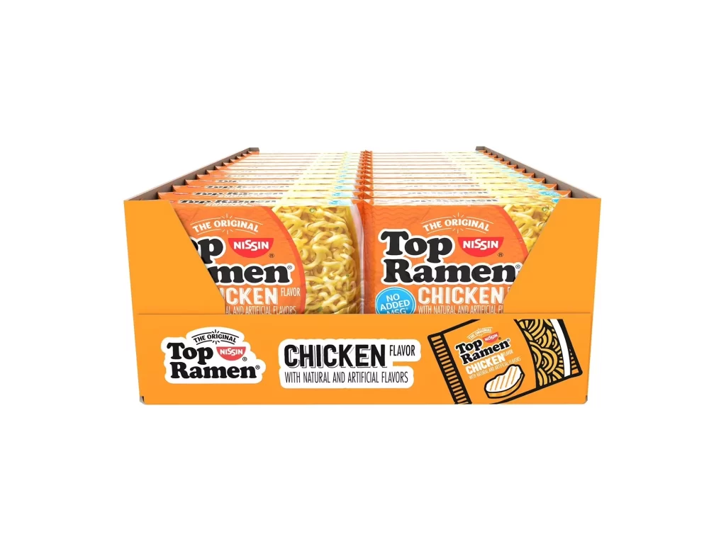
Bright orange cardboard forms the bulk of this display, with individual Chicken-flavored Top Ramen packages arranged in neat rows inside. The Nissin logo appears in red above the bold black 'Top Ramen' lettering on each wrapper, while the front of the outer box features a large 'CHICKEN FLAVOR' label alongside an illustration of the noodle block. Shot from a slightly elevated three-quarter angle against pure white, the lighting is even and shadowless, emphasizing every printed detail from the 'No Added MSG' badge to the fine texture of the dried noodles visible through the clear window.
What stands out here is the aggressive use of that signature orange hue across both the master carton and the inner sleeves, creating a unified visual block that dominates the frame. The typography mixes chunky retro sans-serifs with smaller regulatory text, and the inclusion of a realistic noodle photograph next to a stylized line-art graphic on the box front offers an interesting study in brand consistency. Even the way the packages are staggered in their tray creates rhythmic horizontal lines that guide the eye across the composition.
Packaging designers studying color theory in mass-market food products would find this arrangement particularly useful for analyzing how saturated backgrounds affect perceived value. 3D artists building grocery store environments could pull exact measurements and print placement data from the visible faces of the carton. Anyone working on brand identity for budget-friendly consumer goods might examine how the hierarchy between the parent brand and specific flavor variant is established through scale and position.