Nissin Cup Noodle Box Design
Topics
Details
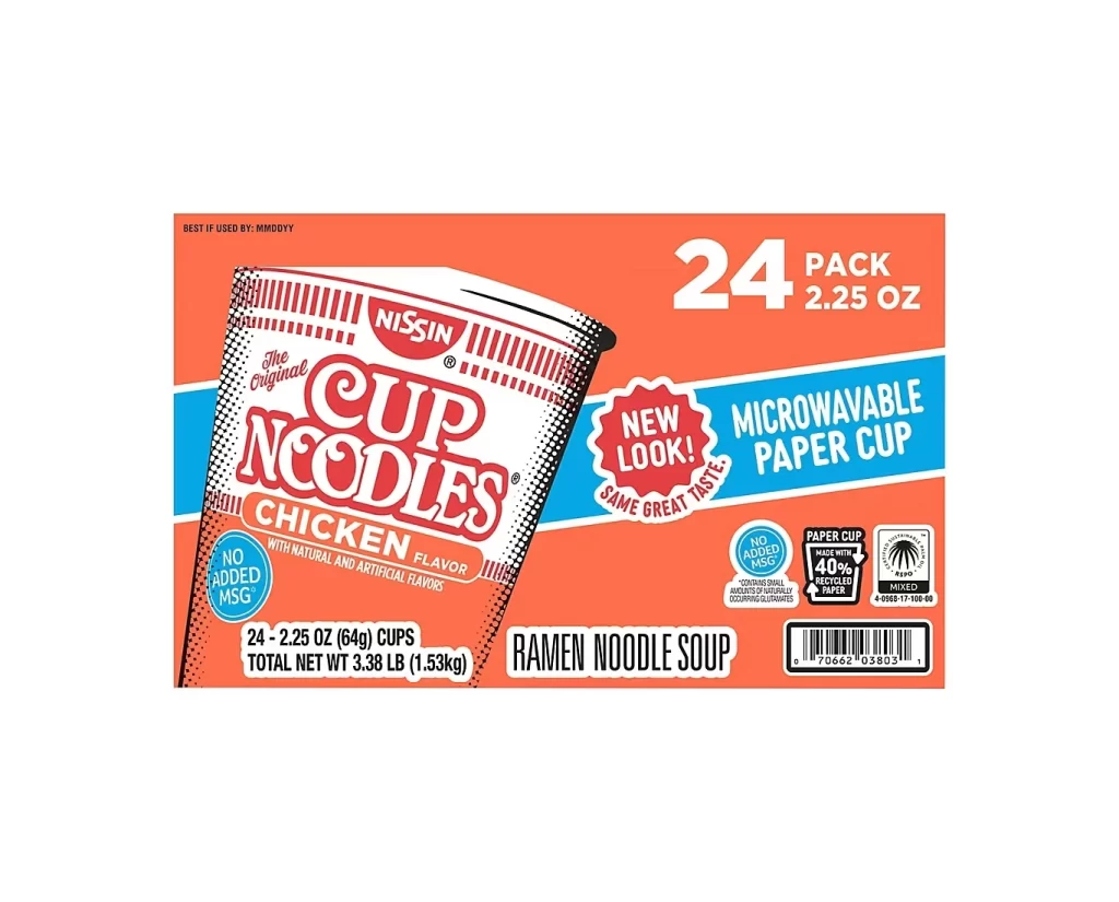
Dominating the frame is a bright orange cardboard carton for a twenty-four pack of Nissin Cup Noodles, photographed straight-on against a clean white void. The packaging features a large, stylized illustration of the iconic white paper cup with red vertical stripes, angled slightly to reveal the bold 'Cup Noodles' typography and 'Chicken Flavor' banner. A cyan-blue diagonal stripe cuts across the right side of the box, housing text that announces the 'Microwavable Paper Cup' and a 'New Look' badge, while smaller circular icons at the bottom highlight health and sustainability claims like 'No Added MSG' and 'Made with 40% Recycled Paper'.
Visual interest in this specific iteration comes from the high-contrast color blocking between the saturated orange background and the electric blue accent band. The retro-inspired illustration style of the cup itself utilizes halftone dot patterns and thick black outlines that give the product a graphic, comic-book aesthetic distinct from photorealistic food photography. Furthermore, the dense layering of information—from the large '24 Pack' count to the tiny certification logos—demonstrates how to balance hierarchy within a confined retail space without creating visual clutter.
Brand strategists might study this layout to understand how legacy products signal modernization through eco-friendly badges while maintaining nostalgic brand equity. Packaging engineers could utilize the spatial arrangement as a case study for fitting mandatory nutritional data and barcodes into a design that still feels open and breathable. Additionally, illustrators looking to emulate commercial pop-art styles would find the line work on the cup graphic a useful template for creating appetizing yet abstract food representations.