NaturVet Immunity Supplement Bottle
Topics
Details
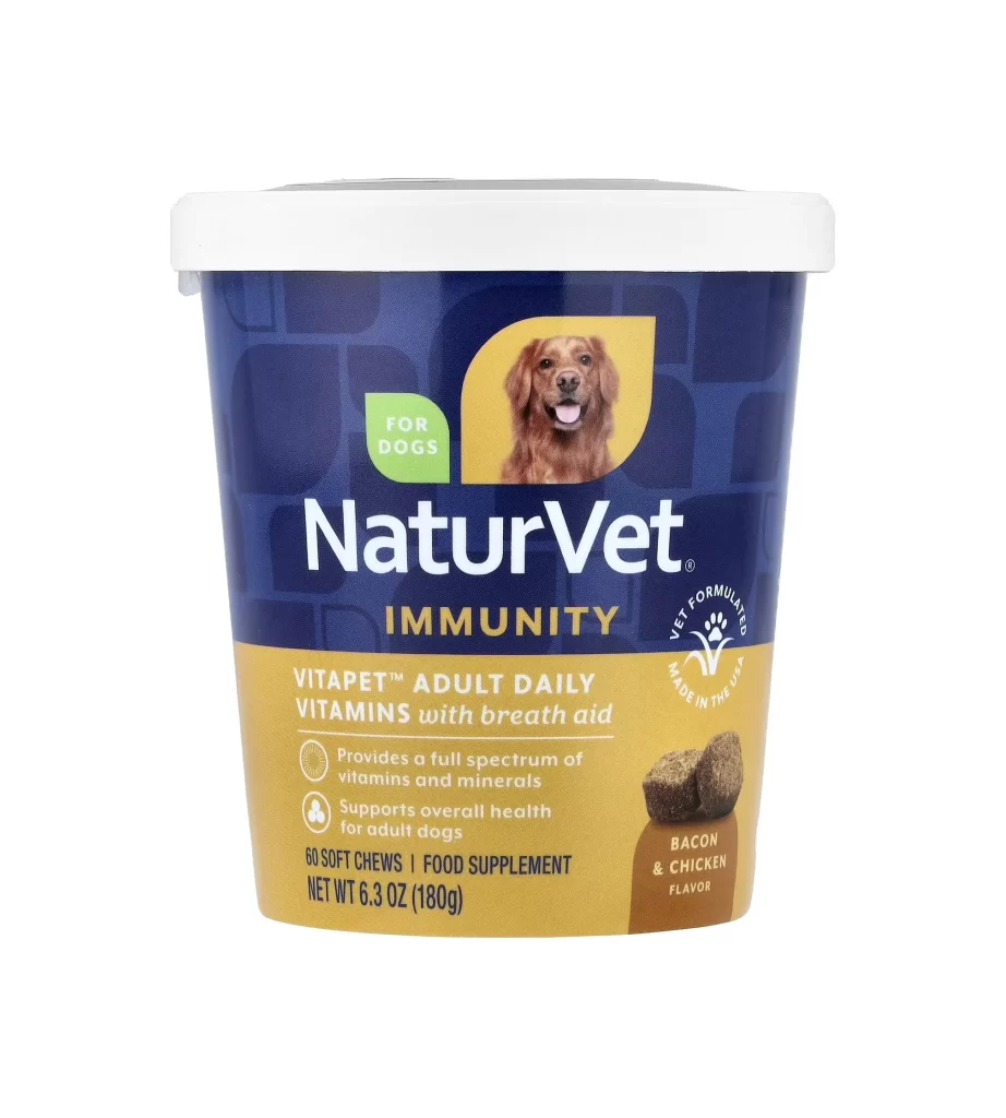
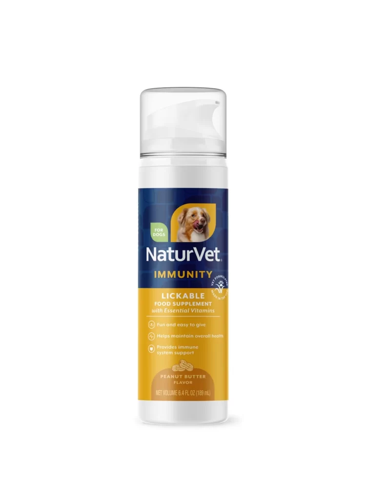
Centered within a seamless white void, a cylindrical supplement bottle stands upright, capped by a translucent white pump mechanism. The container's label is bifurcated into a deep navy blue upper section and a warm golden-yellow lower band. Prominently displayed across the middle is the brand name 'NaturVet' in bold white serif lettering, situated above the word 'IMMUNITY' in a contrasting yellow font. A cheerful dog's face appears inside a rounded yellow rectangle on the left side of the label, while the bottom portion details the product as a 'Lickable Food Supplement' in peanut butter flavor.
Visual interest stems from the distinct color-blocking strategy that separates branding from functional information. The navy and gold palette conveys a sense of medical reliability combined with pet-friendly warmth. Furthermore, the inclusion of a photographic element—the dog's portrait—adds an emotional anchor that balances the clinical text regarding vitamins and immune support. This specific layout effectively guides the eye from the brand identity down to the flavor profile and net volume of 6.4 fluid ounces.
Product photographers might utilize this composition to study how to arrange cylindrical packaging for e-commerce listings without distracting shadows. Packaging designers could analyze the typographic hierarchy used here to prioritize essential information like 'For Dogs' over secondary details. Additionally, marketing teams creating assets for pet wellness brands may find this reference useful for understanding standard color conventions in the veterinary supplement industry.