Elliott Lily Cat Food Blue Card Minimalist
Topics
Details
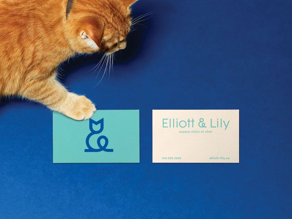
An orange tabby cat with a dark collar extends a pale paw onto a mint-green card featuring a navy-blue ampersand logo shaped like a cat and dog. Beside it lies an off-white card displaying 'Elliott & Lily' in teal sans-serif type, with the French subtitle 'espace chien et chat' beneath. The composition sits atop a deep cobalt surface, photographed from a direct overhead angle under soft, even lighting that emphasizes the matte texture of both cards.
Visual interest emerges from the clever integration of typography and iconography, where the brand's ampersand mark doubles as a stylized animal silhouette. The restrained palette of mint, navy, cream, and teal creates a sophisticated yet playful identity that avoids typical pet-industry clichés. Subtle material contrasts between the colored stock and natural fiber paper add tactile depth to the minimalist layout.
Brand strategists developing pet-service identities might study this example to understand how logomarks can convey dual-species care through abstract form. Print designers specifying business card stocks could reference the color interactions between the turquoise elements and neutral backgrounds. Photographers planning product shoots for animal-related brands may note how incorporating a live subject adds scale and emotional resonance without cluttering the frame.