Cat Food Kitten Treats Pink Yellow Cute
Topics
Details
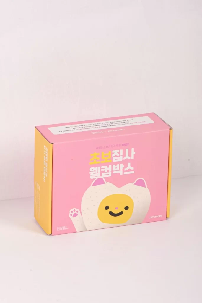
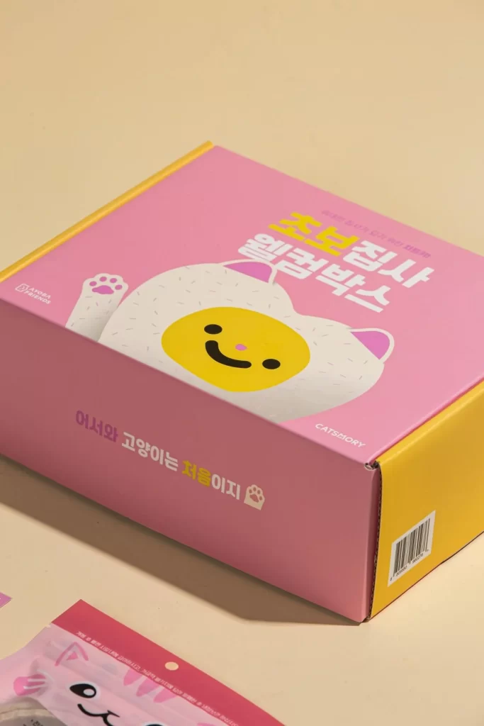
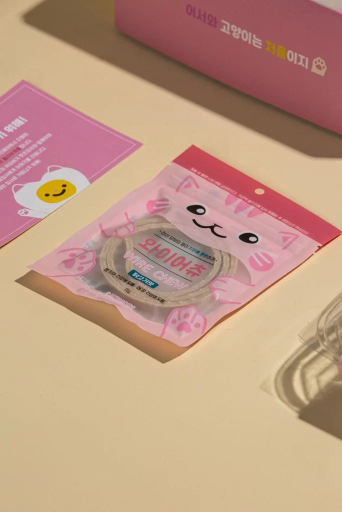
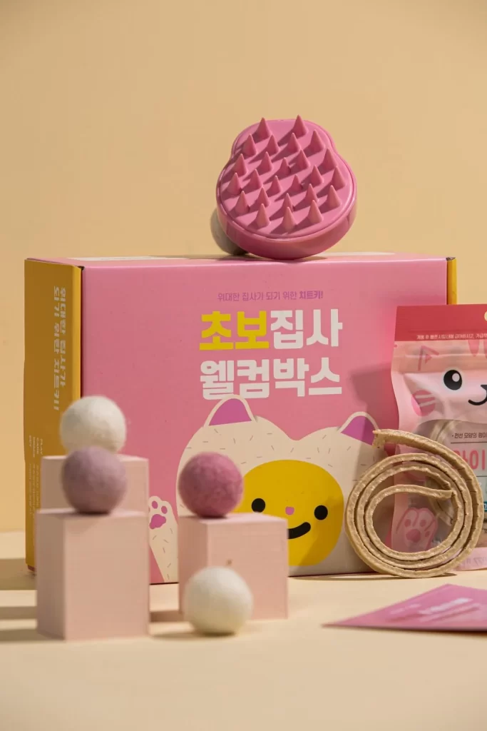
A matte pink cardboard box dominates the center of the composition, featuring a cartoon cat face with yellow skin, pink ears, and a simple black smile. Bold Korean text reading '초보집사 웰컴박스' (Beginner Owner Welcome Box) sits above the illustration in white and yellow lettering. Atop the box rests a circular pink silicone brush with conical bristles, while the foreground contains stacked pale pink cubes topped with felted wool balls in cream and mauve. A coiled beige rope and a translucent pink package with a cat graphic occupy the right side, all set against a warm butter-yellow backdrop under soft diffused lighting from the upper left.
The visual identity relies on a carefully curated pastel palette that merges millennial pink with mustard accents to signal approachability and playfulness. Rounded geometries appear consistently across every element—from the spherical wool balls and cylindrical brush to the soft-cornered packaging—creating a cohesive language of safety and gentleness appropriate for novice pet owners. Typography employs chunky, friendly sans-serif characters with high contrast against the saturated background, ensuring legibility while maintaining an informal, welcoming tone.
Brand strategists developing entry-level pet product lines could analyze this arrangement to understand how color psychology influences consumer trust among first-time animal caretakers. Packaging designers might study the spatial relationships between the primary box and accessory items to optimize unboxing experiences for subscription services. Retail merchandisers could reference the prop styling techniques—specifically the use of varied-height platforms and textural contrasts—to construct engaging physical or digital storefront displays for juvenile animal care categories.