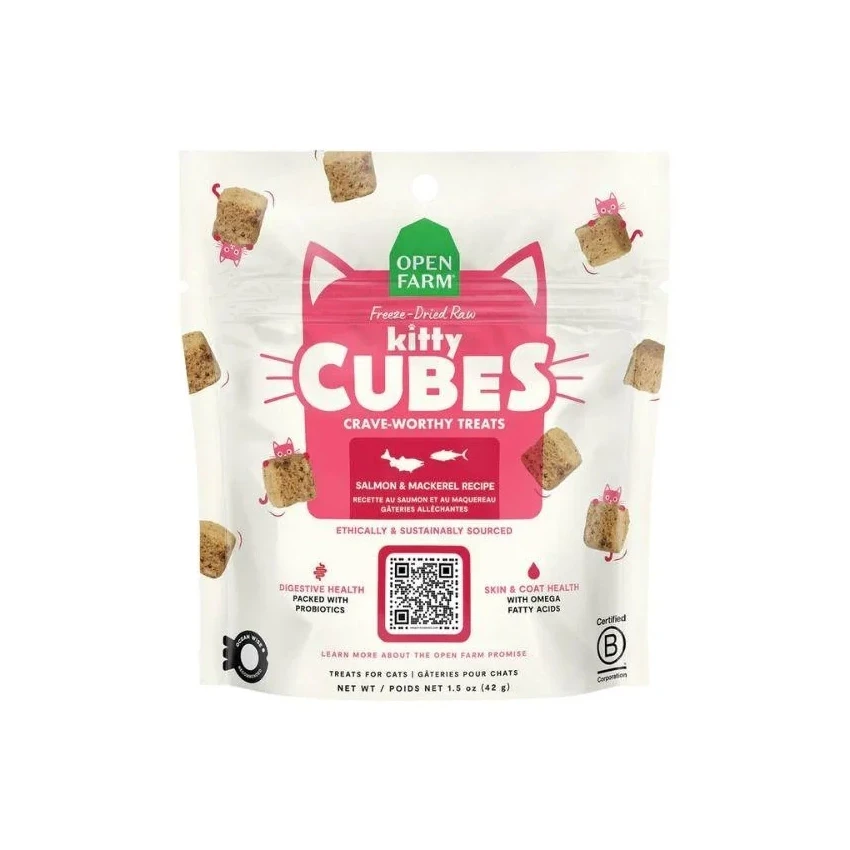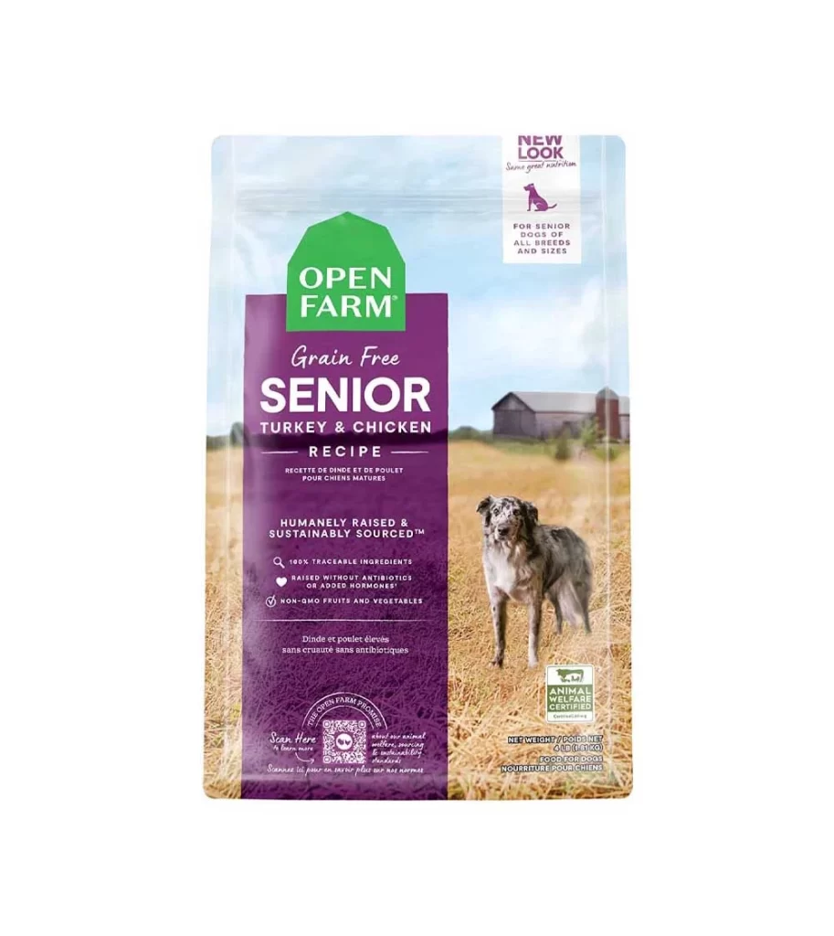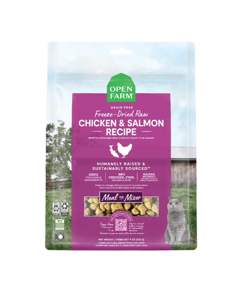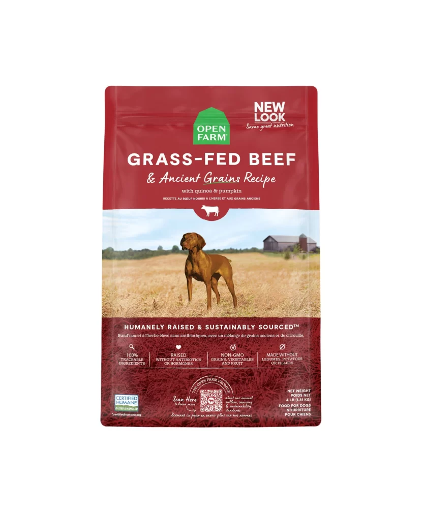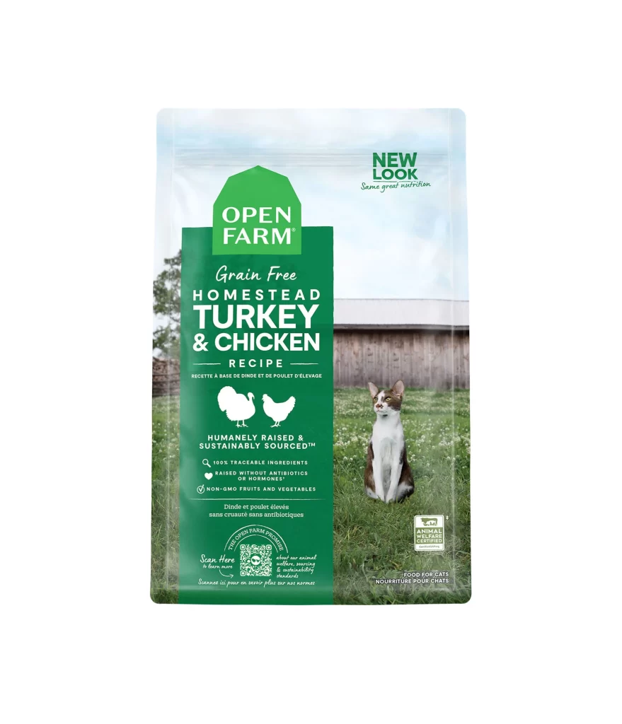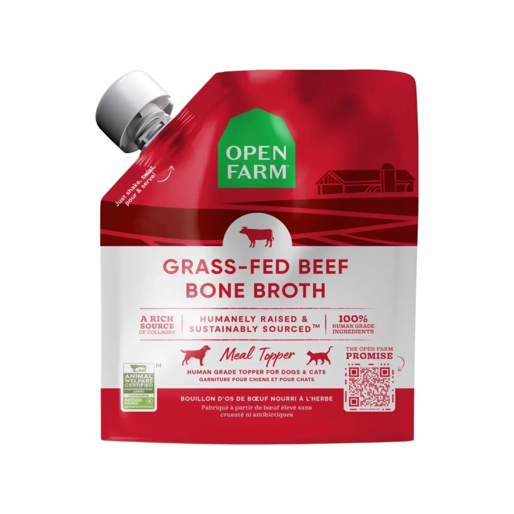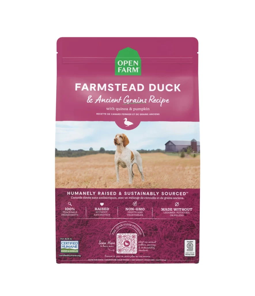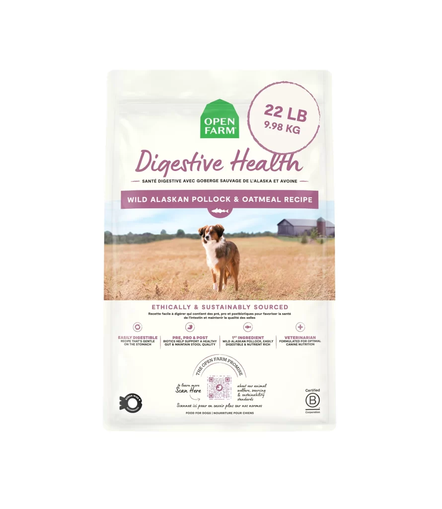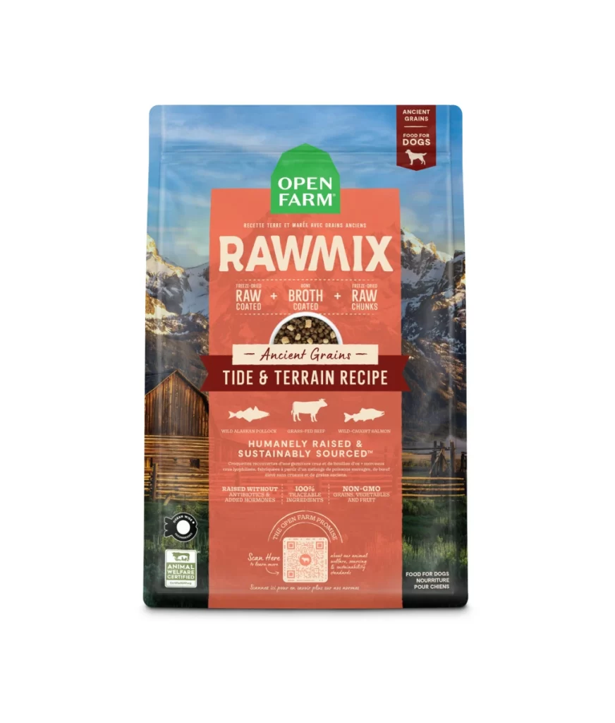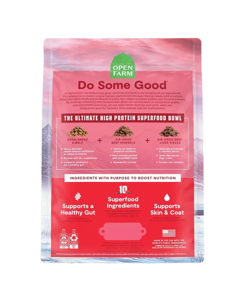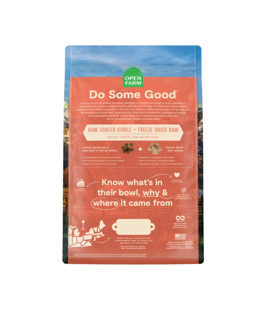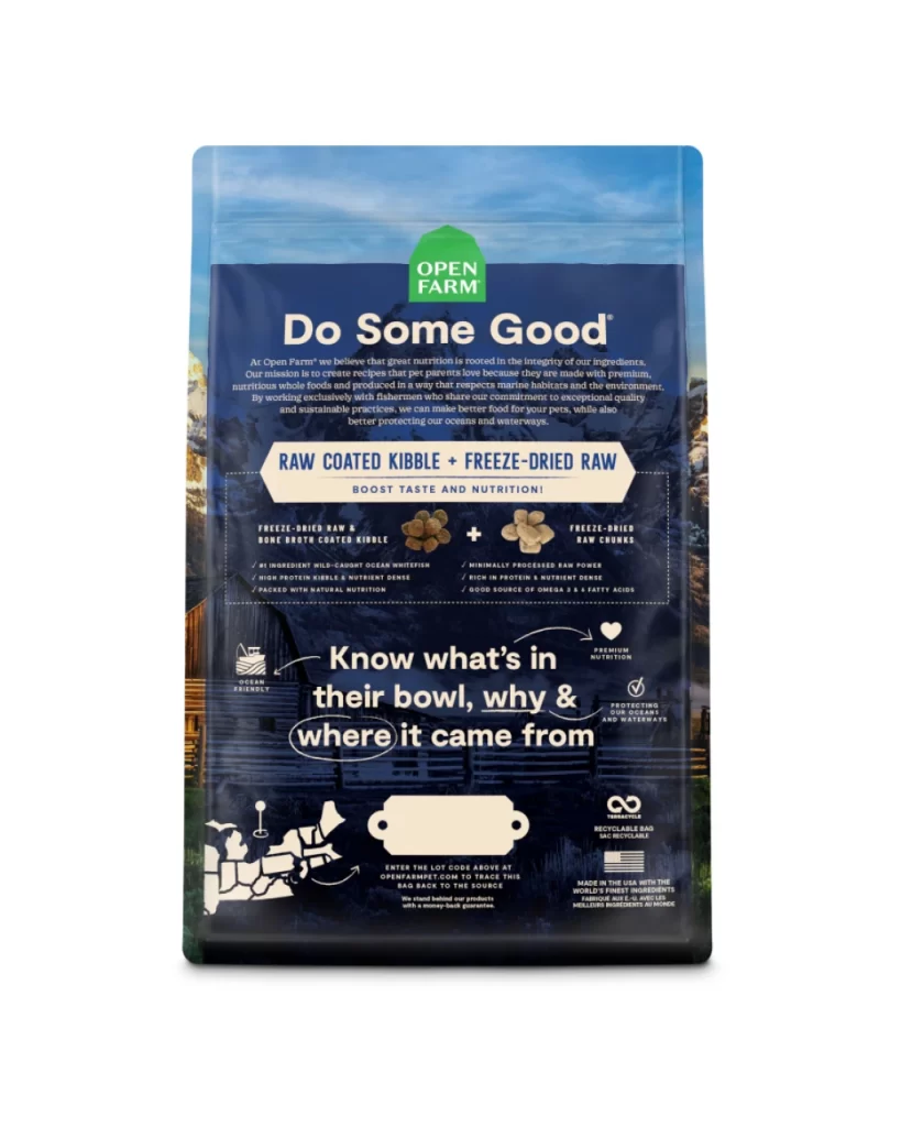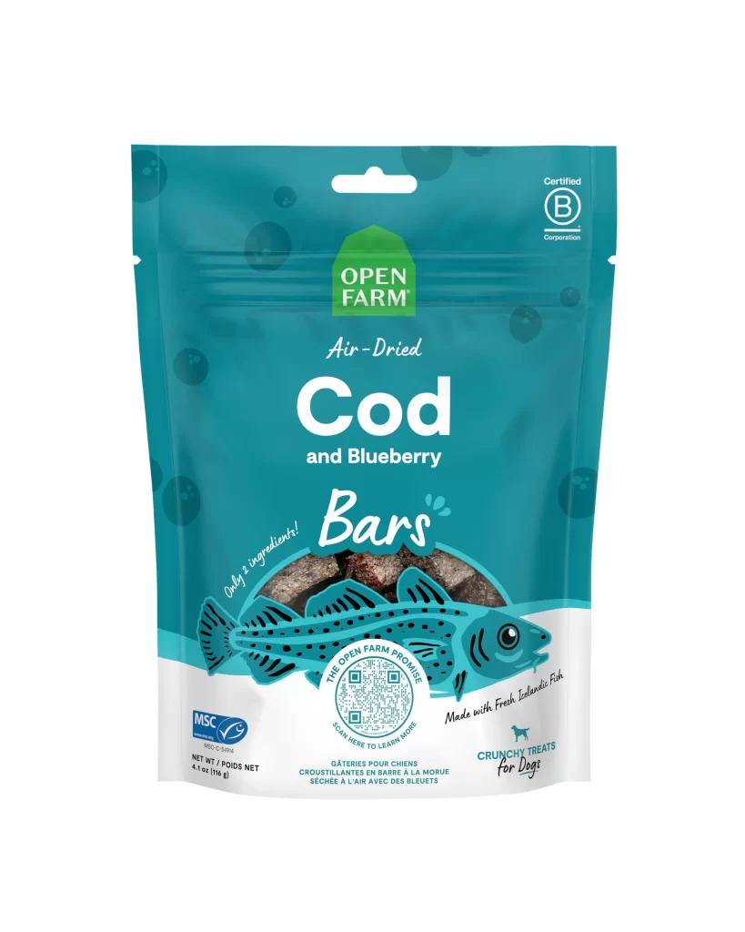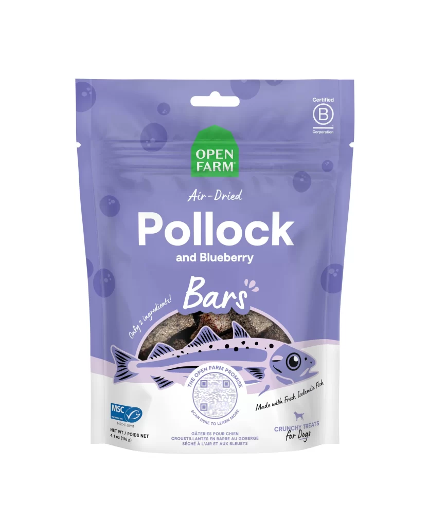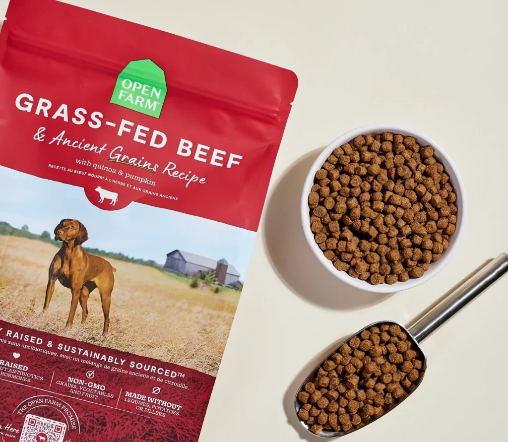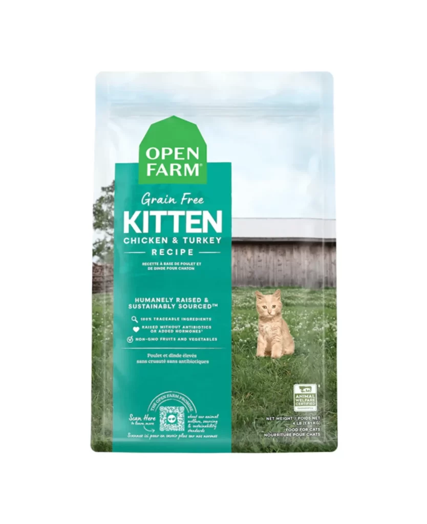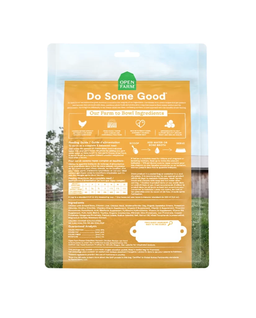
Open Farm Do Some Good orange cat food Packaging
Topics
Details
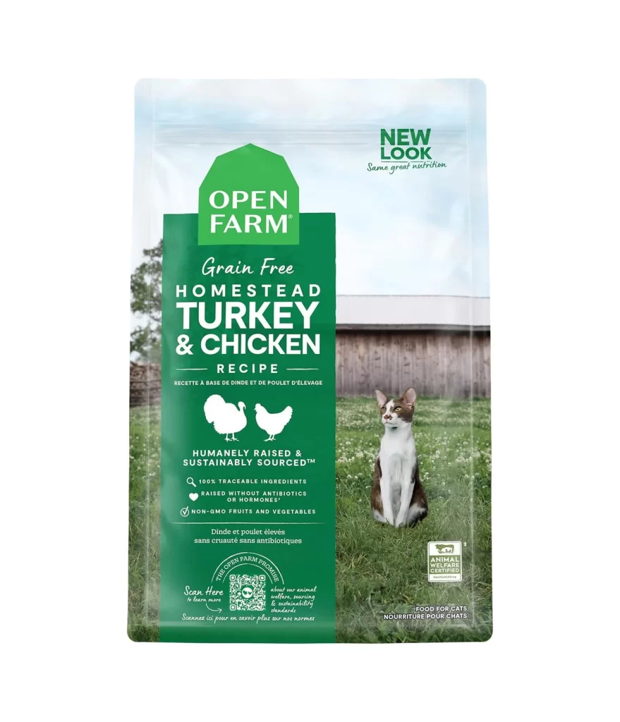
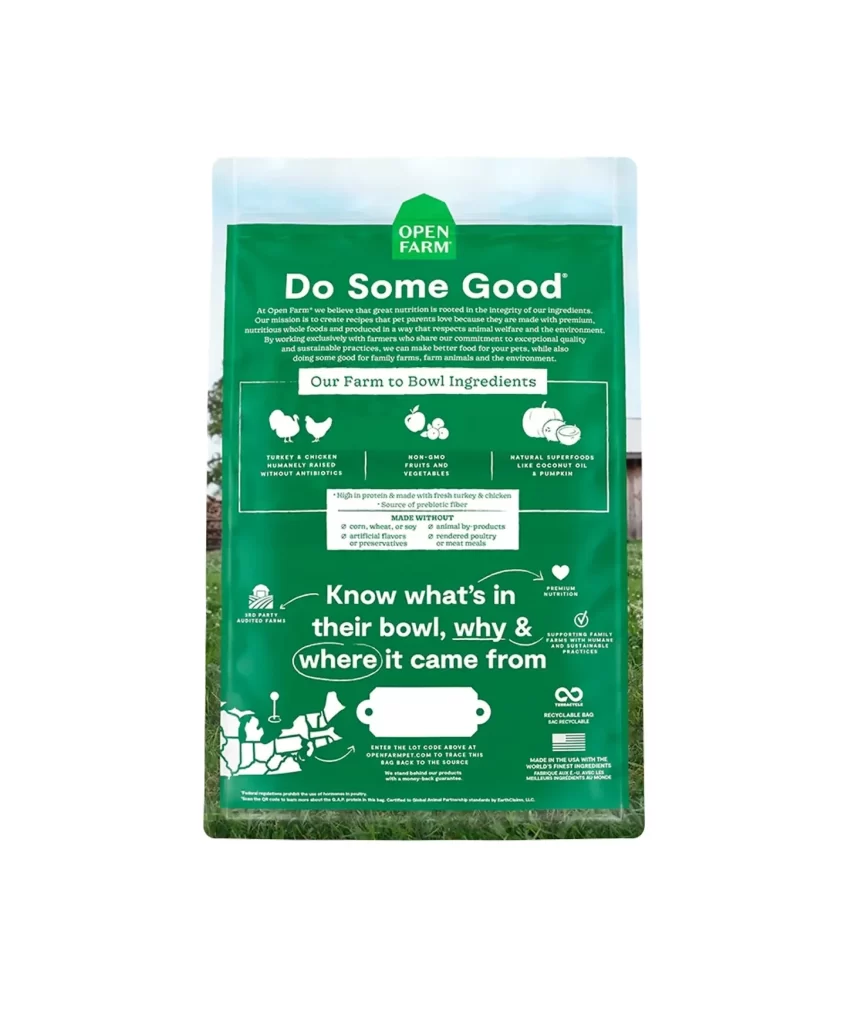
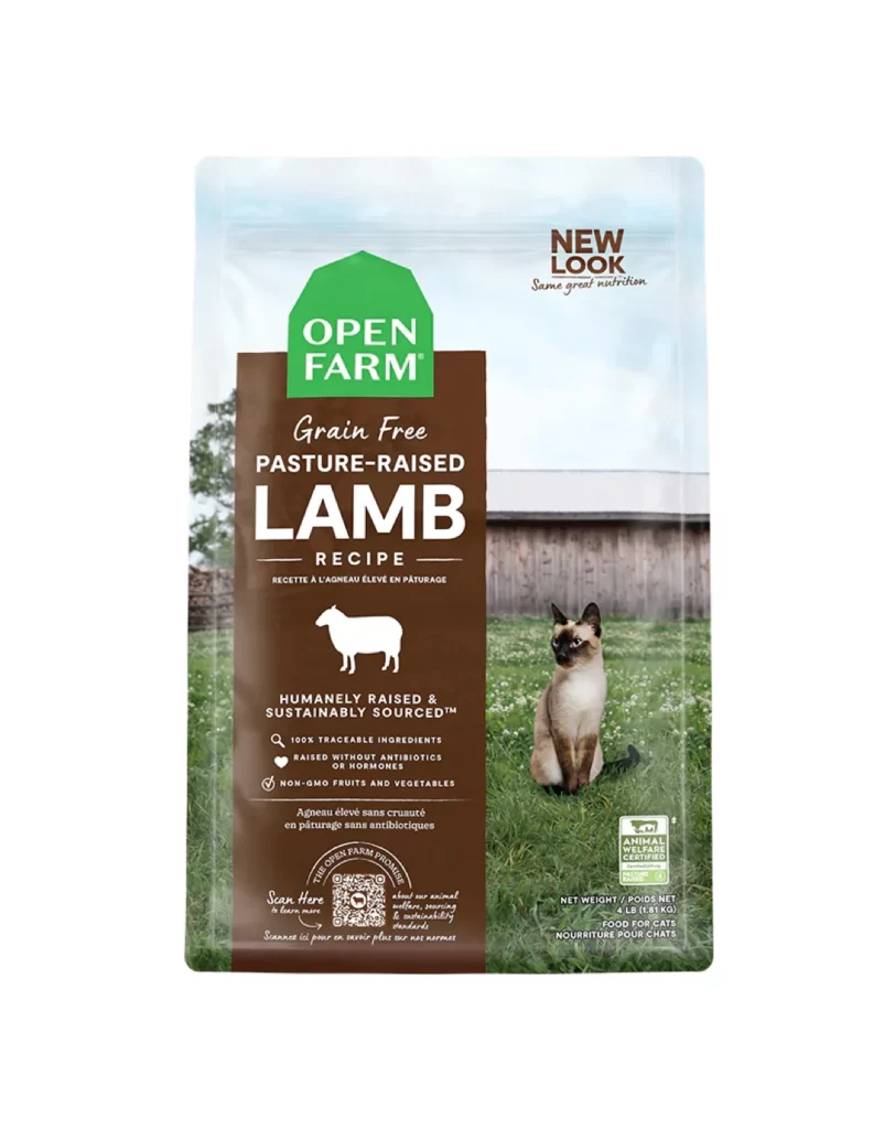
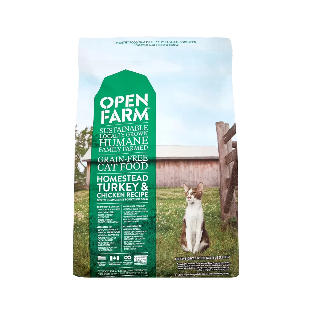
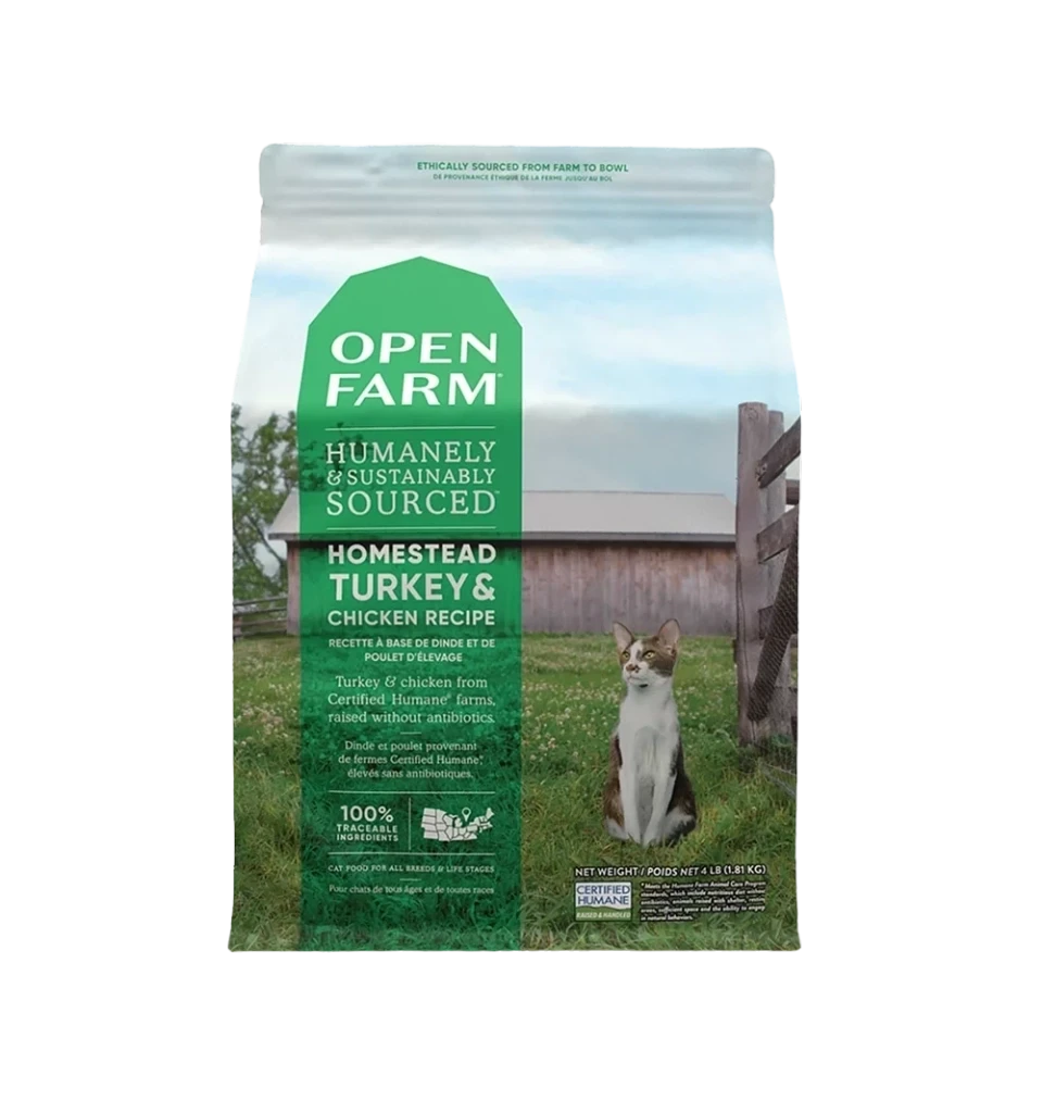
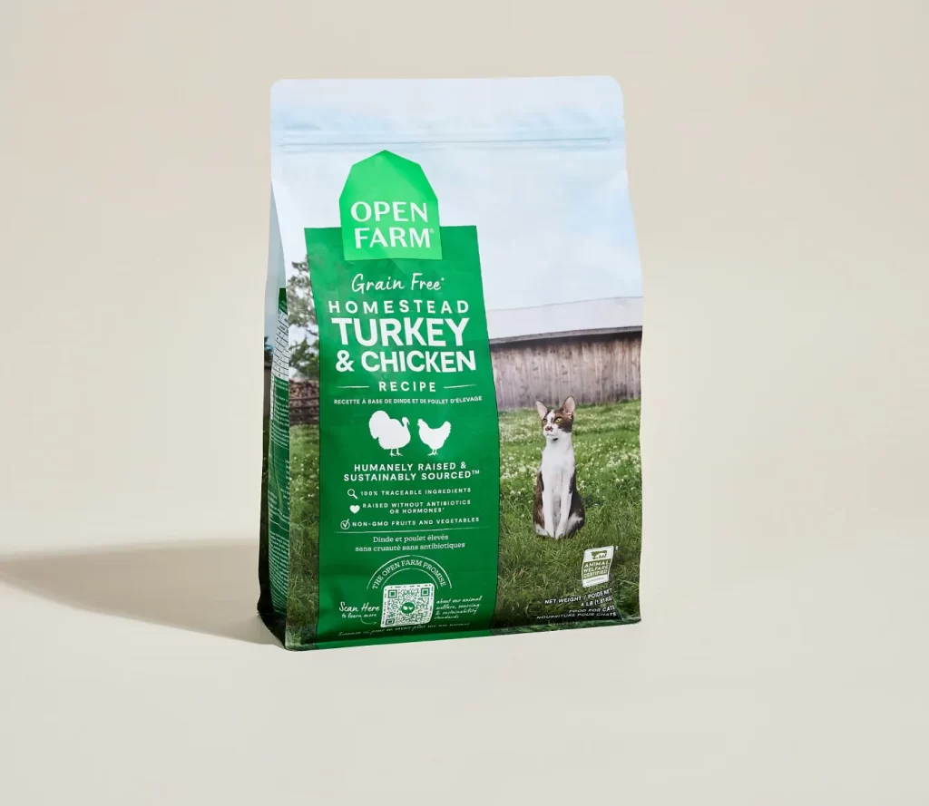
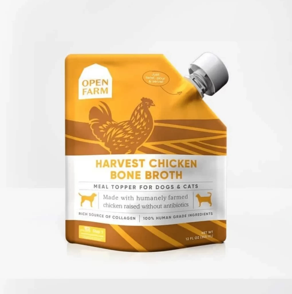
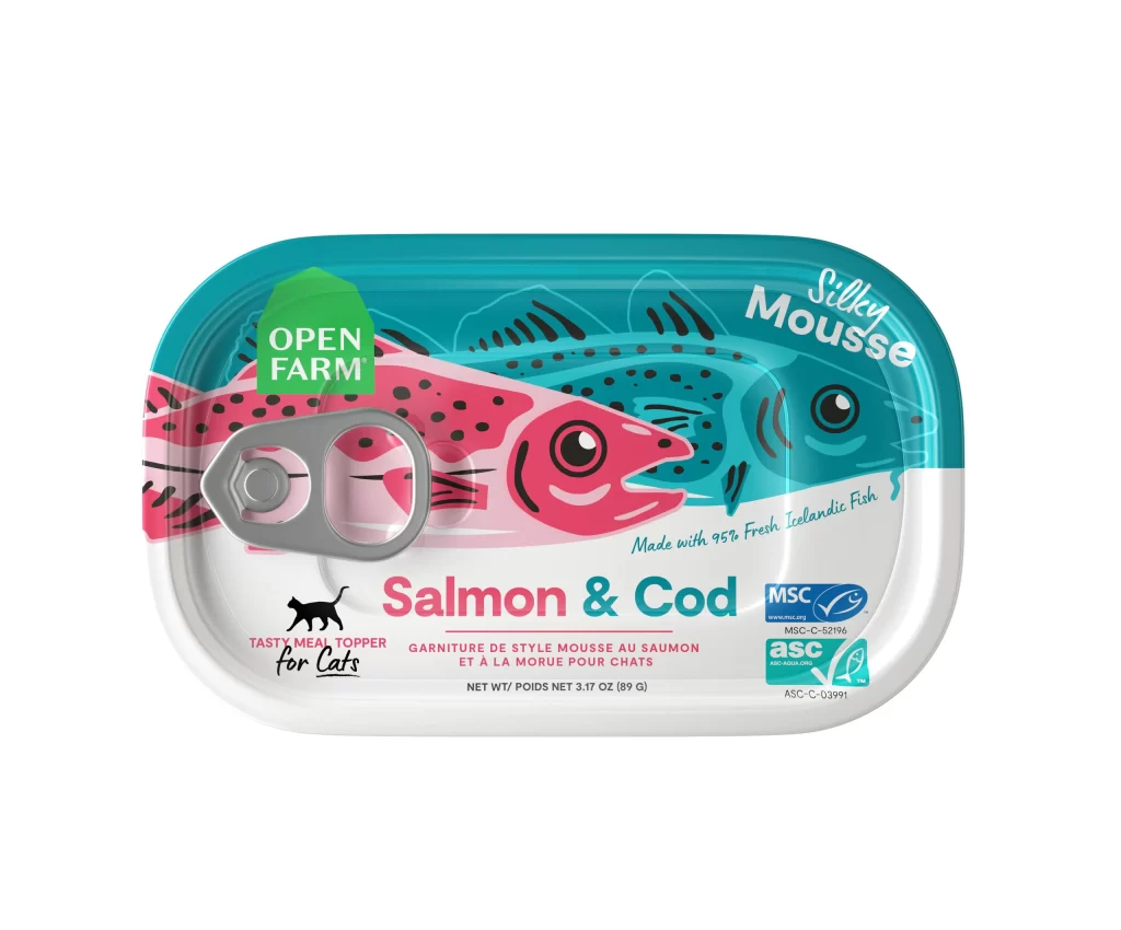
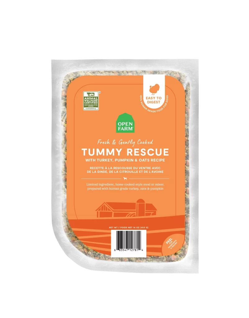
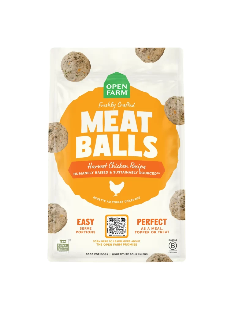
A vibrant orange panel dominates the visual field of this Open Farm Do Some Good cat food packaging, topped by the brand's green house-shaped emblem and the bold white 'Do Some Good' headline. The straight-on camera angle captures the flat, glossy surface, which displays a detailed ingredients list and feeding guide beneath the main branding. Soft-focus green grass and a wooden barn appear only at the edges of the composition as a subtle pastoral backdrop.
High-contrast white typography against the saturated amber background creates immediate readability for consumers scanning nutritional information. Four distinct icons illustrating humane sourcing and ingredient quality are arranged in a horizontal row, breaking up dense text blocks with simple visual shorthand. The inclusion of a bilingual feeding guide alongside a specific preparation diagram adds functional complexity that distinguishes this from standard label layouts.
Brand managers analyzing competitor packaging strategies can study how this layout balances regulatory text with lifestyle imagery. Print production specialists might reference the color separation between the photographic background and the solid ink coverage of the central information zone. Packaging engineers could evaluate the placement of the hang hole relative to the logo hierarchy to optimize shelf presence.