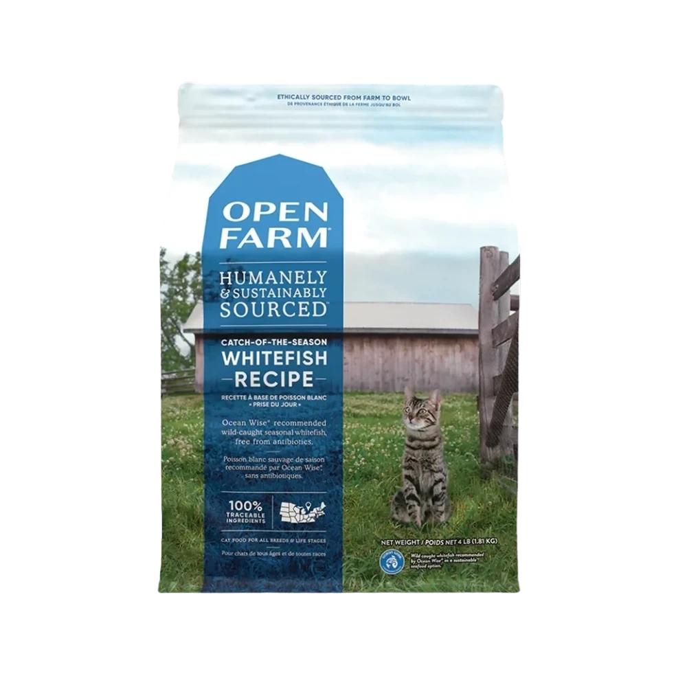
Open Farm Catch of the Season Whitefish Cat Food Packaging
Topics
Details
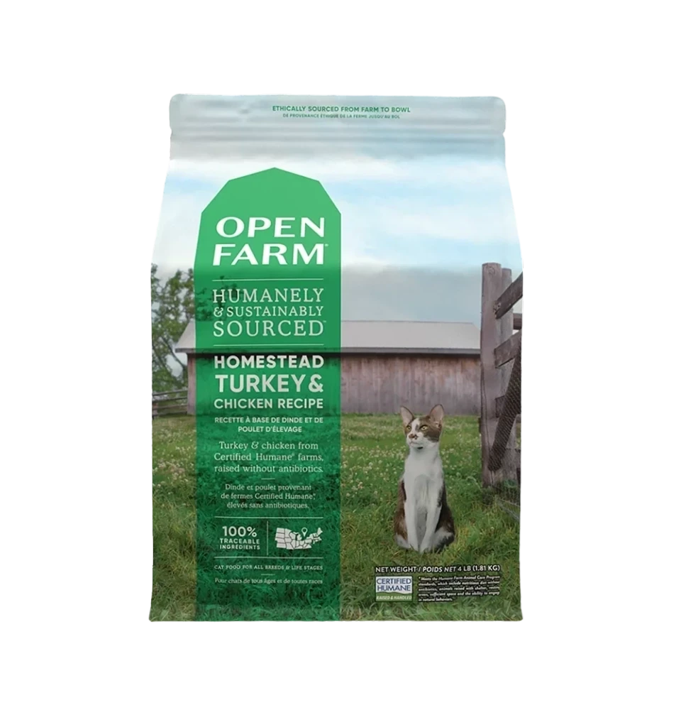
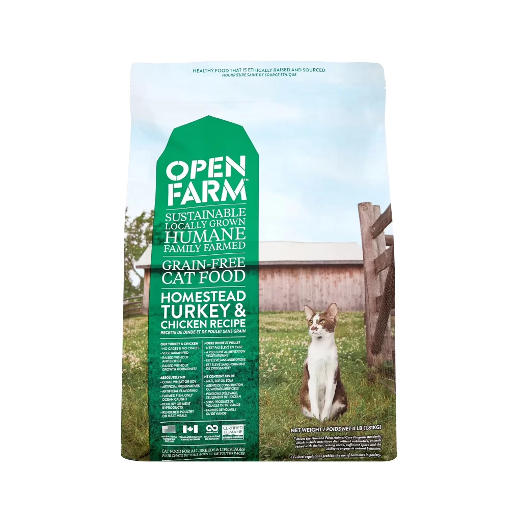
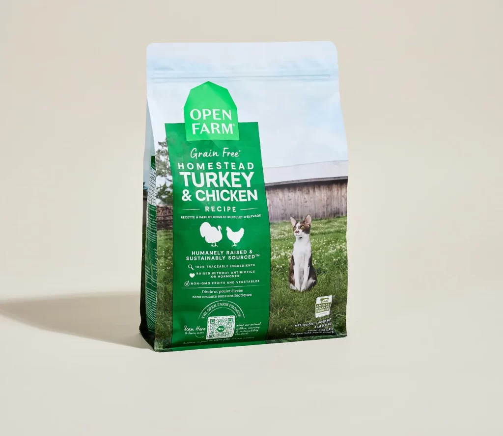
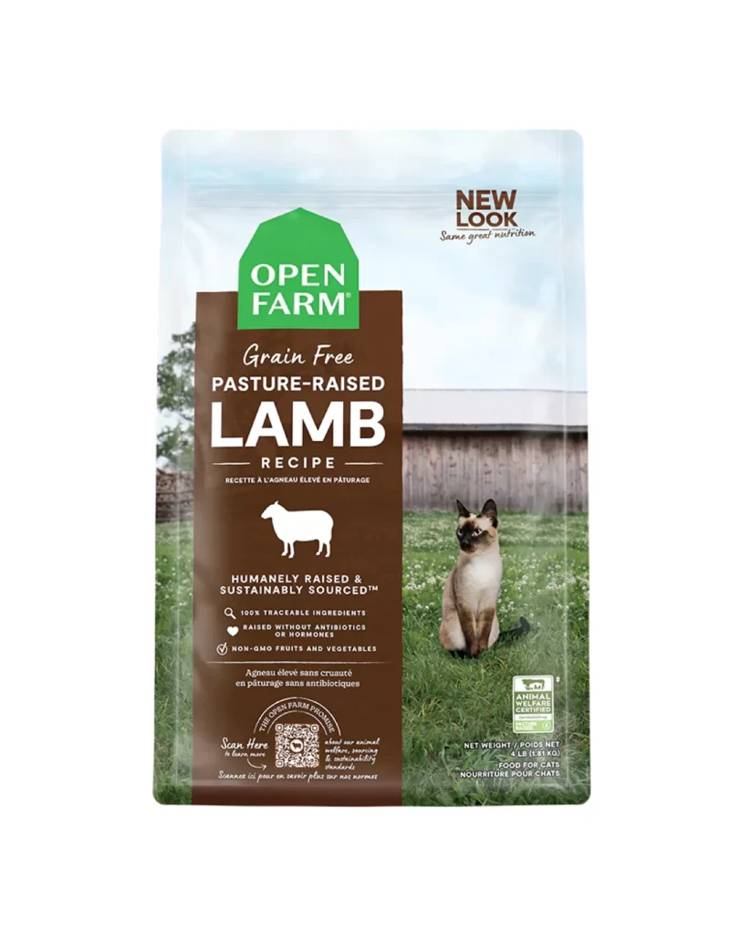
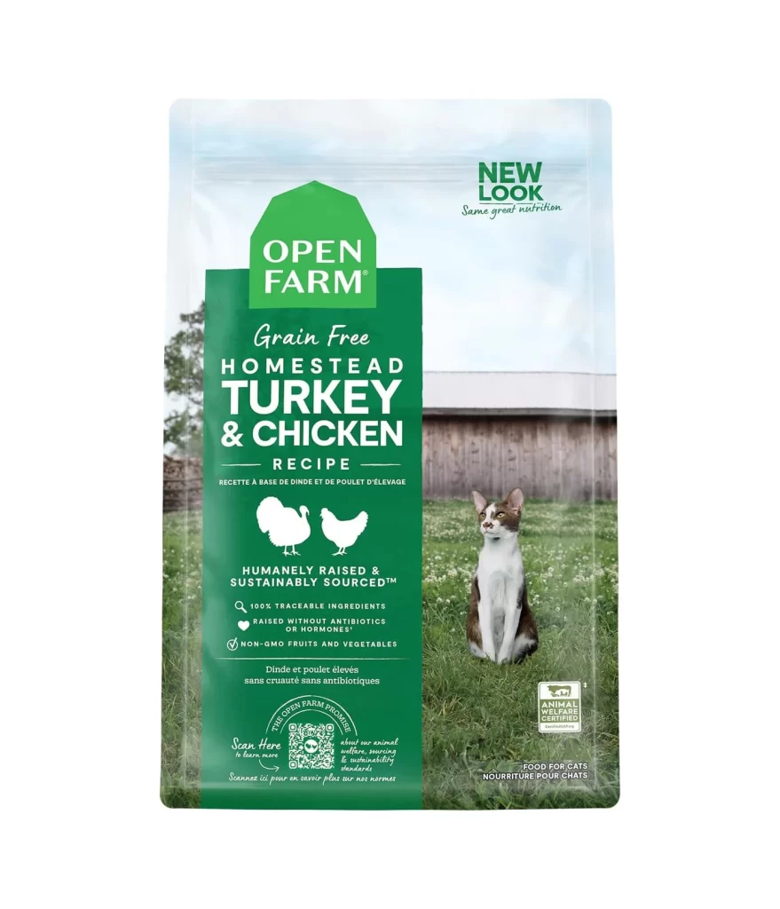
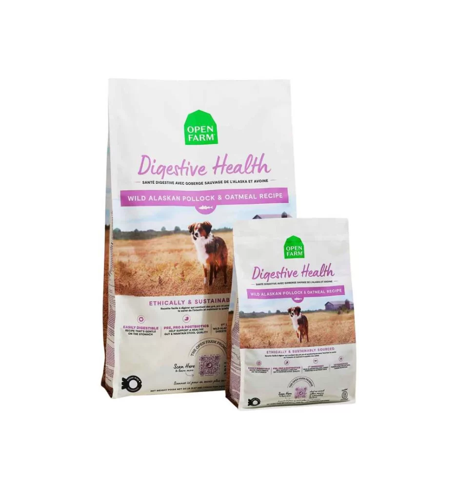
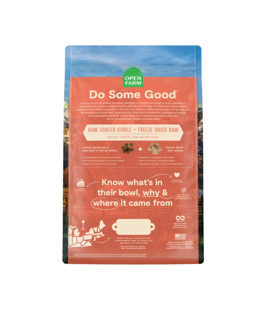
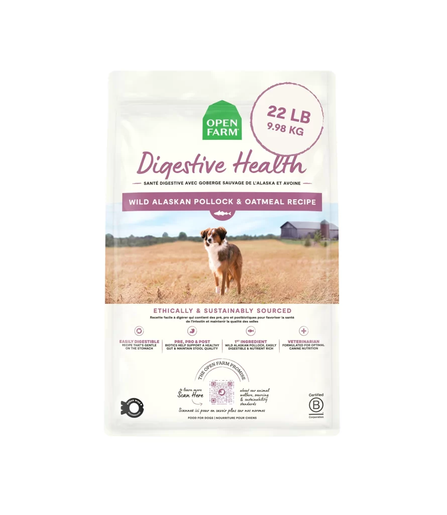
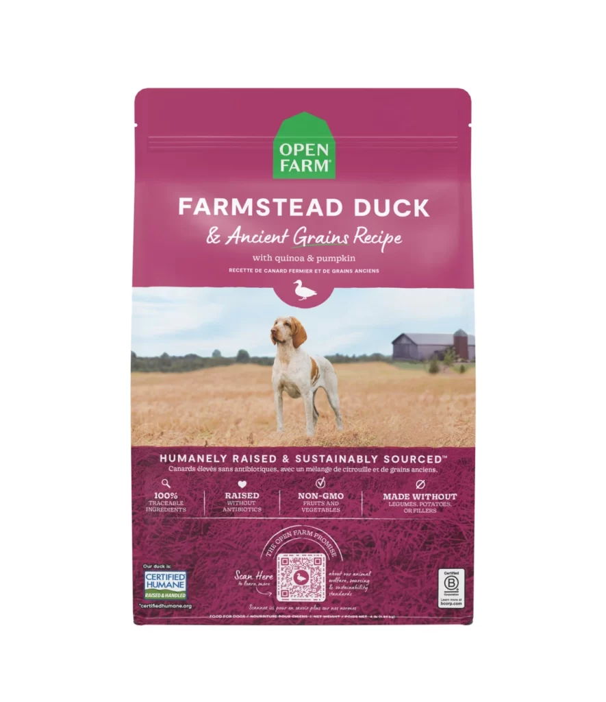
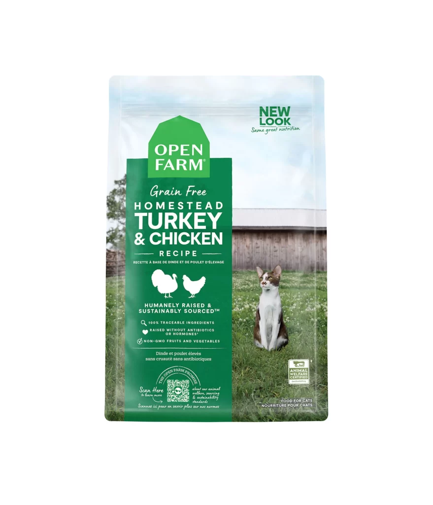
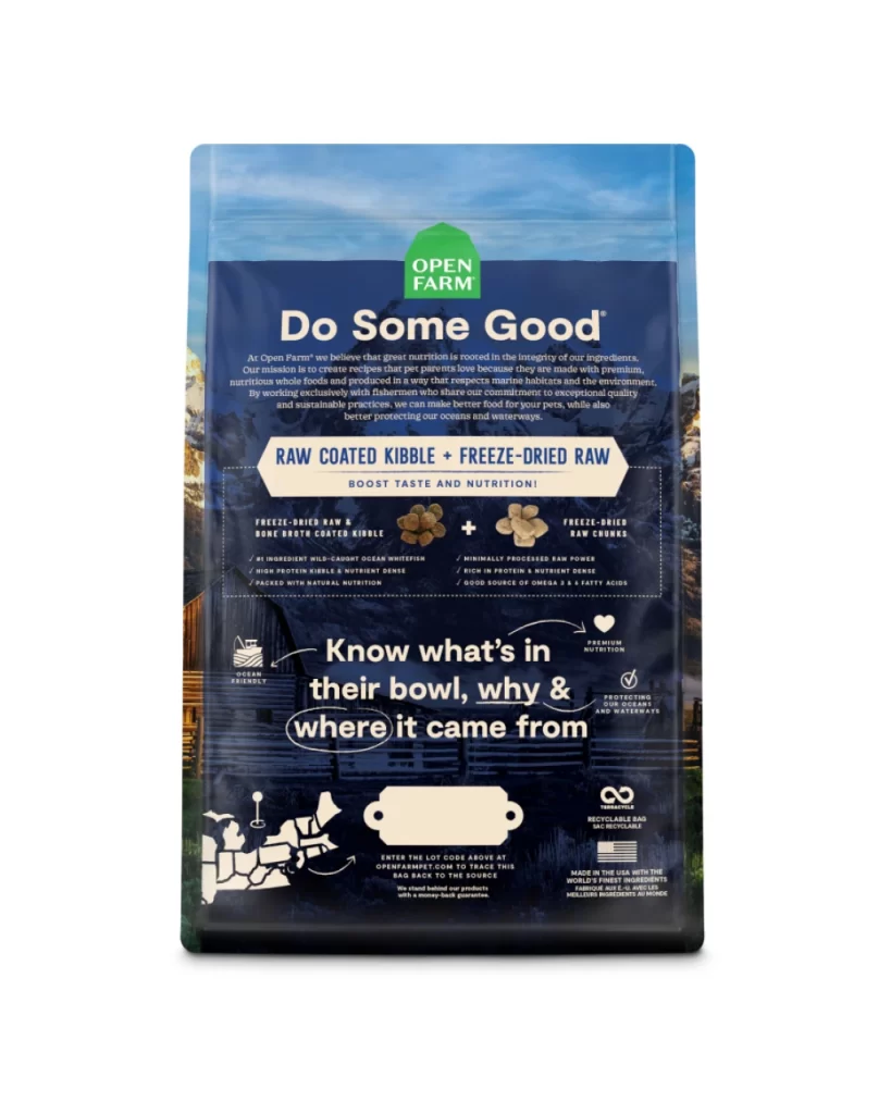
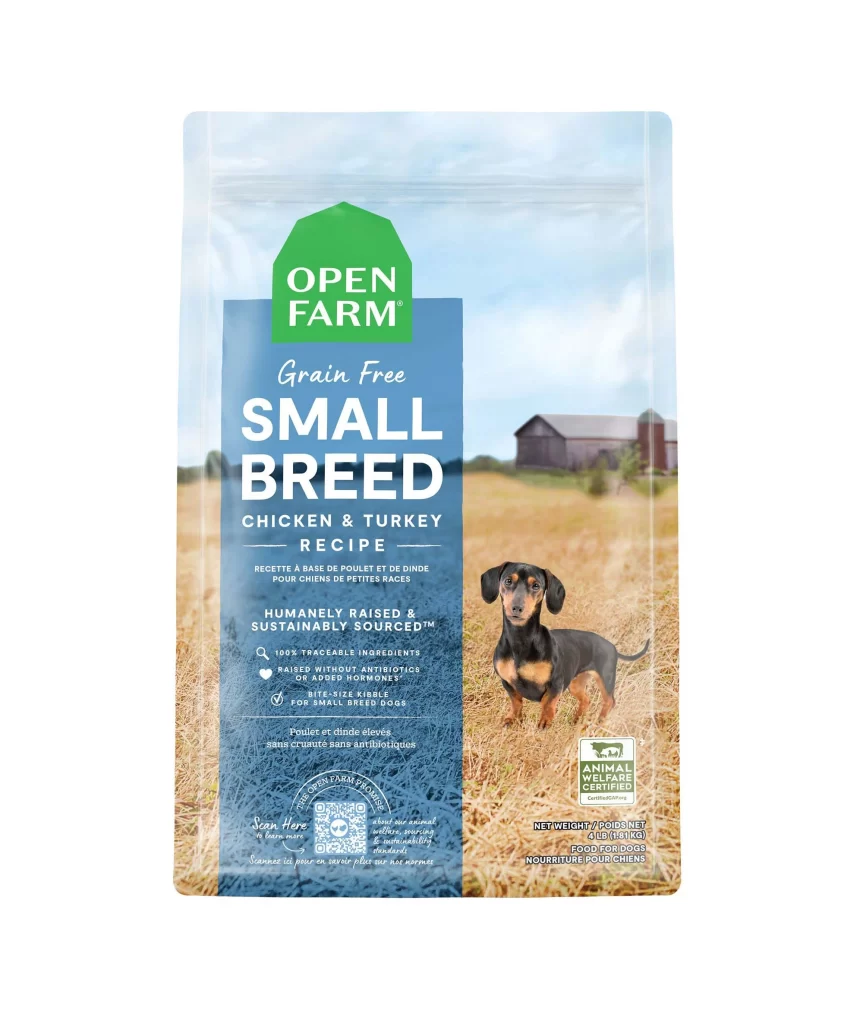
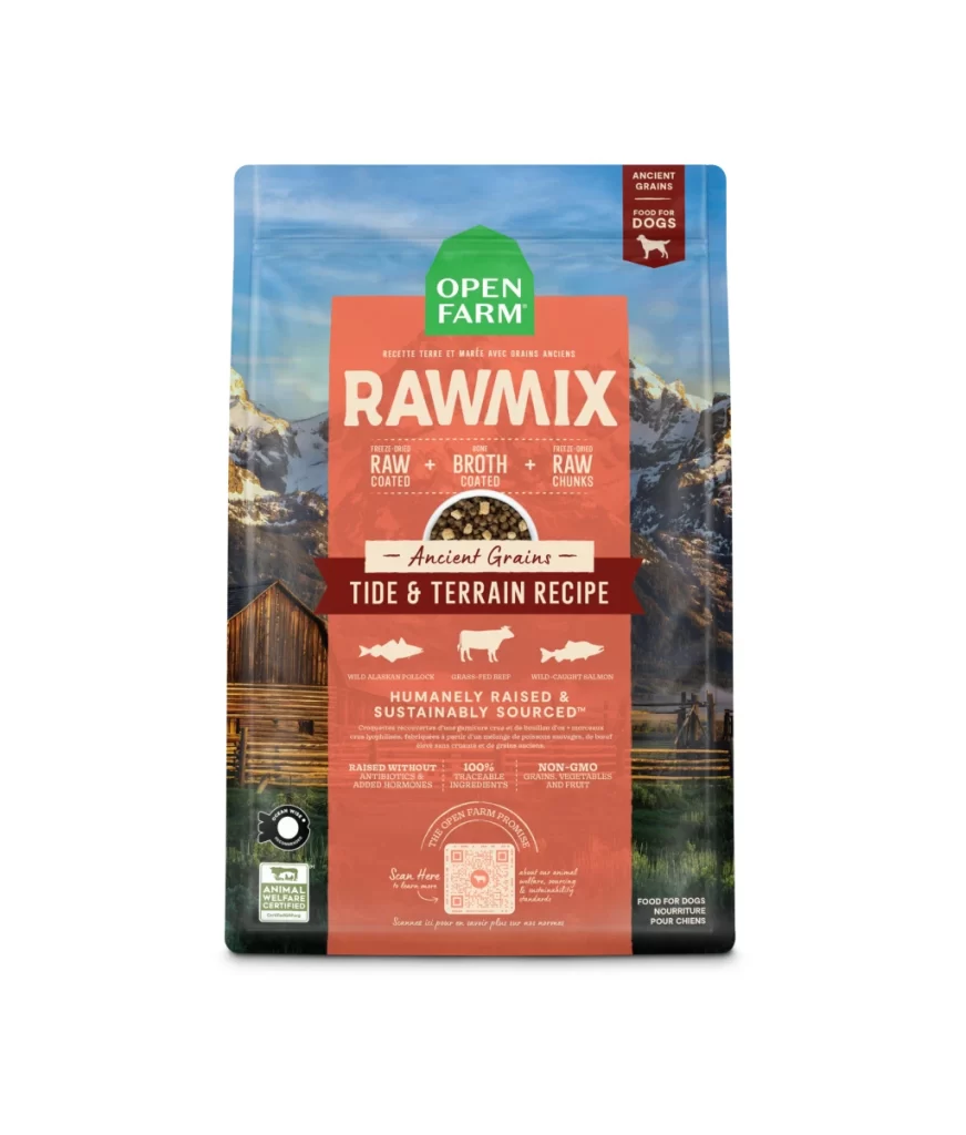
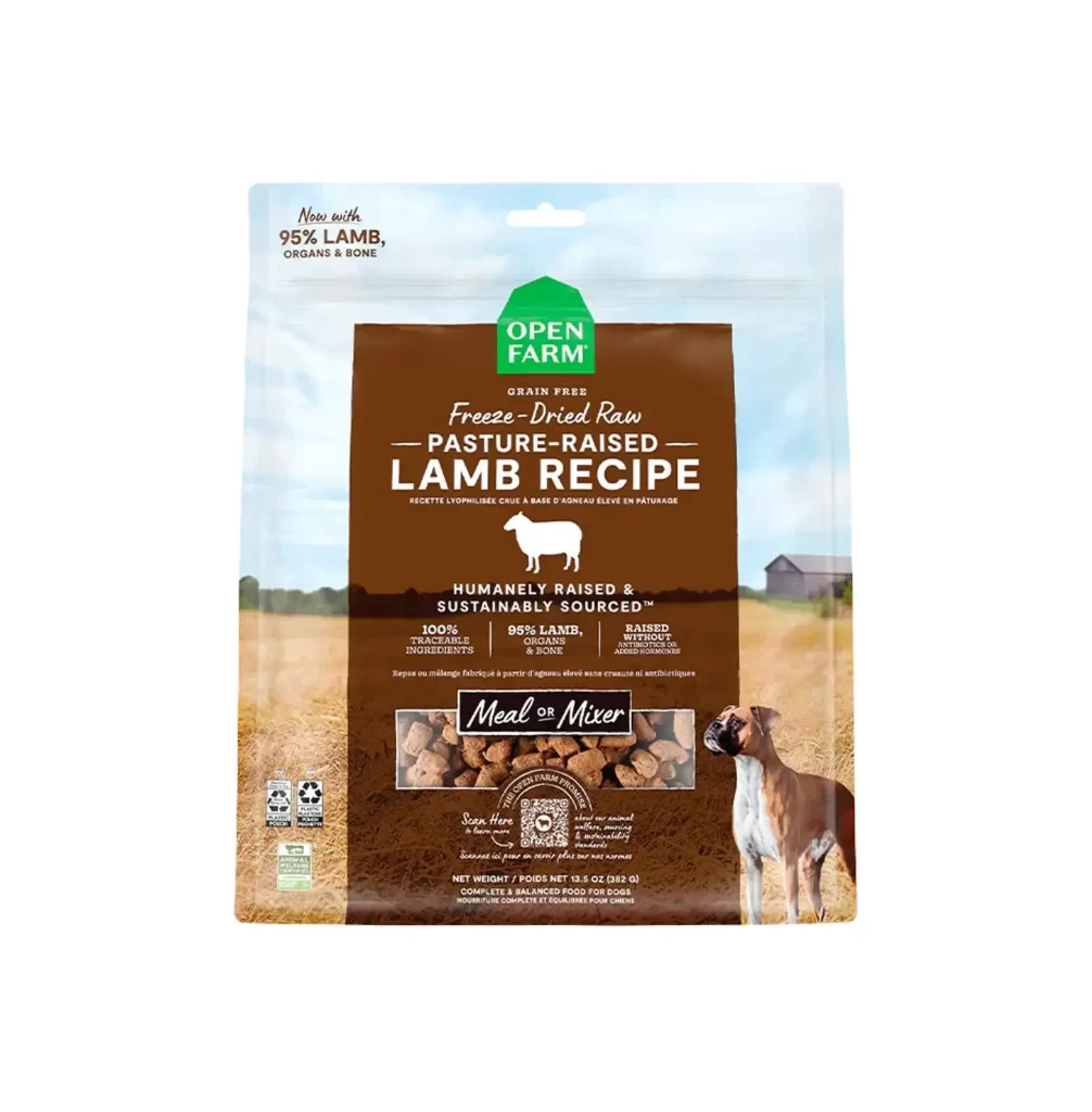
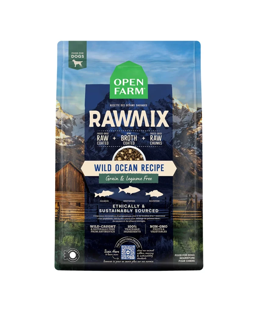
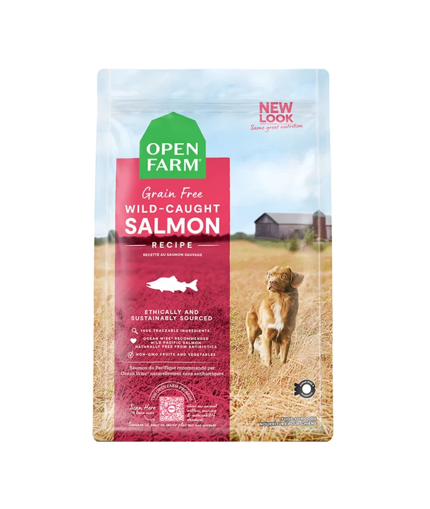
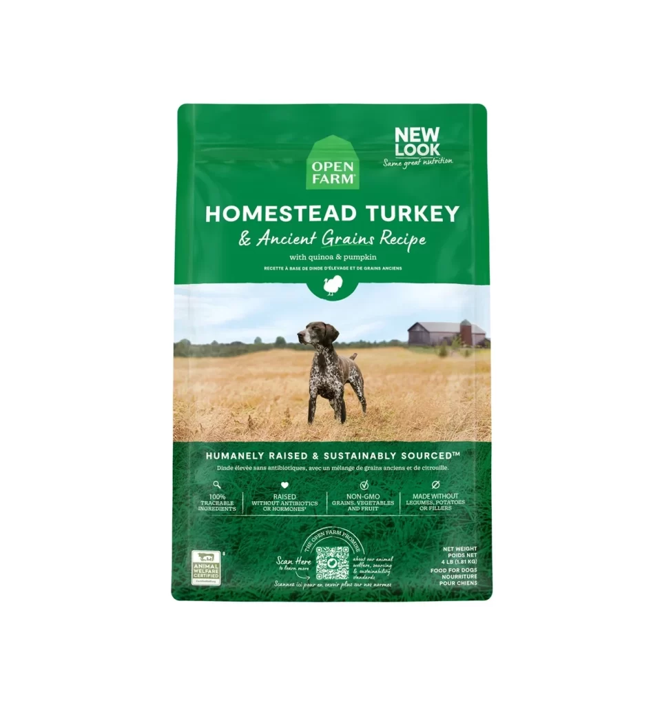
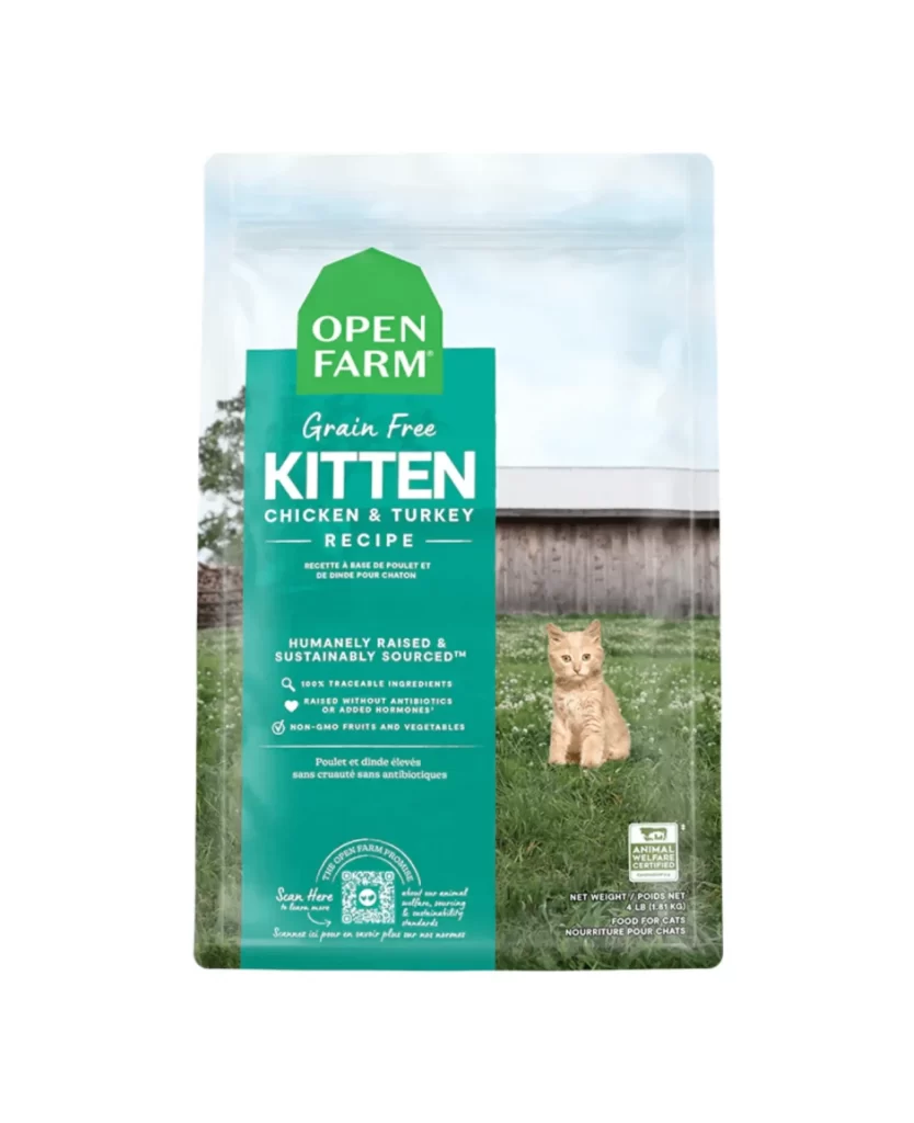
Dominating the center of the composition is a deep navy blue vertical banner with a distinctive peaked roof silhouette, housing the 'OPEN FARM' brand name in bold white sans-serif type. Behind this graphic element, a photographic background depicts a sunlit pastoral scene featuring a tabby cat sitting on green grass, a rustic wooden barn, and a weathered fence post under a pale blue sky. The packaging surface appears to be a matte, flexible film material, with the net weight of 4 LB (1.81 KG) printed in small text at the bottom right corner alongside a circular certification seal.
Visual hierarchy is established through the stark contrast between the saturated blue overlay and the naturalistic, high-key photography of the farm setting. By integrating the product's ethical sourcing claims—such as 'Humanely & Sustainably Sourced' and '100% Traceable Ingredients'—directly into the main color block, the layout ensures that sustainability messaging is as prominent as the flavor profile. This approach merges corporate responsibility with aesthetic appeal, using the barn-shaped geometry to subtly reinforce the agricultural narrative without relying on excessive iconography.
Brand strategists analyzing premium pet food markets would utilize this visual to study how transparency claims are integrated into primary packaging real estate. Packaging engineers could examine the balance between large-format typography and lifestyle photography to understand consumer engagement in the specialty grocery sector. Furthermore, art directors working on eco-conscious product lines might reference this specific layout to see how 'farm-to-bowl' narratives are translated into physical shelf presence through color blocking and spatial arrangement.