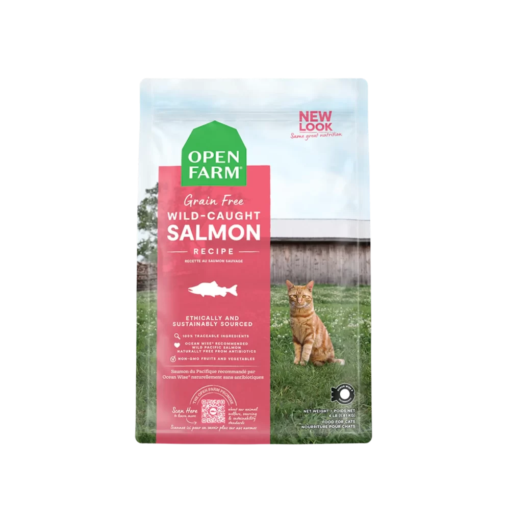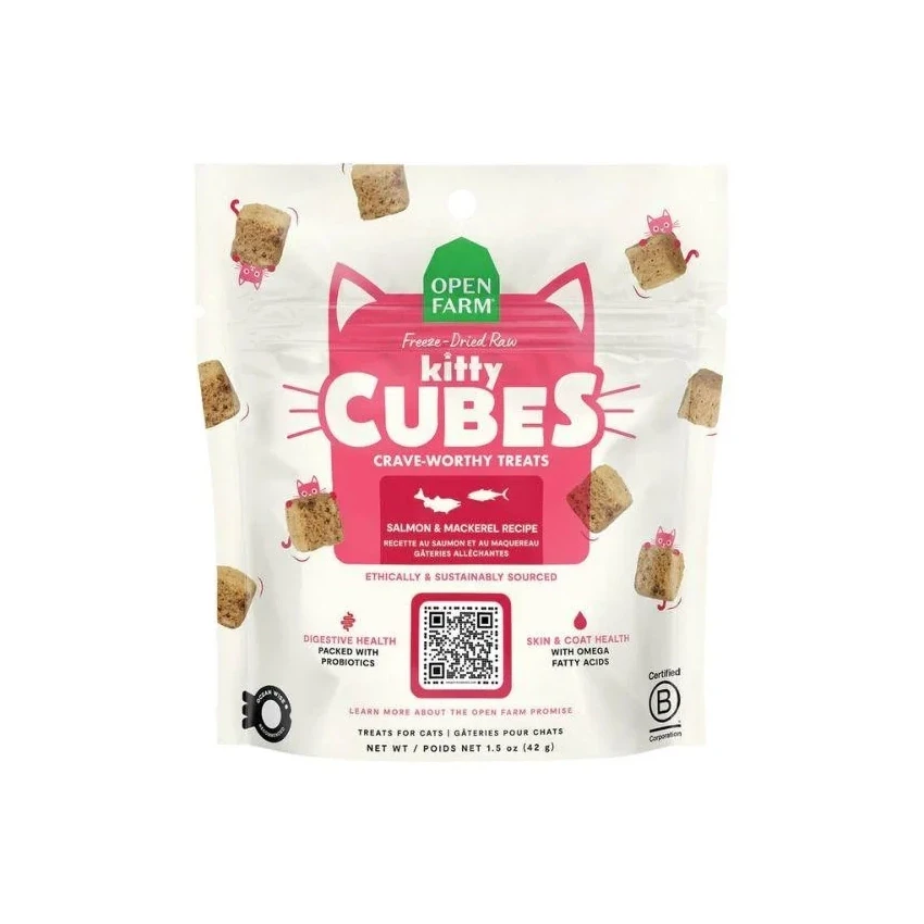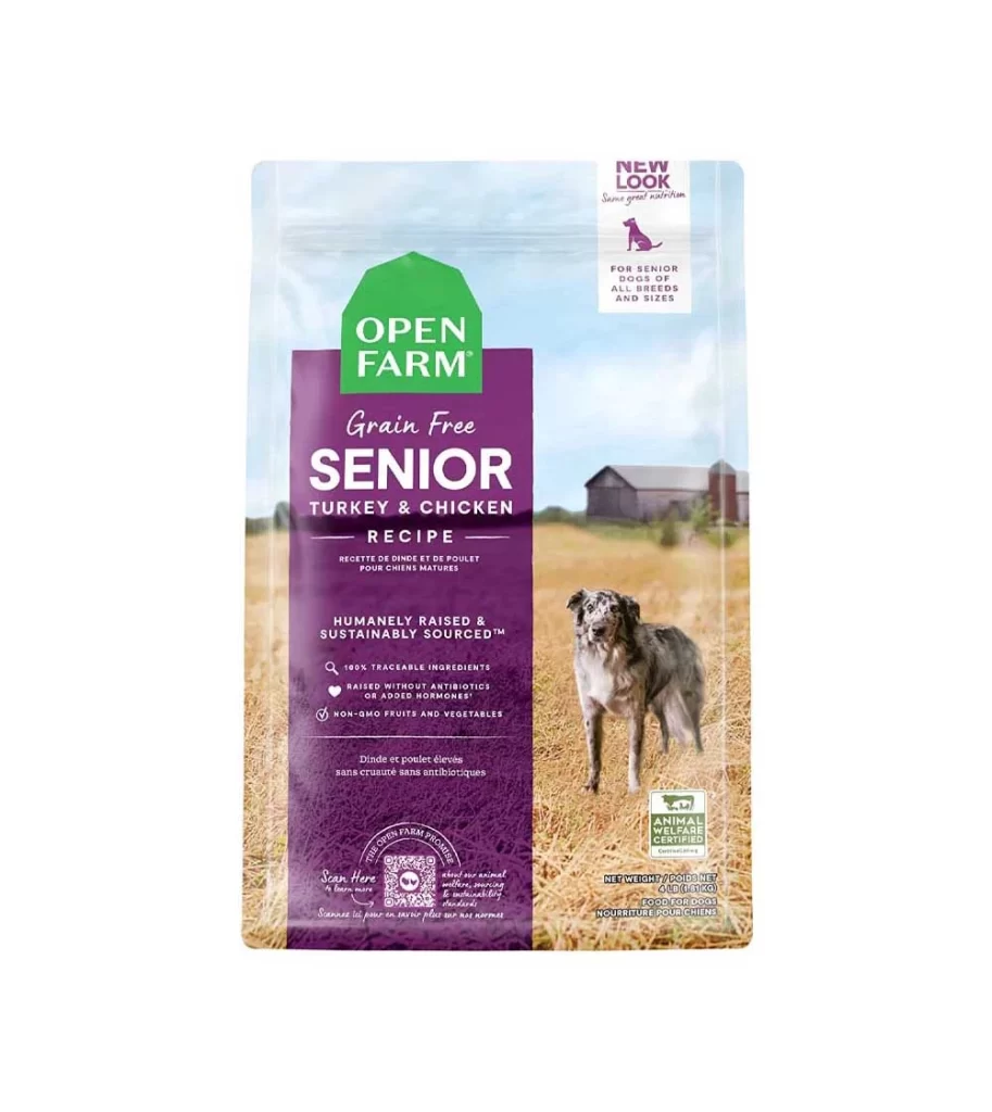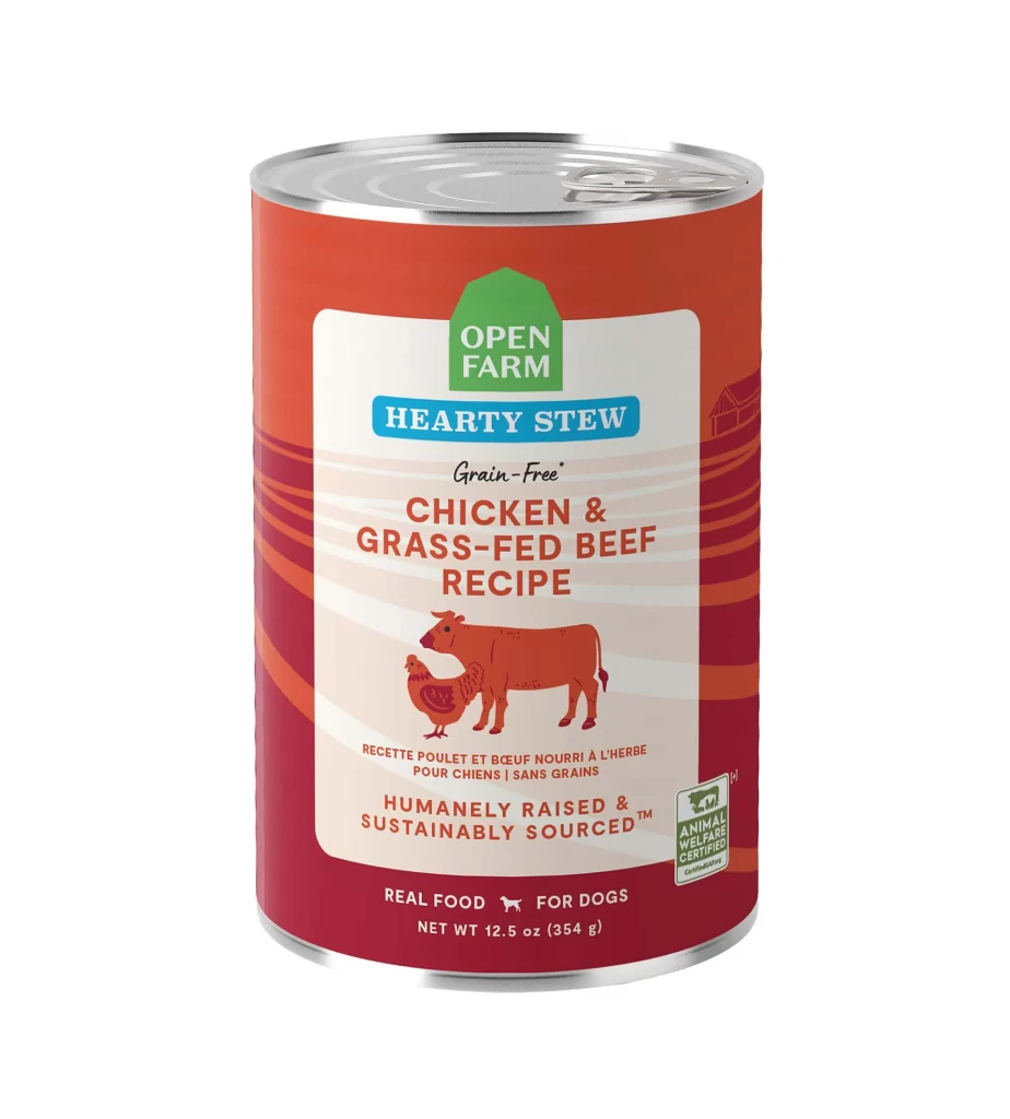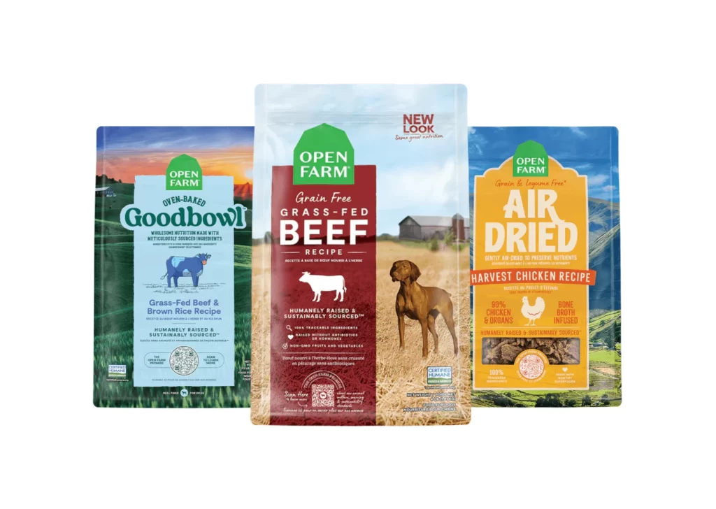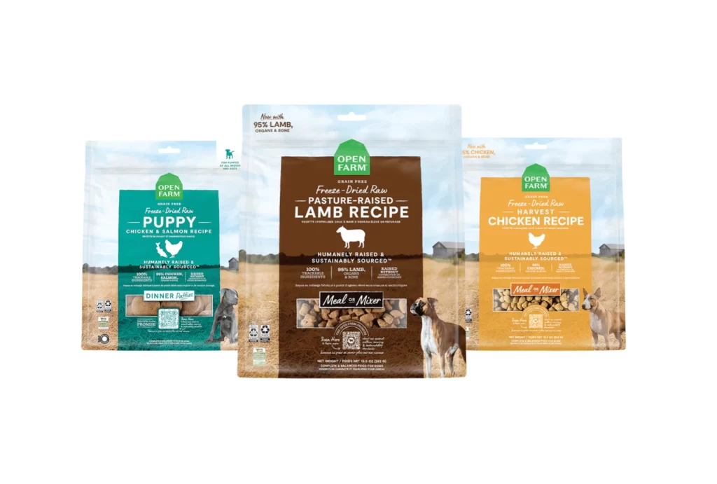
Open Farm Do Some Good Cat Food Packaging
Topics
Details
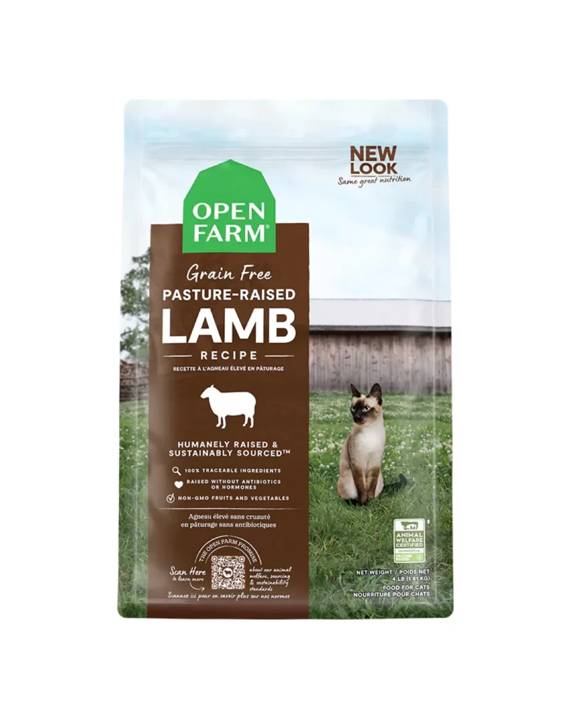
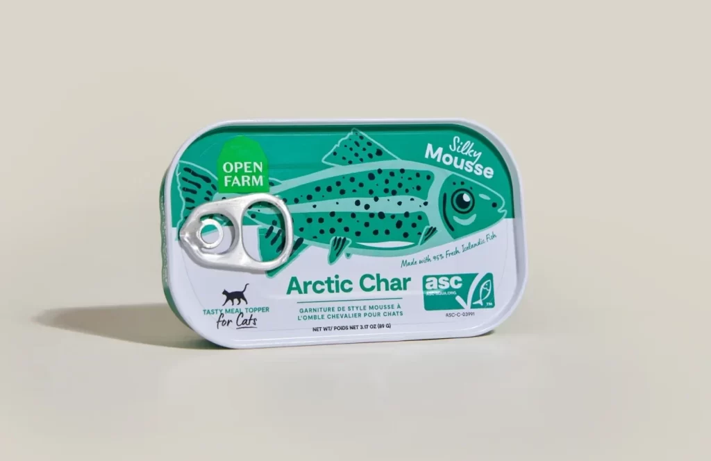
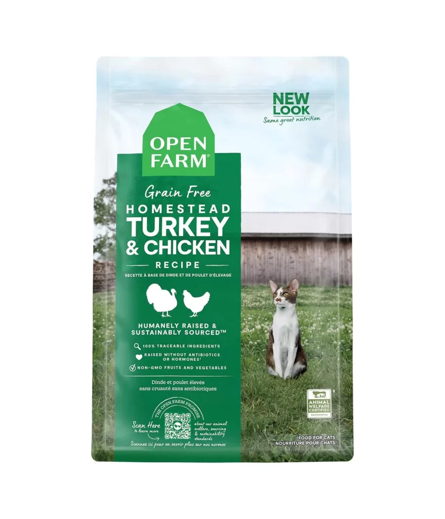
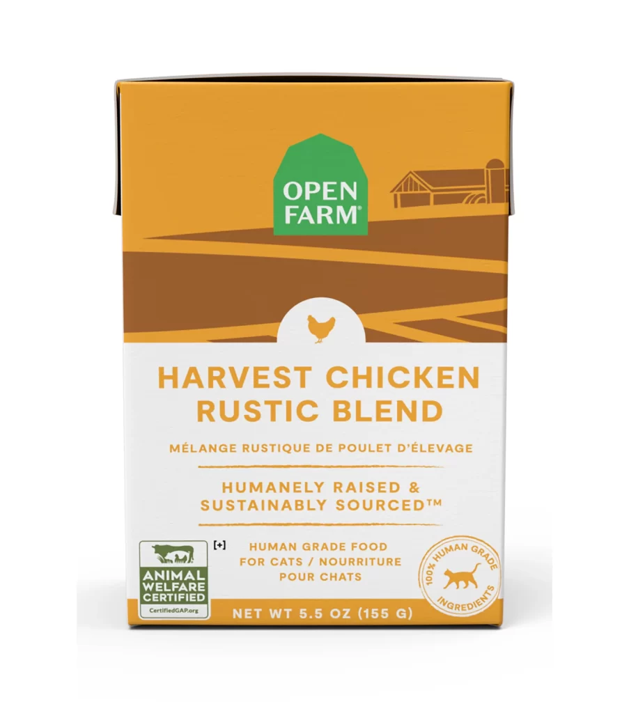
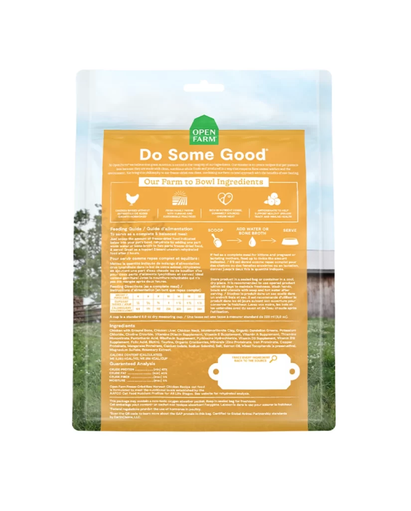
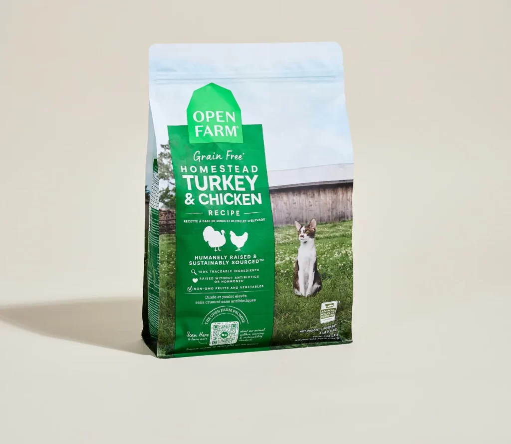
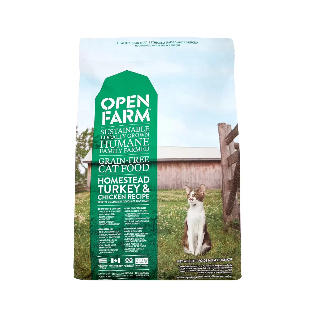
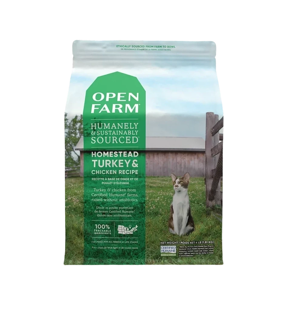
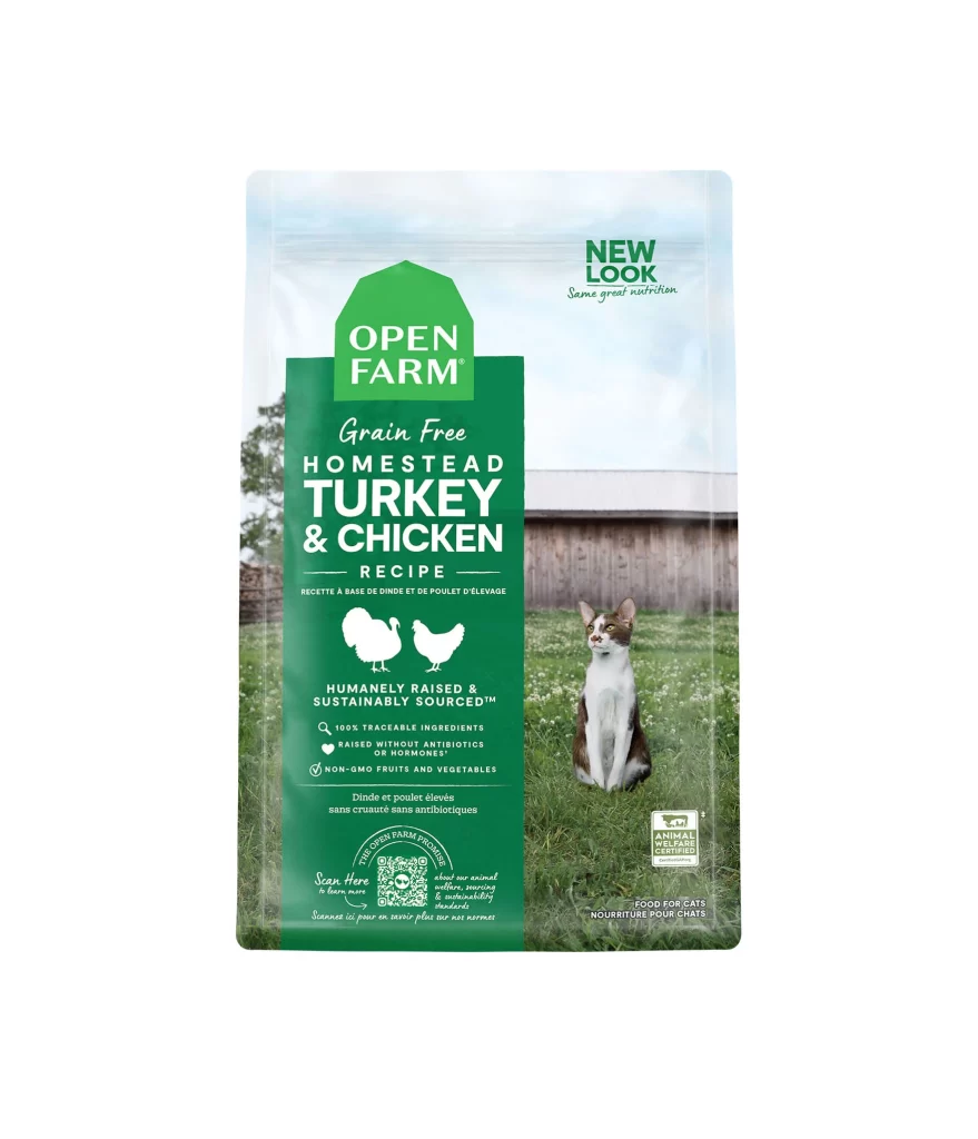
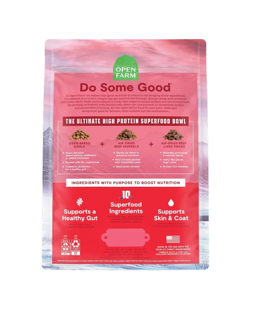
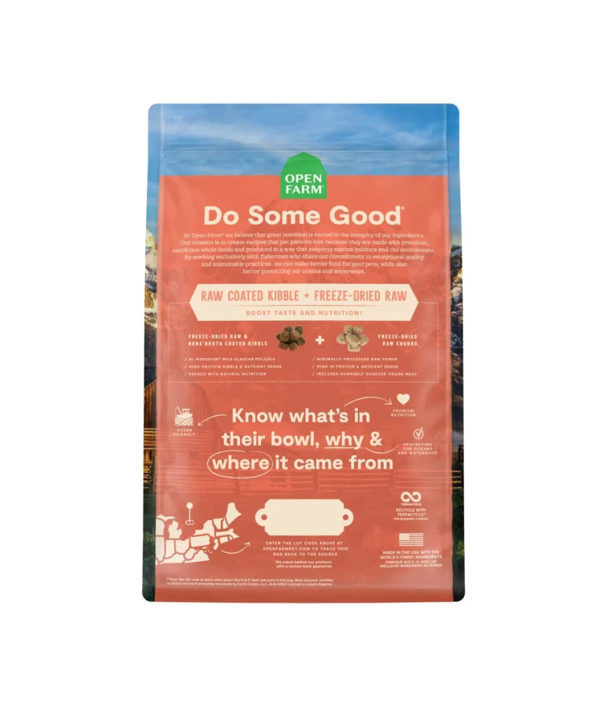
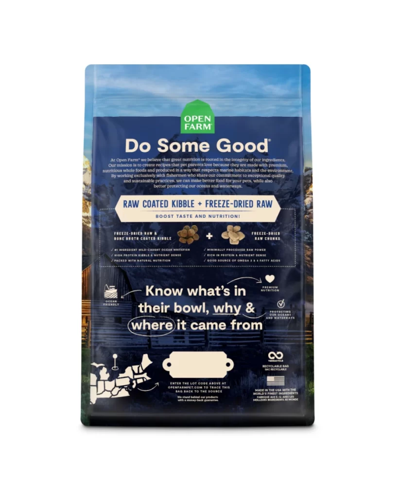
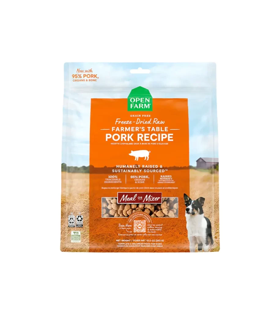
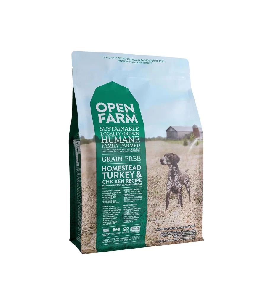
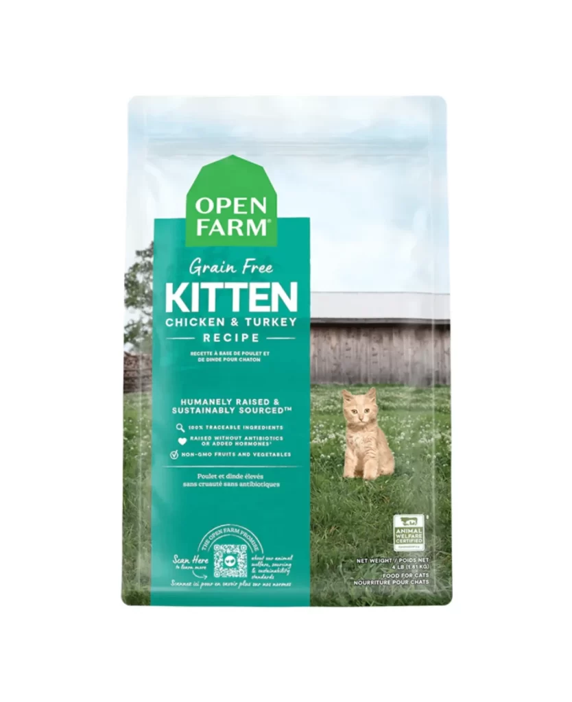
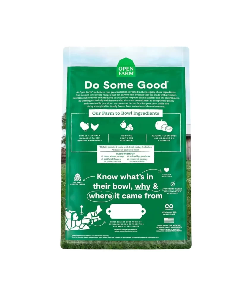
A vibrant emerald green dominates the surface of this Open Farm pet food package, set against a soft-focus pastoral backdrop of grass and sky. The composition centers on the bold white typography of the 'Do Some Good' slogan, which sits beneath a house-shaped logo containing the brand name. Below the mission statement, a structured grid displays white line-art icons representing turkey, chicken, fruit, and pumpkin, while the lower portion features a map of the United States and various certification badges arranged in a clean, hierarchical layout.
Visual interest is generated through the disciplined use of negative space and a strictly monochromatic green-and-white palette that evokes organic freshness. The typographic hierarchy skillfully guides the eye from the emotional headline down to the functional 'Farm to Bowl' ingredient breakdown and traceability information. By integrating hand-drawn style iconography with technical data points like lot codes and sourcing maps, the design successfully bridges the gap between artisanal charm and modern transparency requirements.
Brand strategists might analyze this layout to understand how to communicate complex ethical sourcing narratives without cluttering the visual field. Packaging engineers could study the placement of the scannable code area and recyclable bag symbols to optimize their own sustainability messaging. Furthermore, marketing teams developing 'farm-to-table' product lines for human or pet consumption would find this a useful case study in balancing emotional branding with hard nutritional facts.