Open Farm Kitty Cubes Salmon Mackerel Cat Food Packaging
Topics
Details
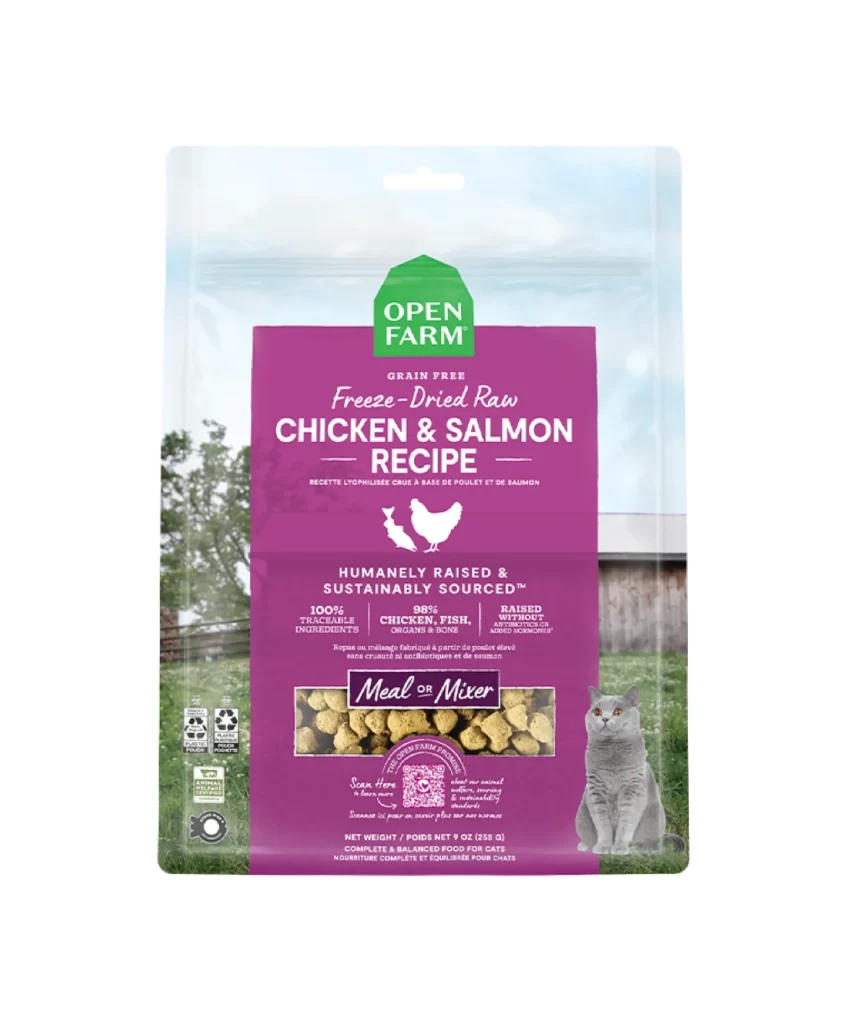
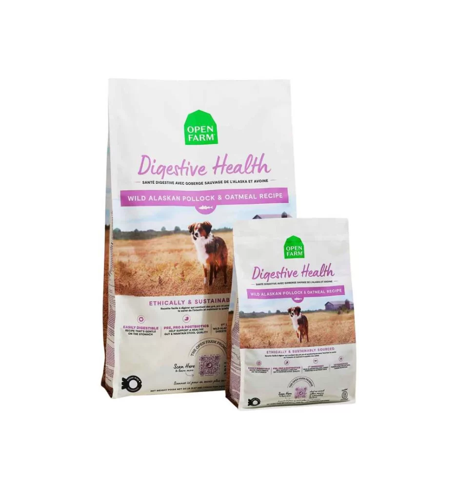
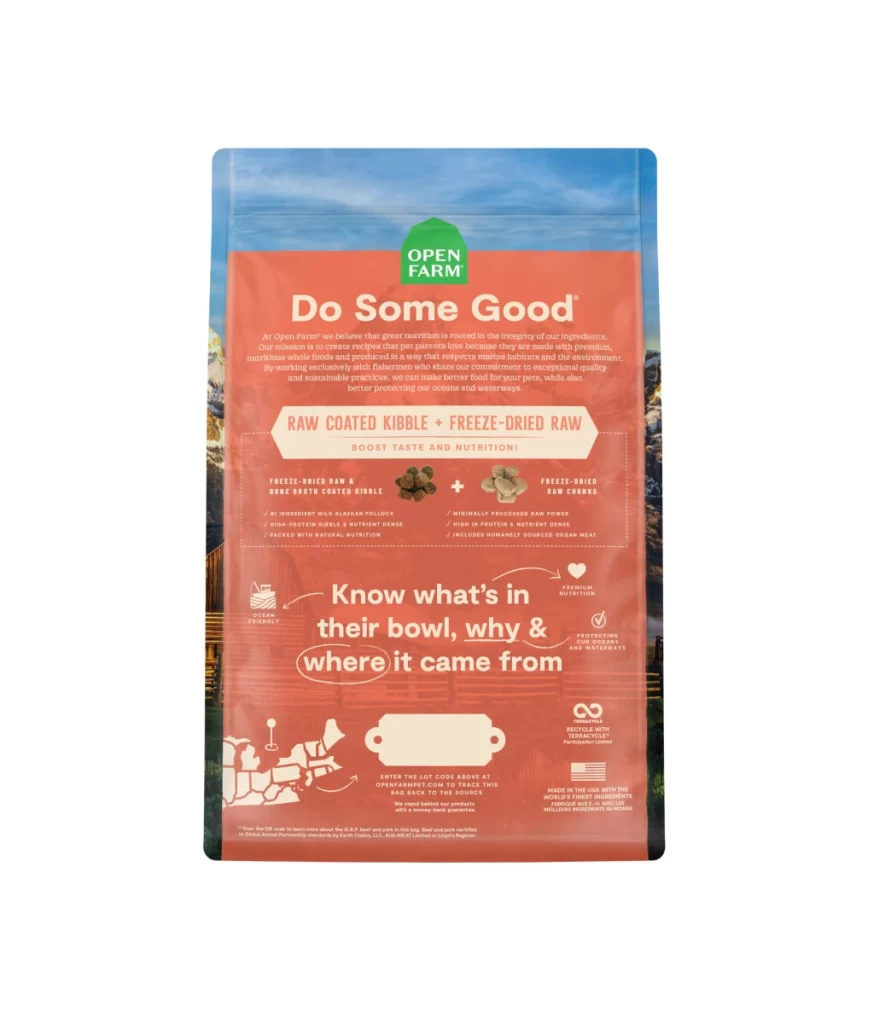
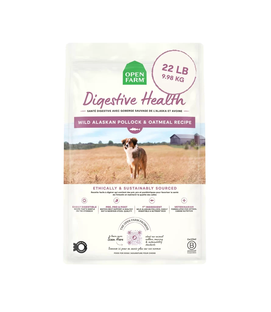
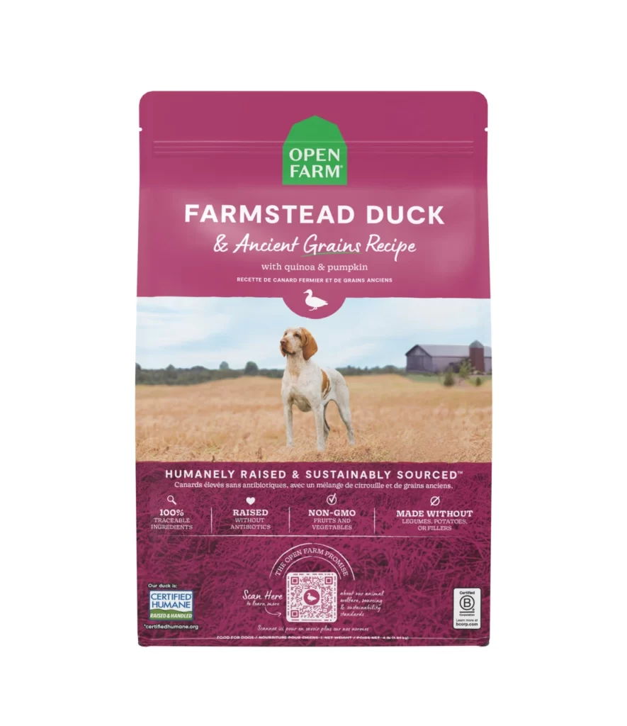
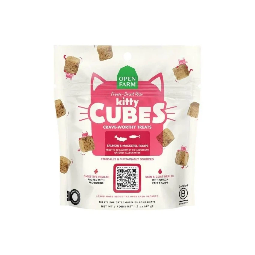
A vibrant pink cat-head label with pointed ears and whisker details dominates the front of the Open Farm Kitty Cubes package, featuring bold white typography for 'kitty CUBES' beneath a green hexagonal logo. Freeze-dried treat cubes and small pink cat icons float playfully around the resealable bag, which rests on a clean white background. A QR code anchors the lower center of the design, flanked by text highlighting digestive health benefits with probiotics and skin and coat support from omega fatty acids.
What makes this packaging stand out is its clever use of negative space combined with bold, playful typography that balances professionalism with pet-friendly charm. The cat-ear silhouette creates instant visual recognition for the feline product category, while the scattered treat imagery gives a tangible sense of the product texture without cluttering the layout. Color psychology works effectively here—the trustworthy green logo contrasts sharply with the energetic pink, making shelf presence both eye-catching and approachable.
Brand designers studying pet food packaging trends would find this example particularly useful for understanding how to integrate nutritional claims into an aesthetic framework without overwhelming the consumer. Marketing teams could reference this when developing visual strategies for premium animal products that need to communicate both quality ingredients and emotional appeal. Packaging engineers might also examine the placement of certification marks and sustainability messaging to see how ethical sourcing can be woven into the primary visual hierarchy.