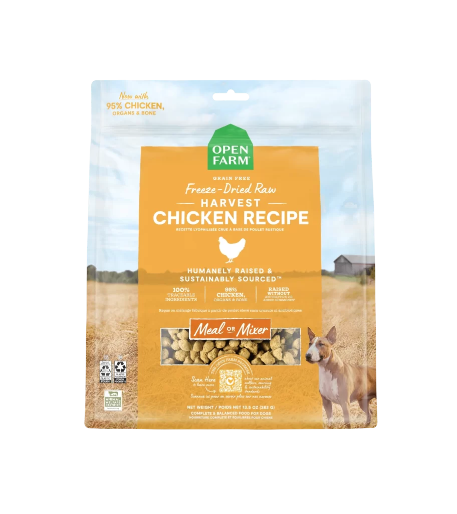
Open Farm Harvest Chicken Recipe orange dog food Packaging
Topics
Details
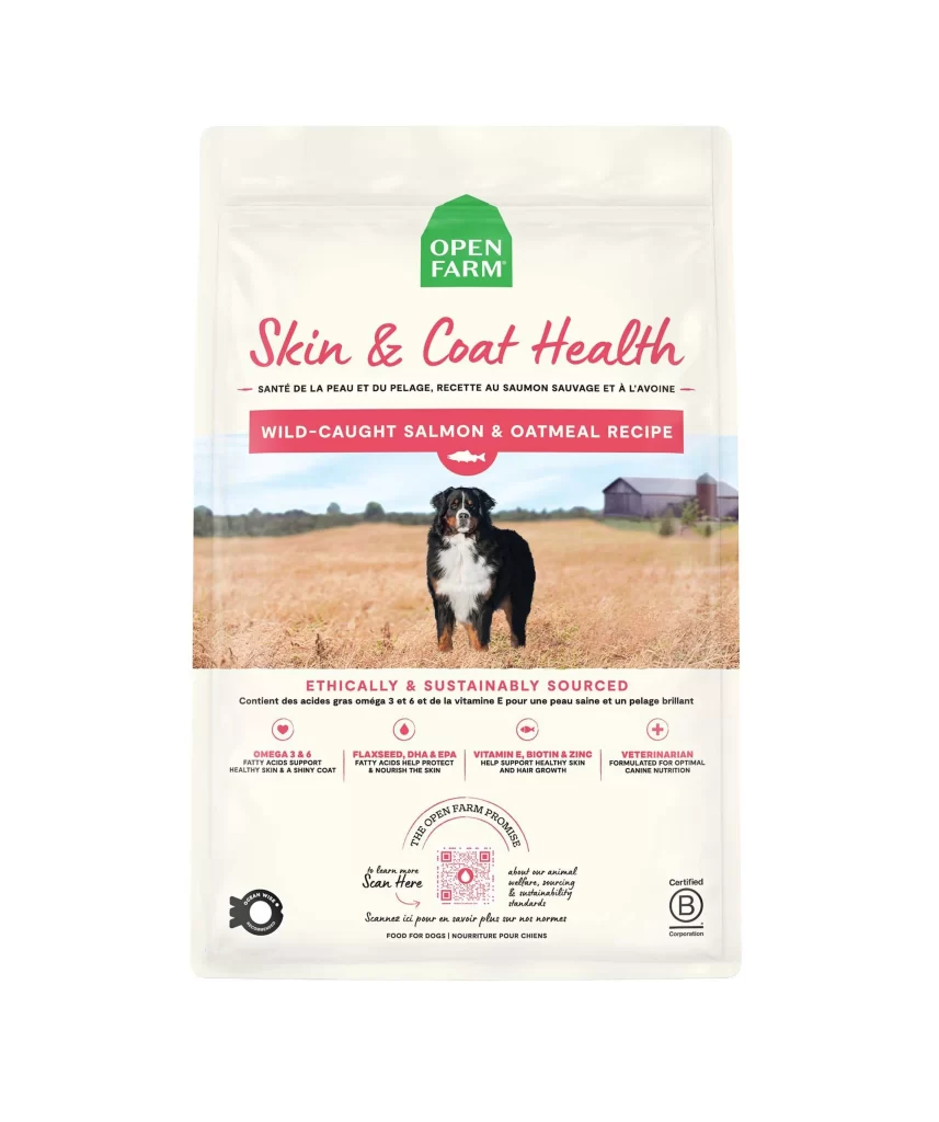
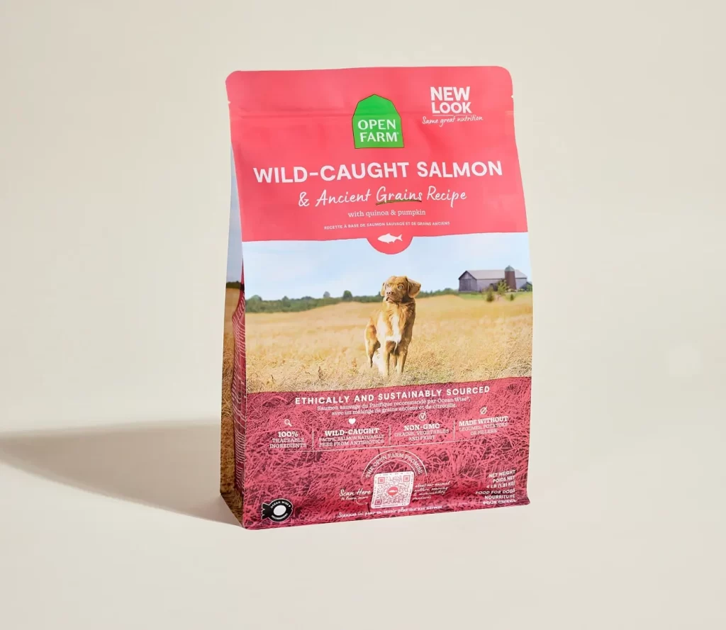
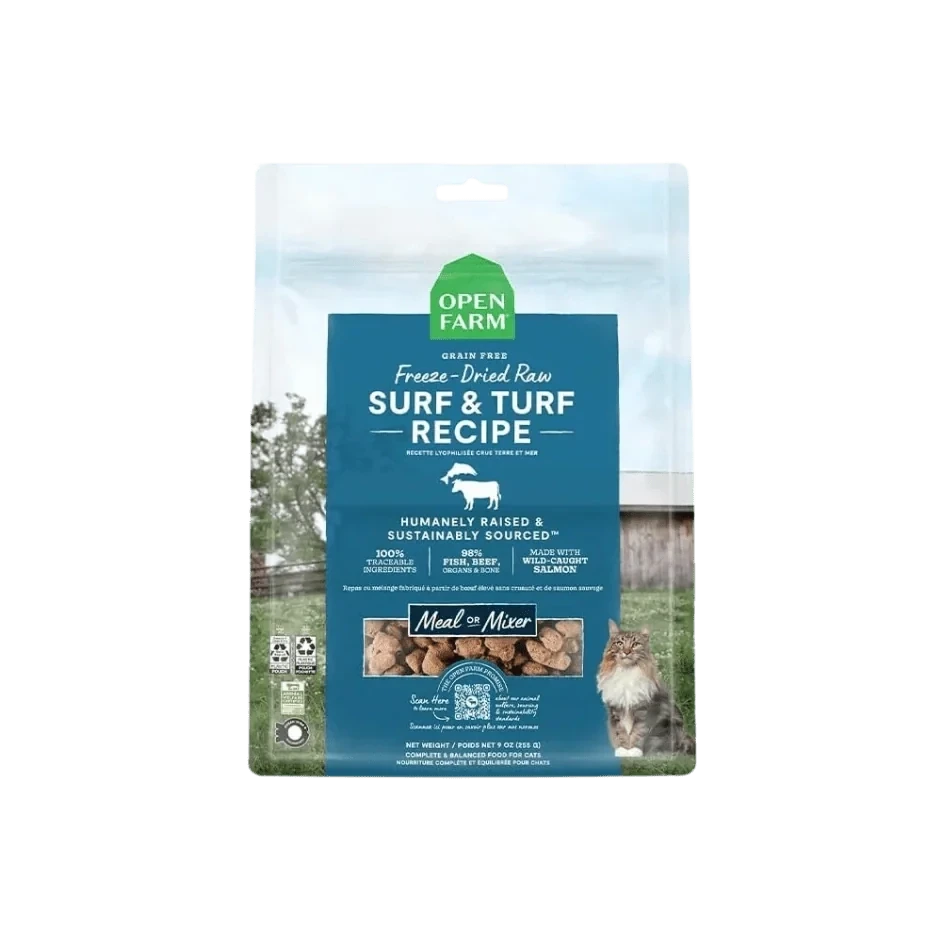
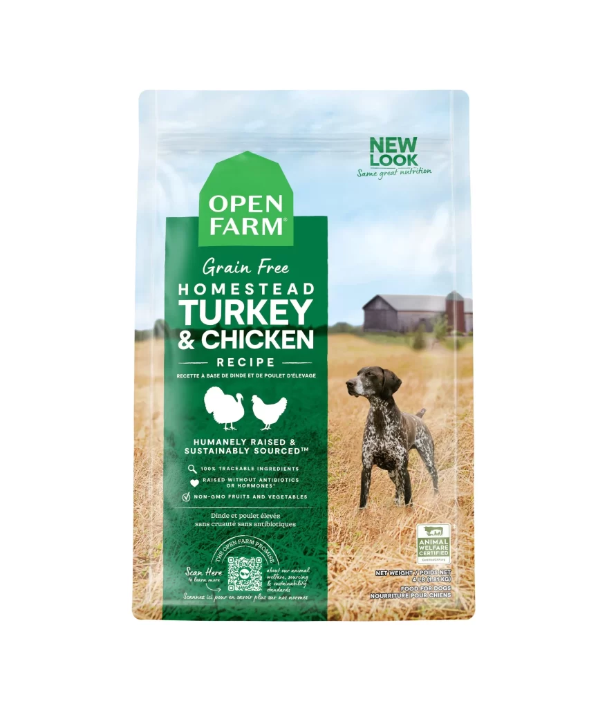
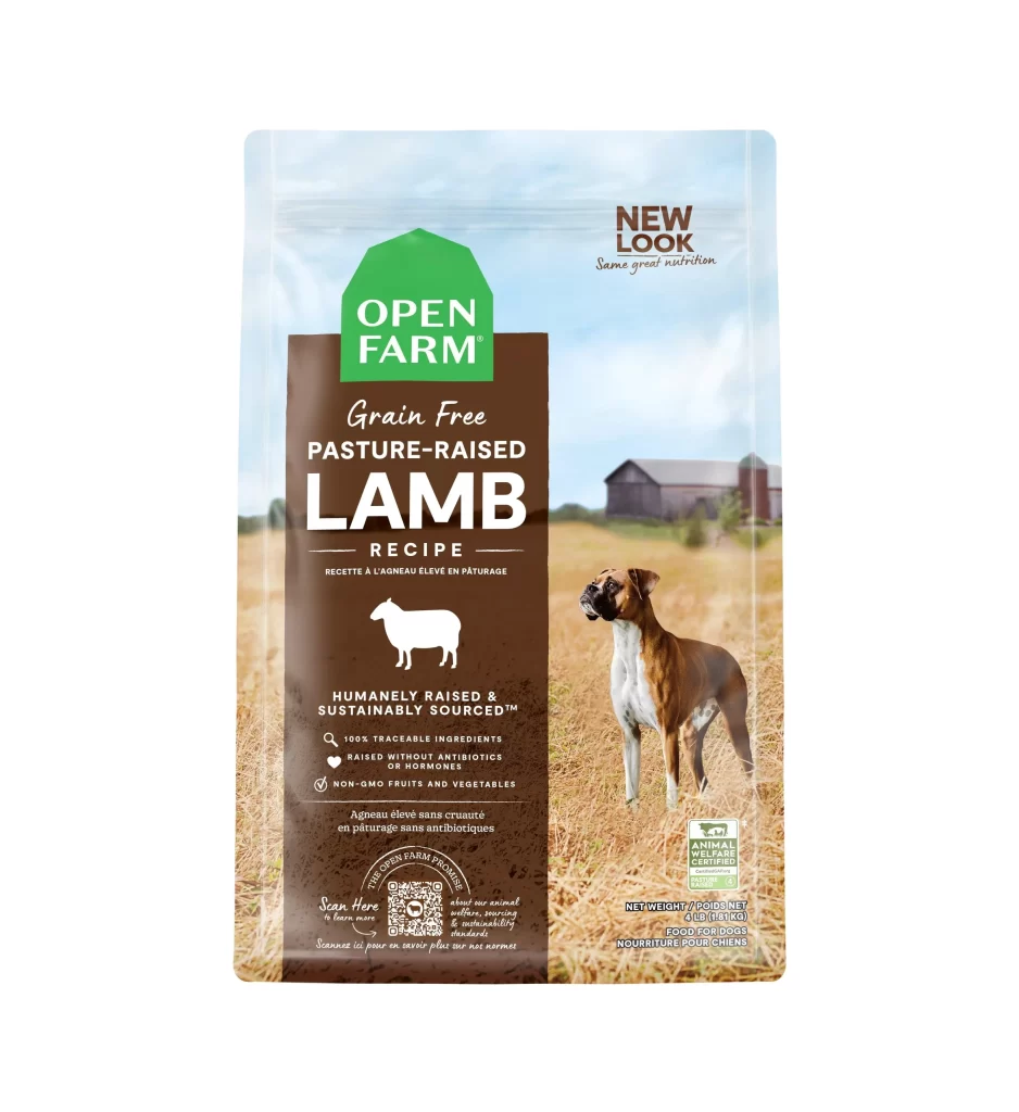
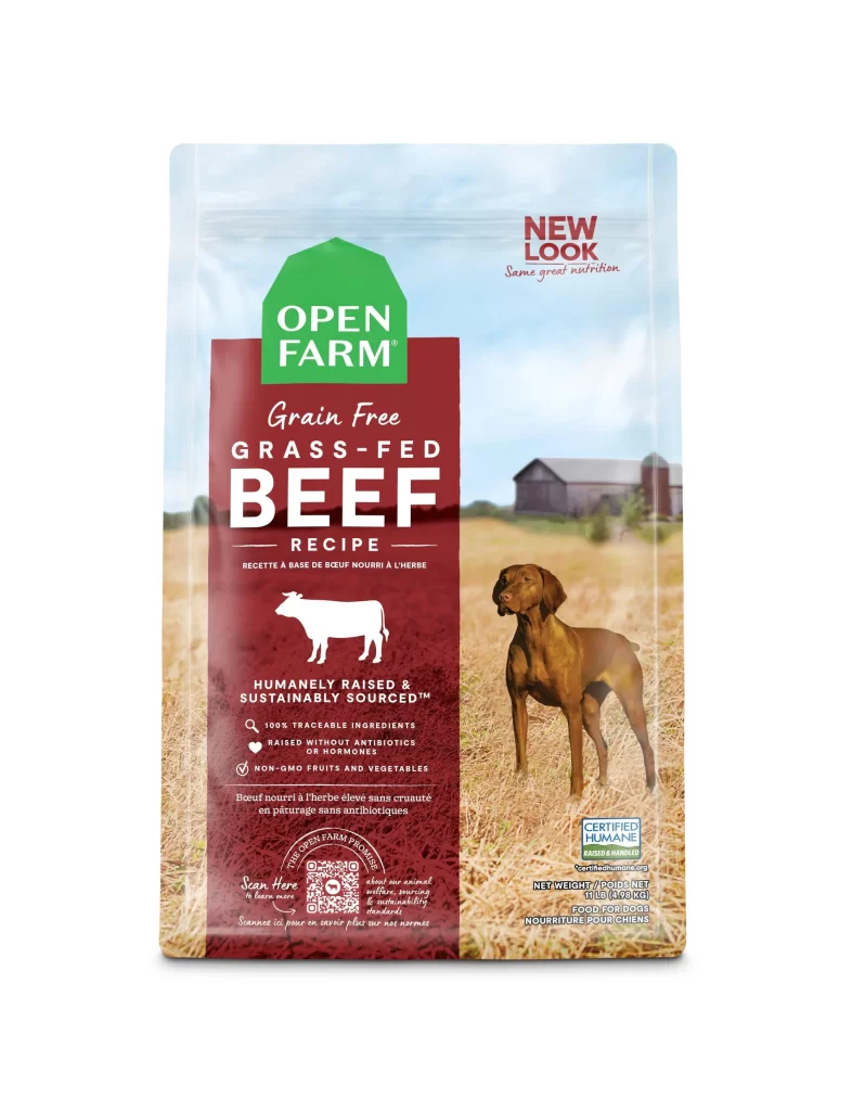
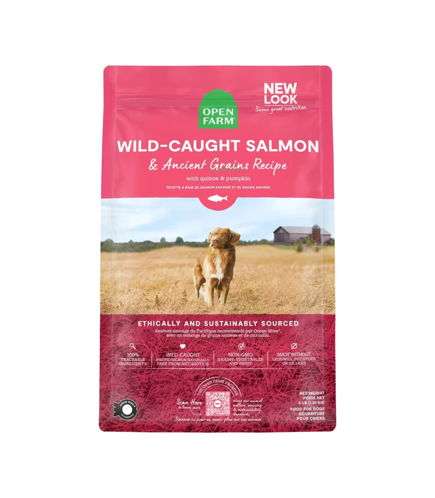
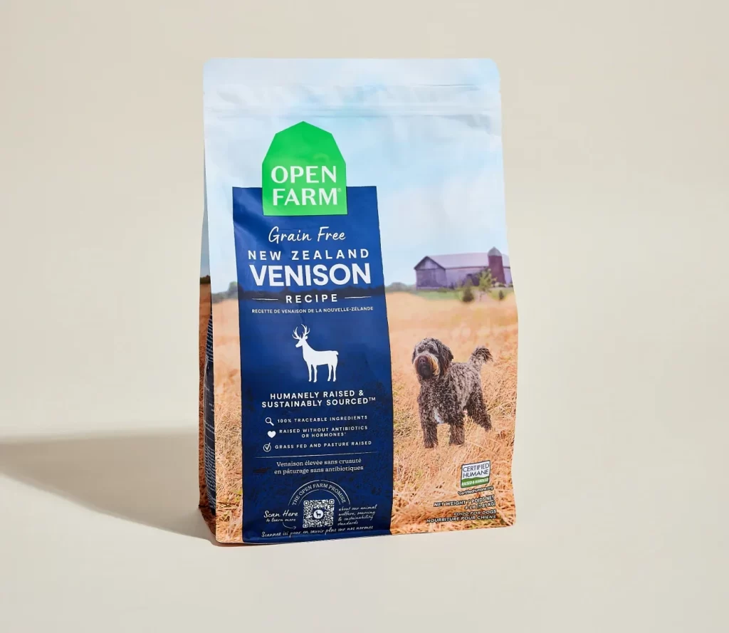
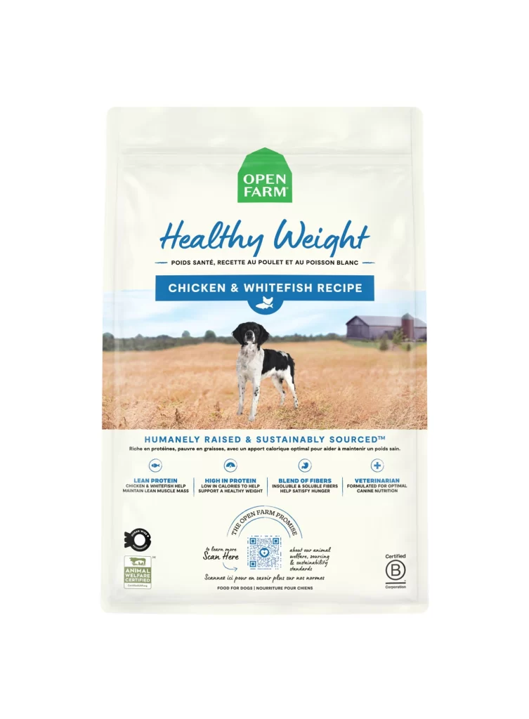
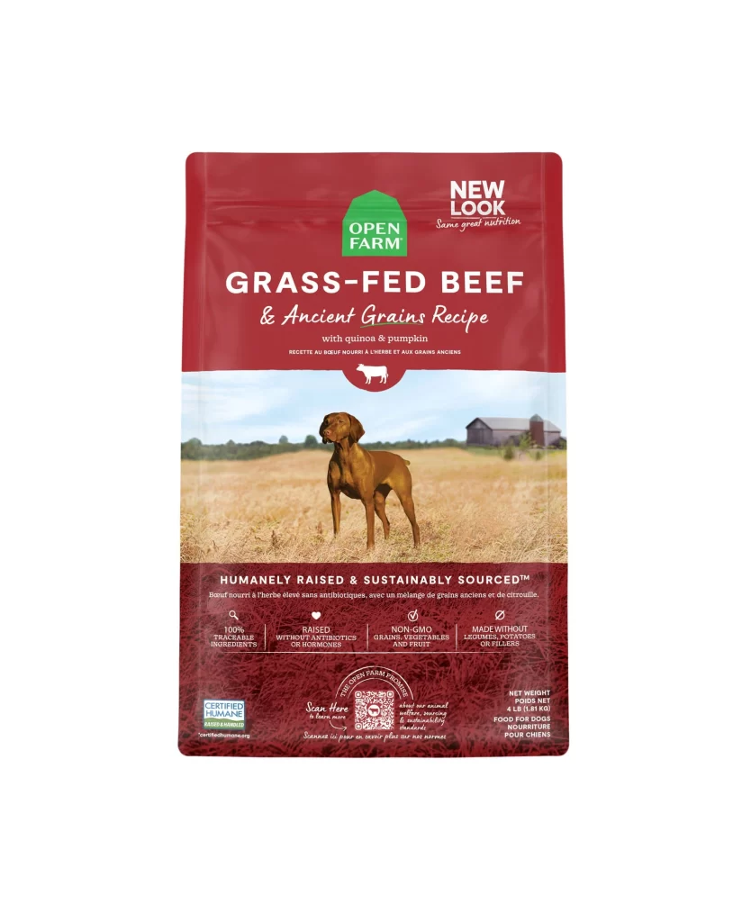
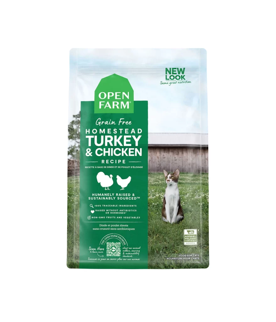
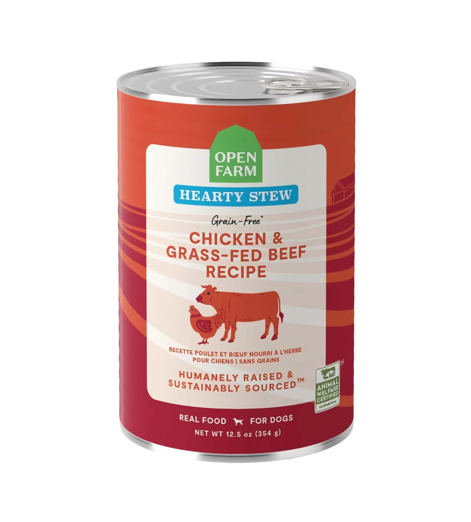
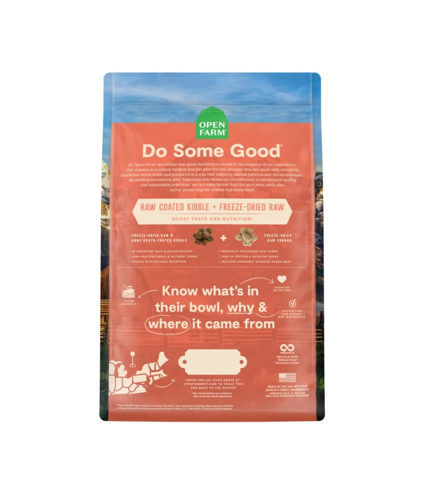
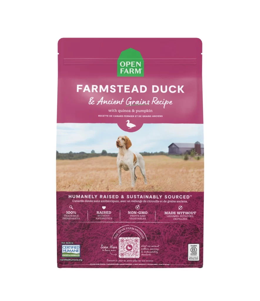
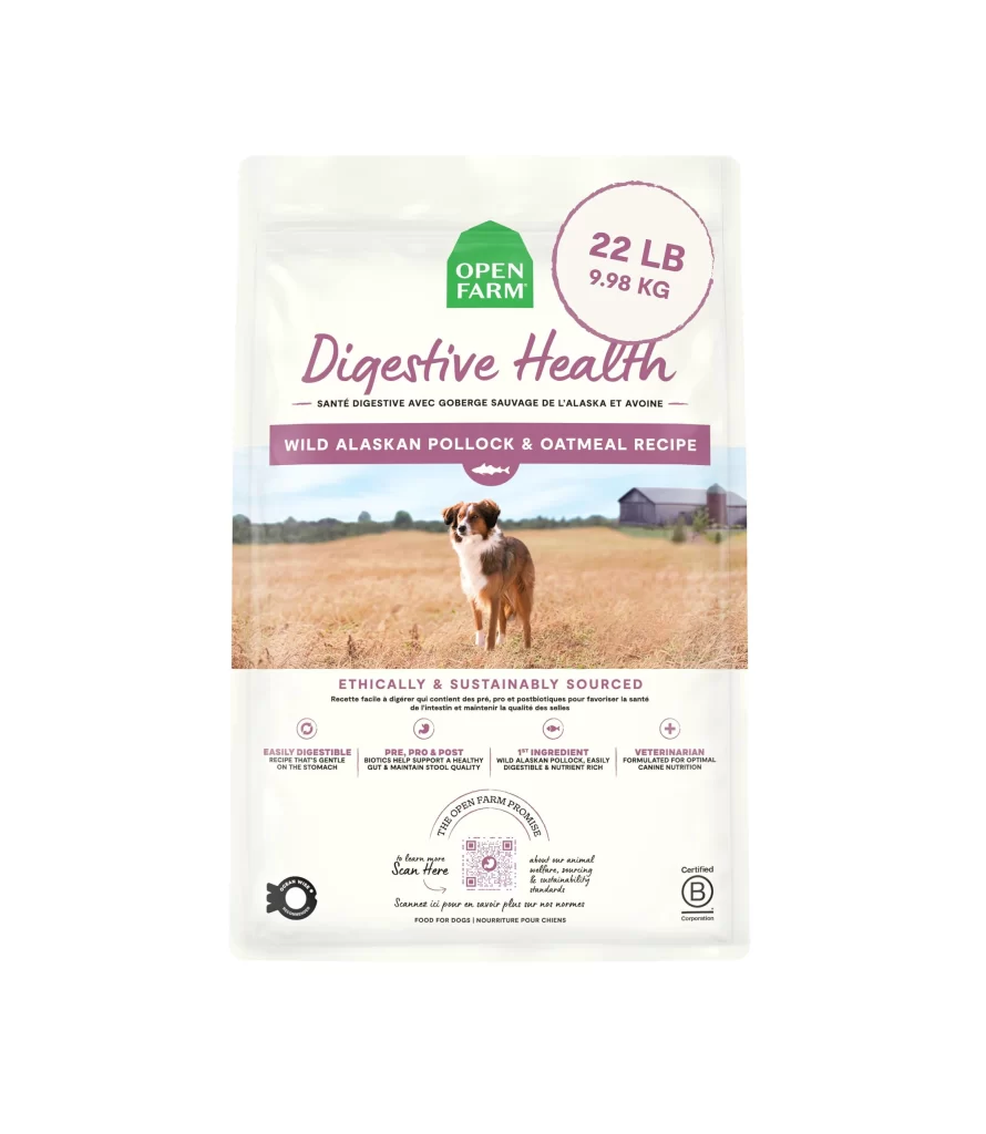
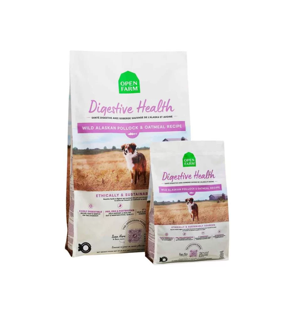
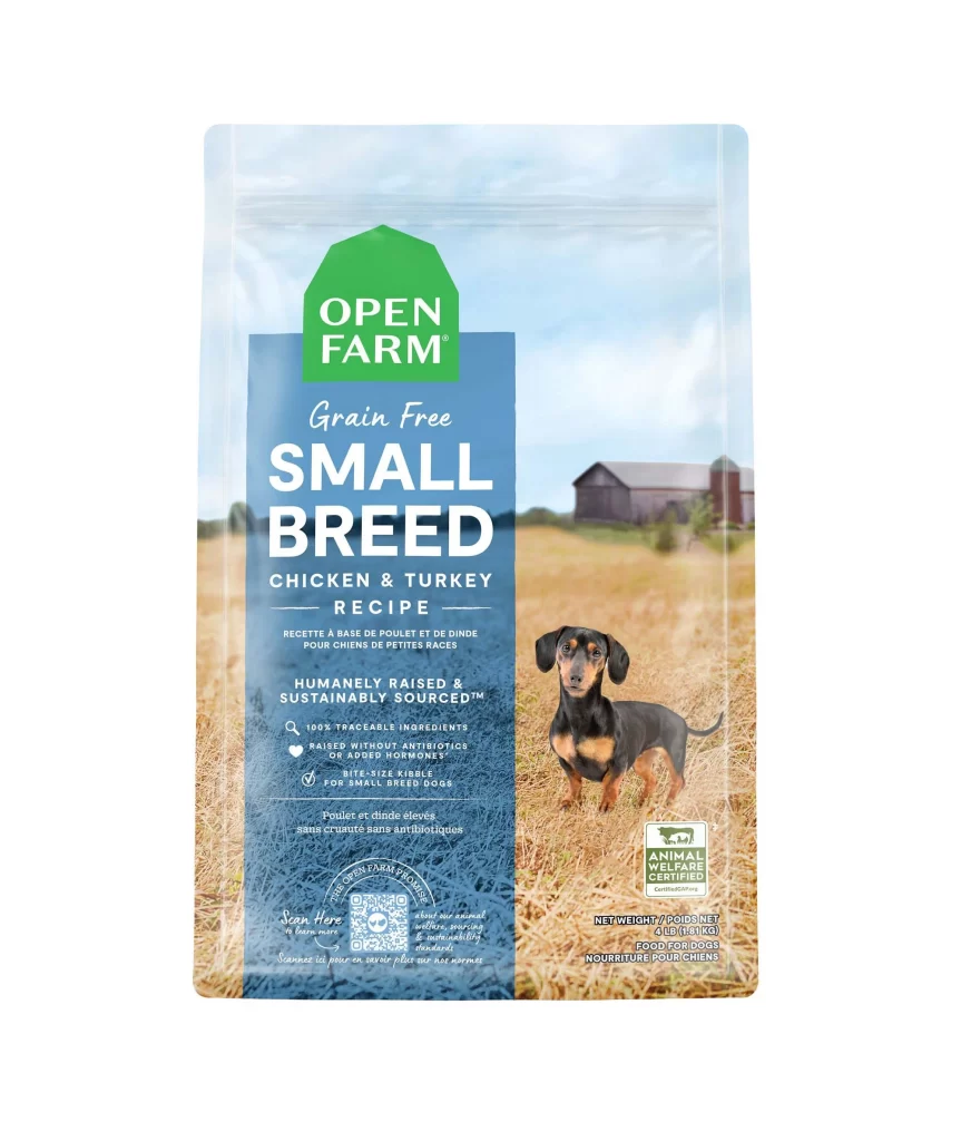
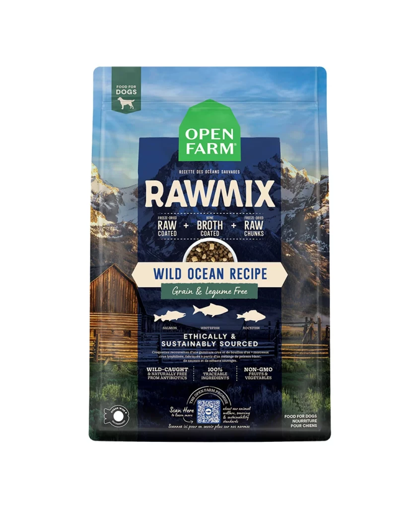
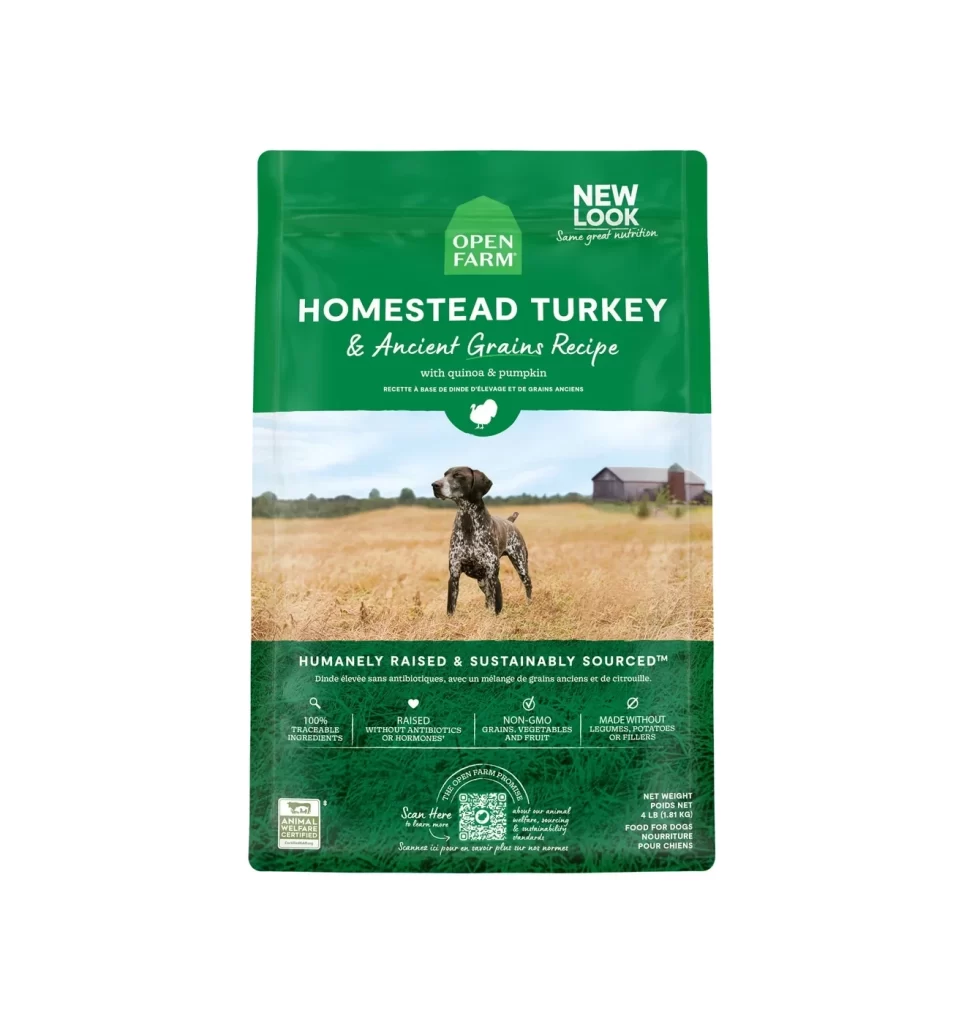
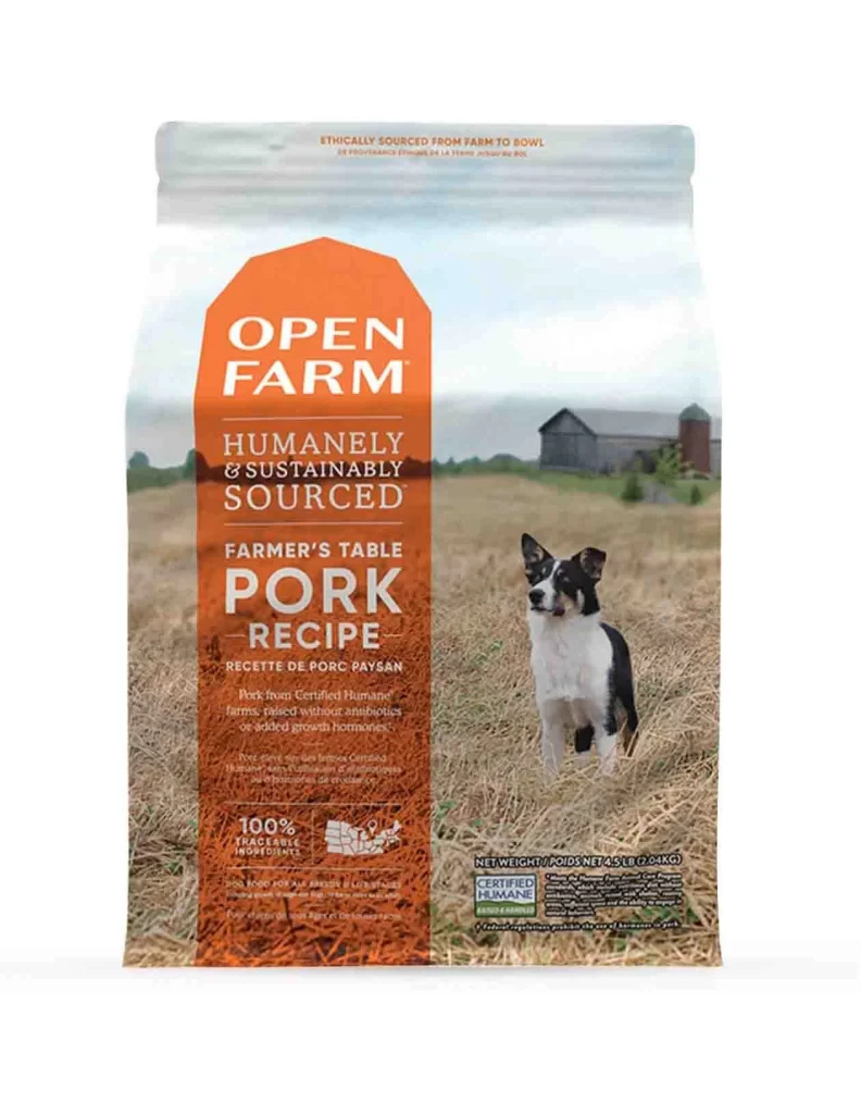
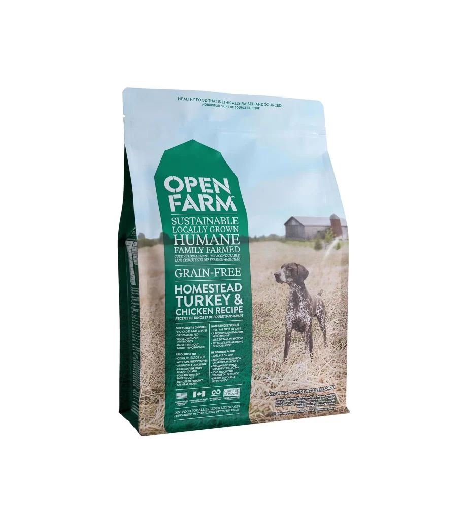
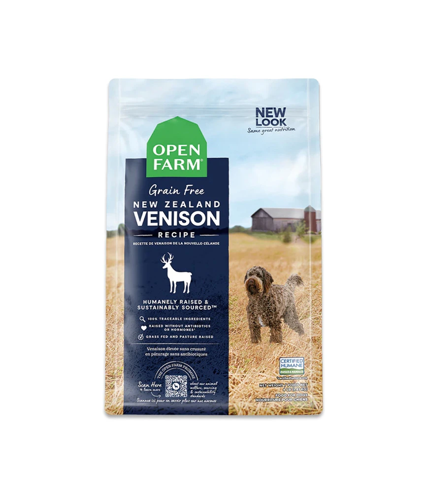
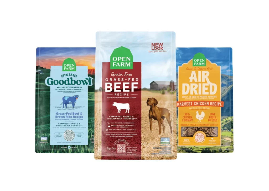
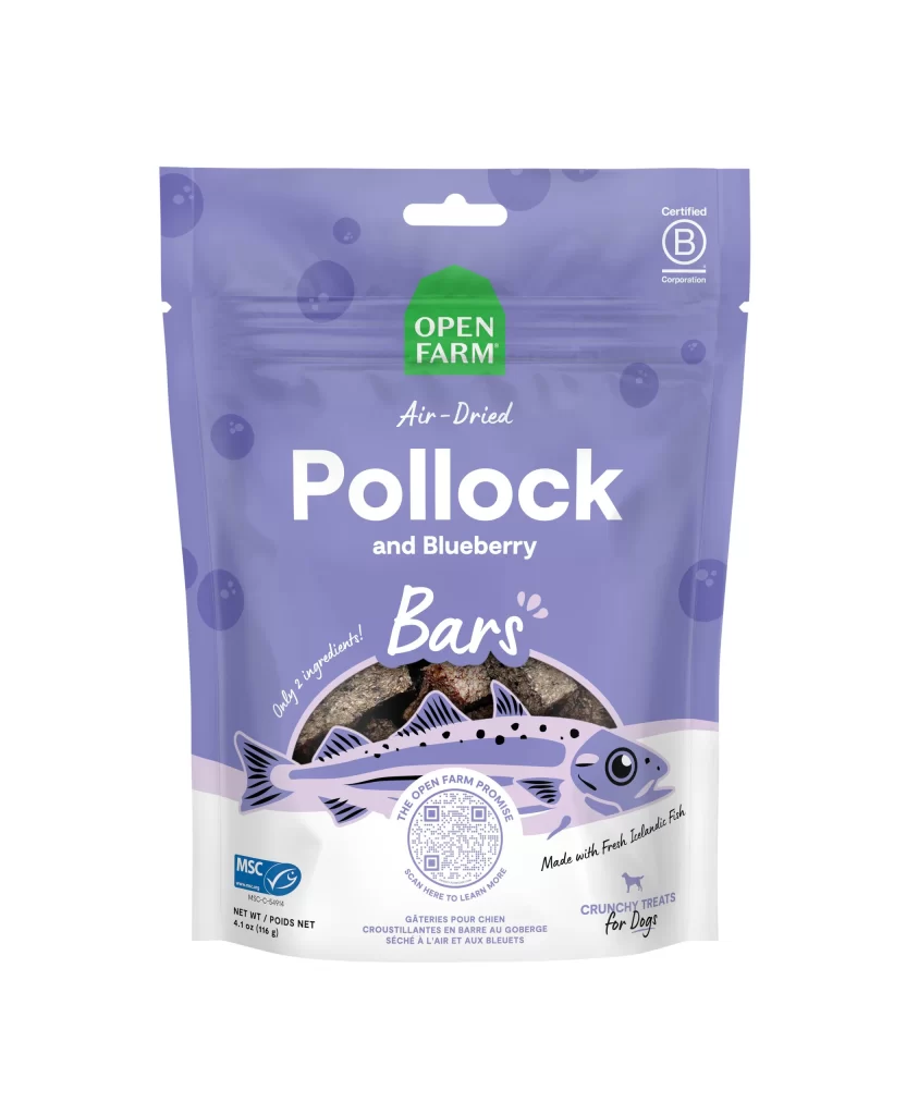
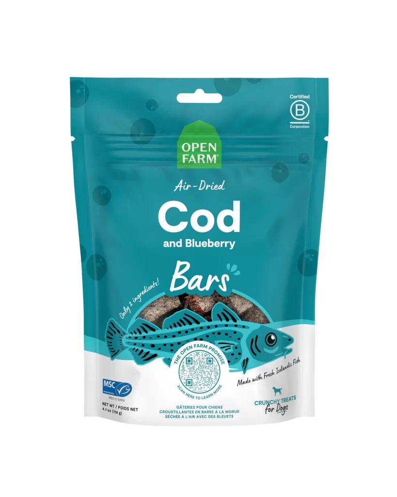
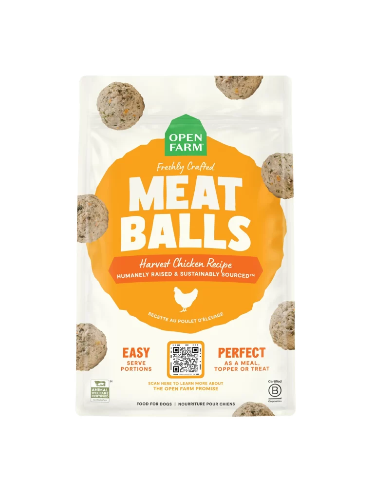
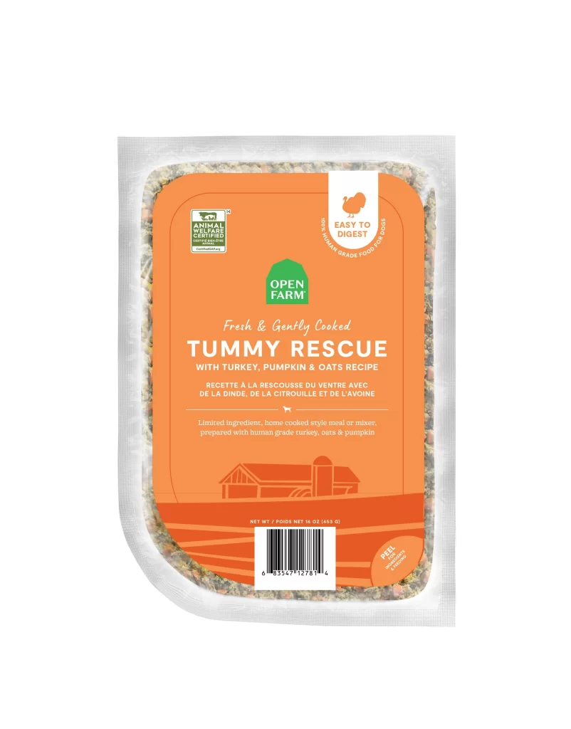
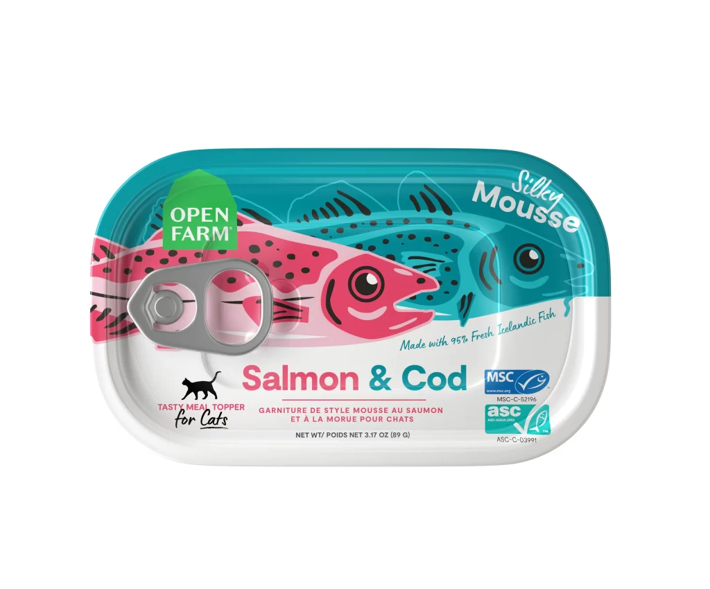
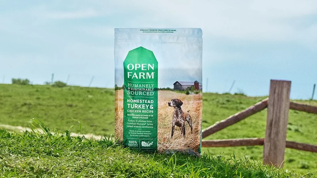
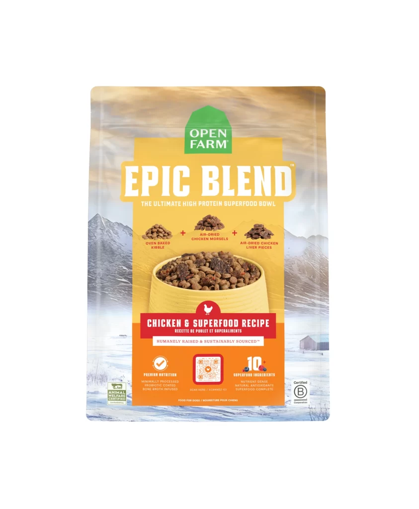
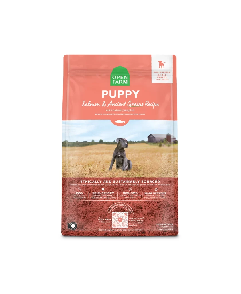
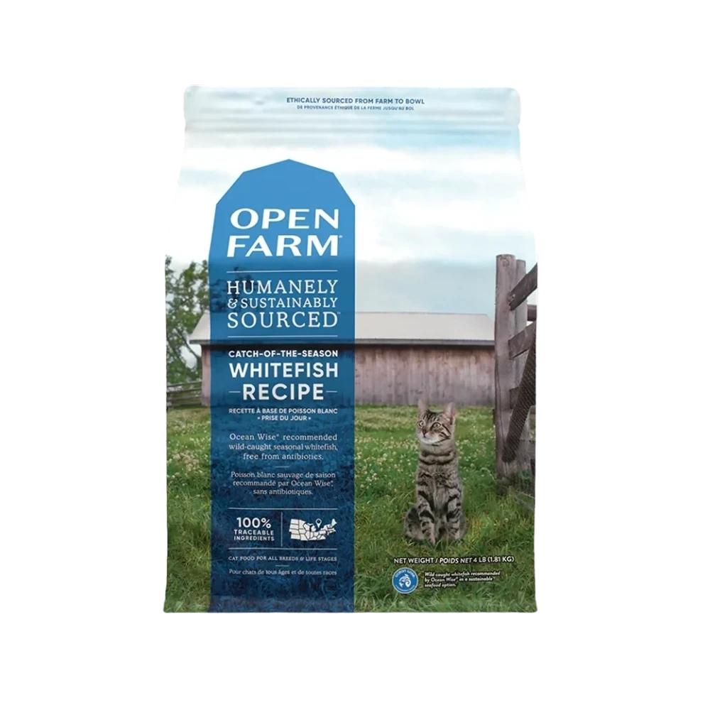
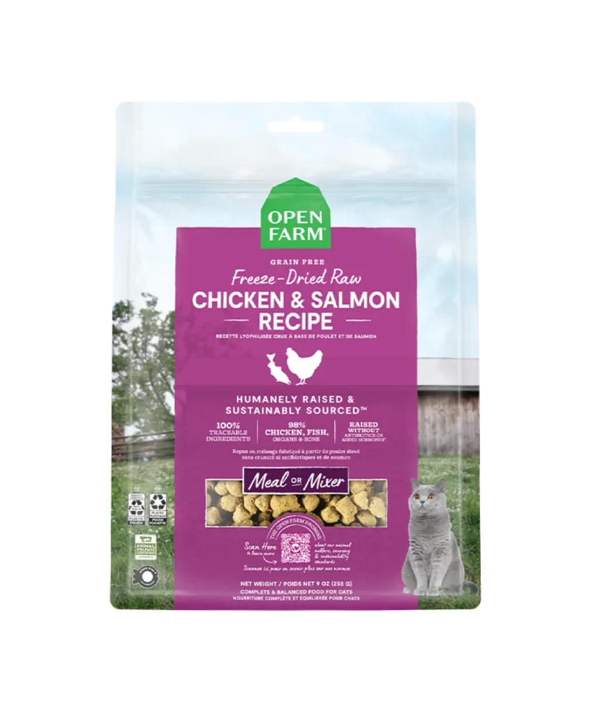
A vibrant orange central panel dominates the Open Farm Harvest Chicken Recipe package, which stands upright in a direct, frontal view revealing every surface detail. The green house-shaped logo containing the brand name sits prominently at the top of the orange field, while a photographic backdrop of golden wheat under a pale blue sky with a distant barn frames the design on a clean white background.
Visual interest is generated through the strategic layering of textures, contrasting the matte finish of the printed orange cardstock with the realistic photography of the rural landscape. The inclusion of a transparent window displaying the actual pale, nugget-shaped kibble adds a tangible, three-dimensional element that breaks up the flat graphic design. Furthermore, the placement of a realistic dog portrait on the right edge creates an immediate emotional connection, balancing the informational density of the certification icons and nutritional claims on the left.
Brand managers analyzing pet food market trends would utilize this visual to study how premium organic products communicate quality through color psychology and farm imagery. Packaging engineers could examine the structural layout of the resealable top notch and the placement of the ‘Meal or Mixer’ callout to optimize their own product labeling. Additionally, marketing teams might reference the specific hierarchy of text—from the ‘95% Chicken’ banner down to the net weight—to understand effective information architecture for similar health-conscious consumer goods.