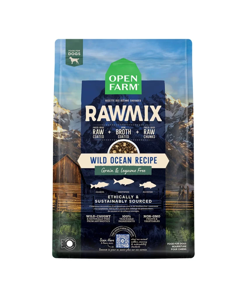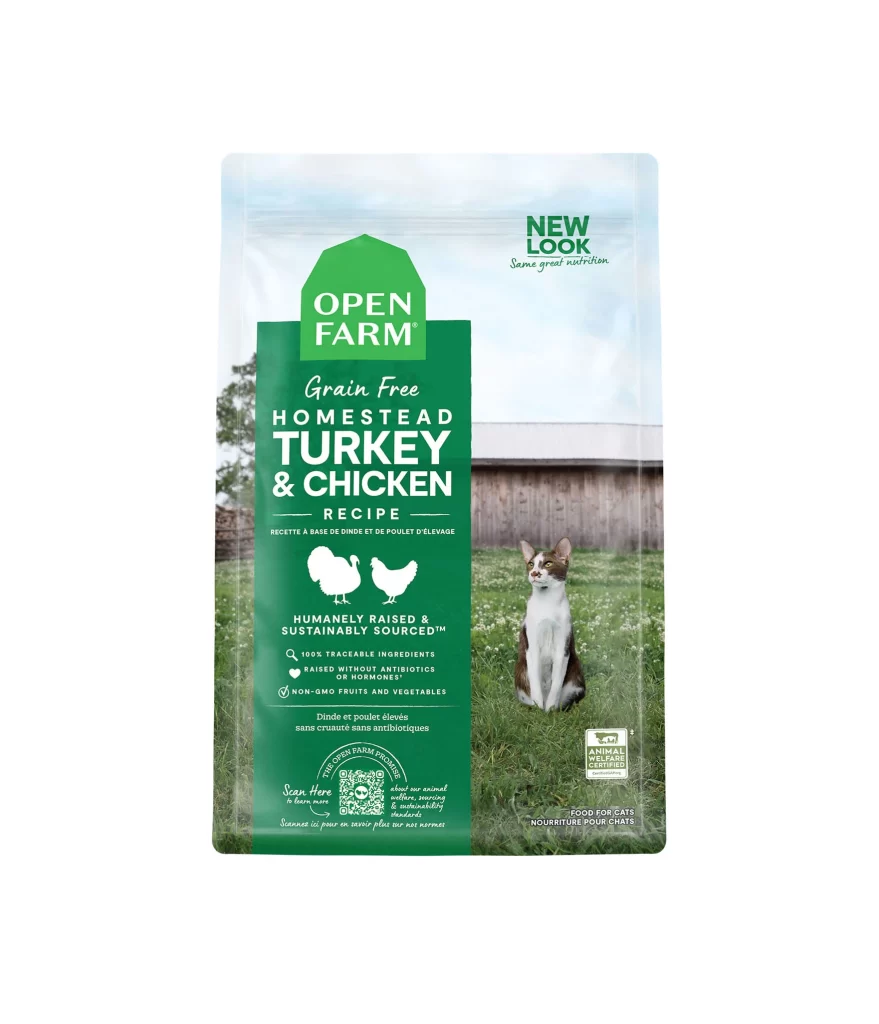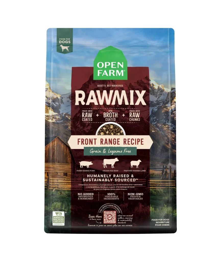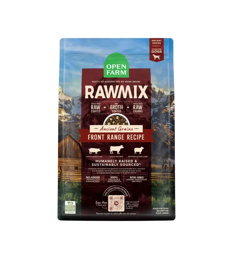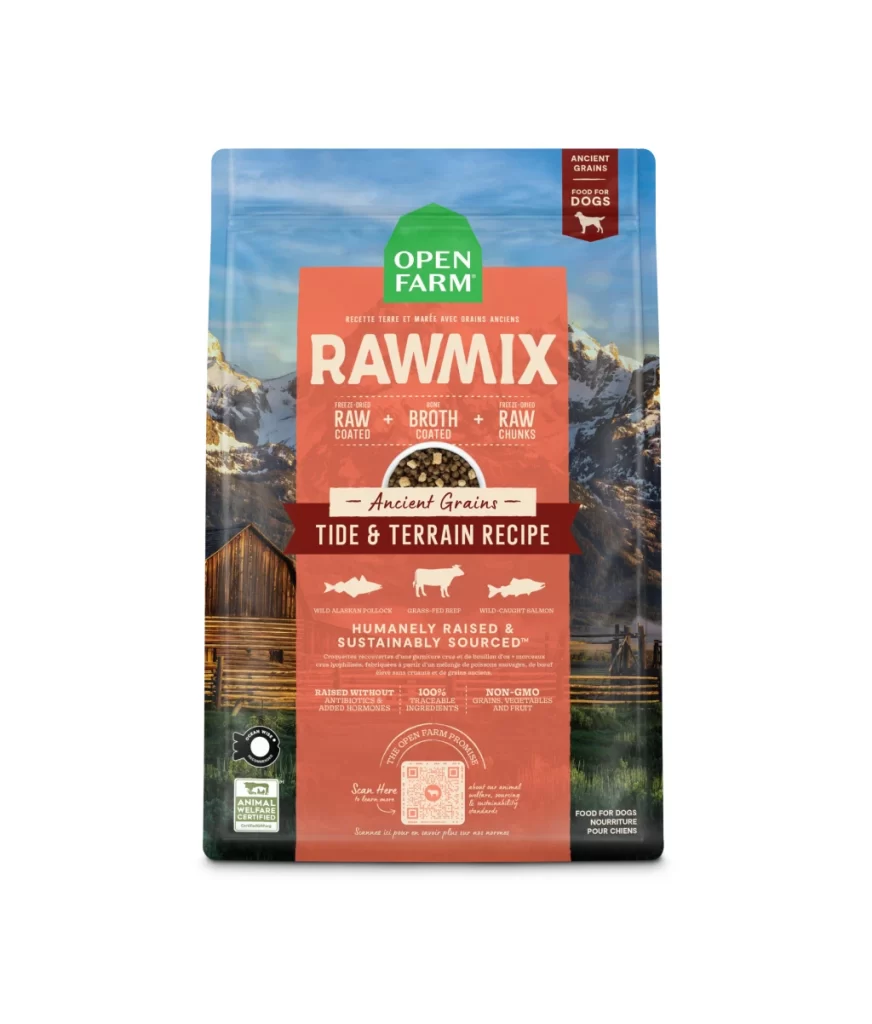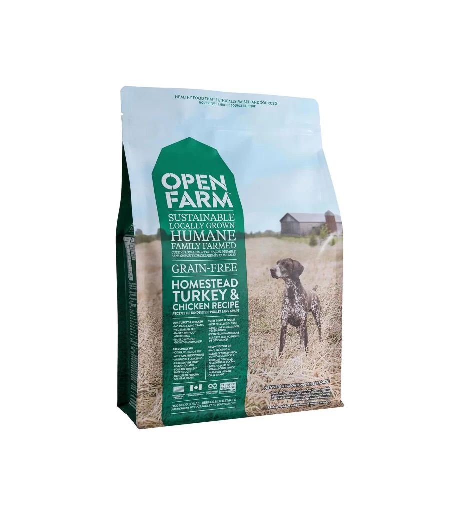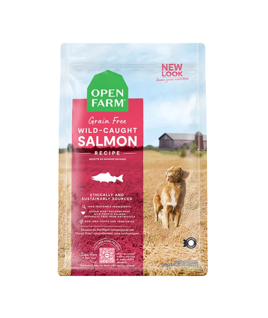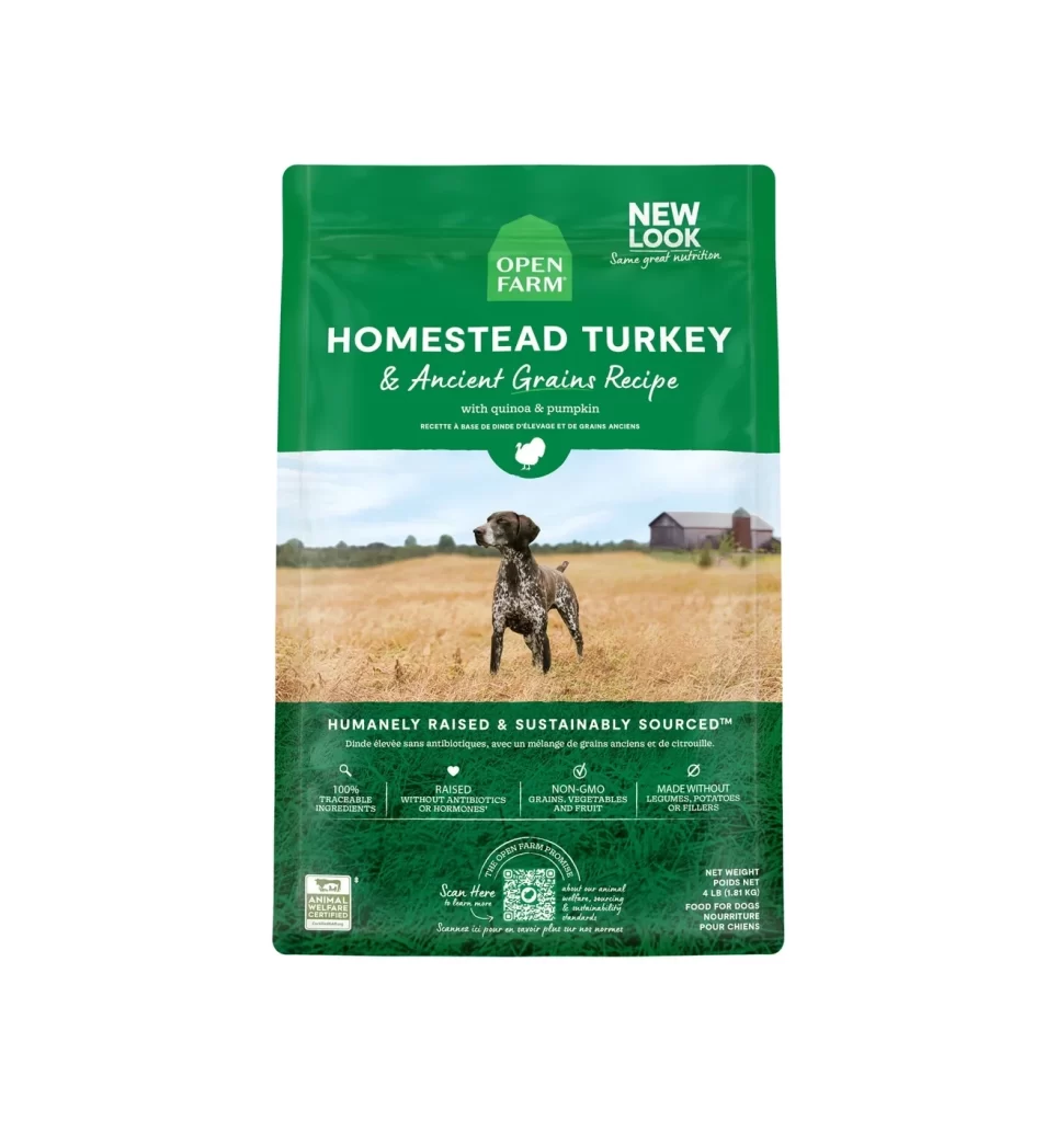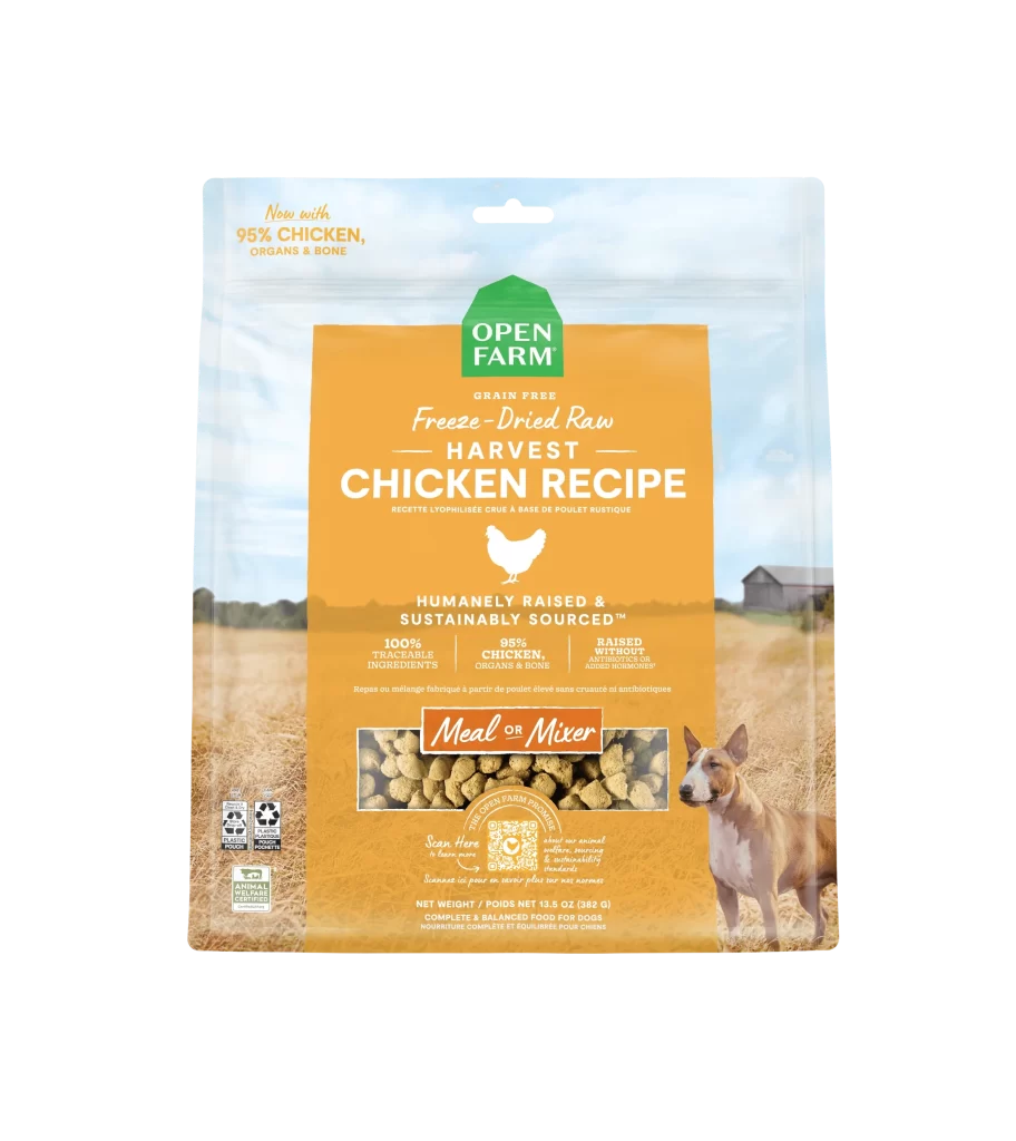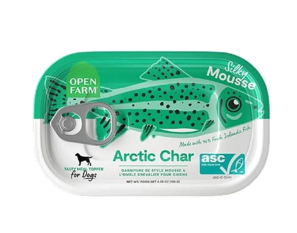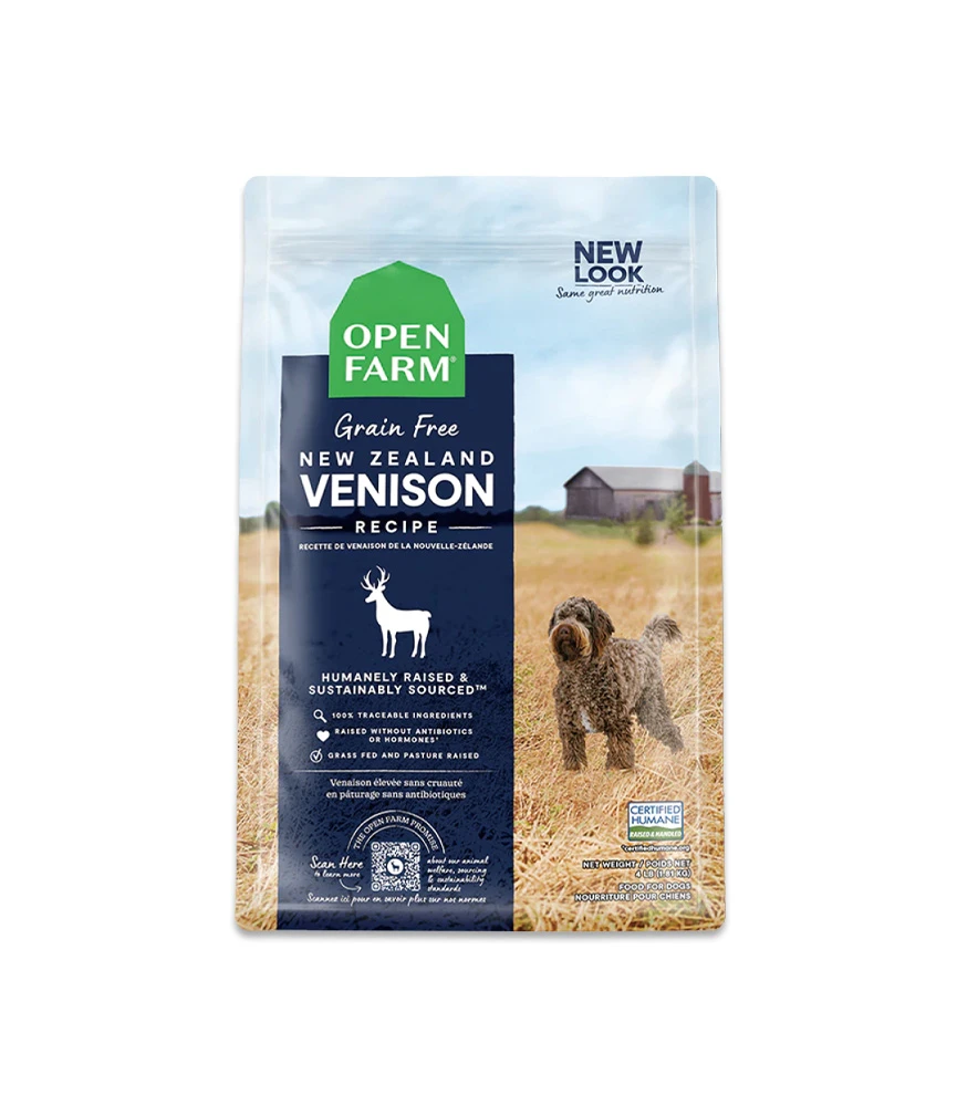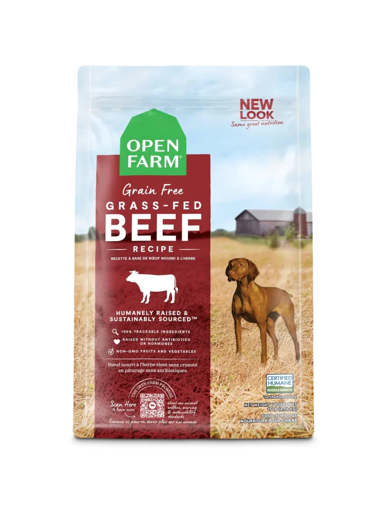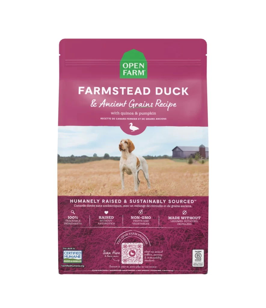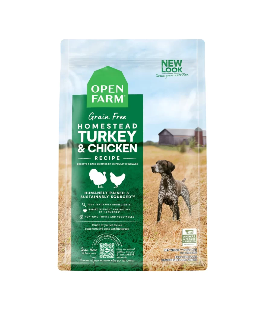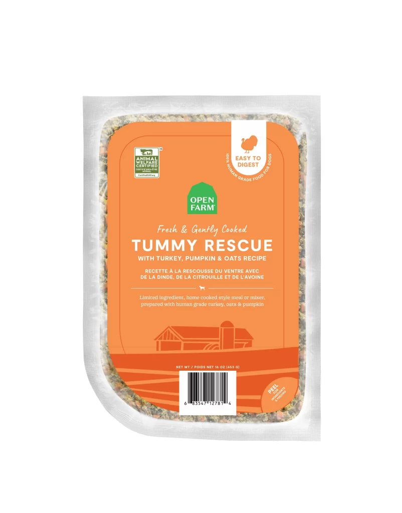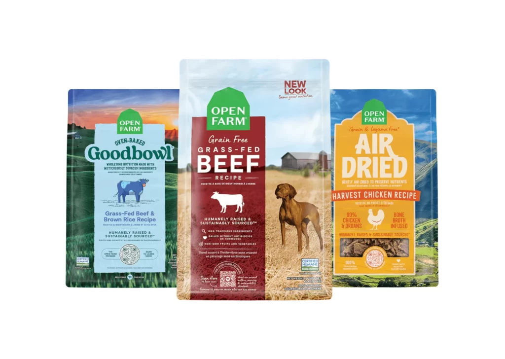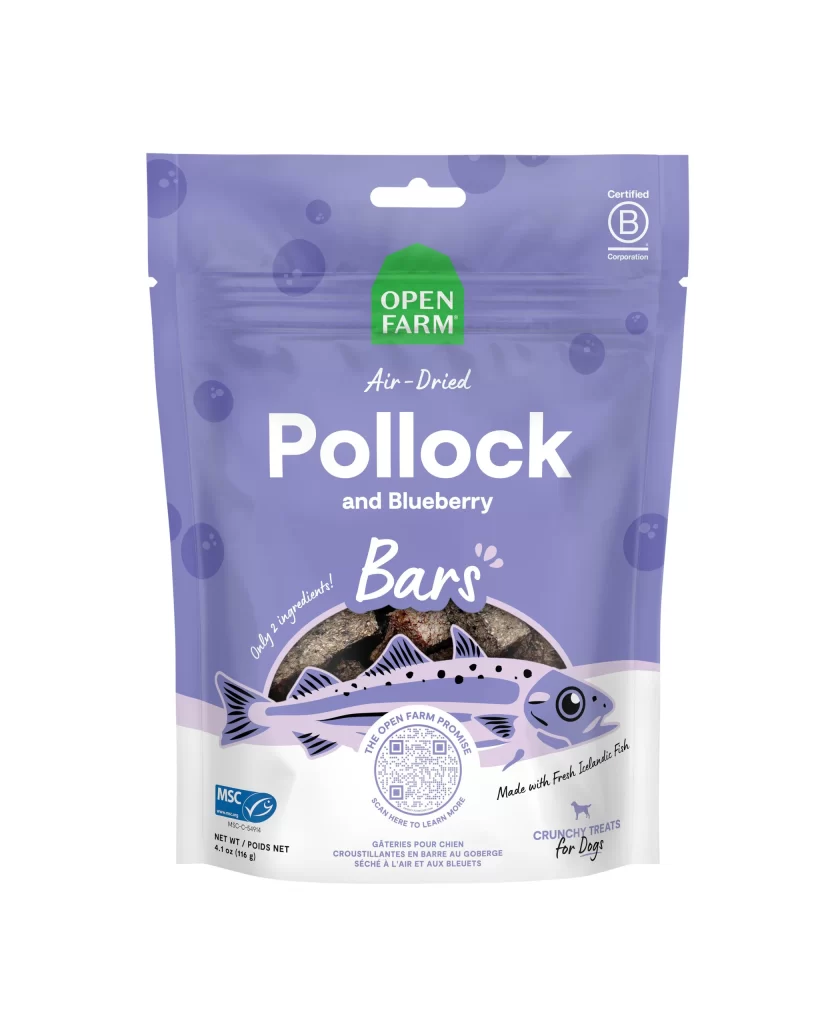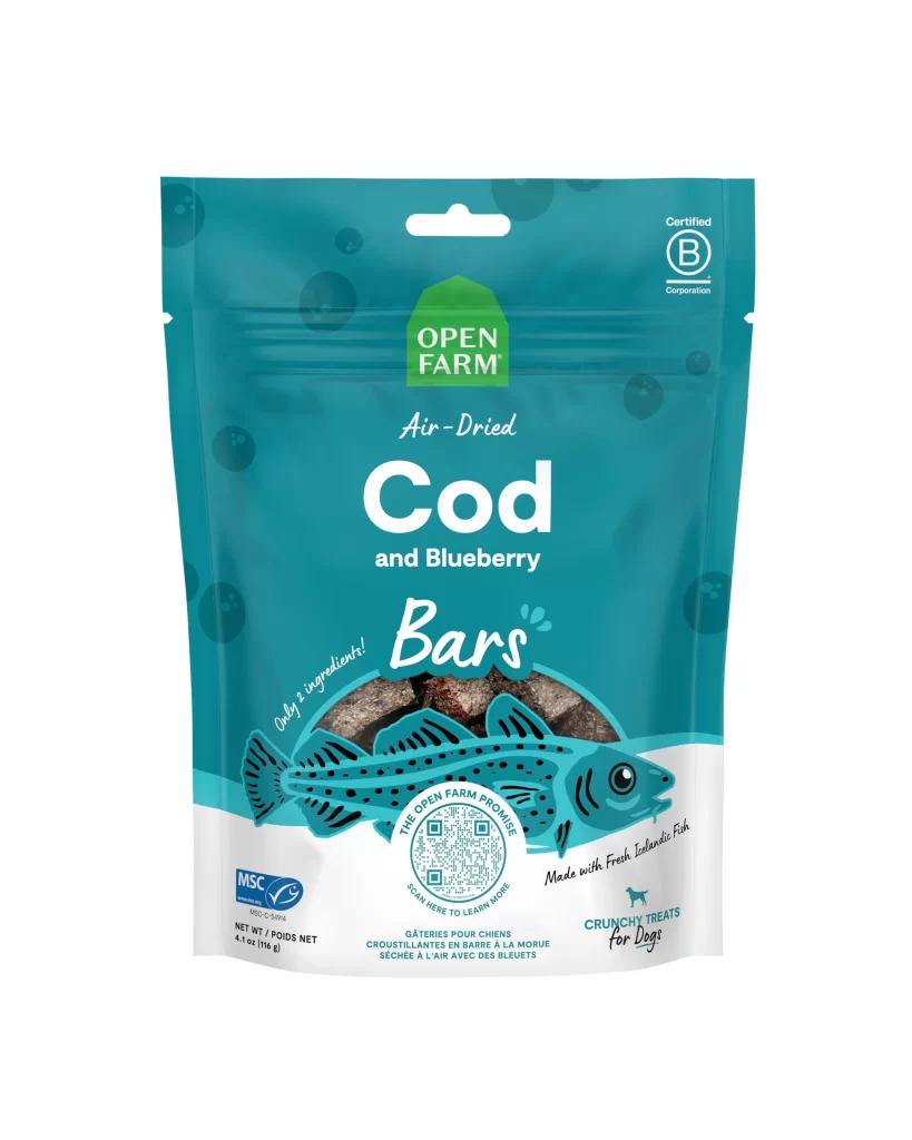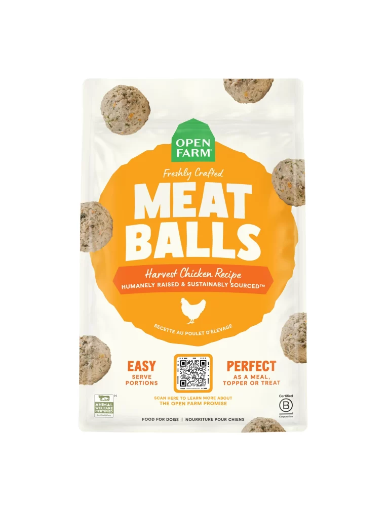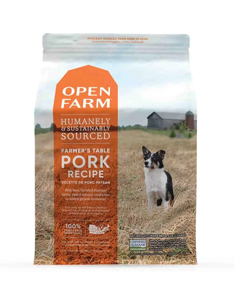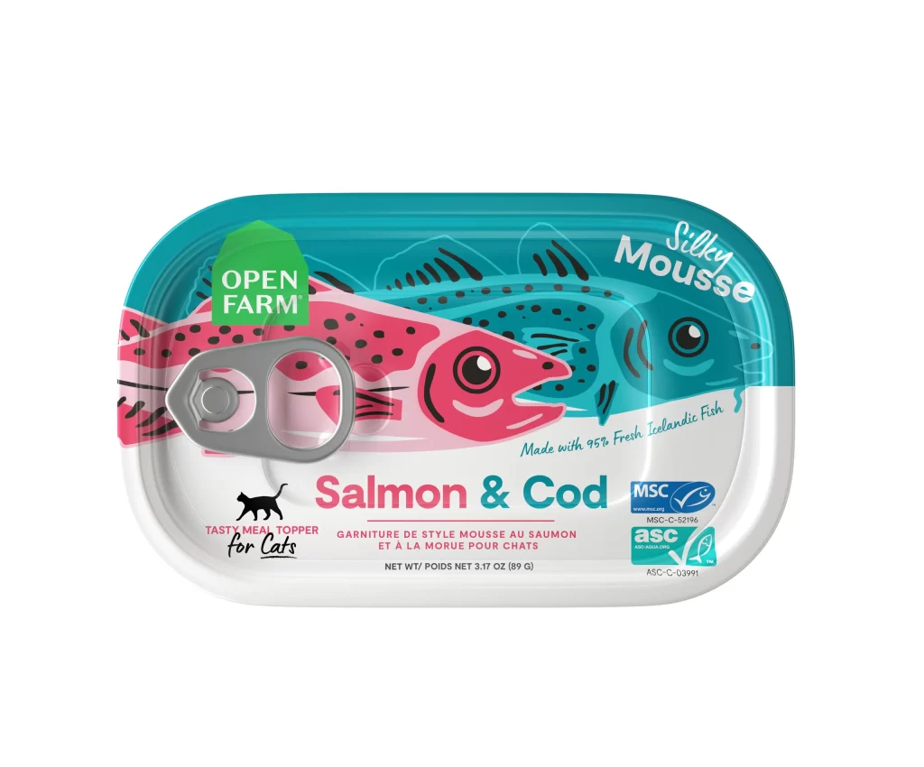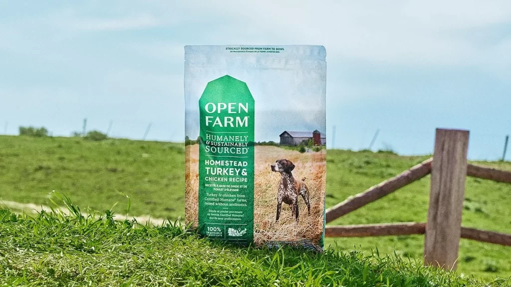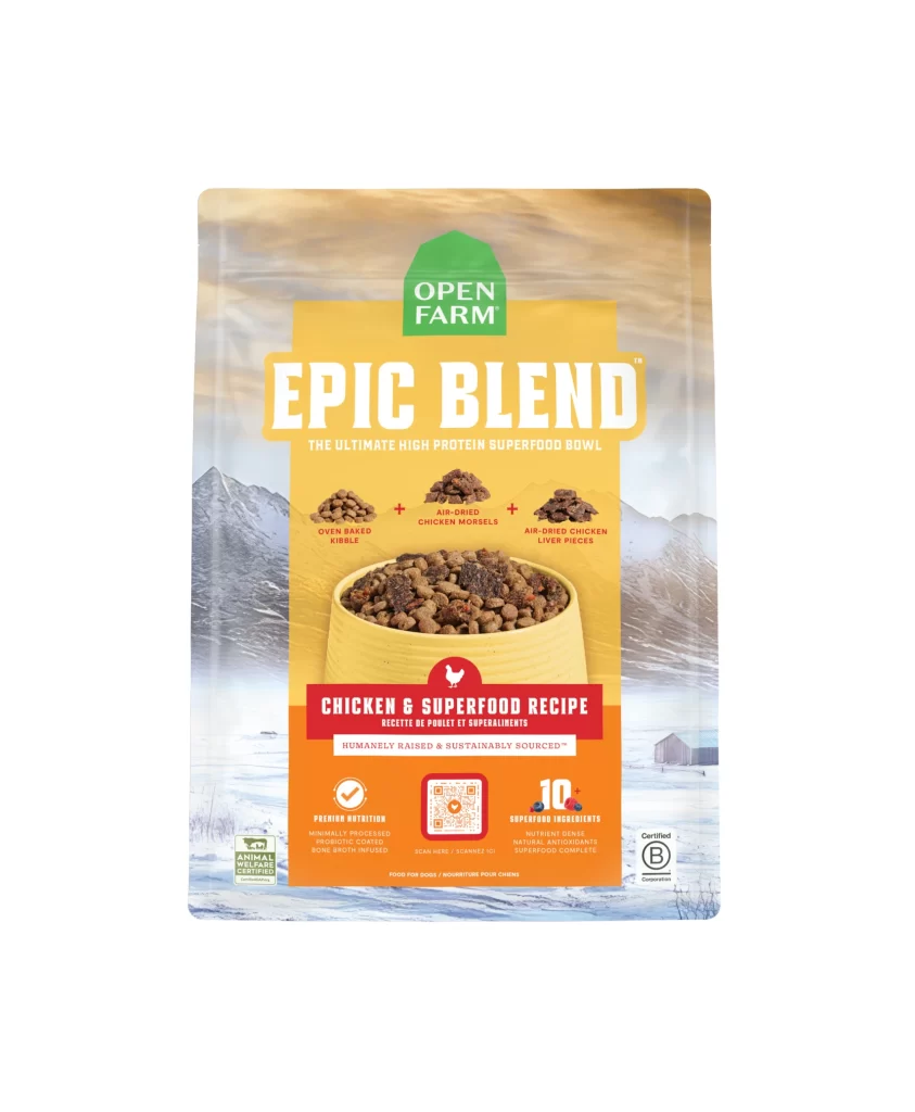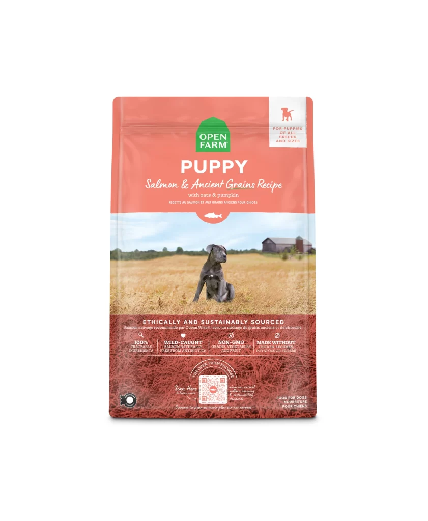
Open Farm Open Farm Dog Food Packaging
Topics
Details
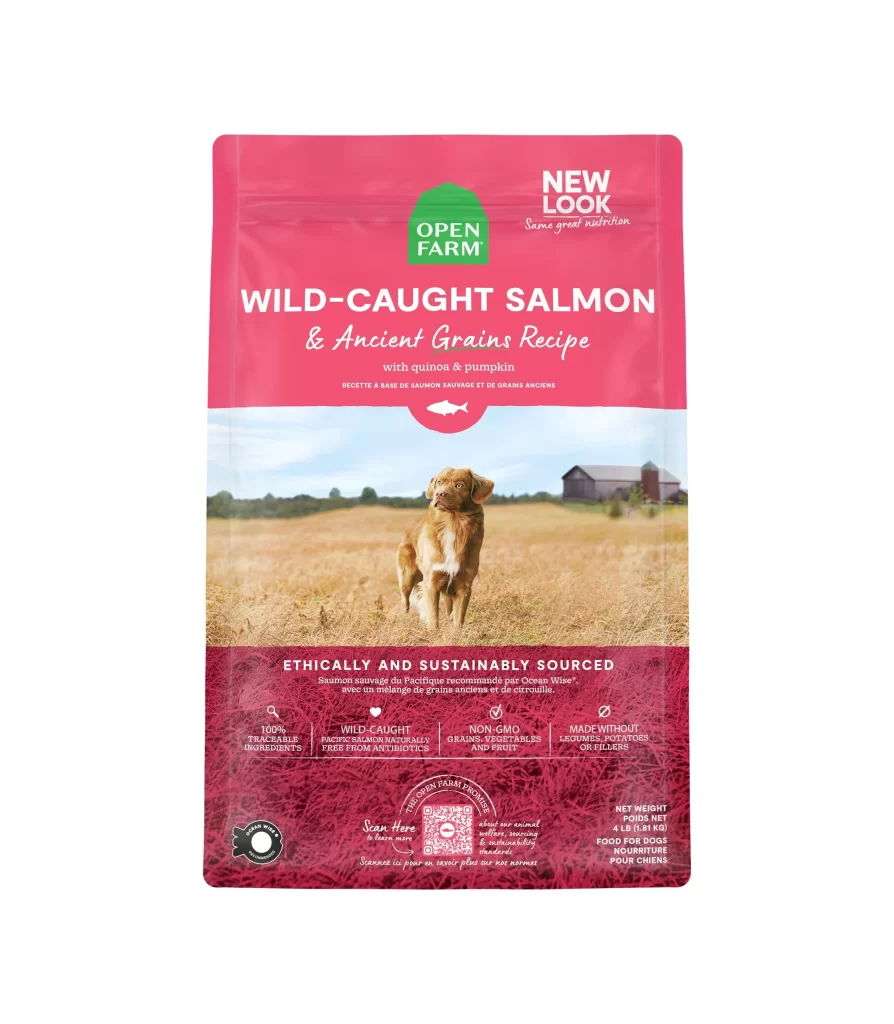
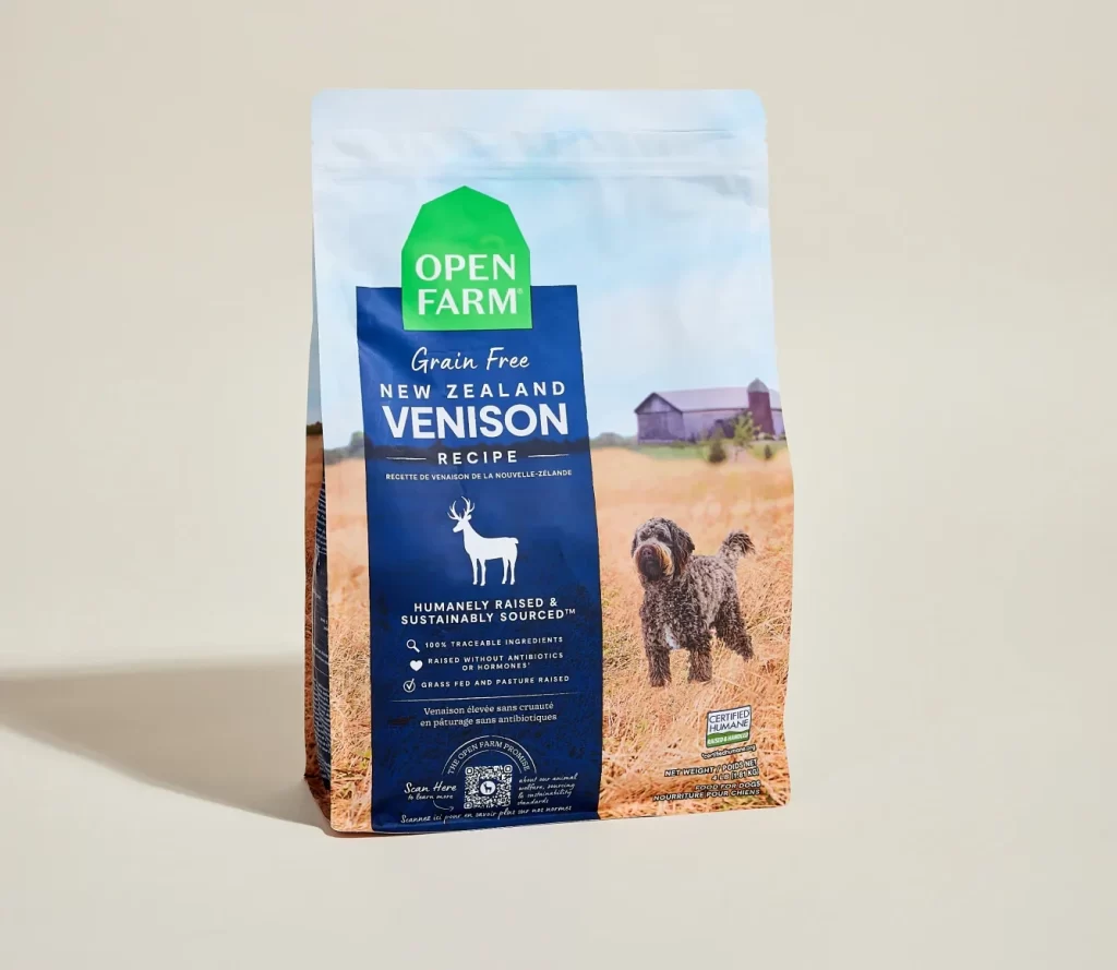
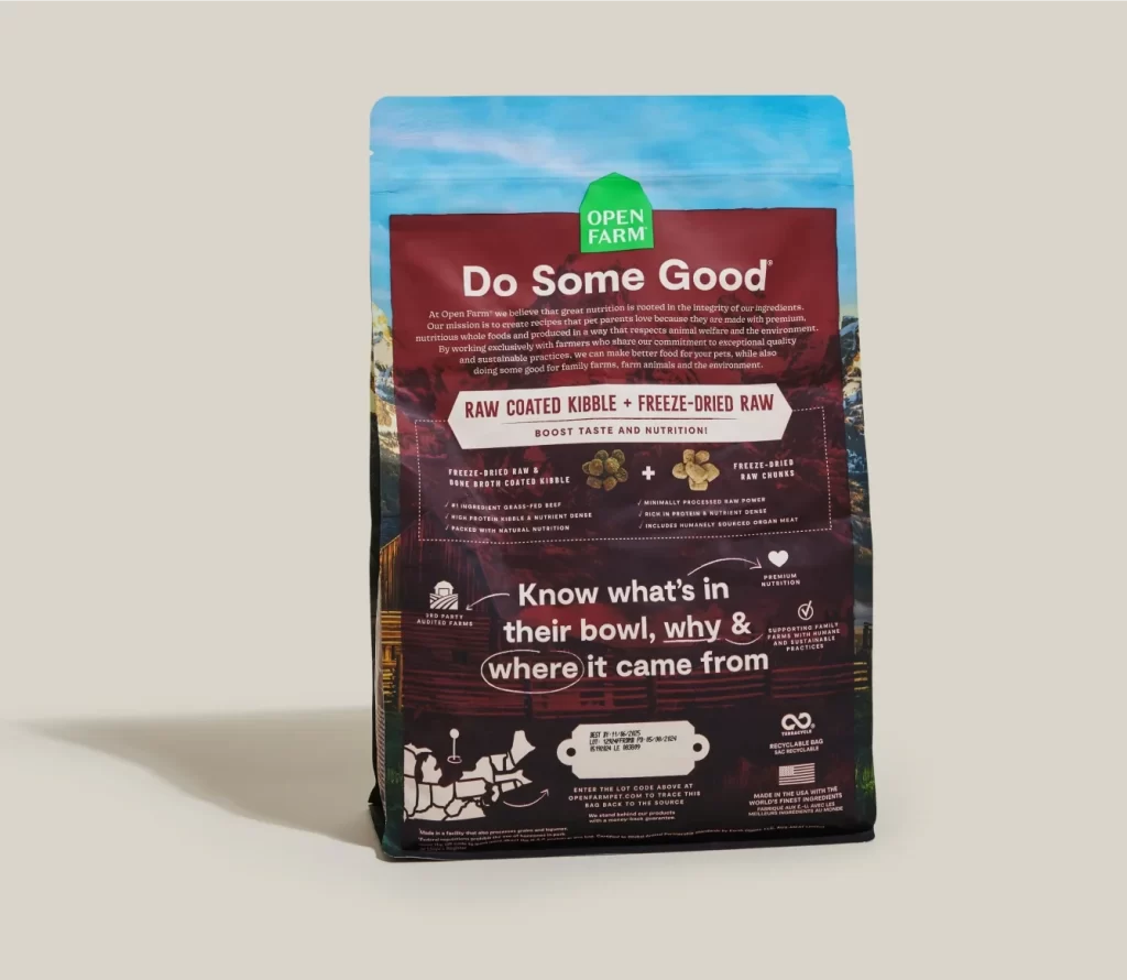
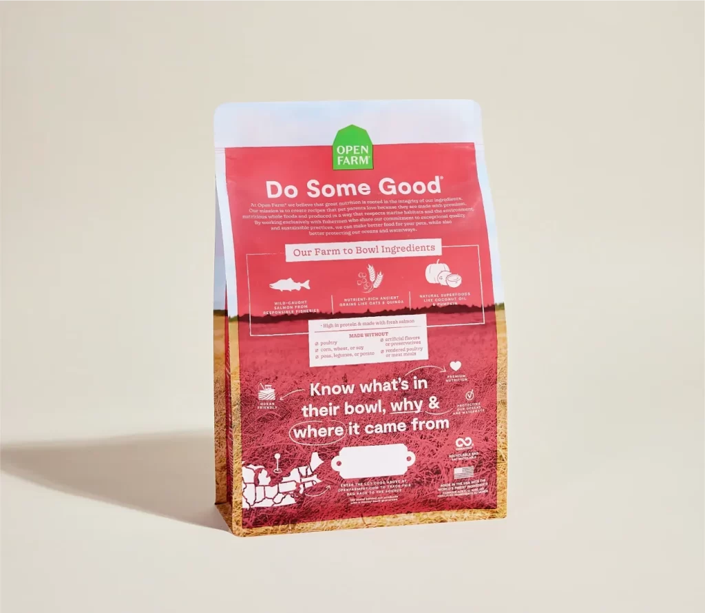
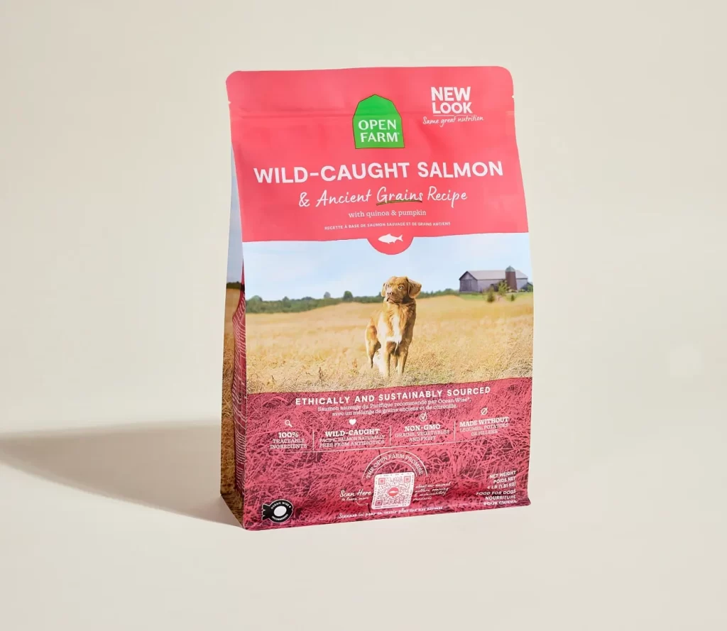
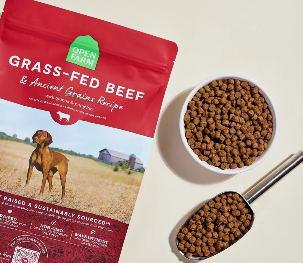
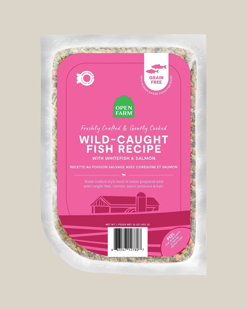
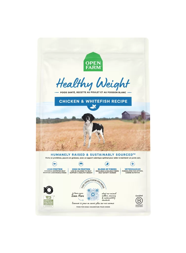
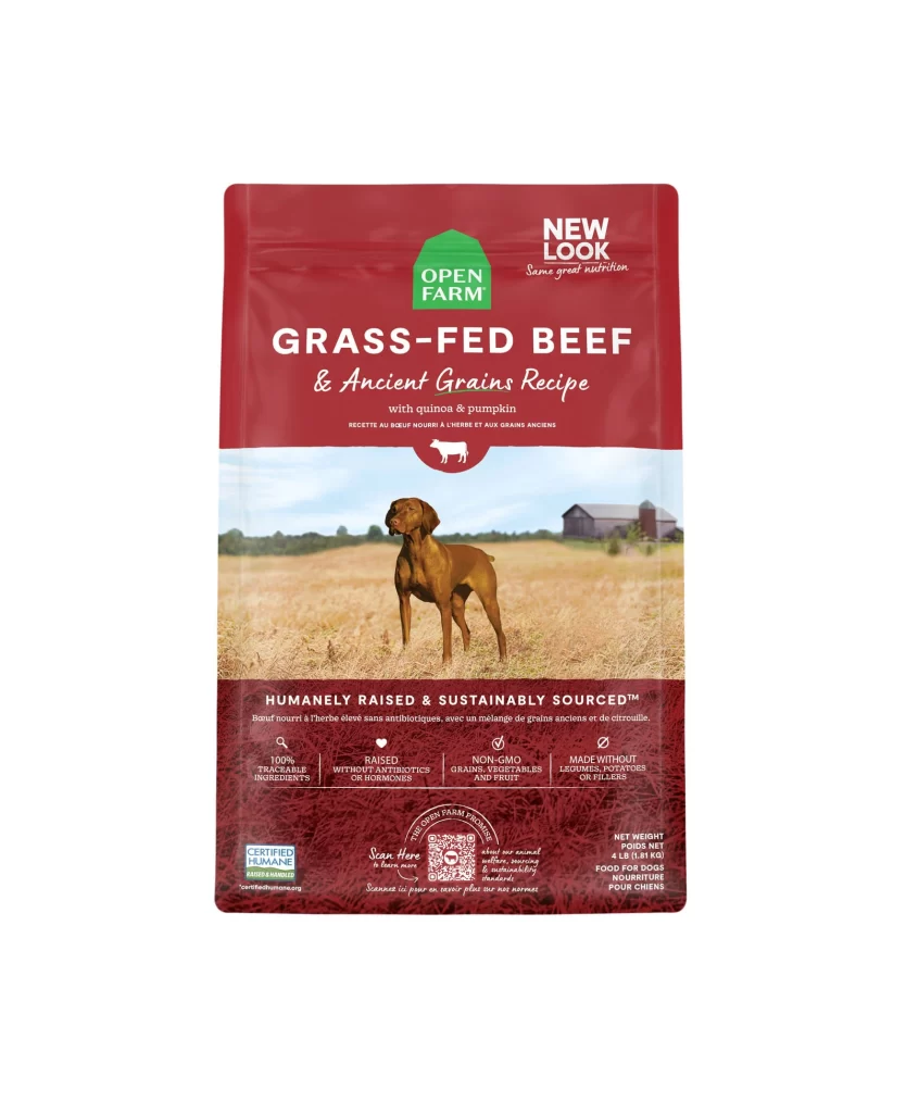
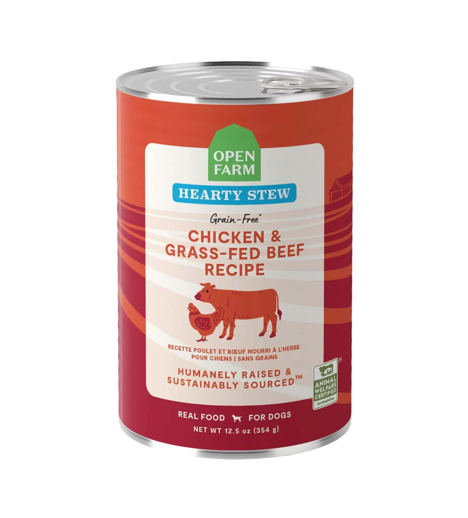
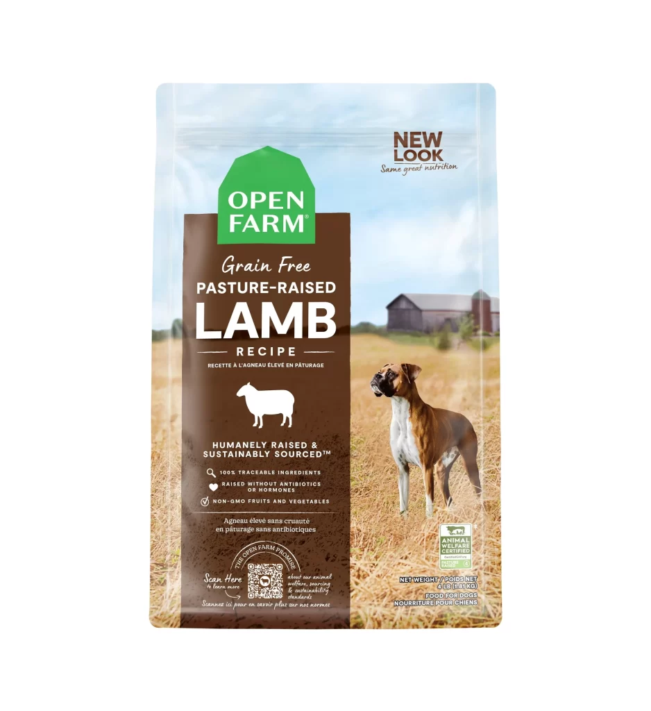
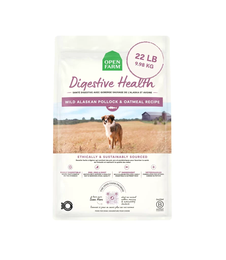
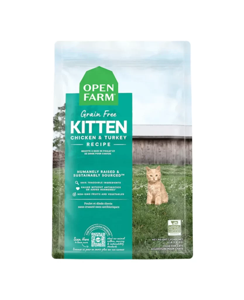
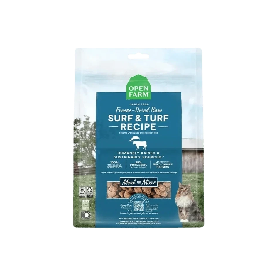
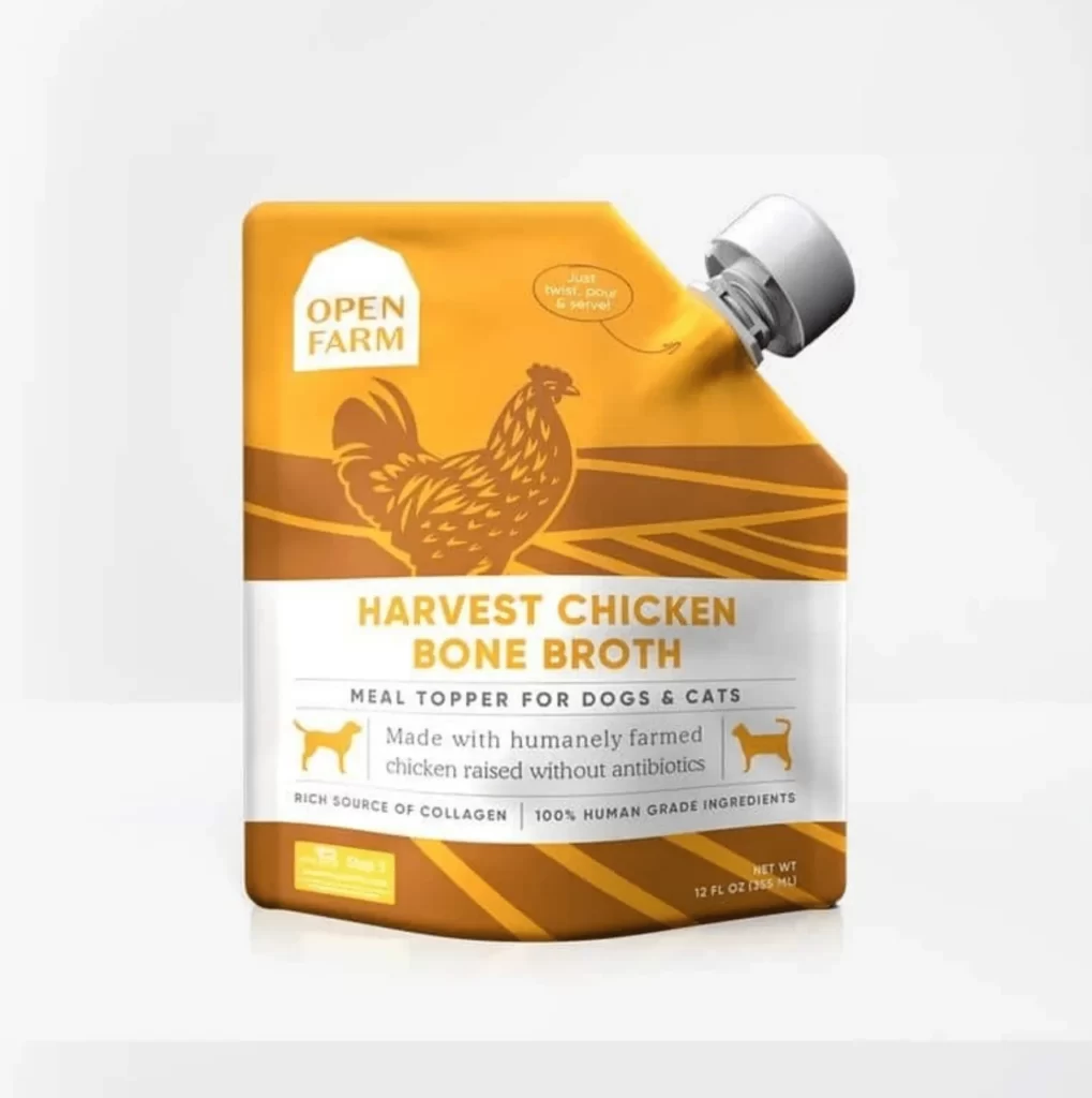
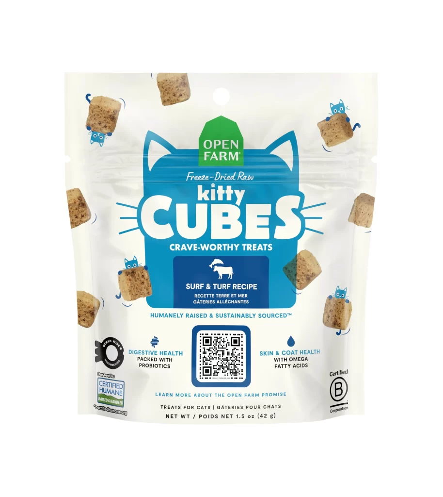
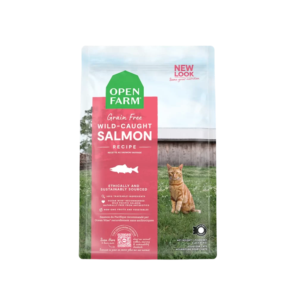
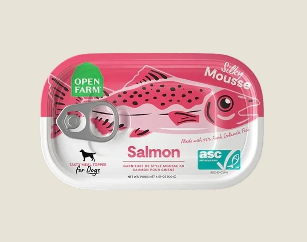
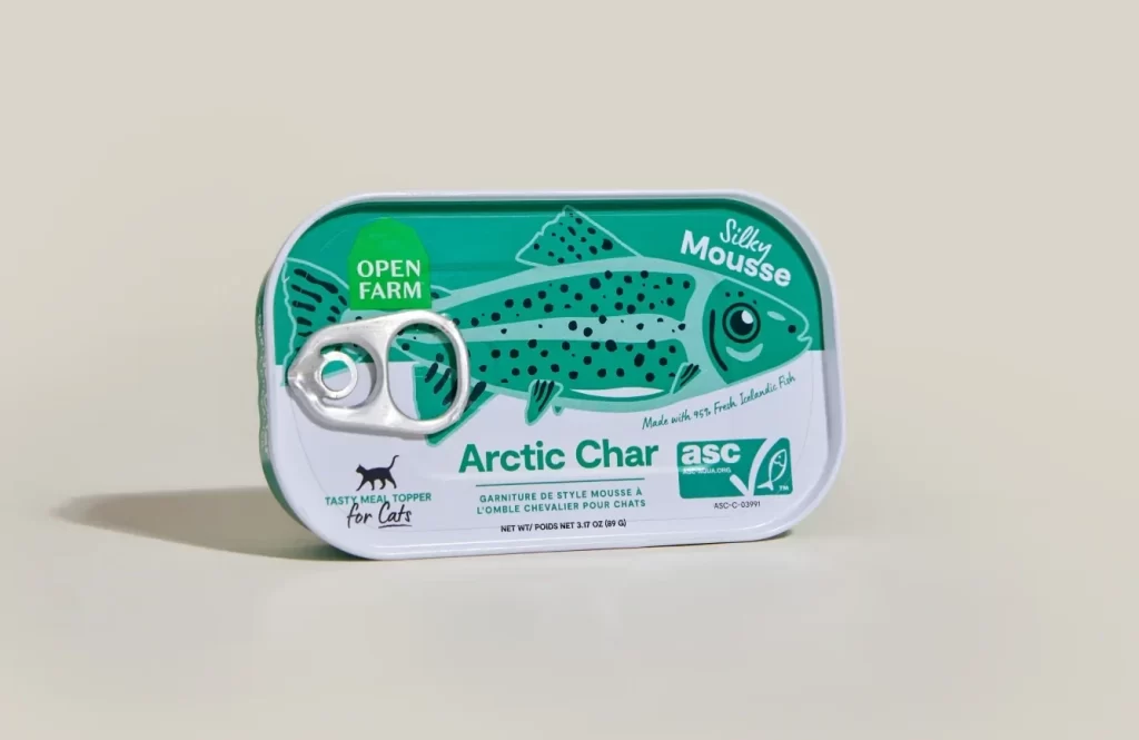
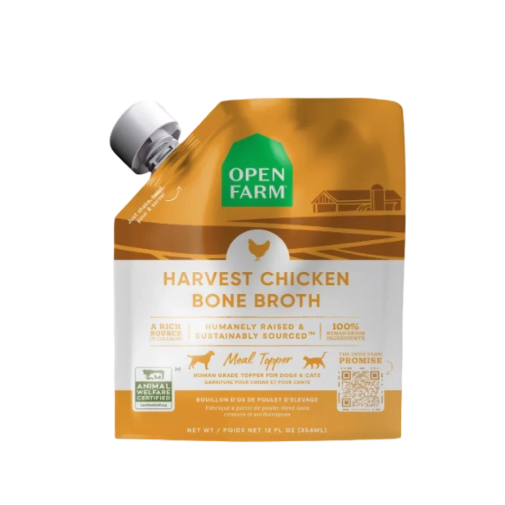
A vibrant green pentagonal shape with a distinct gabled peak reminiscent of a barn roof dominates the composition, featuring bold white sans-serif lettering that spells 'OPEN' on the upper line and 'FARM' directly beneath it. A small registered trademark symbol tucks into the lower right corner of the final letter, while the entire emblem sits on a clean white background.
Visual interest here stems from the clever use of negative space within the house-like silhouette to create an immediate association with agriculture and shelter. The high-contrast pairing of saturated green and pure white ensures maximum legibility even at small scales, while the geometric rigidity of the shape conveys stability and trustworthiness. By eschewing any illustrative details in favor of heavy typography, the design achieves a modern, utilitarian aesthetic that feels both approachable and authoritative.
Brand strategists might analyze this mark to understand how architectural metaphors can reinforce corporate values like transparency and ethical sourcing. Packaging engineers could reference the proportions when developing label systems that require strong visual anchors on rectangular containers. Additionally, marketing teams evaluating color psychology in the pet food sector would find this specific shade of green useful for benchmarking against competitor palettes to ensure shelf differentiation.