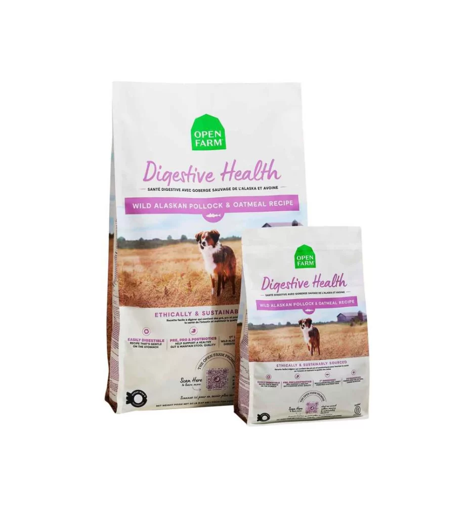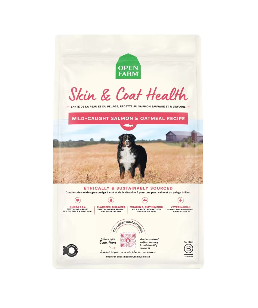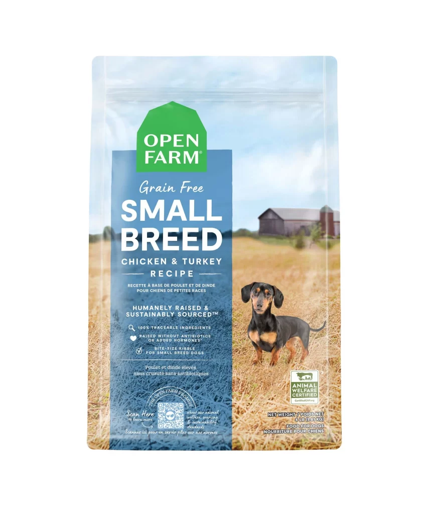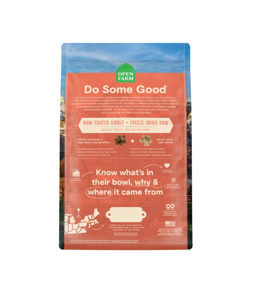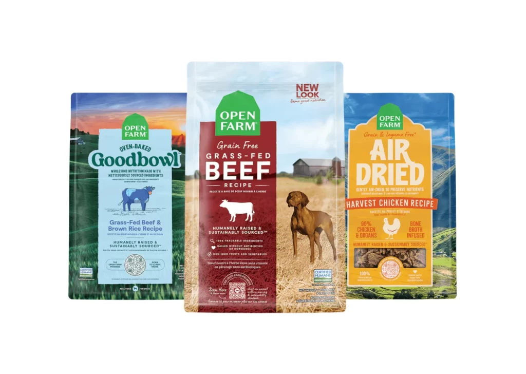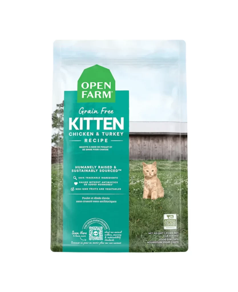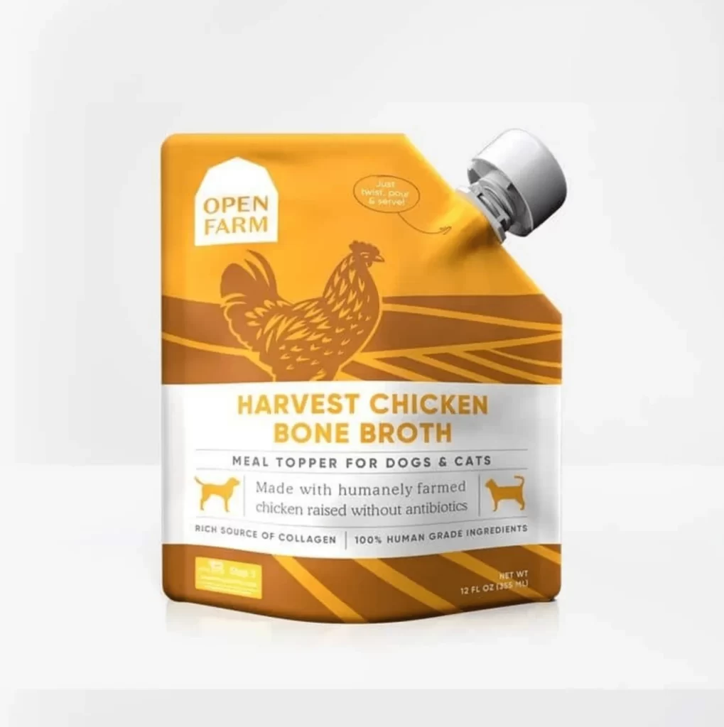
Open Farm Freeze-Dried Raw Kitty Cubes Dog Food Packaging
Topics
Details
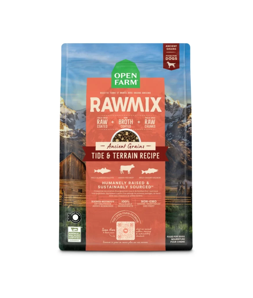
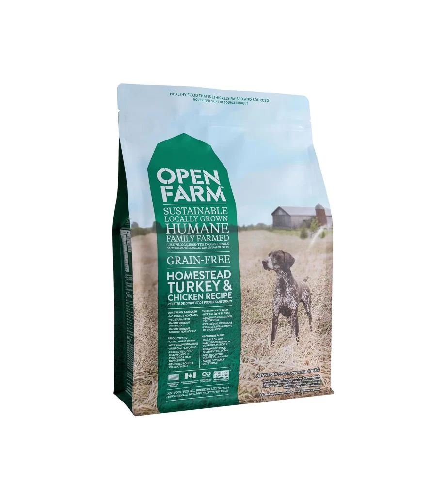
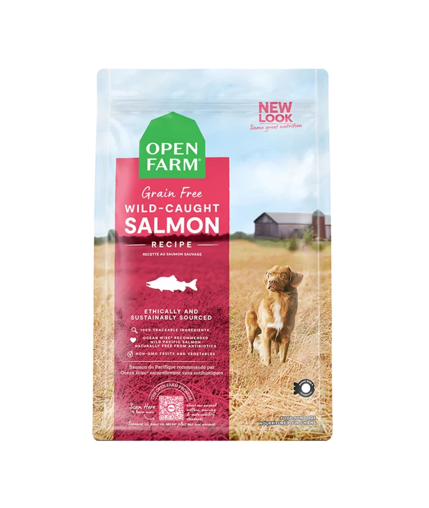
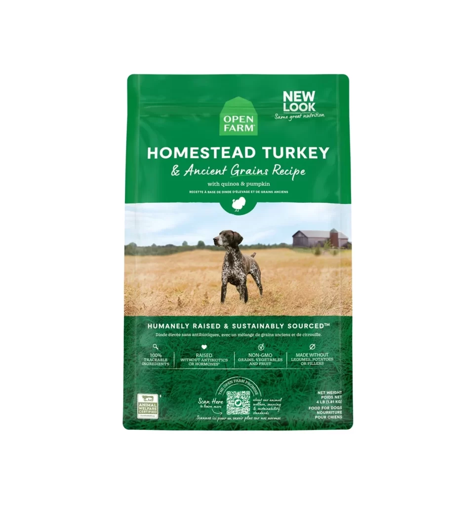
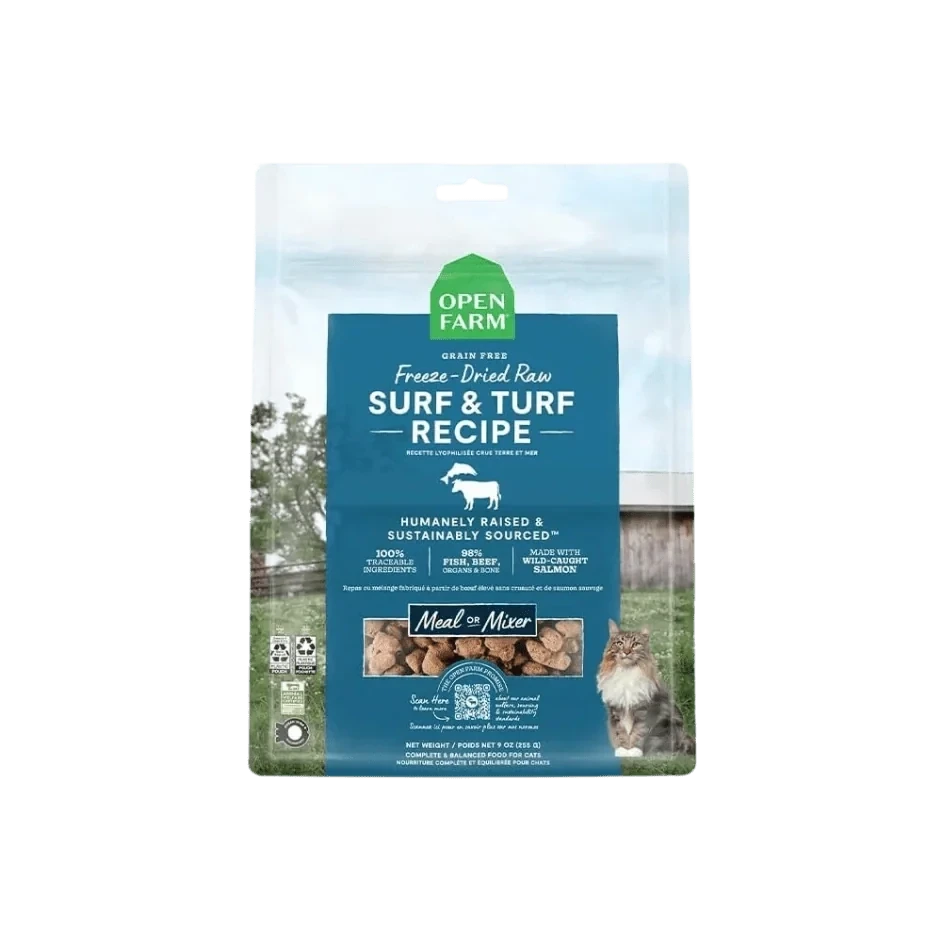
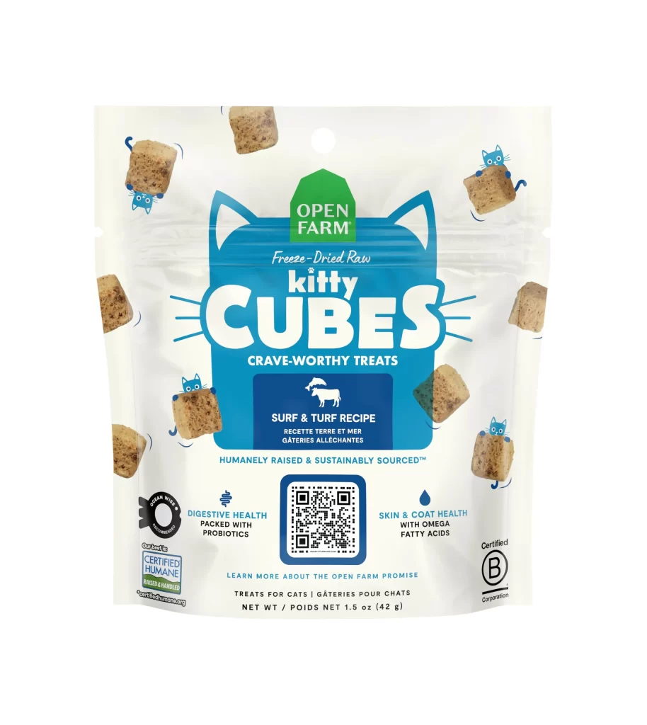
A clear plastic pouch displays a vibrant cyan-blue cat-head graphic that frames the bold white 'CUBES' typography and supports the green 'OPEN FARM' house logo above. Photographic representations of brown, textured cubes appear around the central emblem, each accompanied by small blue cartoon cats, while the white background provides contrast for the packaging's colorful elements.
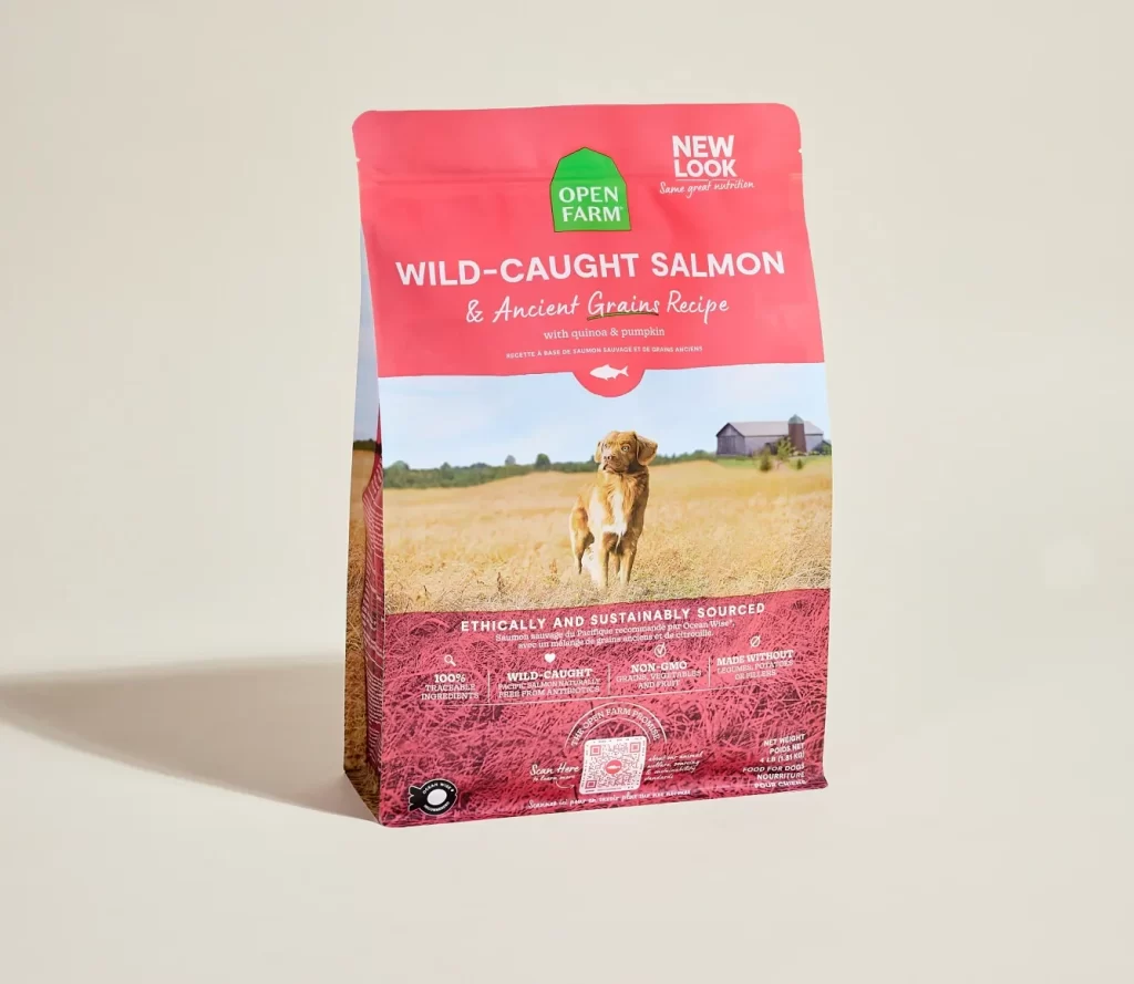
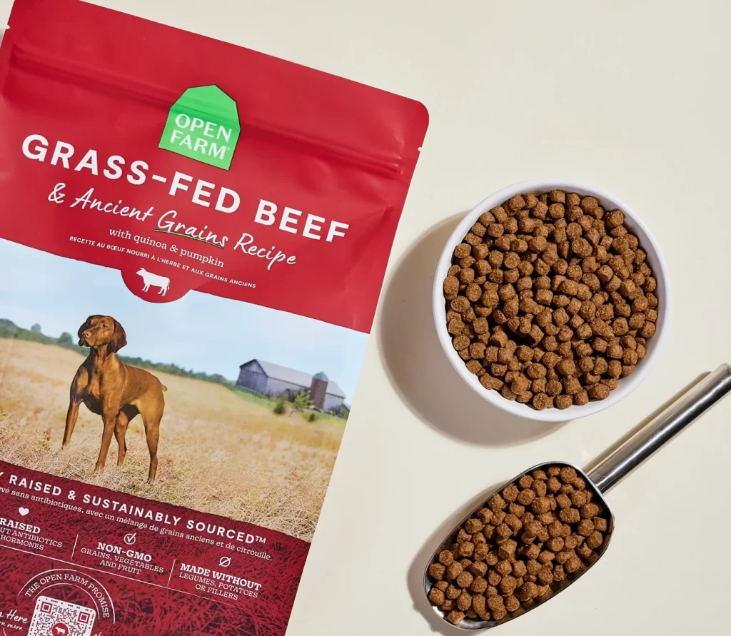
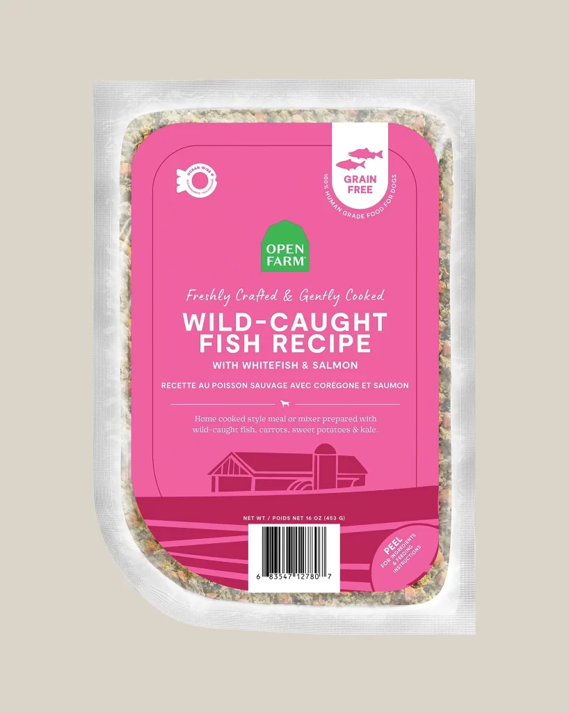
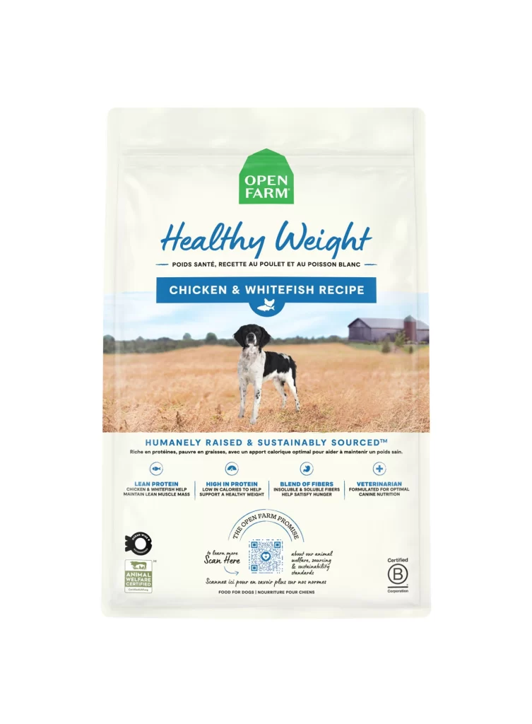
Visual hierarchy is established through a strategic use of contrasting colors, specifically the deep blue background against the stark white lettering and the organic earth tones of the product photography. The design integrates functional information—such as the ‘Surf & Turf Recipe’ label and health benefit callouts—directly into the illustrative elements rather than relegating them to fine print. This approach creates a cohesive brand identity where the packaging graphics serve as both an aesthetic frame and an informational dashboard for the consumer.
Brand strategists might utilize this layout to study how to effectively balance playful character illustrations with serious nutritional claims on limited surface area. Packaging engineers could analyze the placement of the QR code and certification logos to optimize scanning efficiency without disrupting the primary visual flow. Furthermore, marketing teams could reference the specific color palette to ensure consistency across different product lines within the same pet food ecosystem.