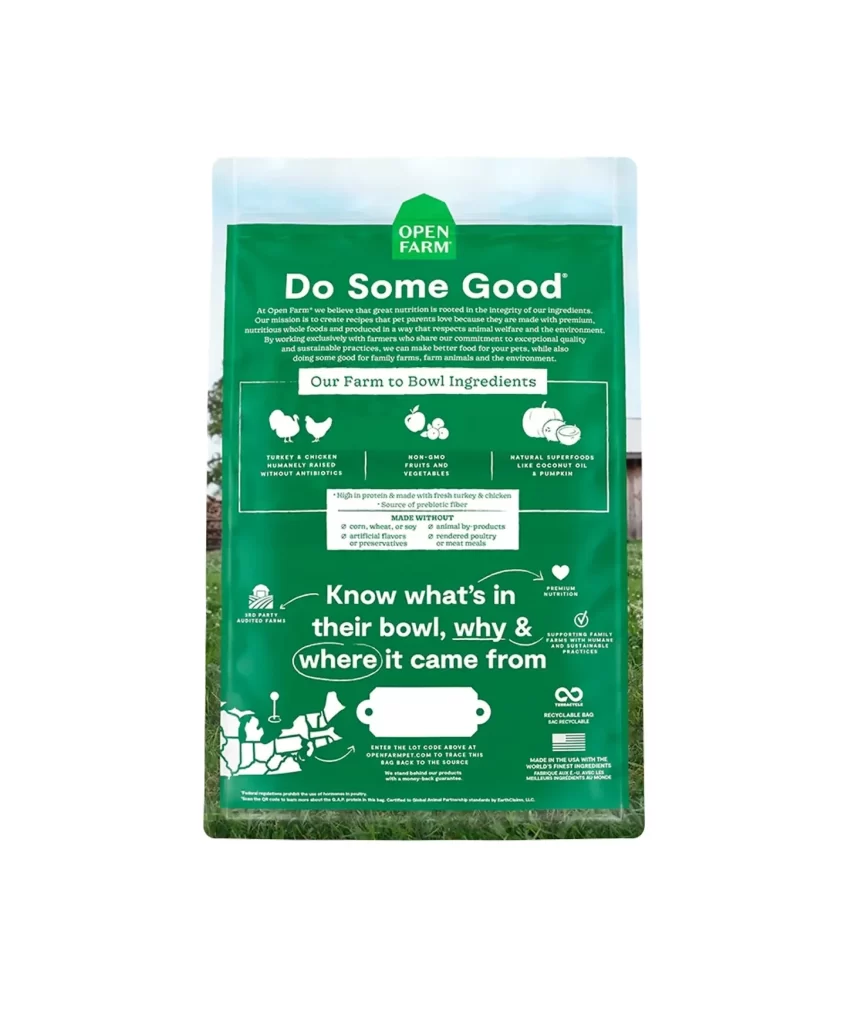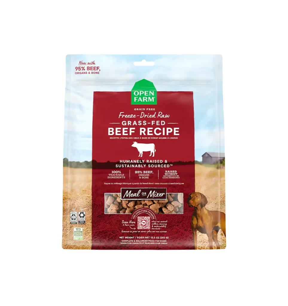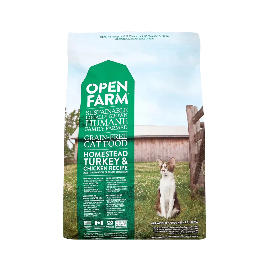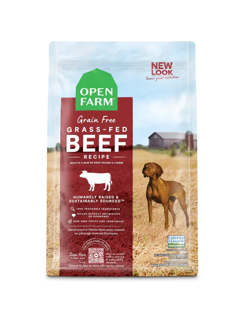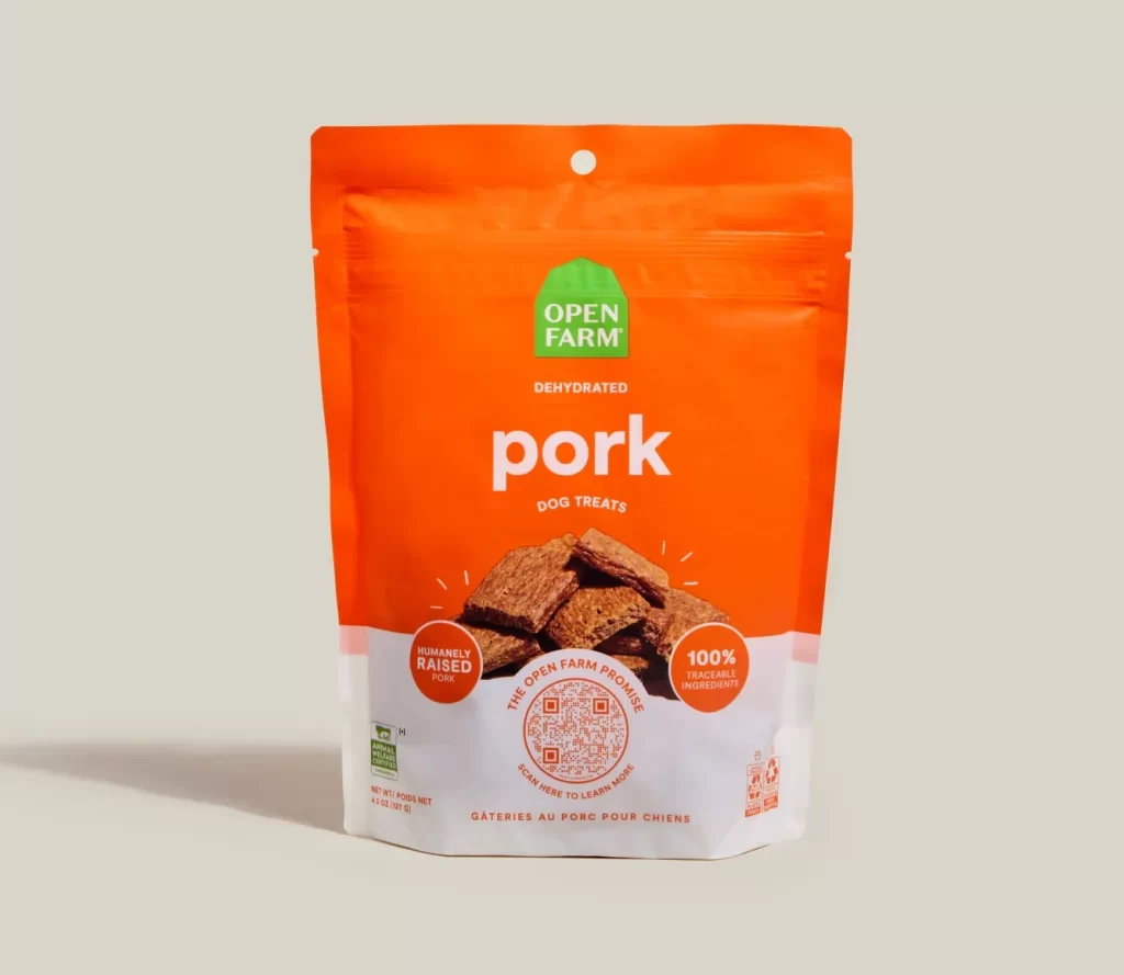
Open Farm Dehydrated Pork Dog Treats Packaging
Topics
Details
A vibrant orange stand-up pouch with a matte finish and resealable zipper dominates the composition, featuring bold white sans-serif typography that spells out 'pork' beneath the green Open Farm logo. The symmetrical packaging displays a circular hang-hole at the upper center and showcases an image of dehydrated pork treats above the white lower band, which contains certification badges and bilingual text reading 'DOG TREATS' and 'GÂTERIES AU PORG POUR CHIENS'. Photographed straight-on against a neutral off-white background, the 4.4 oz pouch highlights claims of humanely raised pork and 100% traceable ingredients surrounding a central QR code.
Visual hierarchy is established through the strategic use of high-contrast color blocking, where the saturated orange field draws immediate attention before guiding the eye downward to the product photography and informational badges. The inclusion of a central QR code surrounded by the text ‘THE OPEN FARM PROMISE’ adds a layer of interactive transparency, balancing modern digital elements with traditional packaging cues like the circular ‘HUMANELY RAISED PORK’ and ‘100% TRACEABLE INGREDIENTS’ seals. This layout successfully merges ethical branding with clear product identification, utilizing negative space effectively to prevent visual clutter despite the density of information.
Brand strategists analyzing pet food market trends would utilize this example to study how color psychology influences consumer perception of natural and ethical products. Packaging engineers could examine the structural details of the gusseted bag design and the placement of functional elements like the zipper and punch-hole for retail display optimization. Furthermore, typographers and layout artists might reference the specific weight and spacing of the letterforms to understand how readability is maintained across different background colors and scales.