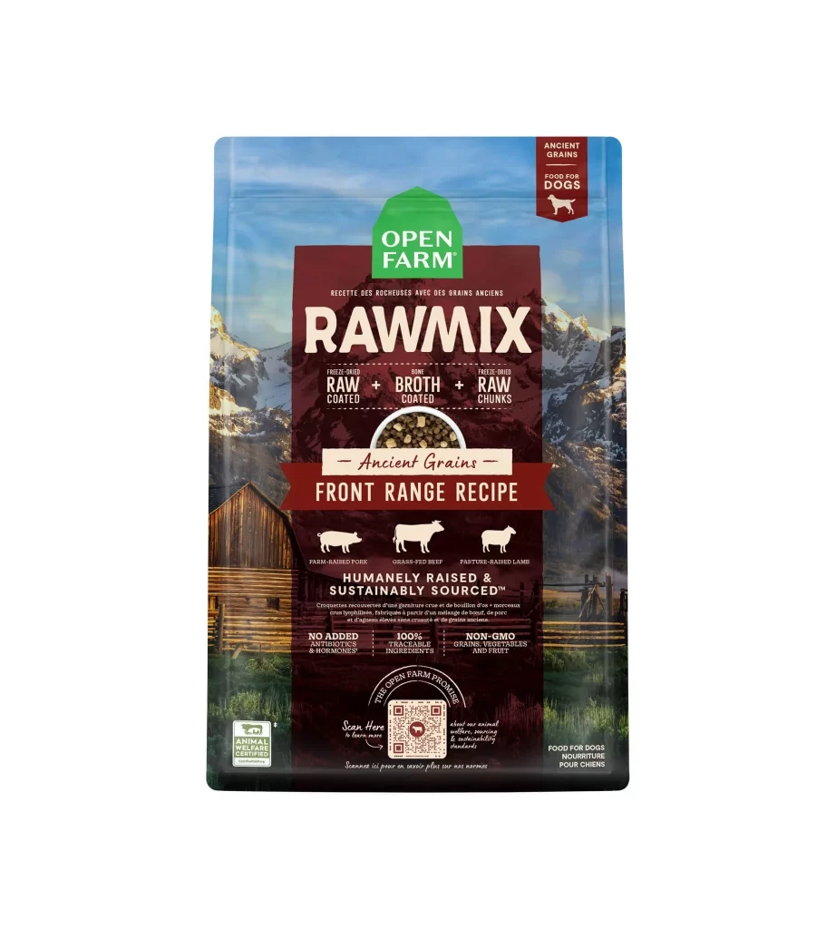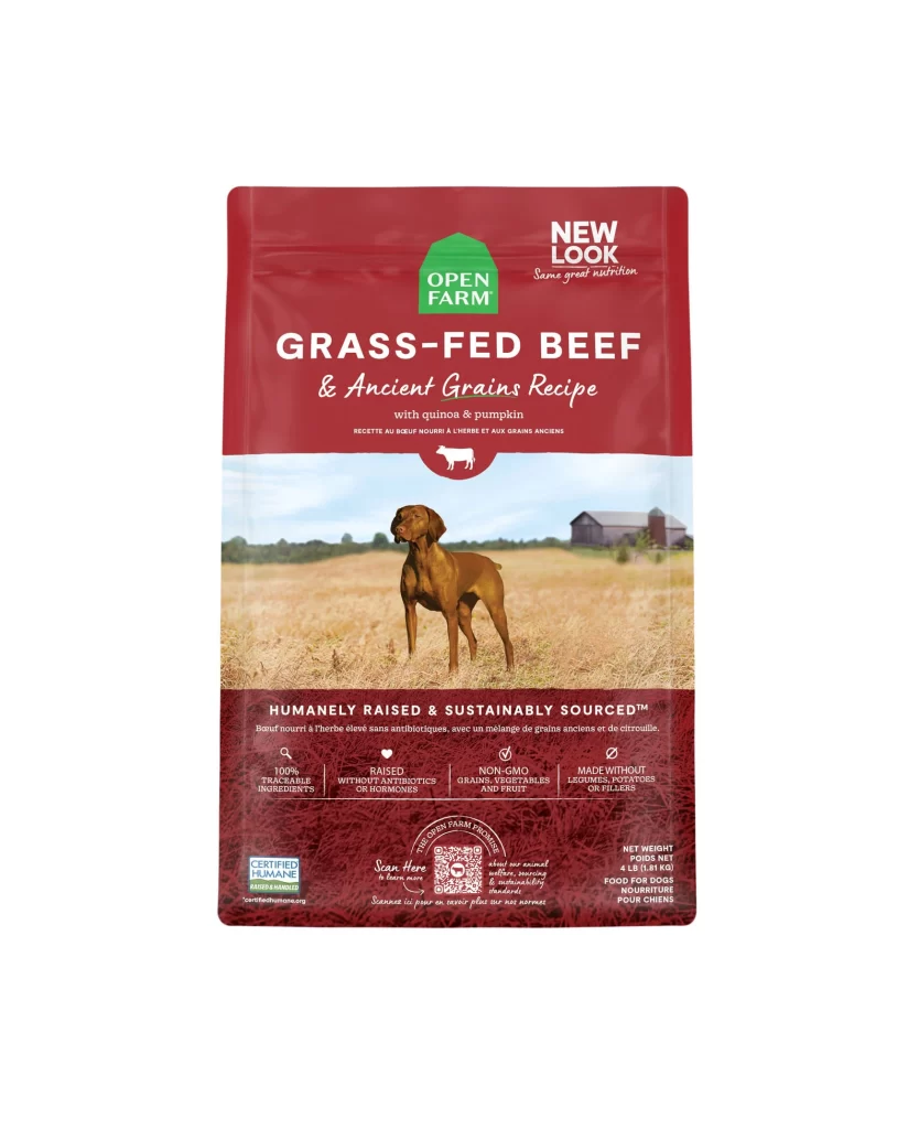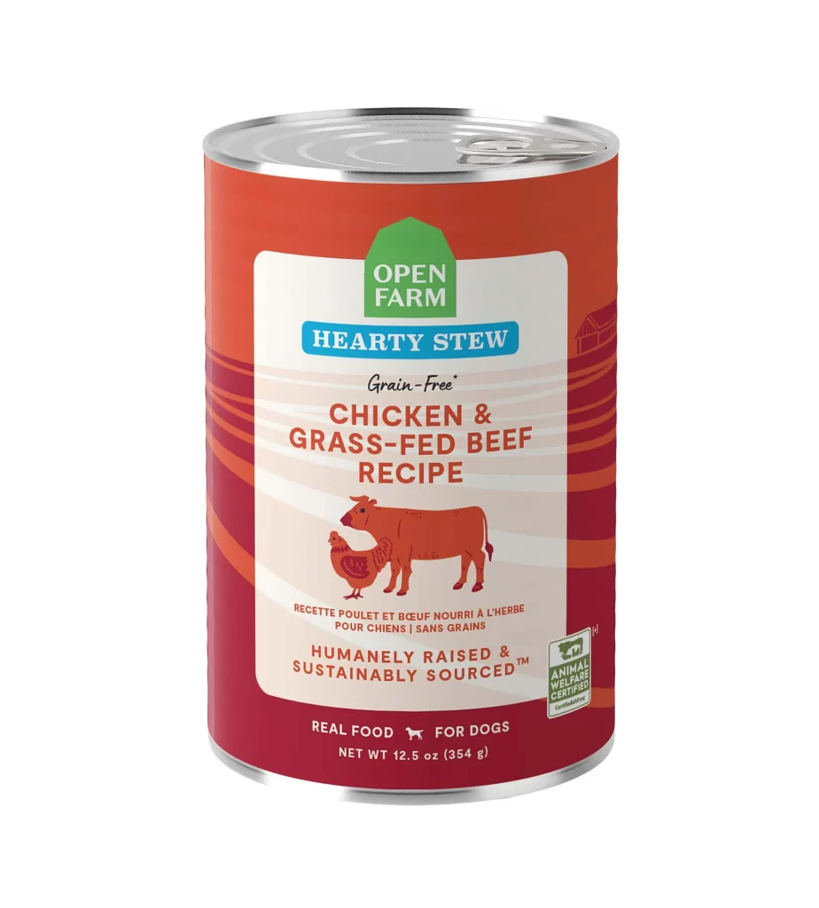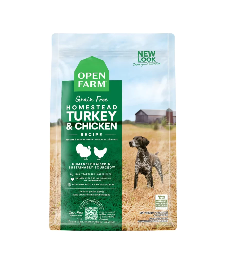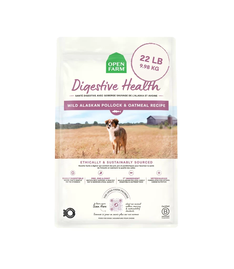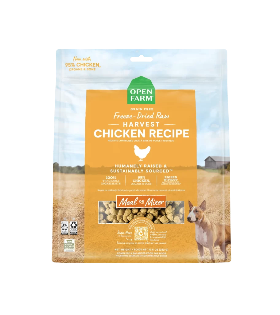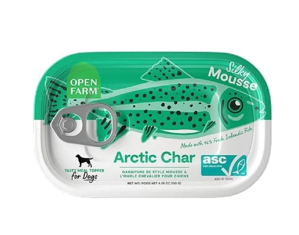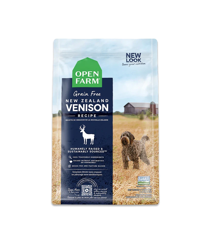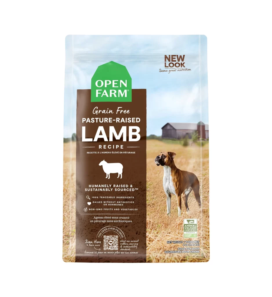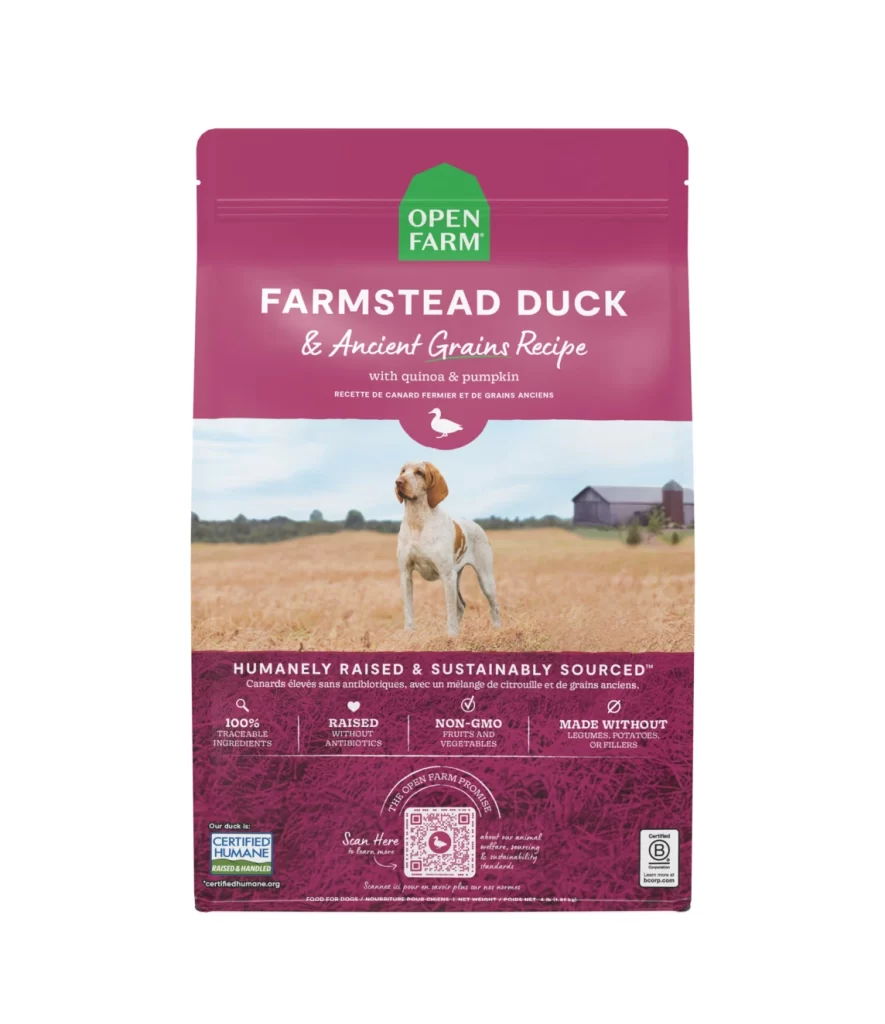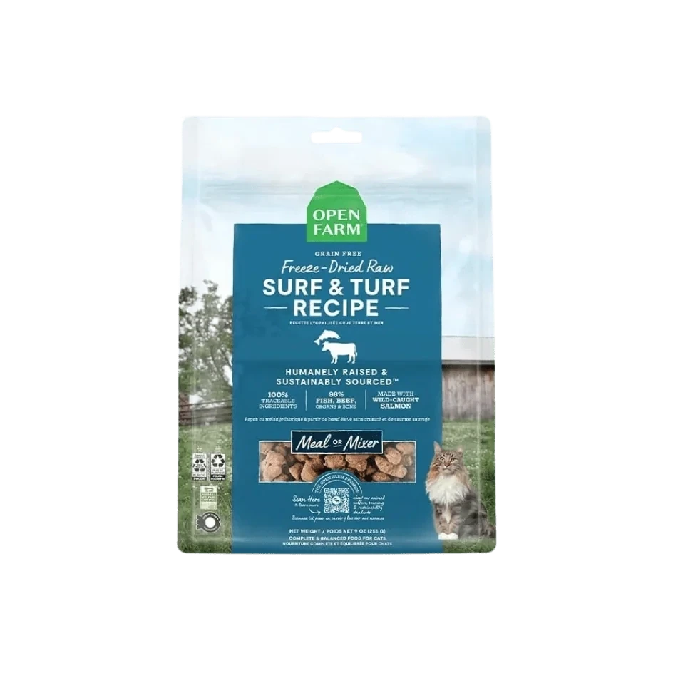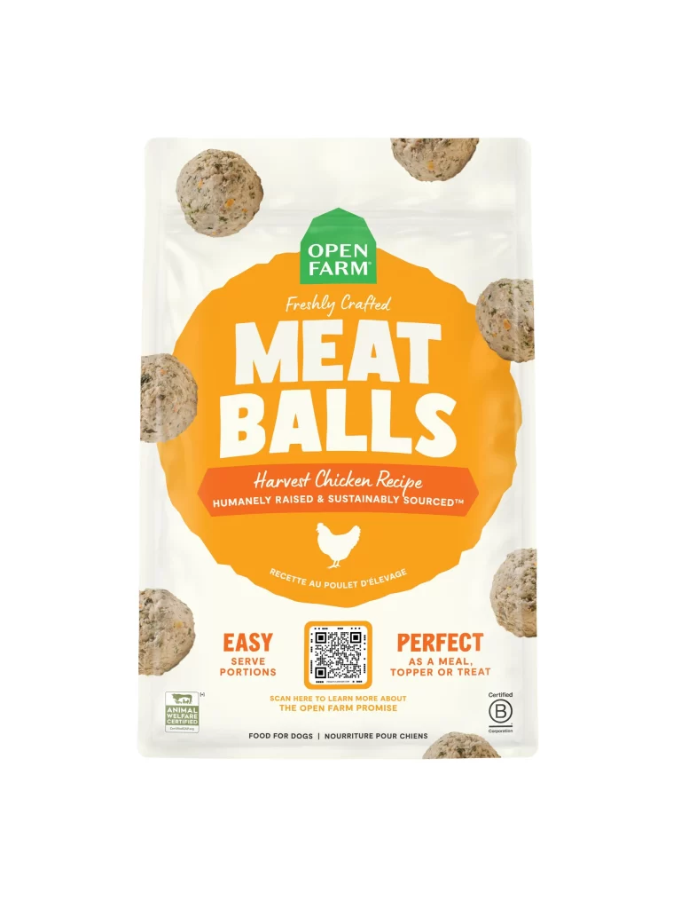
Open Farm Front Range Recipe Dog Food Variant 2 Packaging
Topics
Details
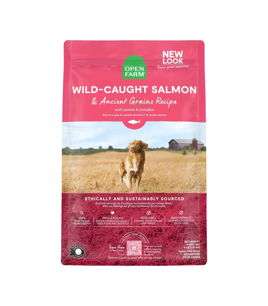
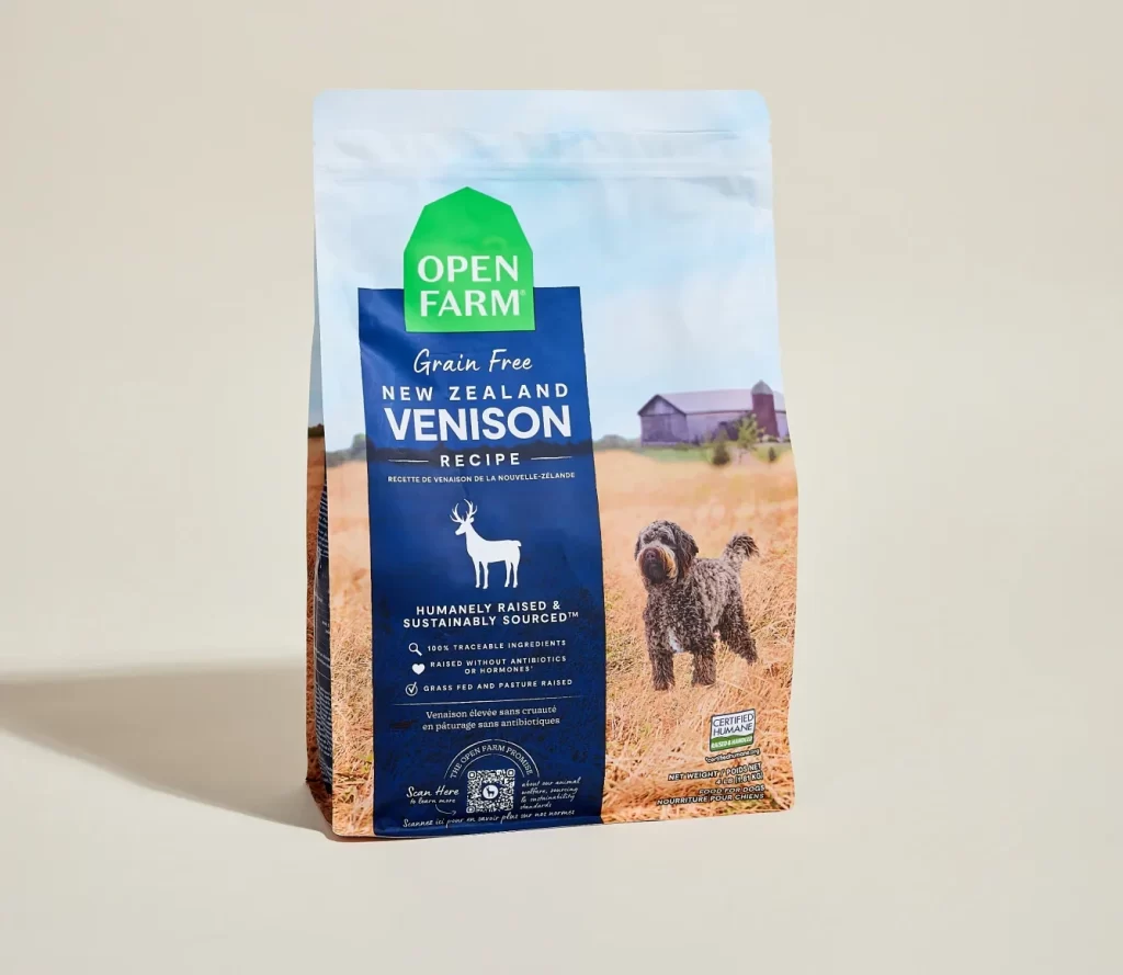
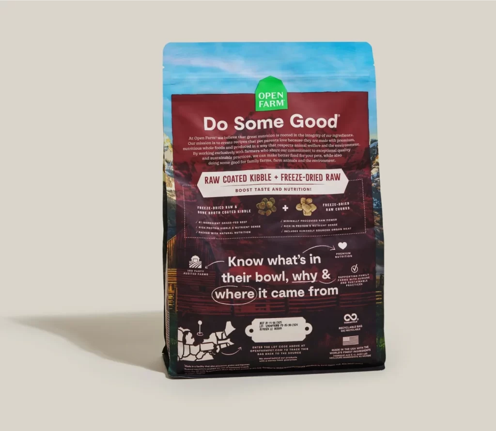
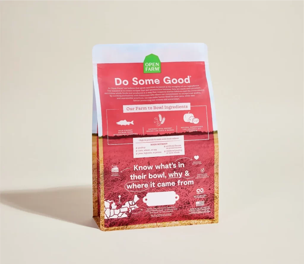
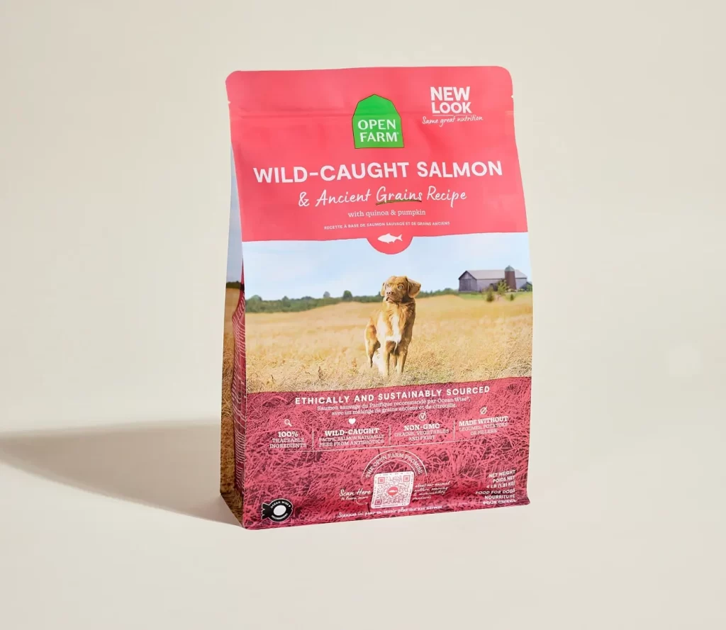
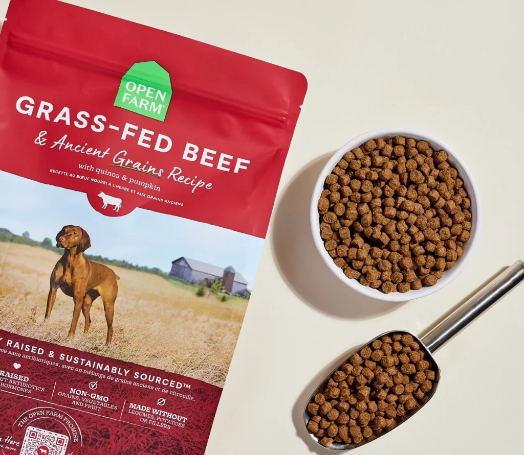
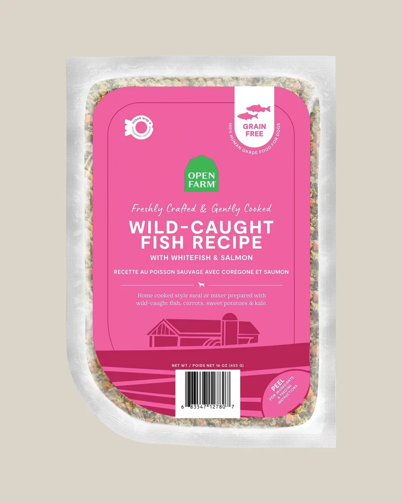
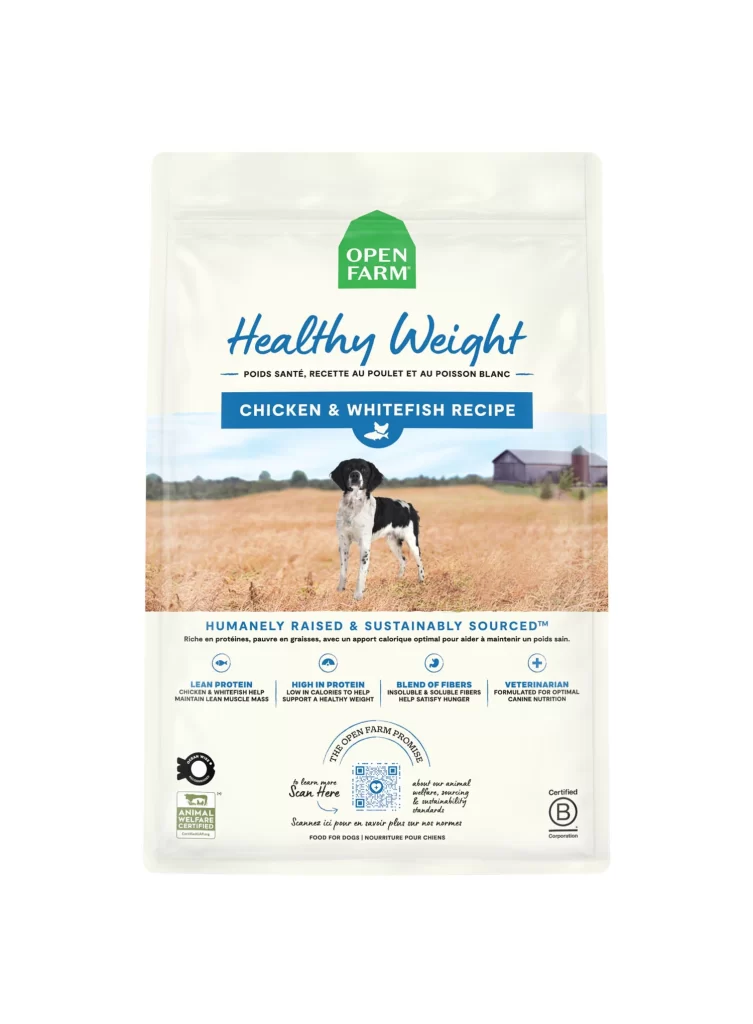
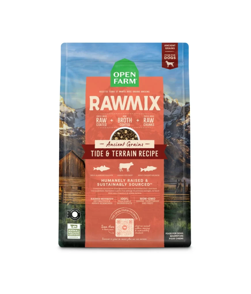
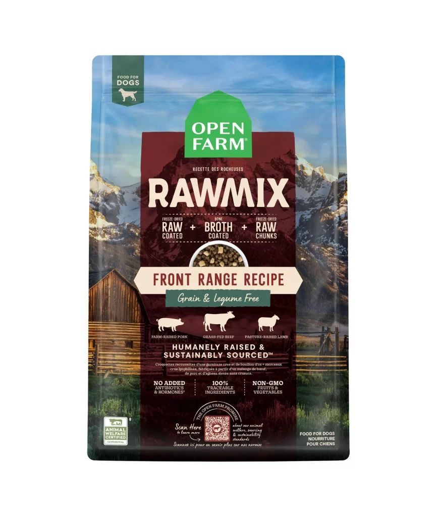
A vertically oriented Open Farm Rawmix package features a deep maroon central panel that dominates the composition, anchored at the top by the brand's signature green house-shaped logo. The product name 'RAWMIX' appears in bold, off-white serif typography, while a circular cutout below reveals the actual kibble texture against a background of snow-capped mountains and a rustic wooden barn.
Visual hierarchy here relies on the stark contrast between the earthy burgundy field and the crisp white informational bands that segment the layout into digestible zones. The ‘Front Range Recipe’ designation sits within an arrow-shaped cream container, creating a focal point that draws the eye downward through the ingredient claims. Notably, the integration of photographic realism with flat iconographic elements—specifically the livestock silhouettes against the painterly landscape—establishes a premium aesthetic that bridges artisanal craftsmanship with industrial packaging standards.
Brand strategists analyzing pet food market positioning would examine this variant to understand how color psychology influences consumer perception of ‘humanely raised’ claims. Packaging engineers might reference the structural balance between the transparent product window and opaque branding areas when developing similar resealable pouch formats. Additionally, retail merchandising teams could utilize this specific arrangement of certification badges and nutritional highlights to optimize shelf-facing communication strategies for grain-free product lines.