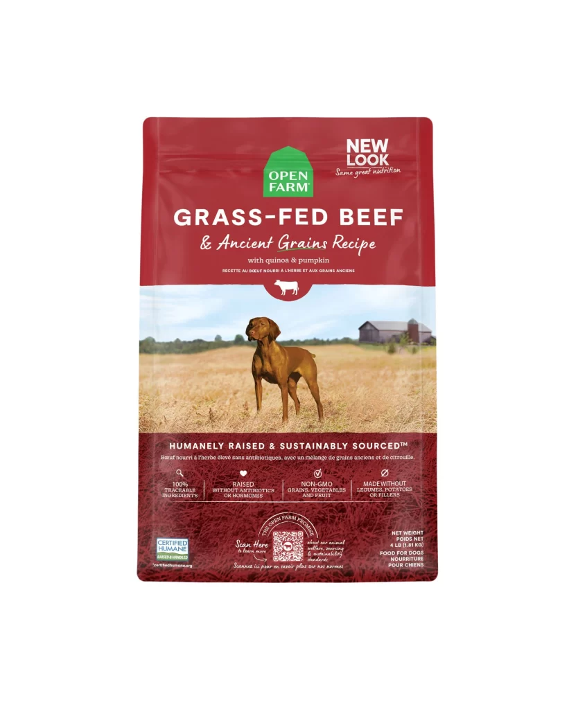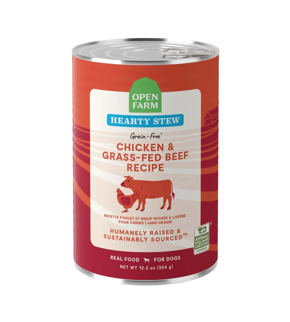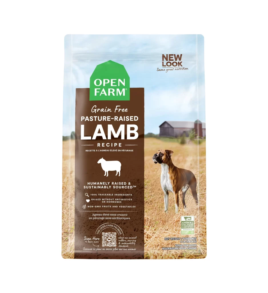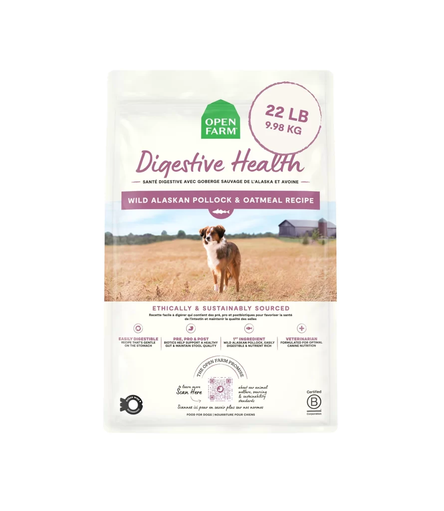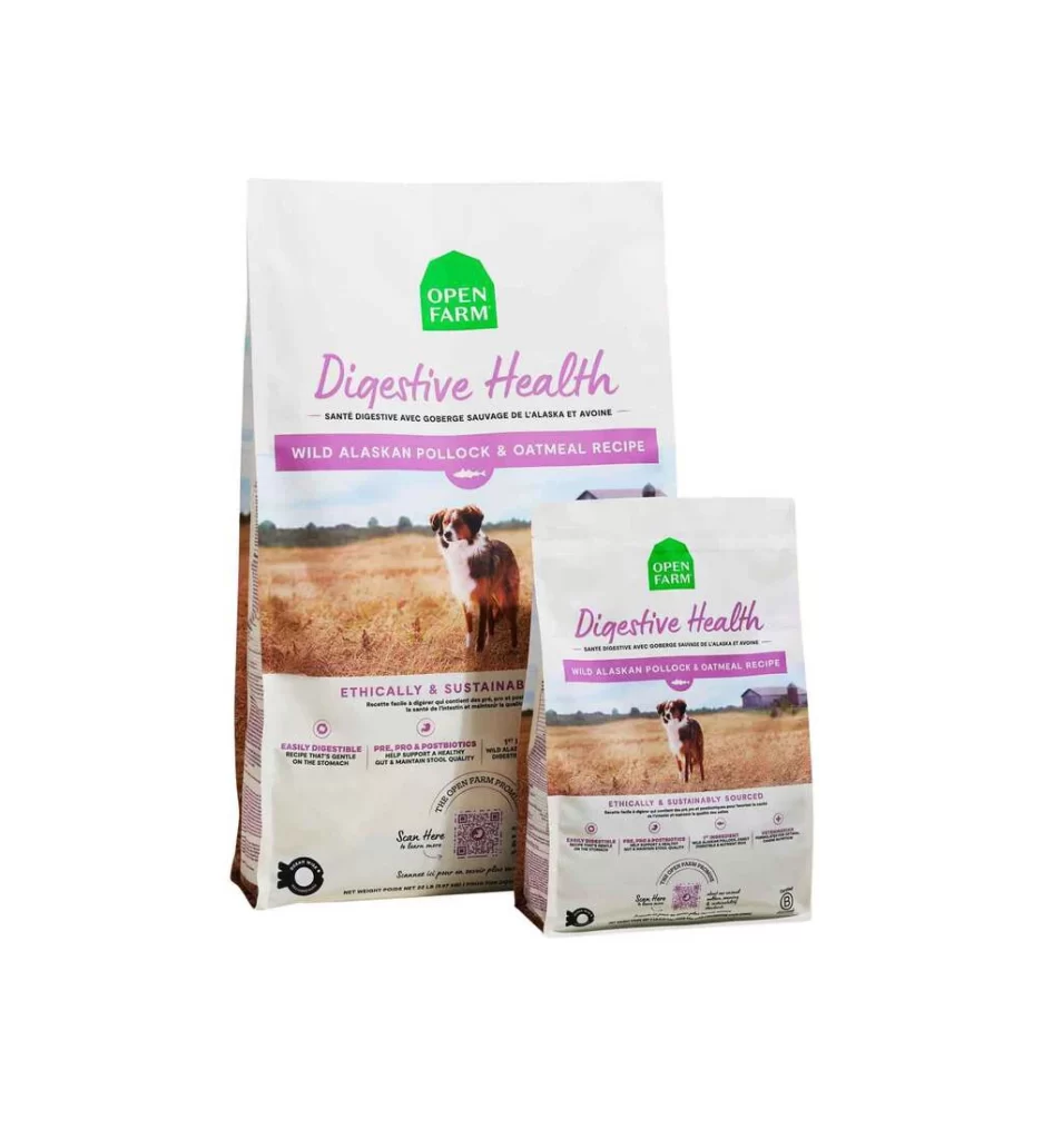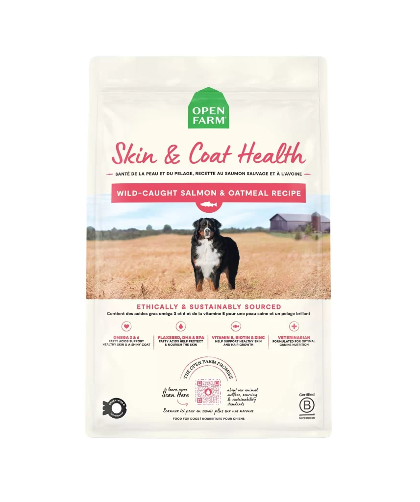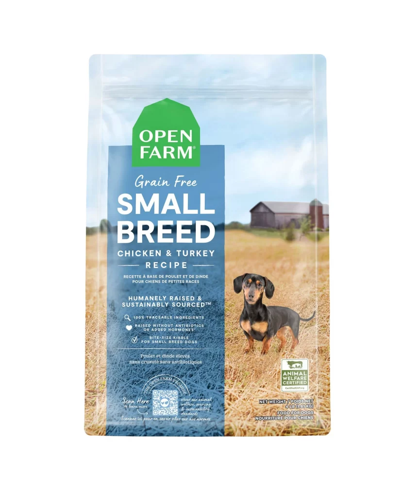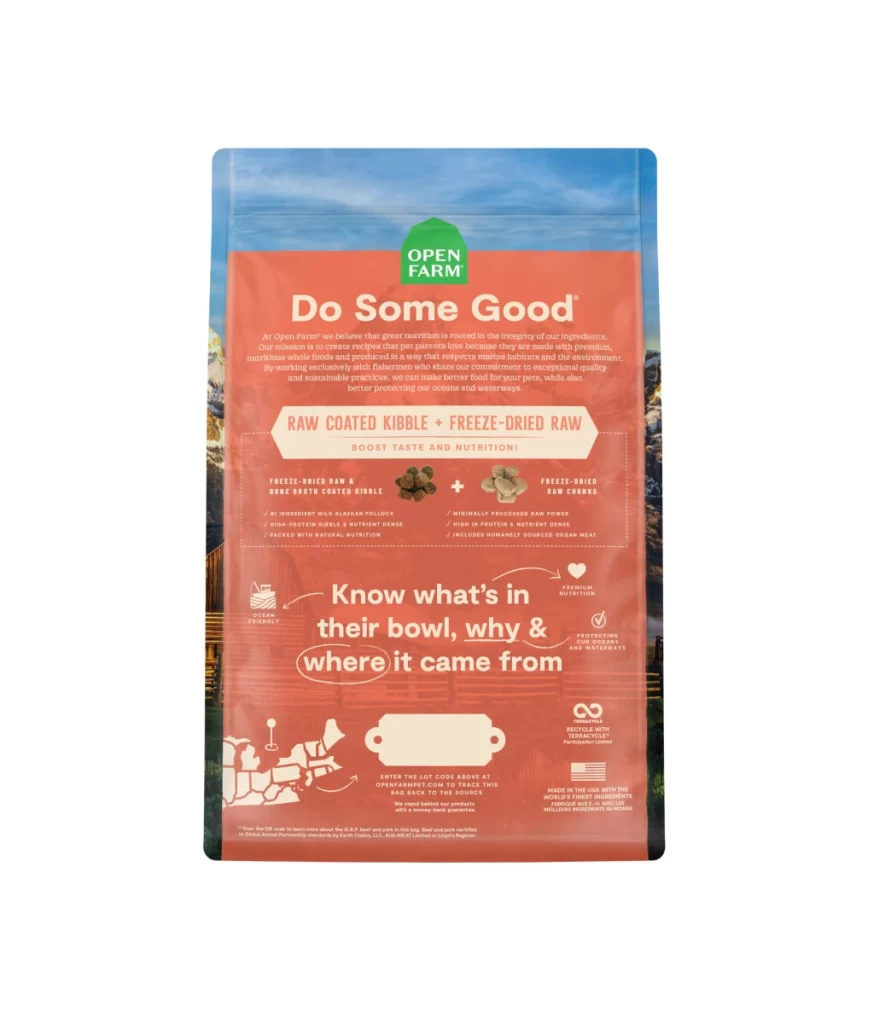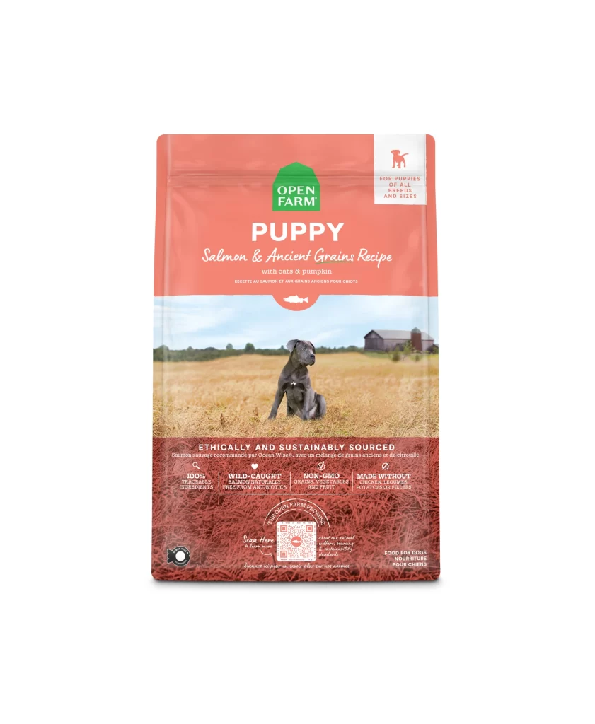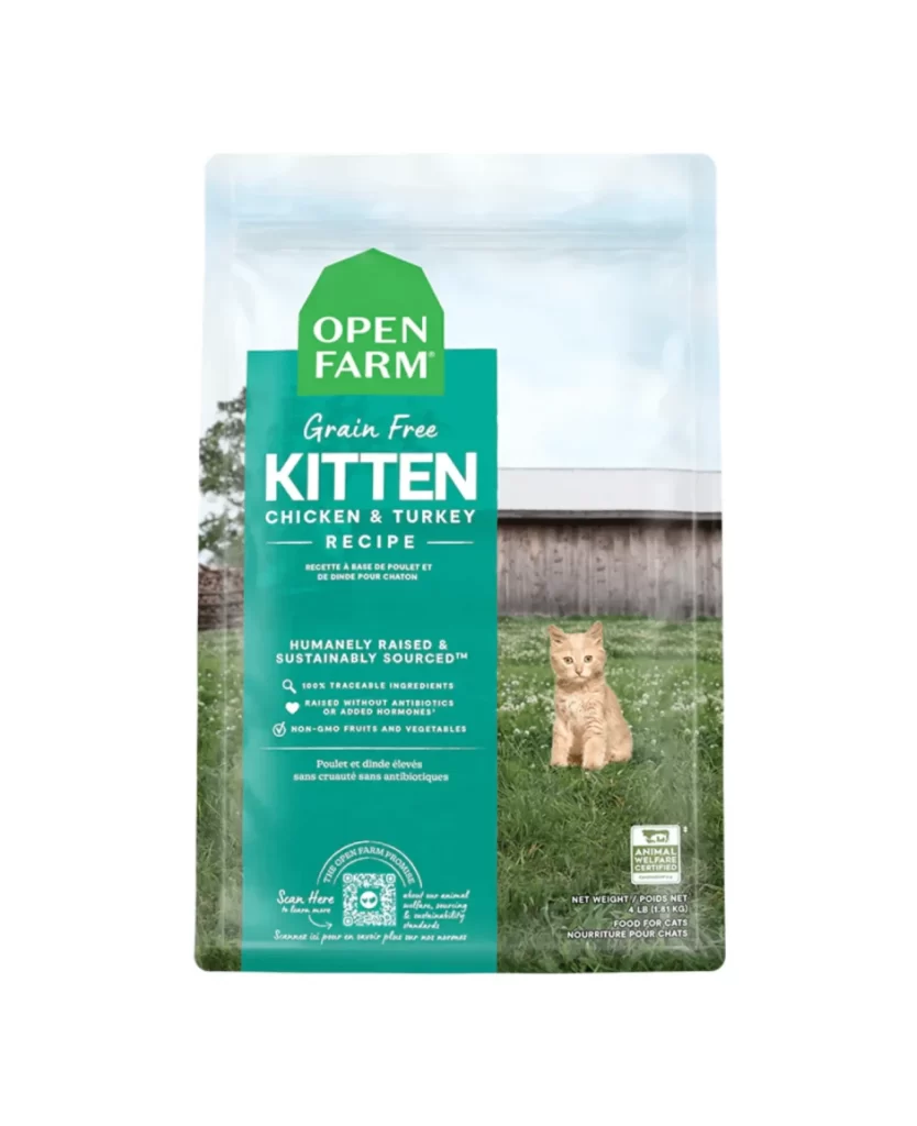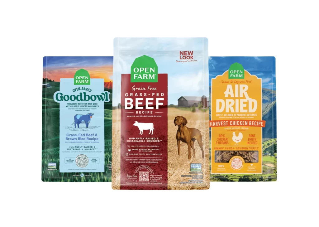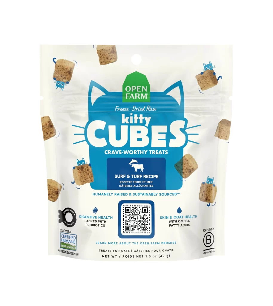
Open Farm Pork Recipe Dog Food Packaging
Topics
Details
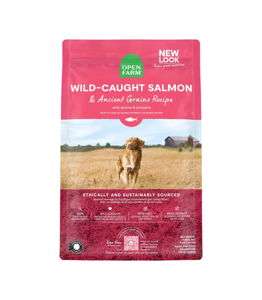
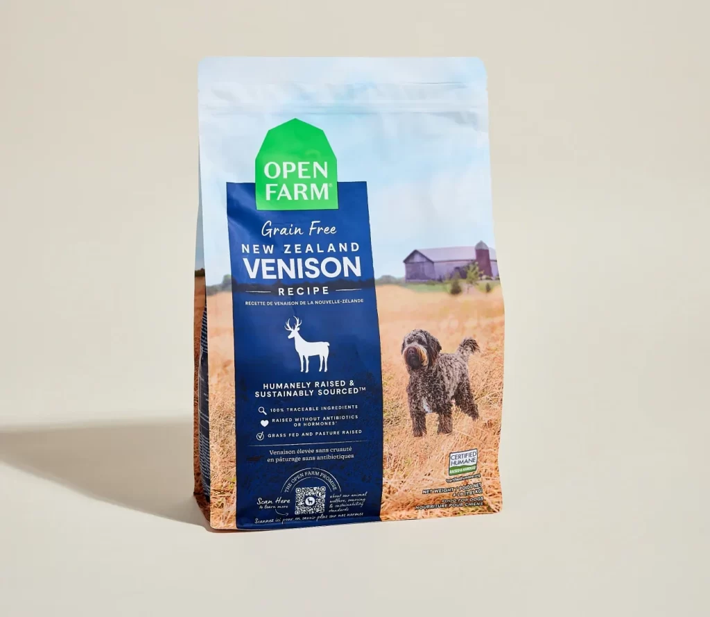
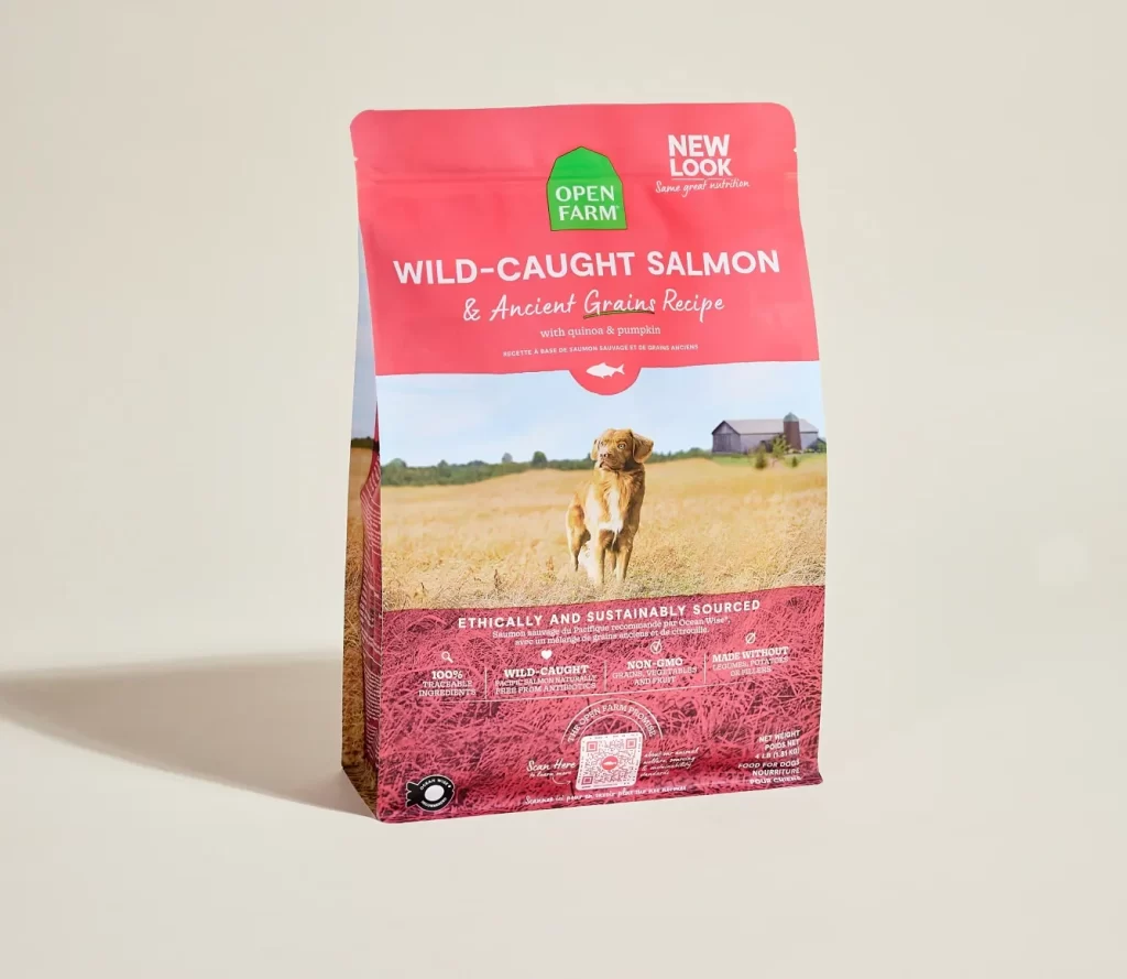
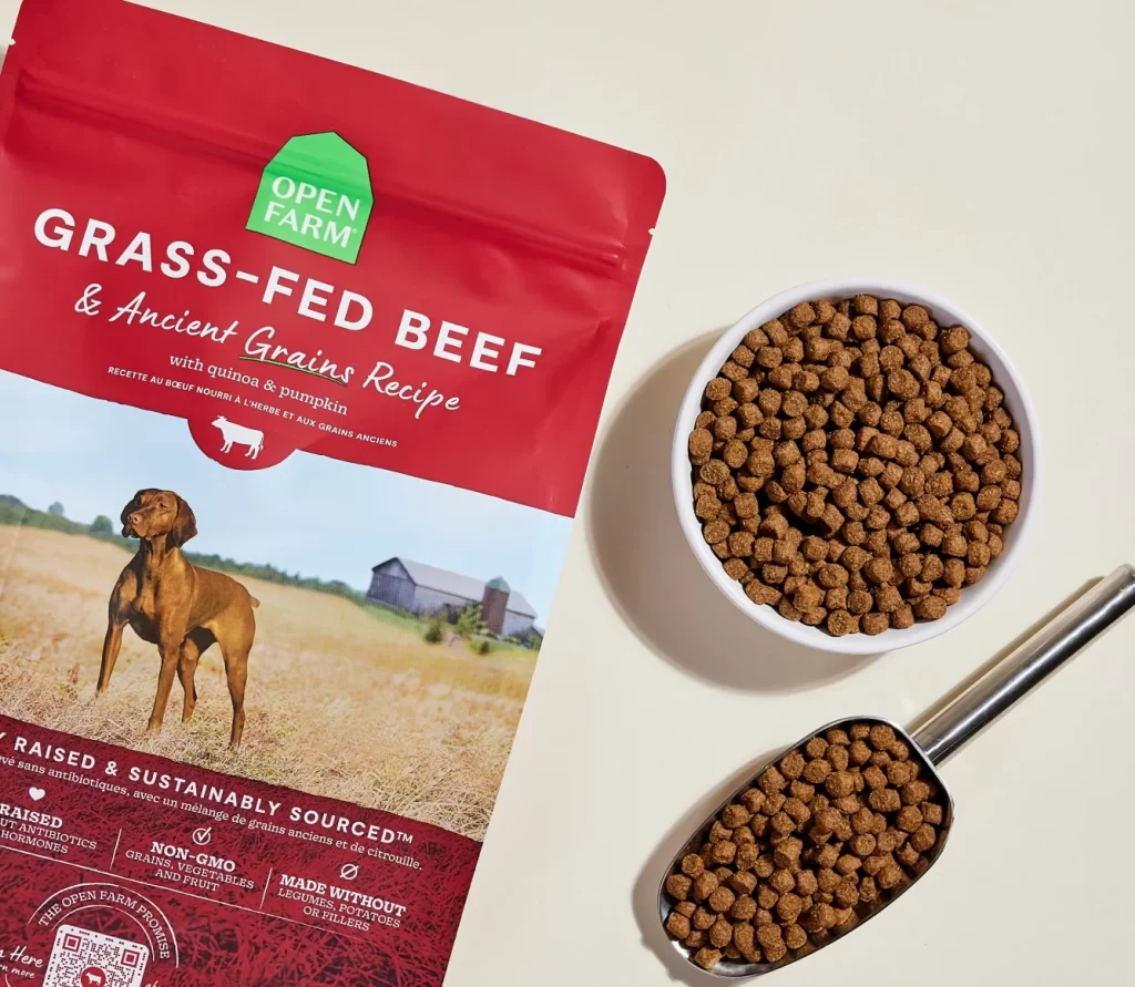
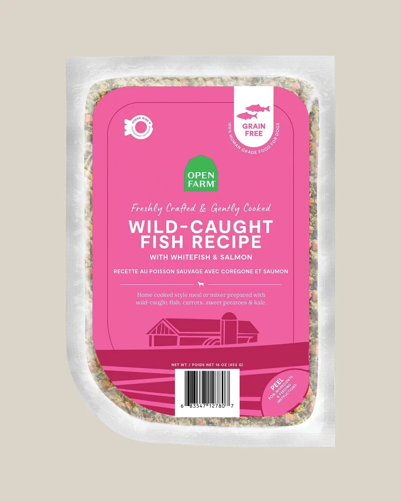
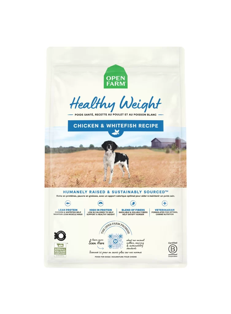
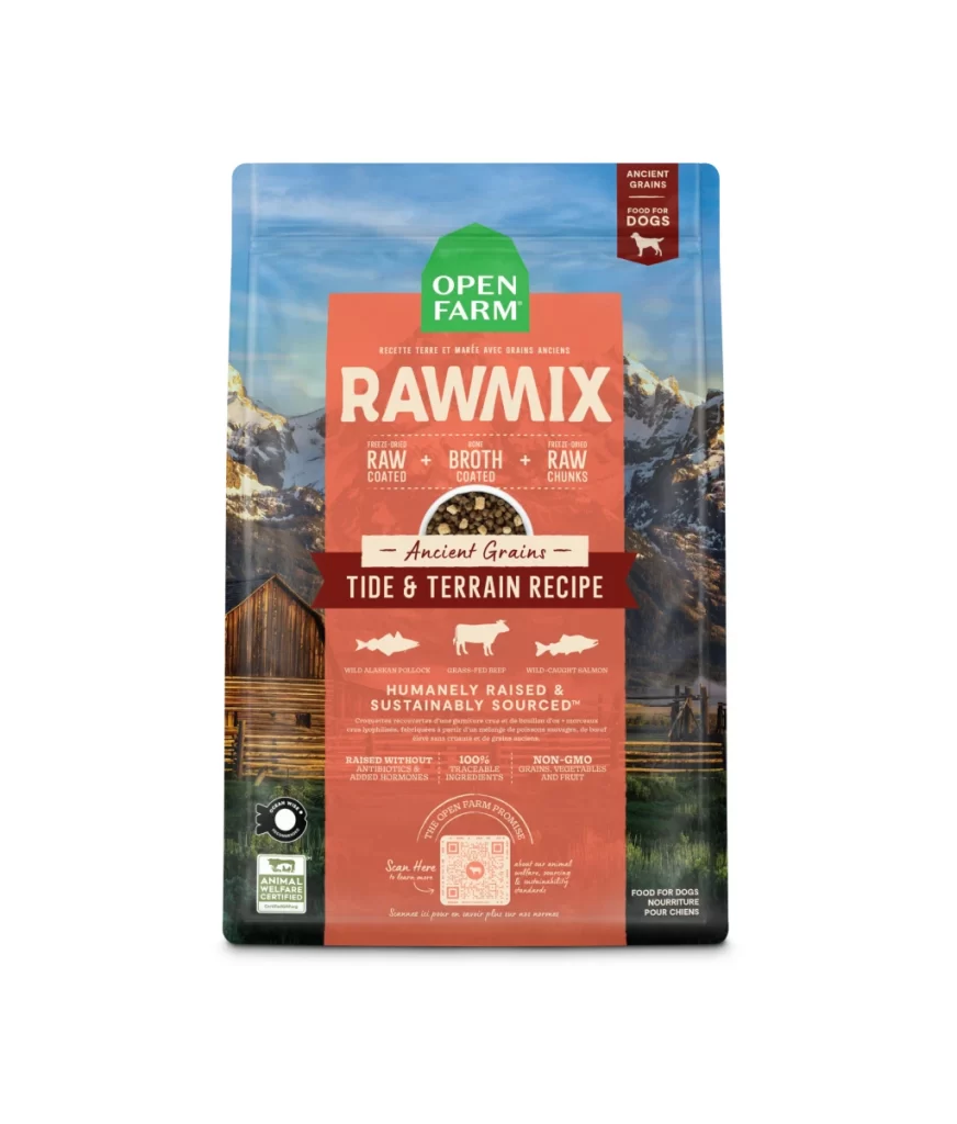
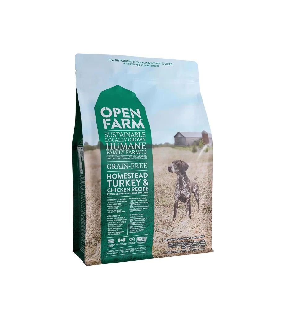
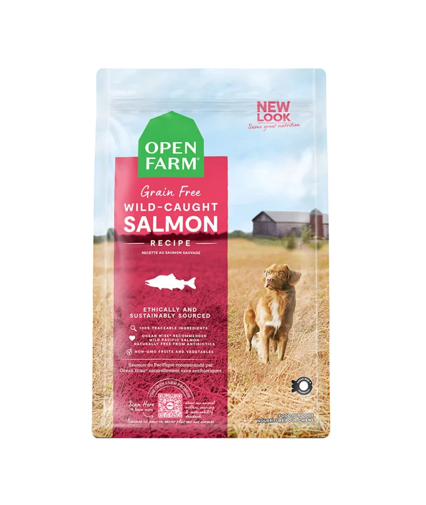
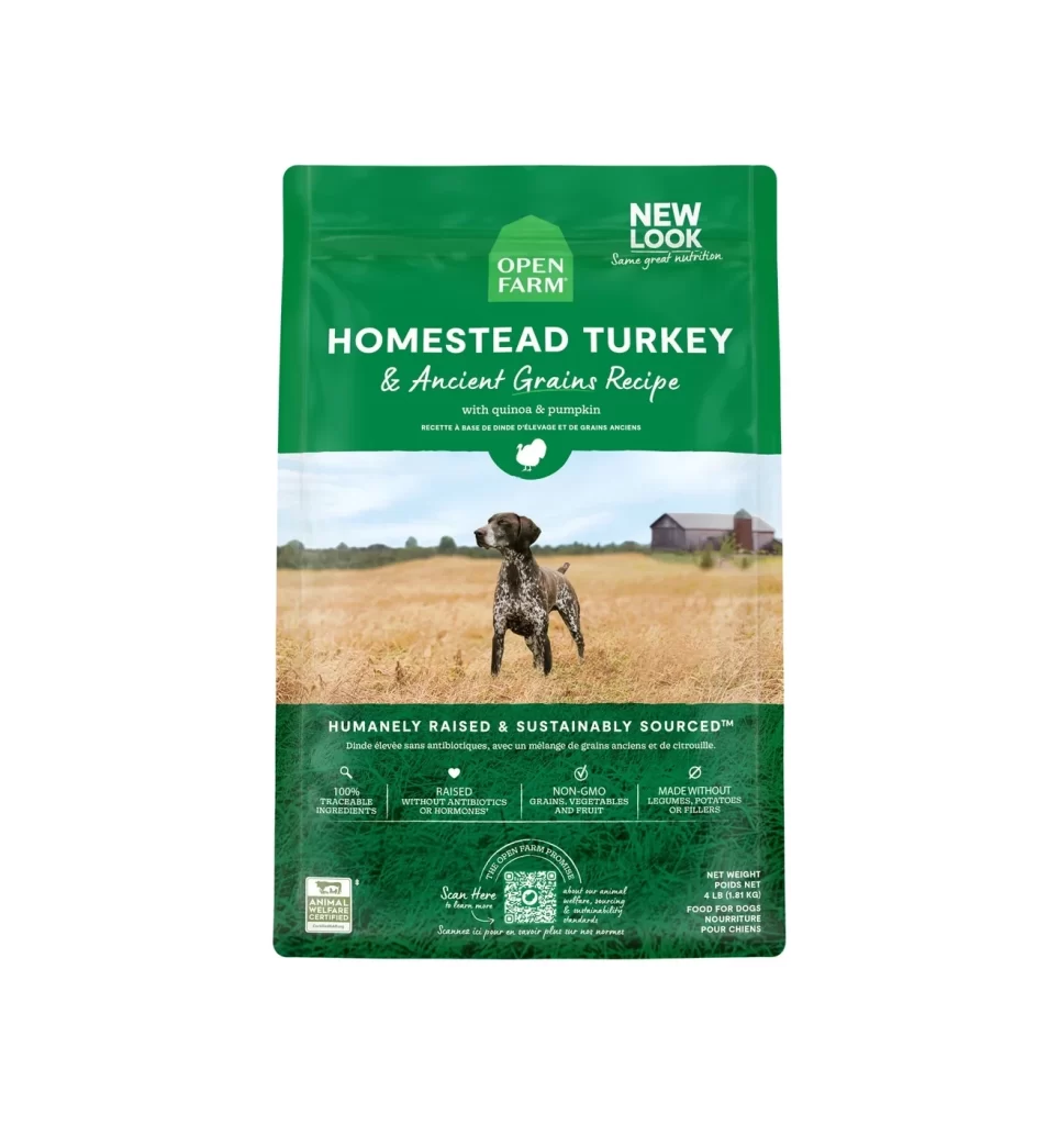
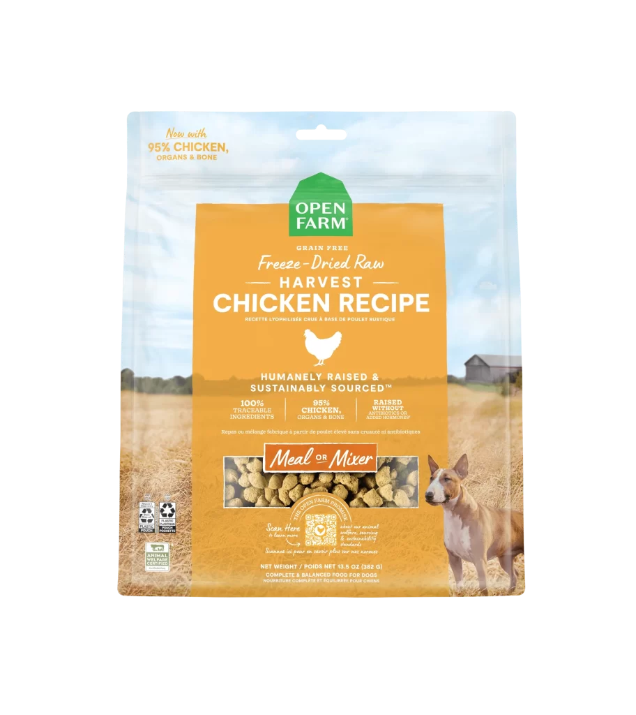
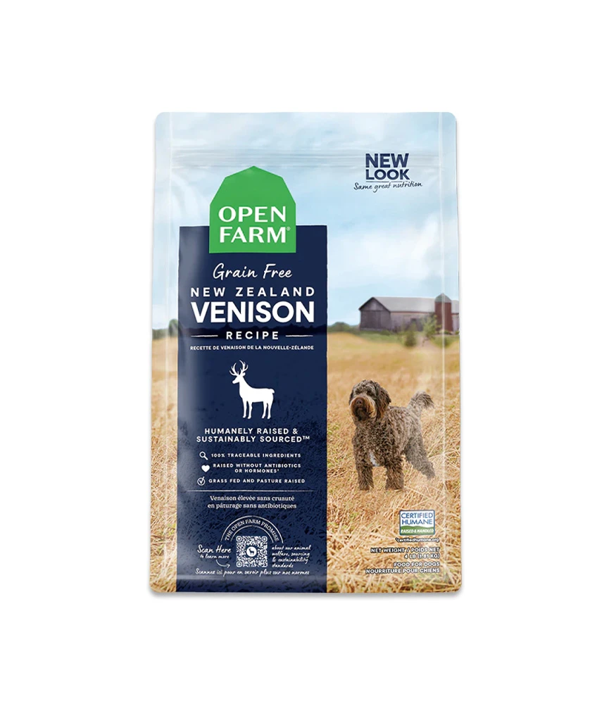
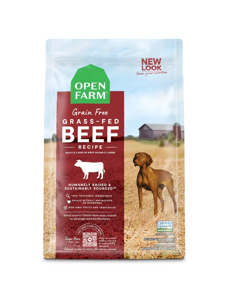
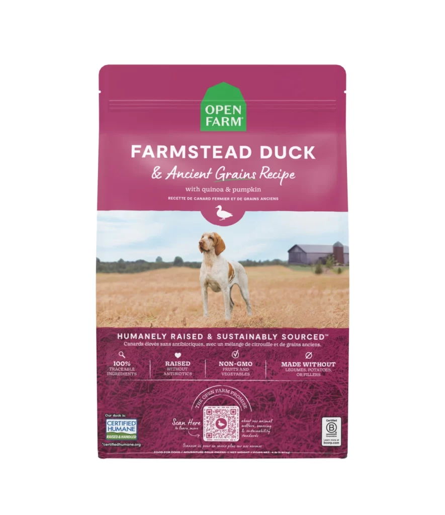
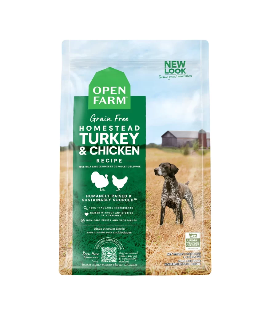
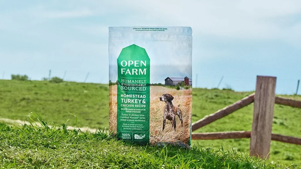
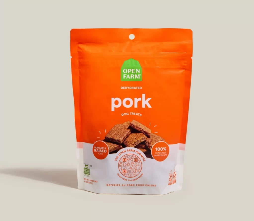
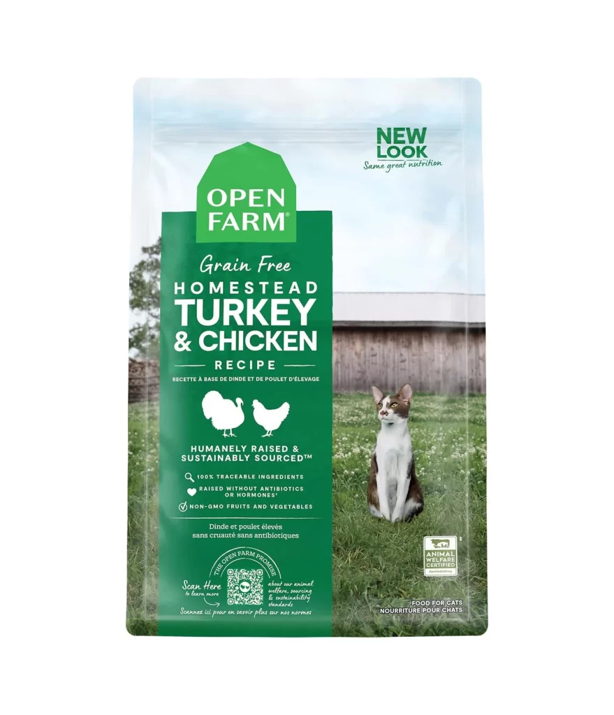
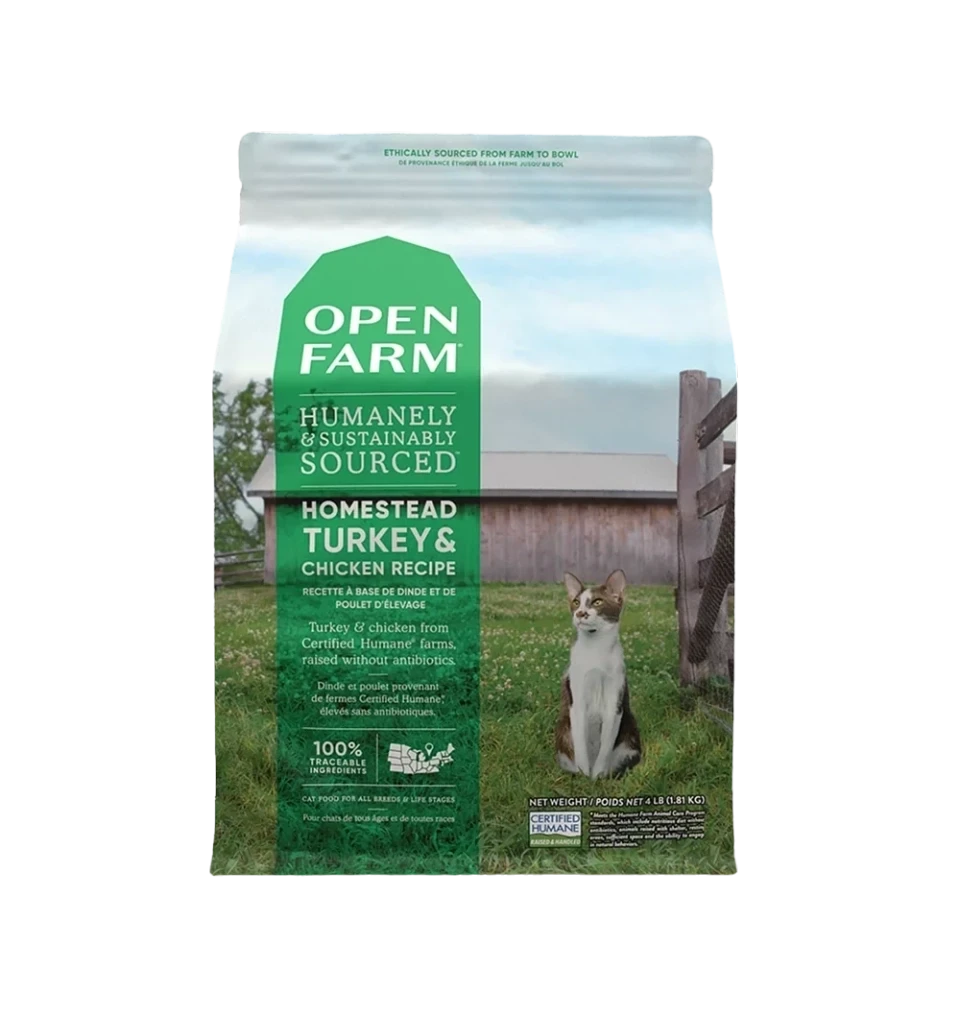
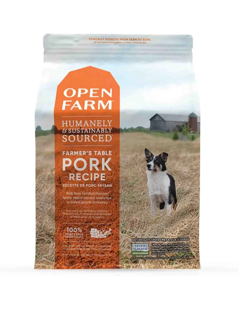
Dominating the center of the composition is a bold, burnt-orange shield shape that anchors the brand identity, featuring crisp white typography for the 'OPEN FARM' logo. Behind this graphic element, a photographic backdrop depicts a sunlit, golden field with a rustic barn and silo in the soft-focus distance, while a black and white Border Collie stands alert in the foreground. The packaging utilizes a matte finish with subtle gradients, presenting the product at a straight-on eye-level angle that emphasizes the vertical hierarchy of the text blocks.
Visual interest is generated through the striking juxtaposition of the industrial orange label against the organic, pastoral photography, creating a high-contrast focal point that draws the viewer's gaze immediately to the recipe type. The design cleverly balances dense informational text—such as the 'Certified Humane' badge and traceability claims—with ample negative space, ensuring the legibility of the 'Farmer’s Table Pork Recipe' title. This specific iteration stands out due to its reliance on authentic farm imagery rather than generic studio shots, reinforcing the ethical sourcing narrative through visual storytelling.
Brand strategists analyzing pet food market trends would utilize this visual to study how transparency claims are integrated into premium packaging layouts. Art directors tasked with creating rustic or agricultural-themed campaigns could examine the color palette and typographic weight to understand how to convey trustworthiness and quality. Furthermore, sustainability consultants might reference the placement of certification logos to evaluate best practices for communicating ethical standards to eco-conscious consumers.