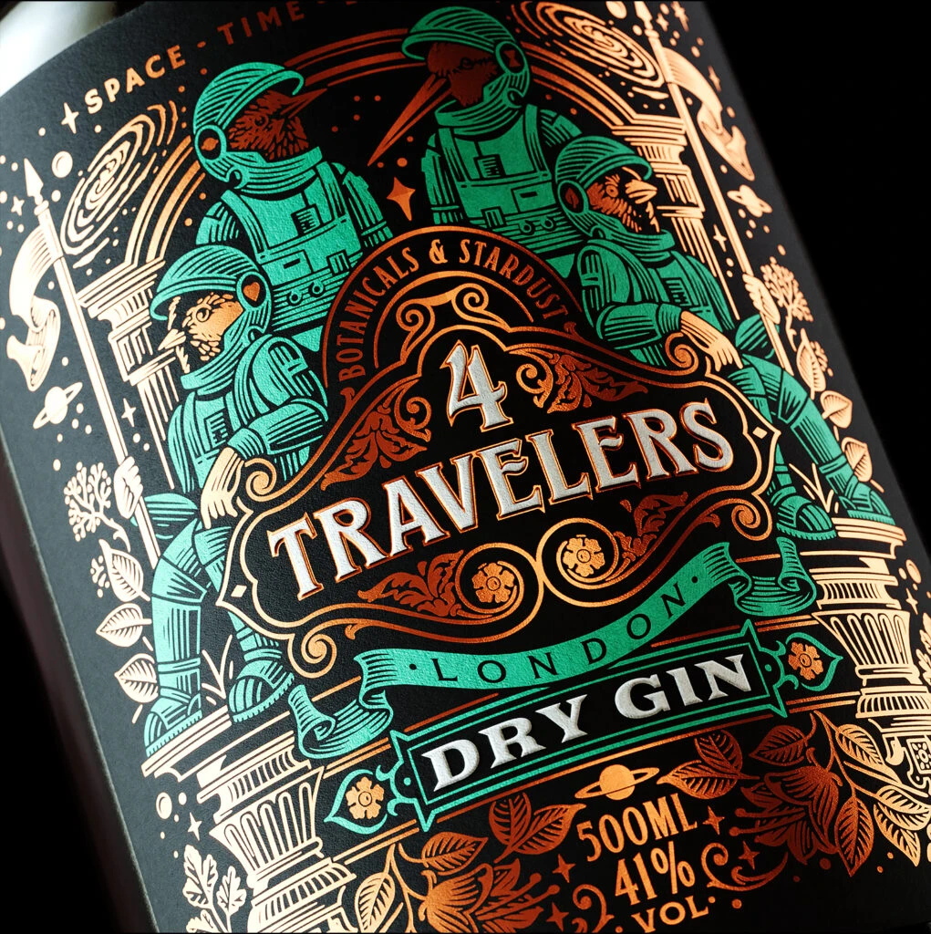
4 Travelers Dry Gin Bottle
Topics
Details
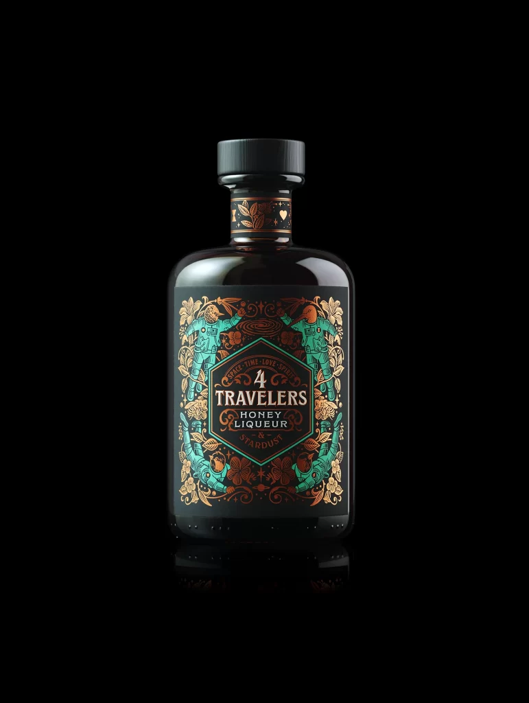
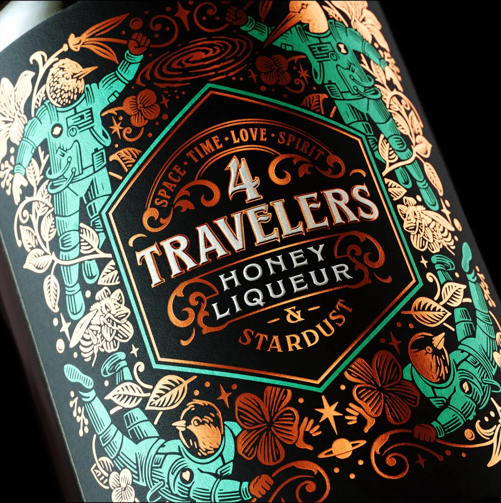
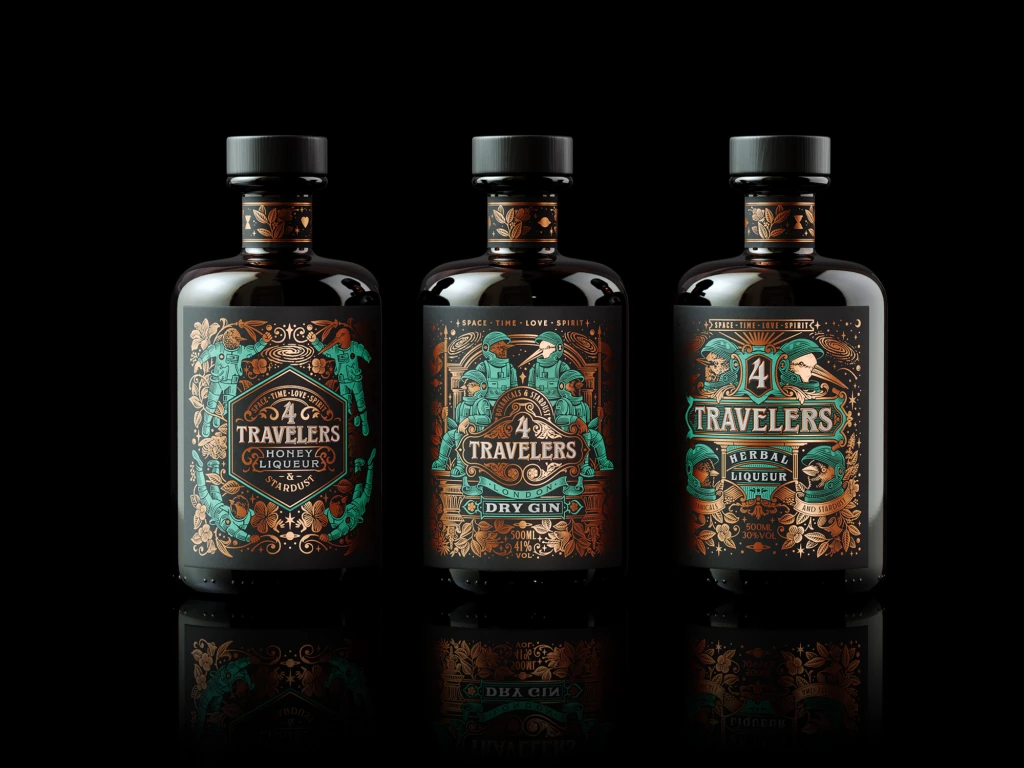
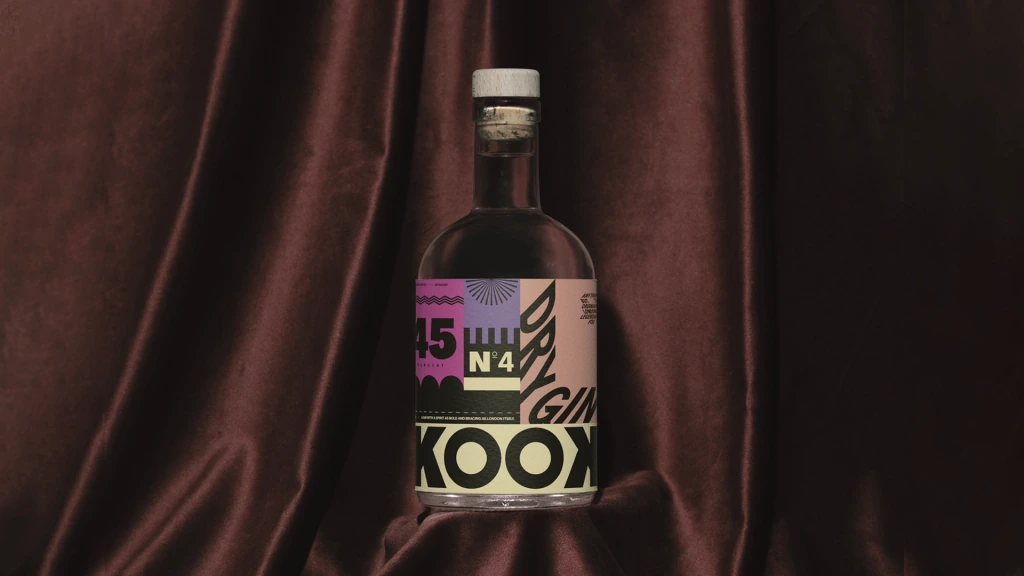
Against a deep matte black background, the cylindrical surface of this gin bottle displays an intricate label dominated by teal, copper, and cream metallic inks. Four avian astronauts in detailed space suits flank a central ornate cartouche bearing the brand name '4 Travelers' in bold serif typography, with 'Botanicals & Stardust' arched above and 'London Dry Gin' positioned below on a ribbon banner. The composition is framed by classical columns, celestial orbits, and botanical foliage, all captured from a slight three-quarter angle that emphasizes the curvature of the glass under soft directional lighting.
Visual distinction emerges from the sophisticated interplay between vintage woodcut aesthetics and retro-futuristic science fiction motifs. The limited yet striking palette of emerald green against burnished orange creates immediate visual hierarchy, while the fine line-work detailing on the bird characters' helmets and suit textures demonstrates exceptional engraving-style craftsmanship. Ornamental scrollwork and decorative flourishes surrounding the text elements lend an artisanal, almost apothecary-like quality that differentiates this from standard minimalist spirit packaging.
Packaging designers studying premium liquor branding would find value in analyzing how traditional typographic treatments can harmonize with whimsical illustrative narratives. Illustrators working on complex vector compositions could reference the layering techniques used to balance dense ornamental borders with clear legible messaging. Marketing teams developing niche beverage identities might examine how specific color combinations and thematic storytelling create memorable shelf presence without relying on photographic realism.