4 Travelers Honey Liqueur Bottle
Topics
Details
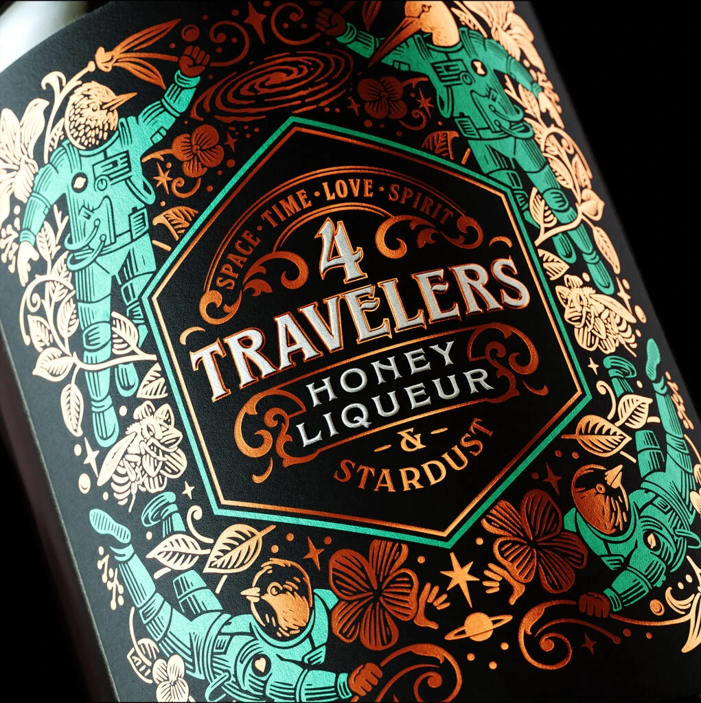
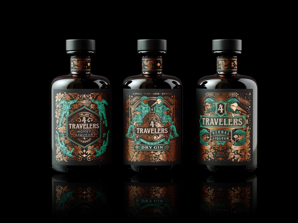
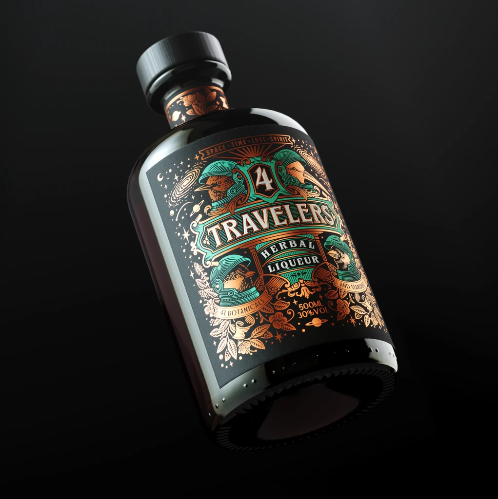
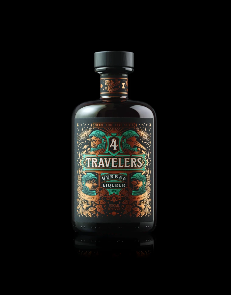
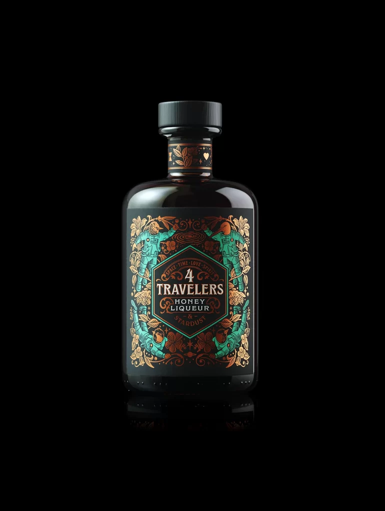
Emerging from an absolute void of black, a dark glass vessel commands the center of the frame with its glossy, reflective surface catching subtle highlights along the curved shoulders. The label presents a complex hexagonal composition, dominated by a rich palette of teal and burnished copper-gold against a matte charcoal background. Intricate illustrative elements frame the central typography, which clearly displays '4 TRAVELERS' in a bold serif font above 'HONEY LIQUEUR' and the sub-brand 'STARDUST', all capped by a ribbed black screw-top that completes the silhouette.
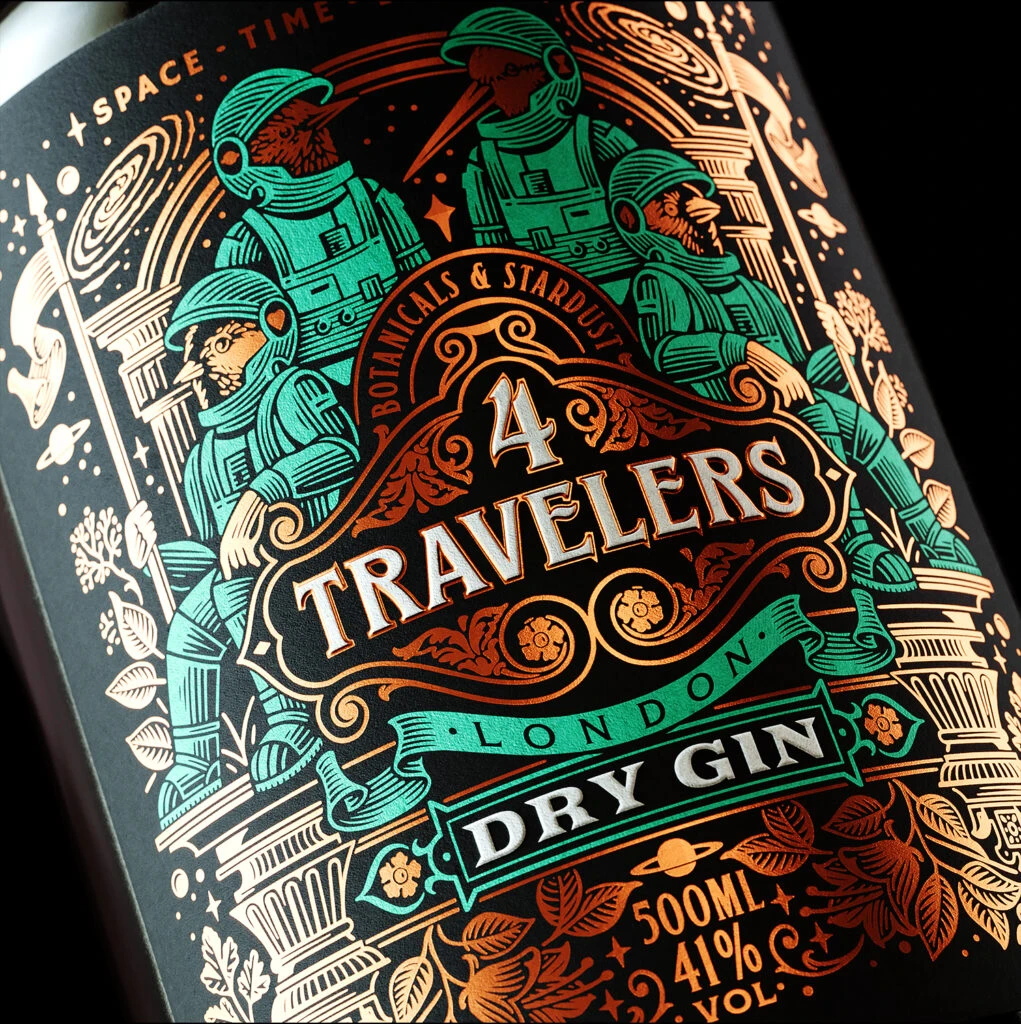
Visual distinction arises from the dense, symmetrical ornamentation that borders the central text block, featuring stylized anthropomorphic figures rendered in a striking turquoise hue. The interplay between the metallic copper filigree and the flat teal illustrations creates a layered depth that feels both vintage and contemporary. Such meticulous attention to typographic hierarchy within the geometric badge ensures legibility while maintaining an artisanal, almost mystical aesthetic that sets it apart from standard liquor packaging.
Packaging designers studying premium spirit branding would find this composition particularly useful for analyzing how ornate border treatments can elevate a product's perceived value. Illustrators looking to master the balance between figurative elements and decorative patterns could deconstruct the spatial relationships between the characters and the floral motifs. Additionally, color theorists might reference this specific combination of cool teals and warm metallics to understand how contrasting temperatures can create visual tension on dark substrates.