Travelers Herbal Liqueur Bottle View
Topics
Details
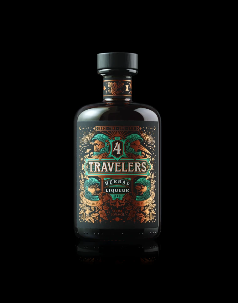
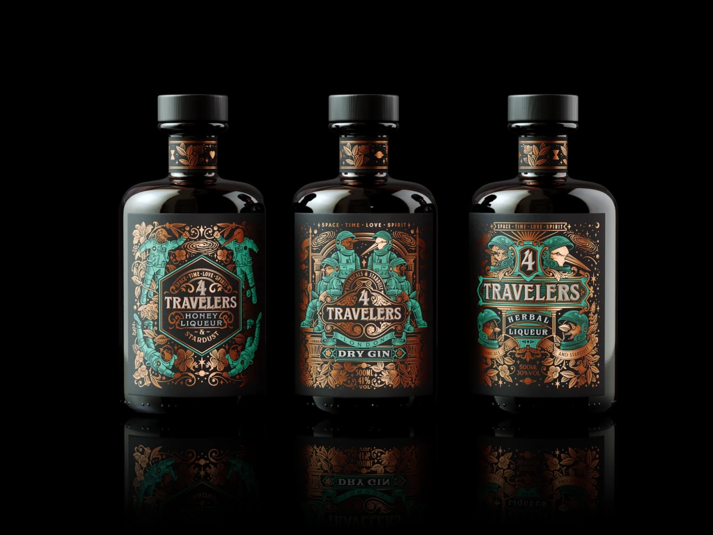
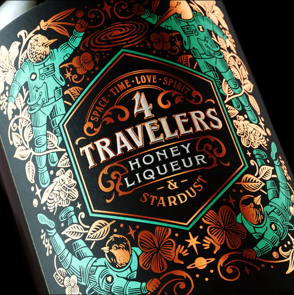
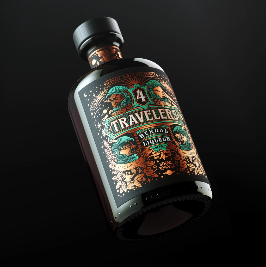
Set against a void-like black background, a dark glass bottle of Travelers Herbal Liqueur floats at a dynamic three-quarter angle, catching light that glints off its glossy surface and ribbed black cap. The label commands attention with a rich palette of copper, teal, and cream, featuring intricate botanical illustrations and cosmic motifs like swirling galaxies and distant planets. Bold typography spells out 'TRAVELERS' above the number '4' and 'HERBAL LIQUEUR', while smaller text notes '41 BOTANICALS', '500ML', and '30% VOL', all framed by ornate borders that suggest both vintage apothecary aesthetics and interstellar exploration.
What distinguishes this packaging is its audacious fusion of Victorian-era scientific illustration with retro-futuristic space-age iconography. The central figures—bird-like creatures wearing astronaut helmets—create an immediate visual paradox that feels whimsical yet sophisticated. Metallic copper foil stamping against the matte dark substrate provides tactile depth, while the dense layering of stars, leaves, and geometric patterns rewards close inspection with hidden details that elevate it beyond standard liquor branding.
Art directors developing speculative fiction packaging concepts will find this particularly useful for studying how to balance complex illustrative hierarchies without sacrificing legibility. Illustrators working on steampunk or sci-fi projects can analyze the color harmony between oxidized metals and deep space tones to achieve similar atmospheric effects. Brand strategists might also examine how narrative elements—suggesting travel through both nature and cosmos—are woven into every graphic decision, from the helmeted avians to the orbital paths surrounding the product name.