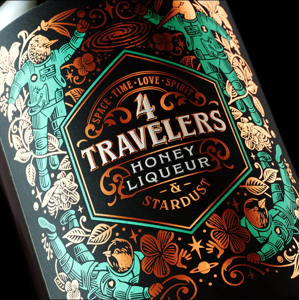
4 Travelers Honey Liqueur & Stardust Label
Topics
Details
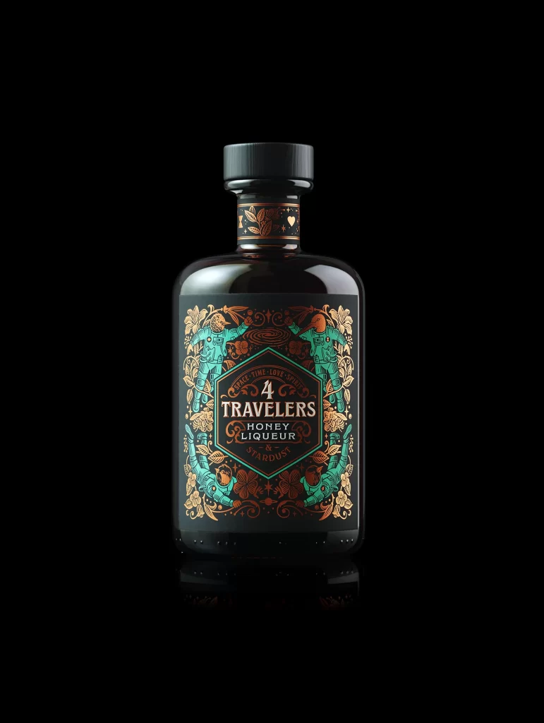
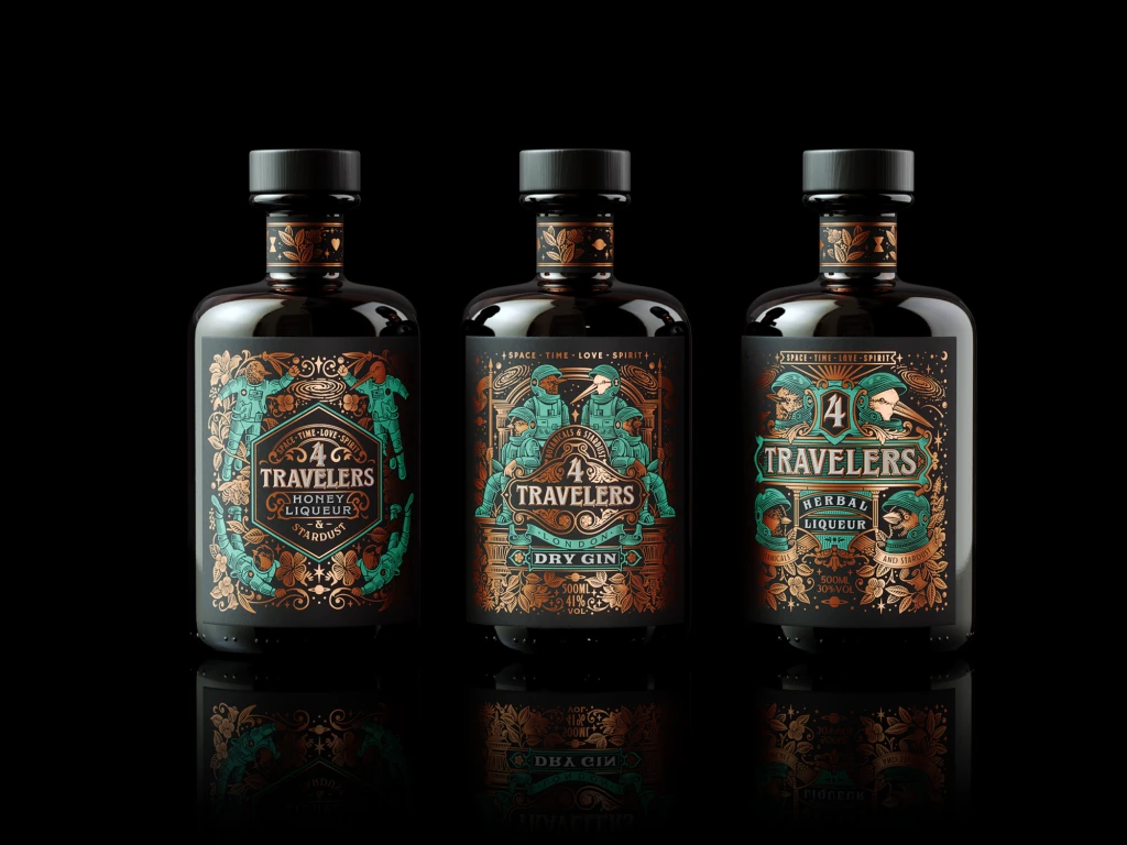
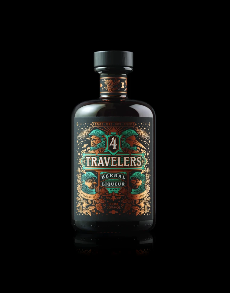
Against a matte black surface, an octagonal label commands attention with its metallic copper and teal foil stamping. The central text block features the number 4 in a bold serif, with TRAVELERS arched beneath it in raised silver lettering, followed by HONEY LIQUEUR & STARDUST in smaller capitals. Surrounding this core are four astronaut figures wearing bird-head helmets, rendered in alternating turquoise and copper tones, while botanical elements like clovers and leaves weave between them alongside celestial motifs such as planets and swirling galaxies.
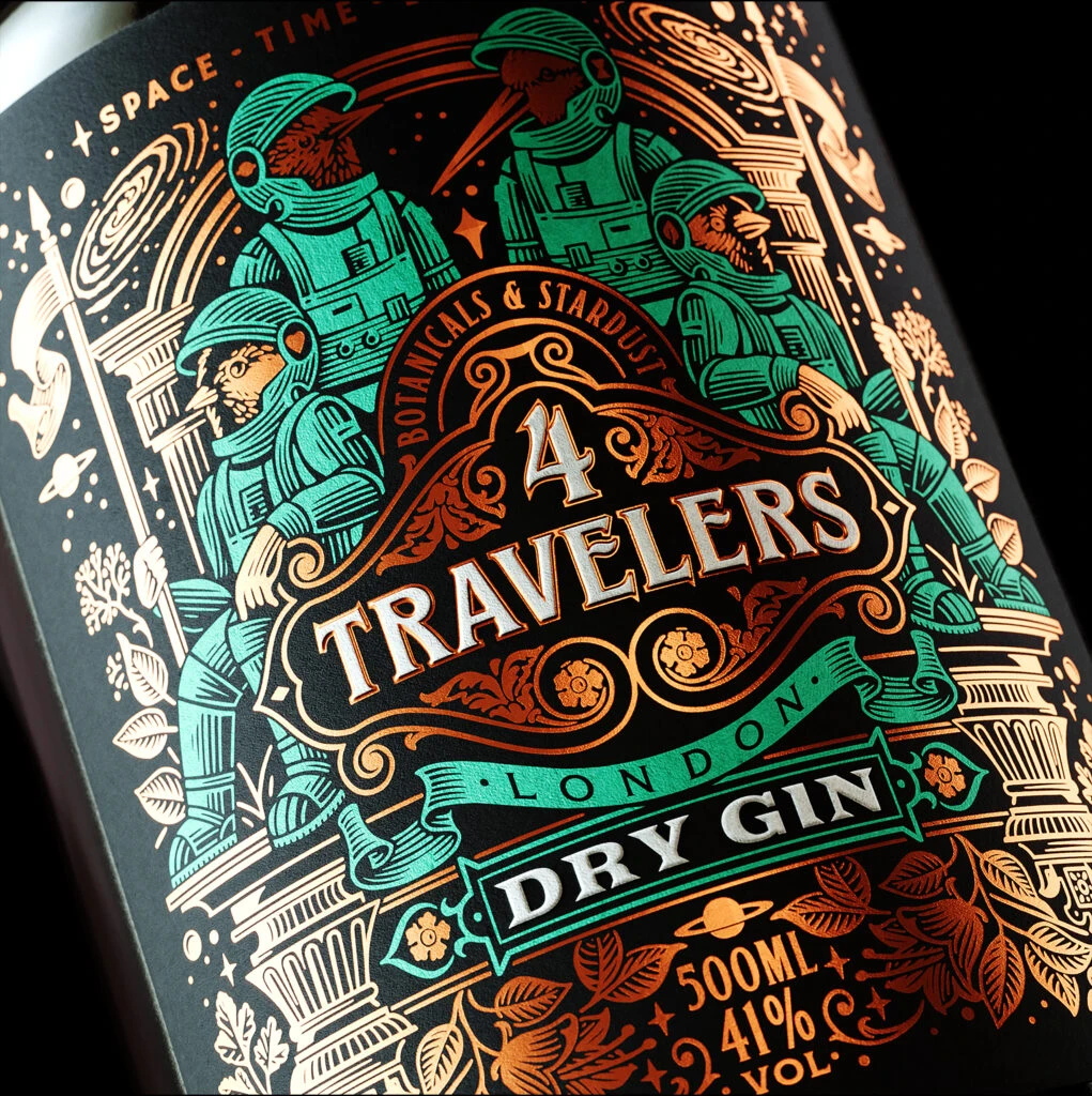
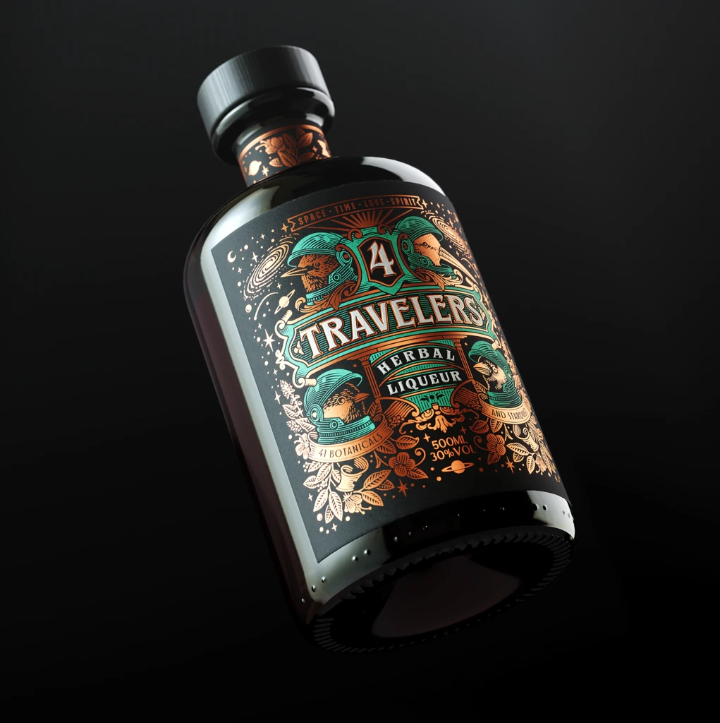
Visual distinction emerges from the intricate interplay of three distinct foil colors against the dark substrate, creating a tactile quality that suggests premium production values. The juxtaposition of space-age imagery with organic floral patterns generates a whimsical yet sophisticated narrative, while the symmetrical arrangement of the suited figures provides structural balance to the ornate decorative flourishes. Lighting catches the embossed surfaces at varying angles, emphasizing the depth of the relief printing and the contrast between flat color fields and detailed linework.
Packaging designers studying luxury beverage branding might examine this composition for its effective use of metallic inks on dark backgrounds. Illustrators working on narrative label art could reference the integration of character design within ornamental borders. Brand strategists analyzing niche spirit markets would find value in how typography hierarchy guides the eye from the prominent numeral through the product name to the evocative subtitle.