TAT Spaghetti Bag View
Topics
Details
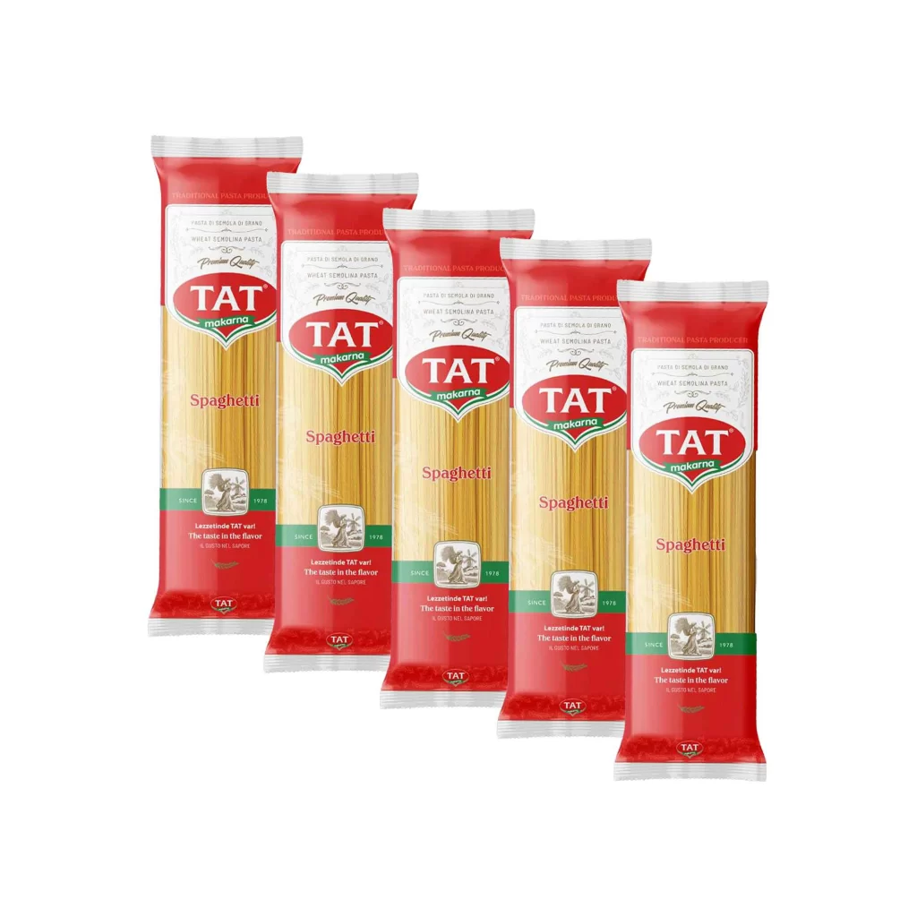
Five identical packages of TAT brand spaghetti stand in a neat, staggered diagonal row against a stark white background. Each bag features a bold red header and footer sandwiching a transparent window that reveals the pale yellow pasta strands inside. The central white label displays the brand name 'TAT' in large red letters above the green word 'makarna', with 'Spaghetti' printed in a matching red script across the middle of the clear section.
Visual hierarchy plays a major role in this packaging's appeal, using a classic tri-color palette of red, white, and green to signal quality and tradition. The inclusion of the 'Since 1978' badge alongside the Italian phrase 'Pasta di Semola di Grano' adds a layer of heritage and authenticity to the product. Furthermore, the slight overlap of the bags creates a sense of depth and abundance, making the product look ready for retail display.
Product photographers can study this arrangement to understand how to effectively showcase multiple units of a consumer good without cluttering the frame. Brand managers might examine the typography and color balance to see how traditional food packaging conveys trustworthiness to shoppers. Additionally, 3D artists could use this as a baseline for modeling realistic plastic textures and how light interacts with semi-transparent materials.