Pasta Farfalle Jazz Blue White
DownloadTopics
Details
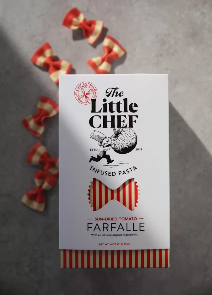
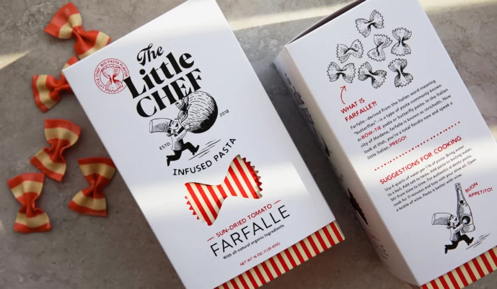
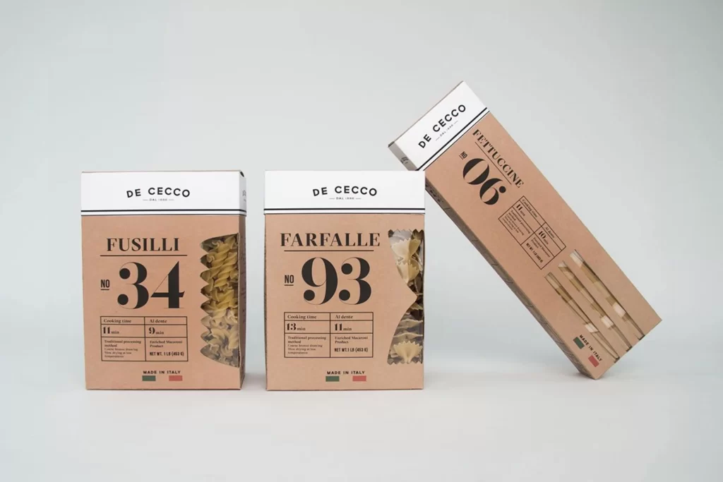
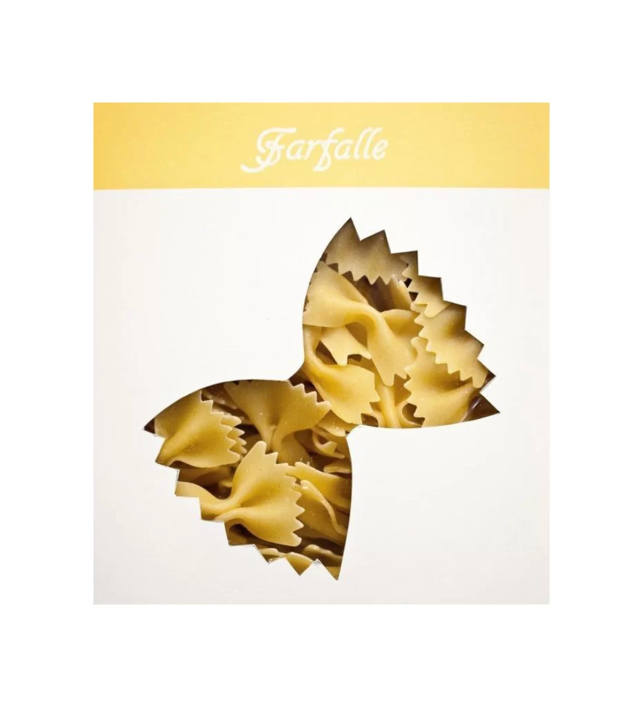
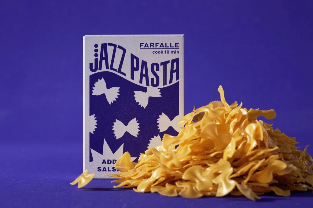
A rectangular pasta box stands slightly left of center, its white cardboard surface dominated by deep indigo graphics and bold, sans-serif typography reading "JAZZ PASTA" in a wavy, rhythmic lockup. The packaging specifies the contents as farfalle with a ten-minute cook time, while the lower portion features scattered white bow-tie silhouettes against the dark blue field alongside partial text suggesting sauce addition. To the right and spilling forward, a generous mound of uncooked golden-yellow farfalle noodles creates textural contrast with their crinkled edges and pinched centers. Everything rests upon a solid violet backdrop that fills the frame, illuminated by soft directional light casting subtle shadows beneath the pasta pile from a straight-on camera perspective.
Visual distinction emerges from the aggressive typographic hierarchy where the brand name dwarfs the product category, utilizing musical notation dots as a visual pun that reinforces the jazz theme through graphic rhythm rather than literal instrumentation. The color palette restricts itself to white, navy, and the natural amber of the dried pasta, creating a sophisticated monochromatic scheme that feels both retro and contemporary. Those oversized bow-tie icons on the lower half of the box mirror the actual pasta shape with playful scale variation, turning functional ingredient identification into decorative pattern work. Designers seeking to study this specific packaging aesthetic can access the full-resolution file at no cost directly from the resource library.
Food photographers might reference this composition when planning product shots that require balancing printed packaging with loose ingredients, particularly for dry goods where texture communication matters as much as branding visibility. Brand identity teams developing artisanal or music-themed food lines could analyze how the wavy baseline and condensed letterforms convey energy without sacrificing readability on shelf. Packaging engineers evaluating structural layouts for tall rectangular boxes will find useful data in how the vertical information hierarchy distributes weight across the front panel while maintaining visual breathing room around the photographic element.