Pasta Fusilli Farfalle Fettuccine Dececco Brown White
DownloadTopics
Details
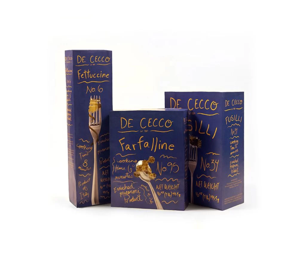
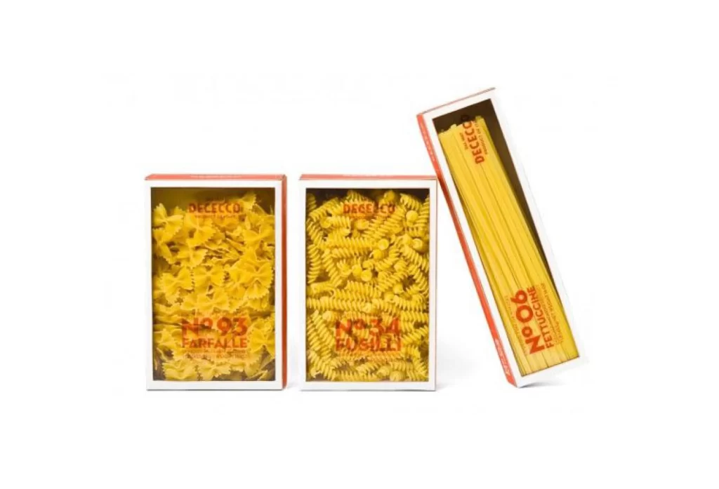
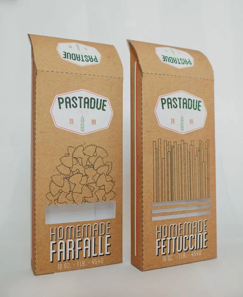
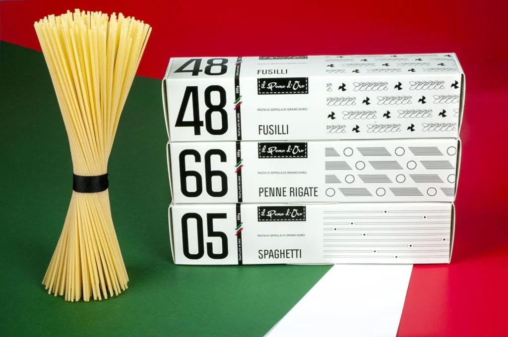
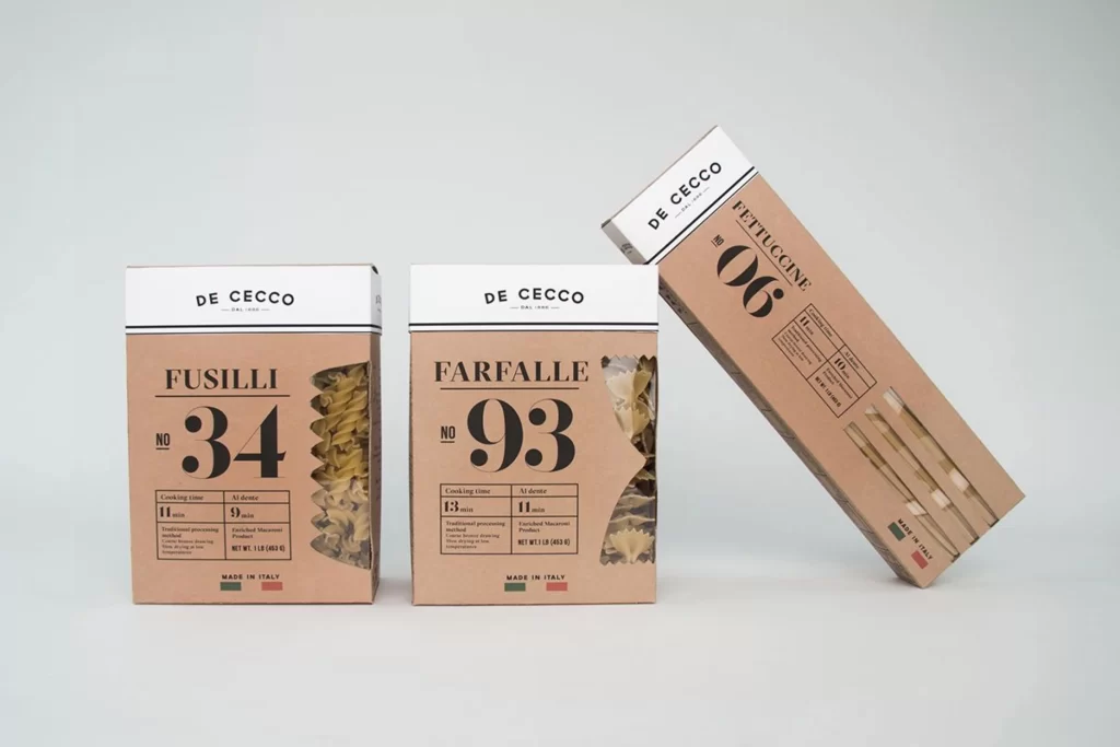
Three De Cecco pasta boxes in kraft brown and crisp white stand against a neutral light-gray surface, with the leftmost Fusilli No. 34 and center Farfalle No. 93 upright while the Fettuccine No. 06 leans at a forty-five-degree angle to the right. Each carton features bold serif typography for the pasta shape name, oversized numerals for the product code, and a transparent window revealing the dried pasta inside, all topped by a white band bearing the brand name in clean sans-serif lettering. Soft studio lighting casts gentle shadows beneath the packaging, emphasizing the matte texture of the cardboard and the subtle Italian flag tricolor strip near the bottom edge of each box.
The visual hierarchy relies on typographic contrast between the delicate uppercase shape names and the massive black numerals that dominate each face, creating an almost archival or catalog-like aesthetic that distinguishes these from typical grocery-store packaging. Kraft paper grounds the composition with organic warmth while the rigid geometric layout and minimal color palette signal premium positioning, and designers can access the full-resolution file without cost to study these material and typographic interactions closely.
Packaging art directors examining sustainable material applications would find this arrangement useful for analyzing how natural cardboard tones interact with high-contrast black ink systems. Brand identity developers working on artisanal food lines could reference the balance between heritage cues—such as the 'Made in Italy' designation—and modernist grid structures when constructing their own visual systems. Photographers planning product shoots might study the angular placement strategy to understand how dynamic positioning adds visual interest to otherwise static rectangular forms.