Pasta Fusilli Eco Green Yellow Red Organic
DownloadTopics
Details
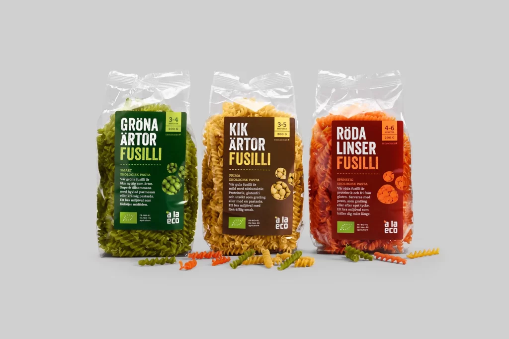
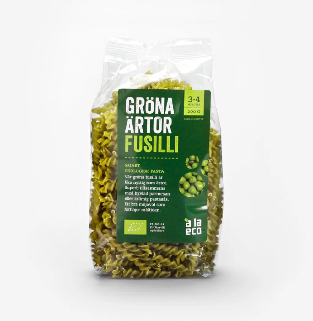
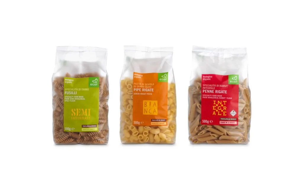
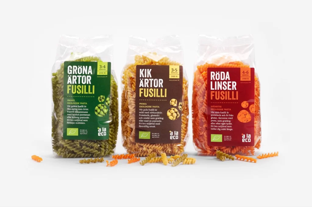
Three transparent plastic bags of spiral fusilli pasta stand in a row, each filled with distinctly colored noodles that match their label schemes. The left bag contains olive-green spirals beneath a dark green label reading 'GRÖNA ÄRTOR FUSILLI', the middle holds golden-yellow pasta under a brown 'KIK ÄRTOR FUSILLI' tag, and the right package features bright orange-red coils paired with a crimson 'RÖDA LINSER FUSILLI' designation. Loose fusilli pieces in matching hues scatter across the light surface before the packages, while soft even lighting illuminates the scene from a straight-on camera perspective.
Color-coded labeling creates an immediate visual taxonomy where the typography, background tint, and ingredient iconography all align with the actual pasta hue inside each bag. This systematic approach turns nutritional differentiation into a cohesive branding language, making it simple to distinguish pea-based, chickpea, and lentil varieties at a glance. Anyone studying this composition can grab the full-resolution file at no cost to examine how organic certification badges and portion sizing integrate into the layout.
Food photographers and packaging designers often study arrangements like this to understand how transparent materials interact with vibrant product contents. The scattered loose pieces offer valuable reference for styling decisions when shooting bulk dry goods or creating e-commerce mockups. Student projects focusing on sustainable food branding would benefit from analyzing the typographic hierarchy and color psychology applied across these three variants.