Pasta Molitalia Red Yellow Green
DownloadTopics
Details
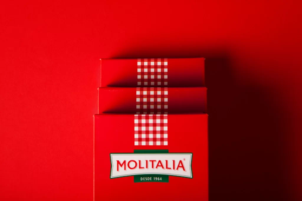
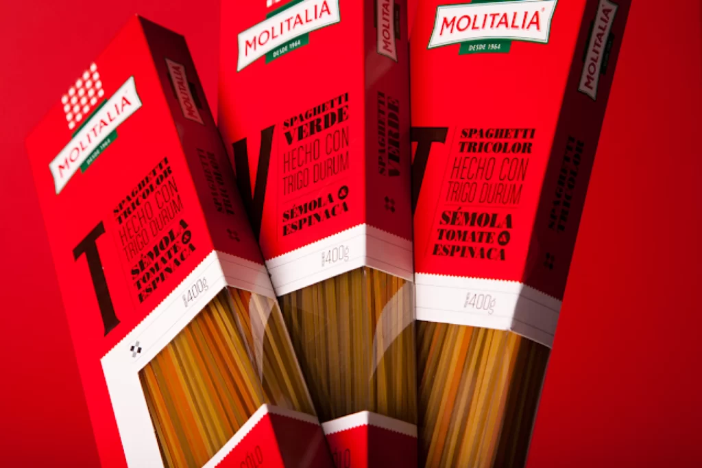
Three red cardboard boxes of Molitalia spaghetti stand at slight angles to one another, revealing the tricolor pasta strands through clear plastic windows at their bases. Each package features bold black typography announcing varieties like Spaghetti Tricolor and Verde, along with ingredients such as sémola, tomate, and espinaca printed against the vibrant crimson surface. The composition sits atop a matching red backdrop that makes the white brand logos and 400g weight markings pop, while soft lighting catches the glossy finish of the packaging material.
What sets this packaging apart is its aggressive, almost typographic-poster approach to product information, where ingredient lists become graphic elements rather than mere fine print. The monochromatic red scheme creates a striking visual unity across different pasta varieties, letting the actual colored noodles provide the only hue variation in the display. Designers studying this layout will notice how the oversized letterforms and tight text blocks turn a grocery staple into something resembling modernist art. You can grab the full-resolution file for closer inspection of those printing details.
Food photographers might reference these angles to understand how to arrange multiple SKUs without losing individual product clarity, while packaging designers could study the hierarchy between logo placement and descriptive copy. Brand identity teams working on Latin American market products would benefit from analyzing how Spanish-language typography integrates with iconic color blocking. Illustrators needing accurate depictions of Italian-style pasta packaging will find the texture of the cardboard and the translucency of the window material particularly useful for realistic renderings.